Global Art Project by Work In Progress, Norway
Opinion by Richard Baird Posted 23 June 2015
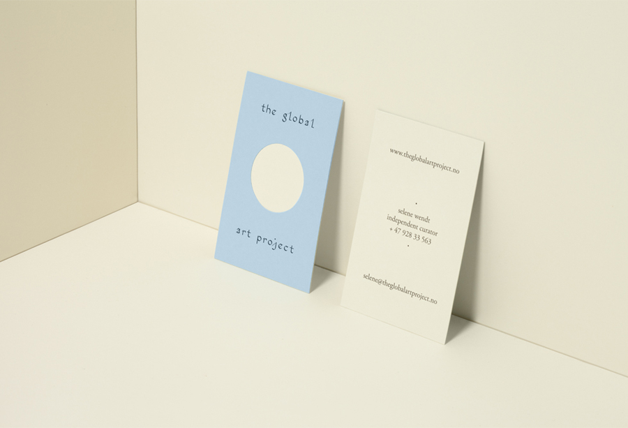
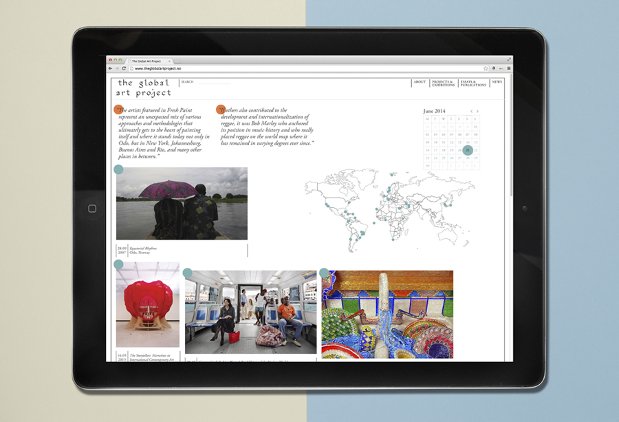
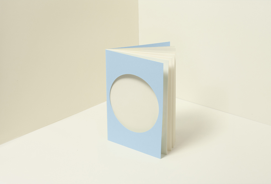
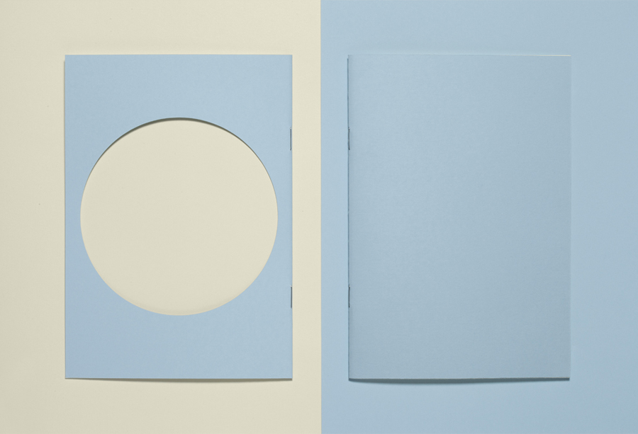
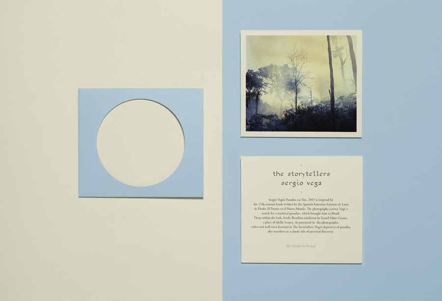
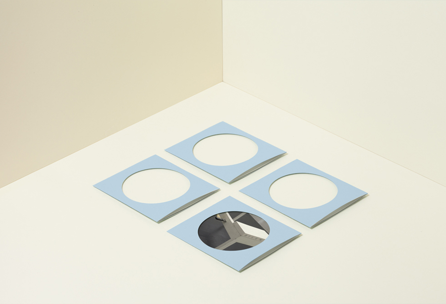
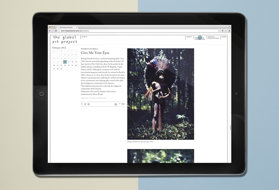
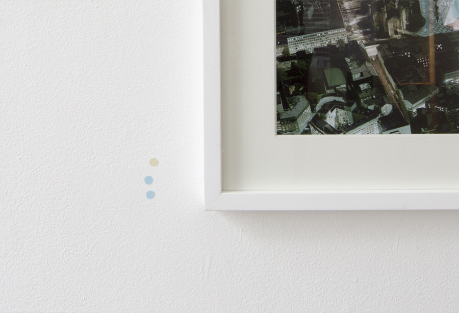
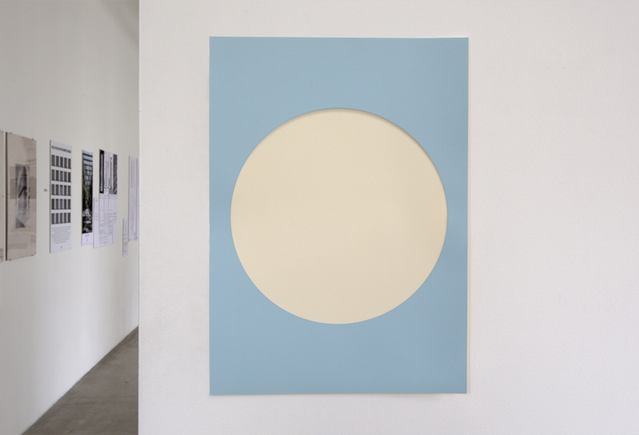
The Global Art Project was established by Norwegian independent curator and writer Selene Wendt as a professional platform and framework for the communication, development and presentation of international contemporary art across geographical borders with the intention of bringing together all aspects of exhibition development. The Global Art Project is based in the city of Oslo and features a new brand identity, developed by multi-disciplinary Scandinavian design studio Work In Progress, that included duplex and die cut business cards, notebook, A6 presentation folder with inlay cards, website design, A1 poster and stickers.
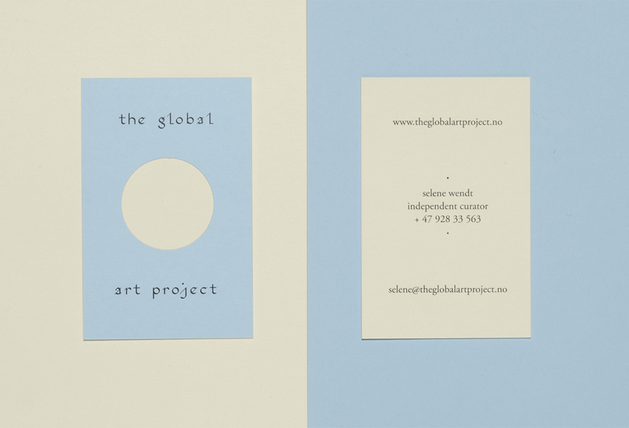
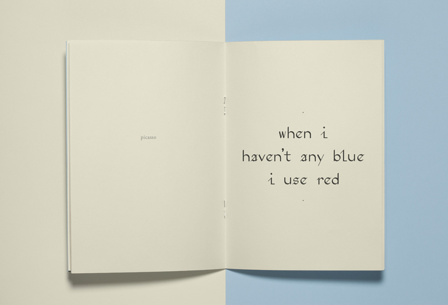
The identity, in print, features uncoated off-white and blue papers, black ink, circular die cuts, glued boards, heavy boarders and a bespoke typeface developed by designer and artist Peter Nencini. It is one of space, calligraphic flourish, small-scale hand crafted qualities, tactile paper choices, and like many gallery identities, plays with framing, reduction and a contrast of colour and form alongside the detail of art and exhibitions.
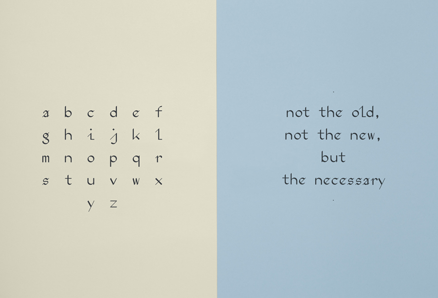
Peter Nencini’s custom typography adds an unusual retrospective hand drawn quality—one with its origins firmly rooted in the calligraphic where you might typically see geometric or humanist sans-serifs—which gives the identity a very personal and distinctive quality well-suited to the individuality of art, its curation, tradition and discussion. Online the addition of colour, a whiter background, italics and art photography sees the identity broaden and work well with a variety of content, whilst retaining key qualities used in print. More from Work In Progress on BP&O.
Design: Work In Progress
Typeface Design: Peter Nencini
Opinion: Richard Baird
Fonts Used: Adobe Garamond
