James Turrell; Jardín Botánico by Savvy
Opinion by Richard Baird Posted 7 August 2015
Botanico Culiacan is a 10 acre botanical garden, designed and built by Tatiana Bilbao in 2012, and located in the city of Culiacán, México. The garden is dedicated to conservation, eduction and botanical investigation, plays host to a variety of cultural events and is home to a contemporary art collection commissioned specifically for the space.
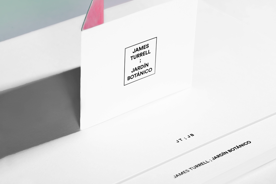
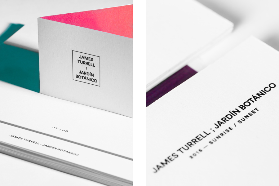
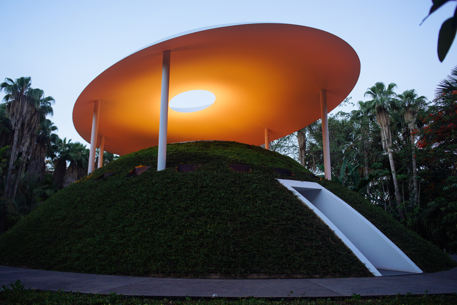
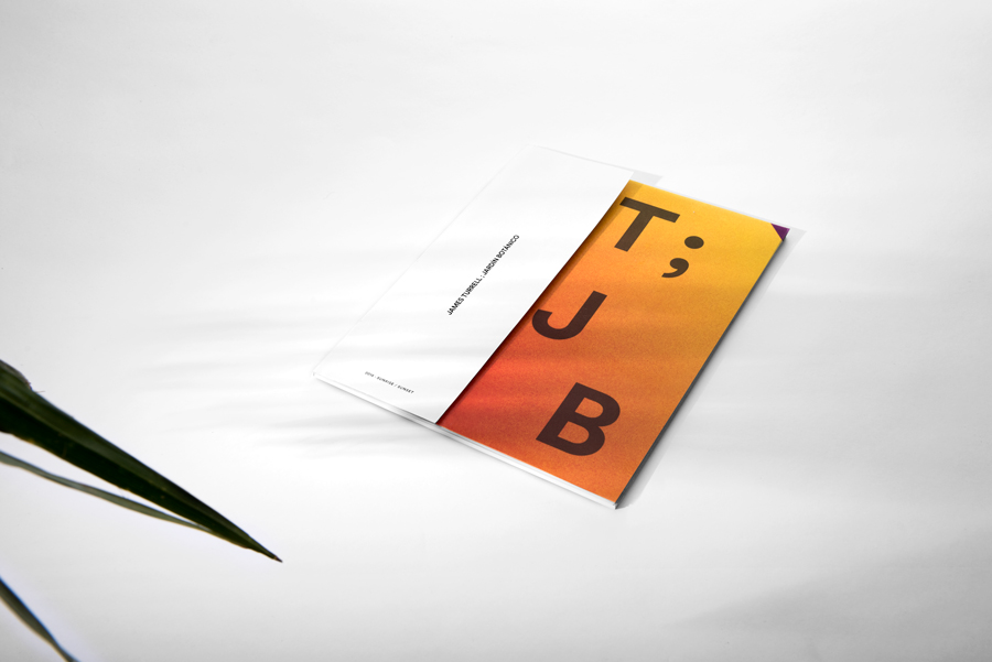
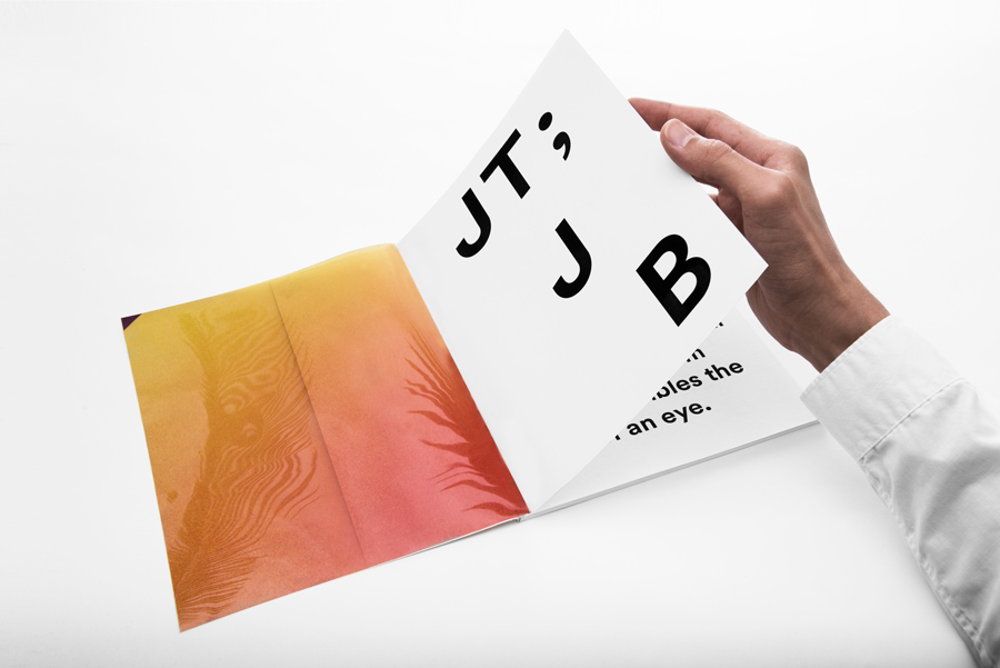
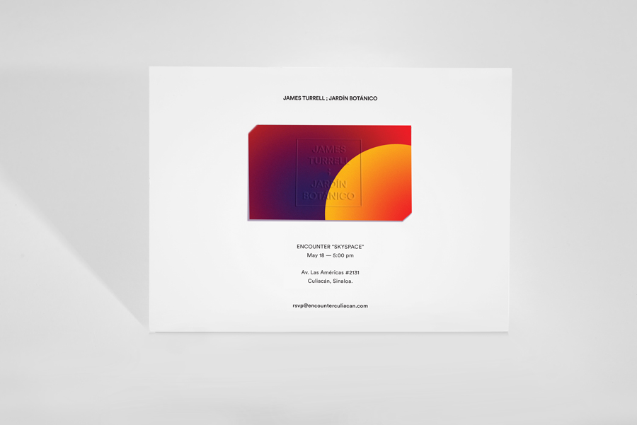
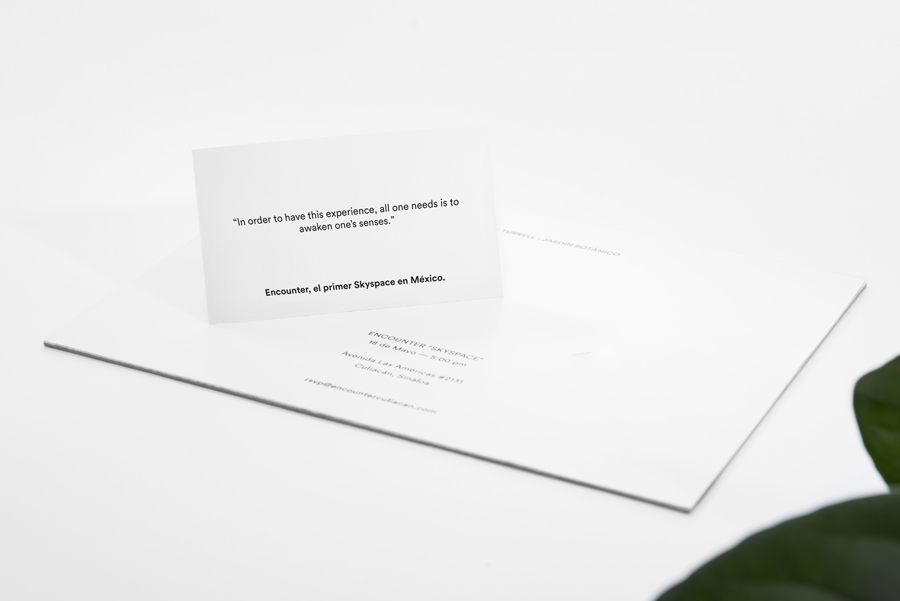
Botanico Culiacan’s latest installation, James Turell’s Encounter, is the first public skyspace in Latin America. The work continues to express James Turell’s interest in light, colour and empty white space through programmed lighting within a domed enclosure and a small opening that frames the sky. This is further explored within the exhibition’s brand identity treatment, created by graphic design studio Savvy, using panels of ink, regions of unprinted space, blind emboss, glossy surfaces and a mix of type and image.
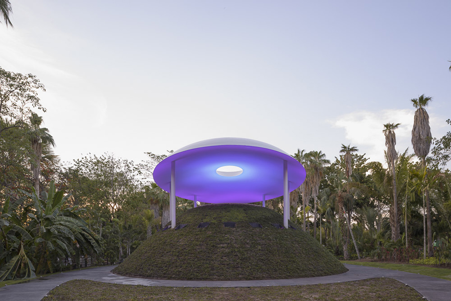
“A Skyspace is an observatory; an enclosed space with a limited opening above, where visitors can experience the interaction between the sky’s colours – abstracted from their natural context – with programmed lighting. The enhanced observation intensifies the effect that the tonal range of dawn and dusk generates in our conscience and human perspective.” – Savvy
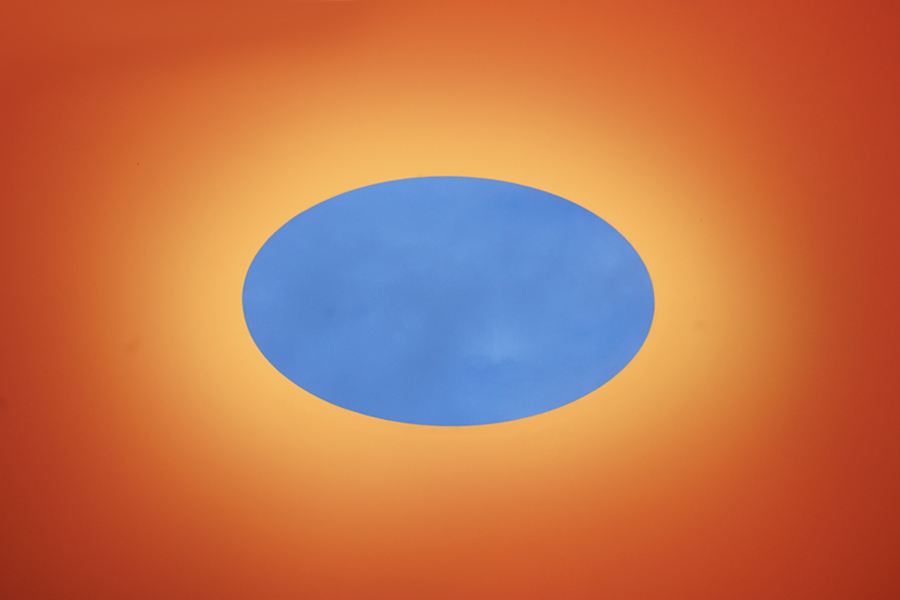
Savvy describe the graphic language of their work as giving light an almost tangible quality and as portraying the experience of the installation in an abstract manner rather than through descriptive information. It is a bold intention, and while perhaps hindered slightly by the absence of the radiant light that proliferates James’ work, appears as a neat interpretation and distillation—within the limitations of print—and as an interesting exercise in contrast and emphasises.
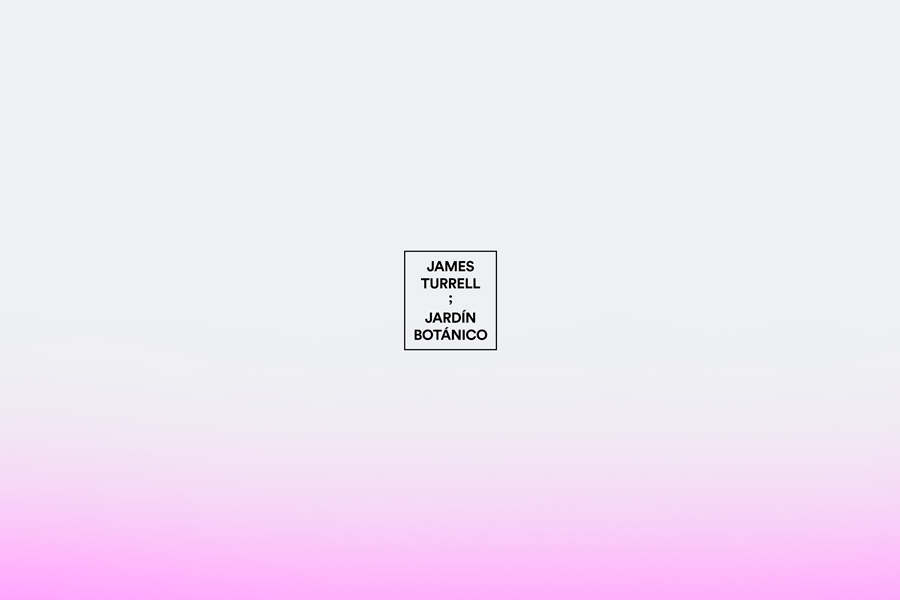

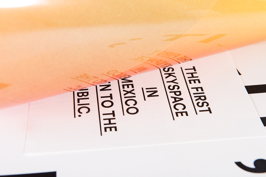
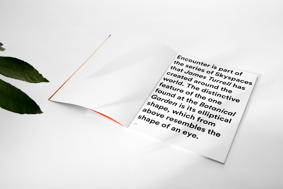
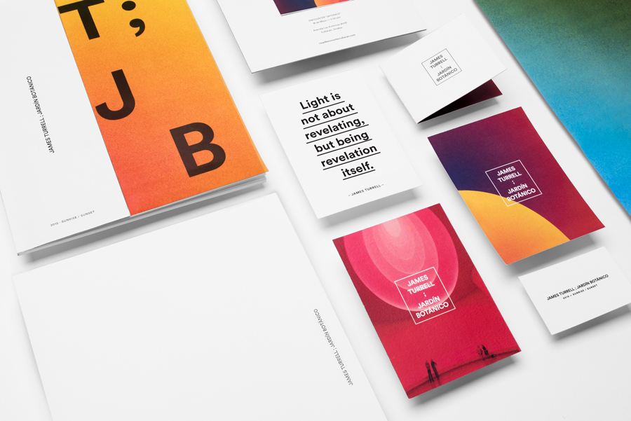
The contrast inherent in James’ work—white space, controlled coloured lighting and the slow change of natural light—runs throughout Savvy’s treatment. From the edge to edge panels of gradients set alongside or within the interior walls of white unprinted substrates, much like the exhibition space, to the elliptical detail of images drawn out and emphasised through black, geometric, sans-serif typography, its stacked, underlined and linear typesetting and square frame.
Neon ink and spot colour over and next to fluorescent white boards appear, although without the radiance of a screen, projection or backlighting, vivid in a similar way to the exhibition, while other small details such as glossy surfaces, mixed paper sizes and a blind emboss continue to play with the themes of light and contrast.
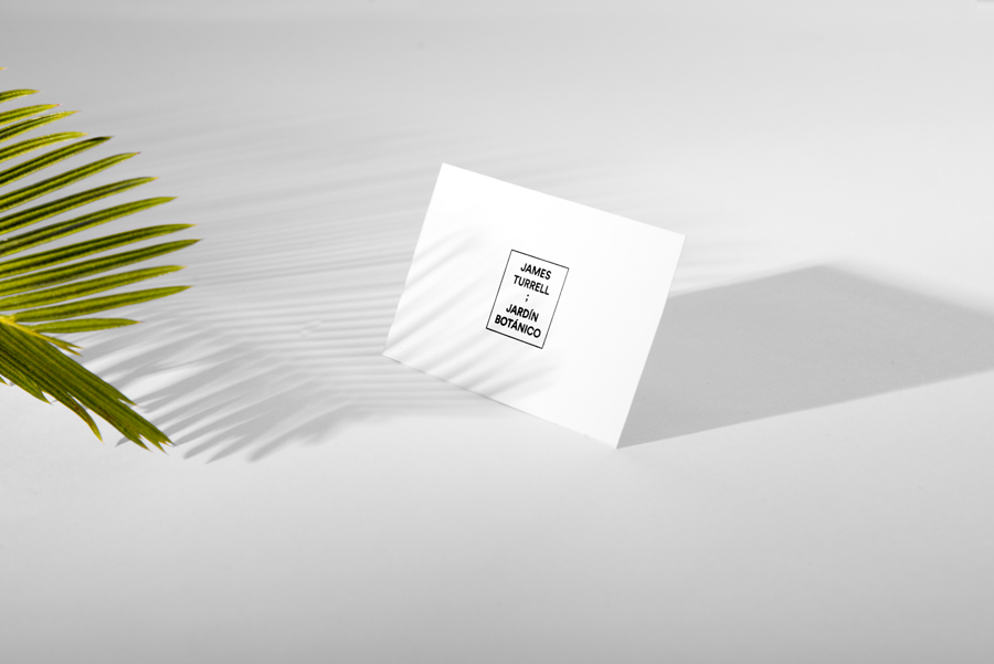
Where there is warmth in the use of colour gradation, and a connection to the floral qualities of the installation’s surroundings, the visual vernacular of contemporary art galleries, characterised by a fairly neutral type choice and its typesetting, plenty of white space and the written expression of artistic intention, is distant and indifferent. Beyond moments of expressive oversized type this lacks character of its own working to frame and emphasise, much like a gallery space, the colour and form of the experience and its visceral rather than intellectual nature. More from Savvy on BP&O.
Design: Savvy. Opinion: Richard Baird
