The Best of BP&O — August 2015
Opinion by Richard Baird Posted 31 August 2015
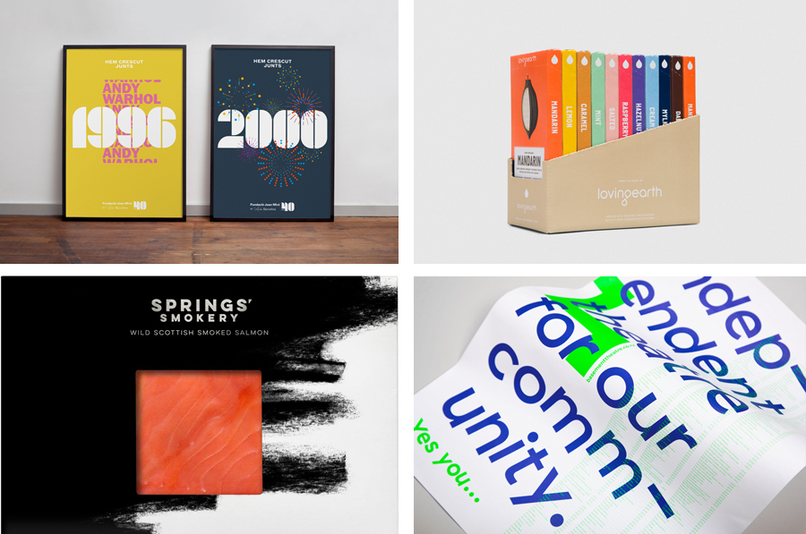
August’s highlights included Bob Design’s work for binding specialist Bubu, End Of Work’s brand identity for fast food restaurant Iron Grill, and Maud’s brand identity and campaign work for The University Of Sydney. However, there were five projects that stood out and have made it into BP&O’s Best Of Series, a feature that brings together the most interesting and unusual projects published on the site each month for another opportunity to be seen and shared.
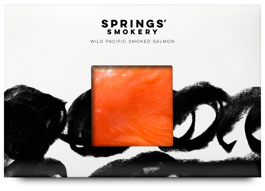
Springs’ Smokery by Distill, United Kingdom
Springs’ Smokery has been producing high-quality smoked salmon for three generations from its location in South Downs, UK, using Sussex oak and a traditional dry-salting process which has remained unchanged for 50 years. Springs’ worked with graphic design studio Distil to develop a new visual identity and package design. Distil’s approach is an exercise in aesthetic impact derived from colour and form contrast, and a conceptual and communicative simplicity that makes a connection with the traditional craft and process of smoking salmon but also draws on the themes of heritage and the sea.
See more of this project here
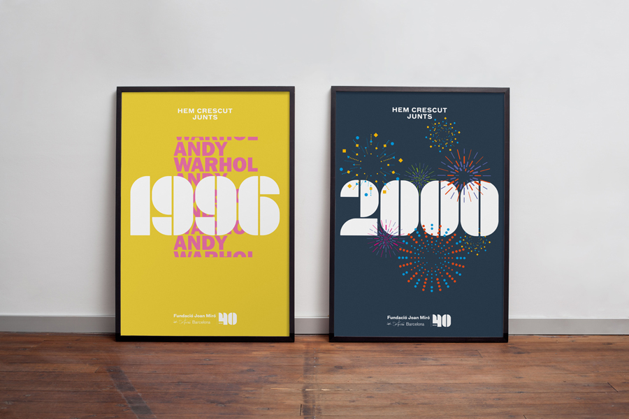
Fundació Joan Miró 40th Anniversary by Mucho, Spain
Fundació Joan Miró is a cultural centre located on Barcelona’s Montjuïc hill. It was opened in 1975 as a place to encourage young artists to experiment with and exhibit contemporary art, and would allow the general public better access to new work of the time, which it continues to do today.
Fundació Joan Miró has a distinctive exterior structure of modular geometric prefabricated surfaces, extrusions, recesses and voids designed by Josep Lluis Sert. Although imposing in form it has at its heart a natural path that guides visitors through its spaces.
Graphic design studio Mucho worked with Anna Noëlle to develop an identity and campaign material that would help celebrate 40 years of Fundació Joan Miró. Drawing on the building’s structure, its cultural agenda and history, whilst also acknowledging its permanent brand identity through contrast, Mucho created a system based around a bold number set, picking out key dates within the history of the building, and derives visual impact through a juxtaposition of austerity and moments of celebratory expression.
See more of this project here
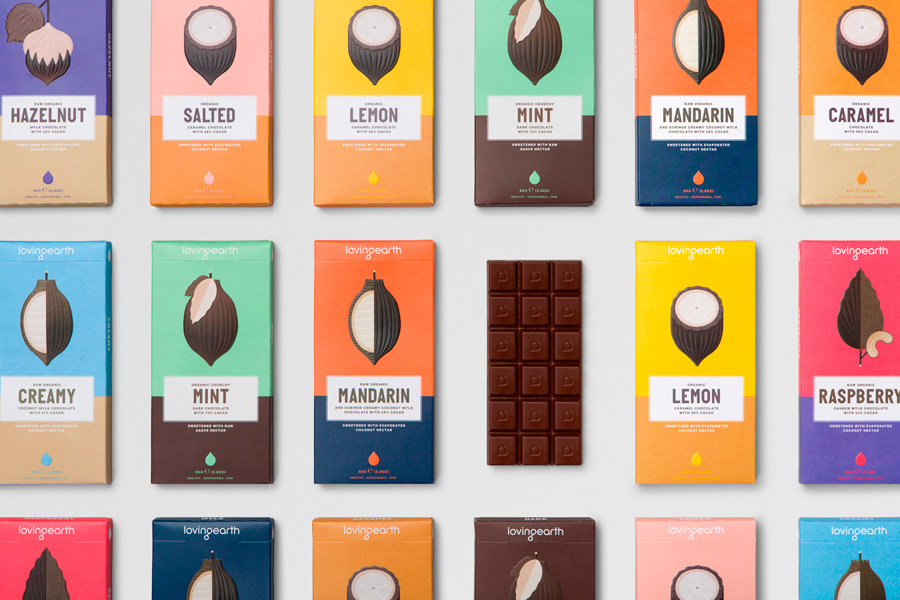
Loving Earth by Studio Round, Australia
Loving Earth is an Australian business, established in 2007 by Scott Fry and Martha Butler, that produces a variety of chocolates, snacks, cereals, butters and spreads. All of Loving Earth’s products are made from high quality, organic and fairtrade ingredients, and include ranges that are gluten, grain, dairy and sugar-free. Although taking advantage of a growing multi-million dollar industry, Loving Earth’s values are grounded by a genuine passion for environmental sustainability and individual well-being, rather than wealth, which is expressed, at length, online.
Loving Earth worked with Melbourne based graphic design studio Round to redesign its raw chocolate packaging. This replaces a low impact but earthy design with one of visual interest that effectively uses colour, form and type to make a better and more compelling connection with raw ingredient, emphasises flavour profile and secures a far more idiosyncratic quality.
See more of this project here
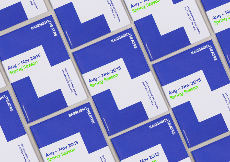
Basement Theatre by Studio Alexander, New Zealand
The Basement Theatre is an independent, underground, community theatre located on Auckland’s Lower Greys Avenue. It was established in 2008 as a place to showcase new voices, fresh perspectives and emerging young talent, and to provide these with the space to develop their performances. The theatre has played host to dancers, visual artists, poets, musicians, comedians and everything in between.
Taking their cues from the unique basement location, and a brief that called for a bold, playful and edgy identity, Studio Alexander built a system around a simple but smart logotype with a step component, the impact of fluorescent inks, tinted photography, rotalics and plenty of contrast.
Read more of this article here
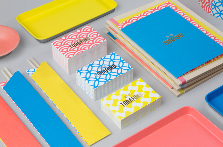
Torafuku by Brief, Canada
Torafuku has a simple yet adventurous menu that reinterprets pan asian flavours as modern shared dishes made from good quality and locally sourced ingredients, and compliments these with a variety of current cocktails, a carefully curated wine list and local craft beers. Torafuku is located on the border of Vancouver’s historic Chinatown and features an open and reductive urban interior space of leather upholstered benches, light wood stools and tables, a long cast concrete surface, panels of material texture and white walls. This is punctuated by a bright and colourful brand identity treatment, which included business cards, menus and packaging, developed by Vancouver based graphic design studio Brief.
Read more of this article here

