Borders Railway Opening Celebrations by KVGD
Opinion by Richard Baird Posted 9 October 2015
Borders Railway is 30 miles of new track, built largely upon the old Waverley Line, that runs between Edinburgh and Tweedbank within the Scottish Borders. Its commissioning saw the end of a fifty year wait for train services to be reinstated in the region and is the longest new domestic railway to be constructed in Britain for over 100 years.
The line was opened by Her Majesty The Queen, accompanied by the Duke of Edinburgh, on September 6th, and was marked by a journey from Edinburgh, aboard a steam engine, and by the unveiling of a plaque at Tweedbank station.
Stark Events commissioned Glasgow based graphic design studio KVGD to develop a visual identity for the opening of the railway. This included logo design, commemorative brochure, tickets, plaque and brand guidelines, and also extended to badges, flags, tote bags and banners.

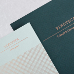
Image: © Joe Gillhooley
KVGD’s visual identity is straightforward in its approach, appropriately taking its cues from, and touching upon, the history of the line and rail travel in the region, the celebratory nature of its opening and the event’s royal guests, in a clear and relatable way.
This manifests itself within the traditional qualities of the coal black wax seal and the typographical composition and uppercase sans-serif letterforms of the logo, the perceived value and texture of a heavy 700gsm Colorplan uncoated paper, the celebratory character of gold block foil print finishes, and the historic connection made through the black and white photography and insight that make up the commemorative brochure.


While simple and few, each choice is well-weighted within the context of the whole. Gold is emphasised by plenty of white space and broken up by the occasional purple and navy blue—both of which are tied to royalty and emphasised by their use across bunting and in the choice of flowers, and by the contemporary precision applied to the traditional composition, spacing, and character style of the logo. The Golden Ticket idea plays well to a younger audience and the sense of occasion while not breaking from the tone and aesthetic of the identity.

Many, if not all of these choices will be familiar, but each is well-executed and well-suited to the project, acknowledge the short life of the identity, draw on rail heritage and a day of celebration with a restraint, as seen in the use of plenty of uninterrupted space, that is in keeping with the royal nature of the occasion. More from KVGD on BP&O.
Design: KVGD. Fonts Used: Trade Gothic Bold No.2. (Customised) Opinion: Richard Baird.