Studio Una by Studio Una
Opinion by Richard Baird Posted 15 October 2015
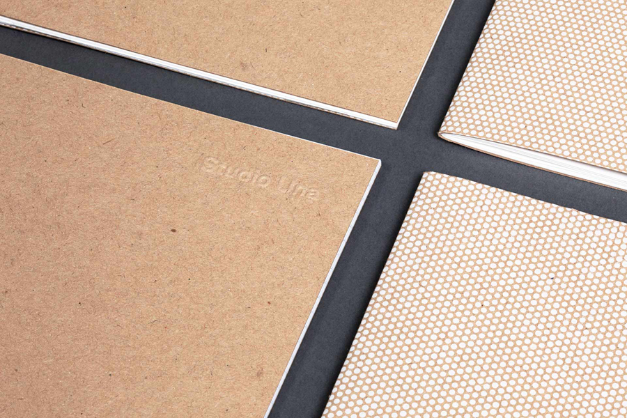
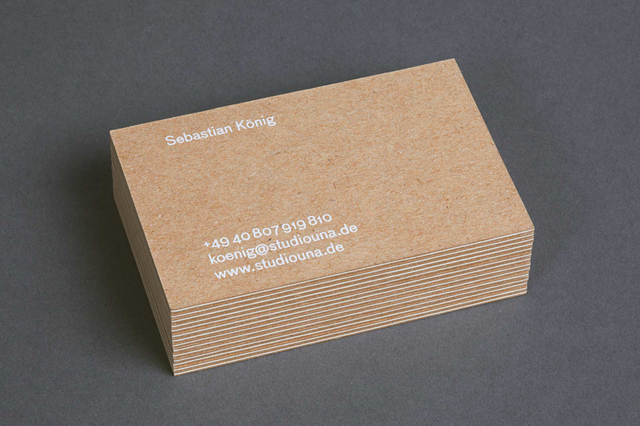
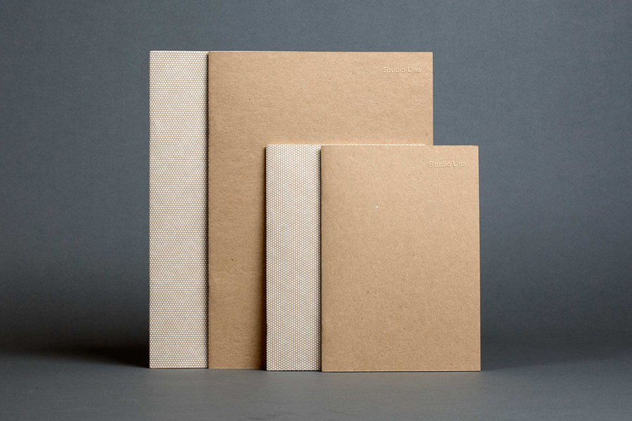
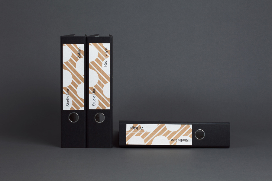
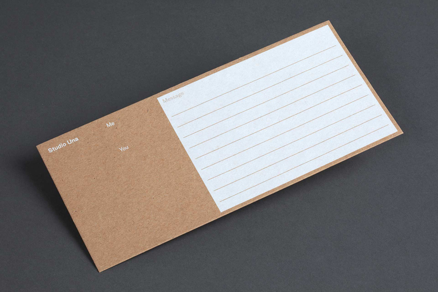
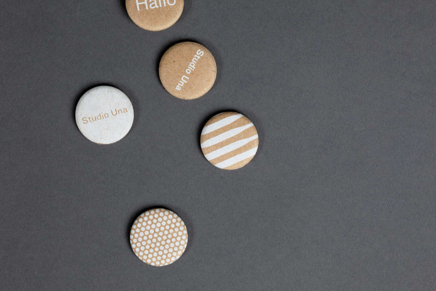
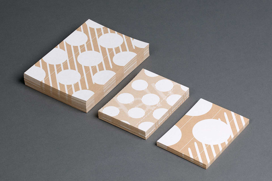
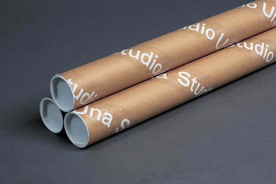
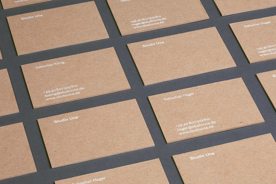
Studio Una is graphic design business, run by Sebastian Hager and Sebastian König, with an office in the German city of Hamburg. The duo works within the fields of visual communication and brand identity design, online and in print, and describe themselves as attaching great importance to the aesthetic effect of design, alongside strong concepts and strategic decisions. This positioning is conveyed throughout their new visual identity using a mix of kraft paper and white ink, pattern and type, applied to notebooks, business cards, box tape, note cards, folders and badges.
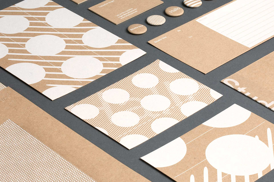
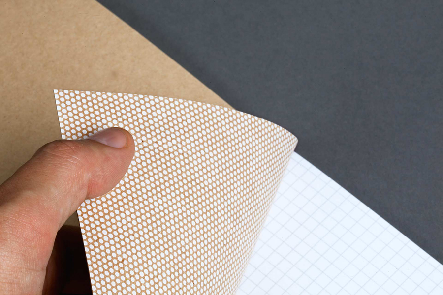
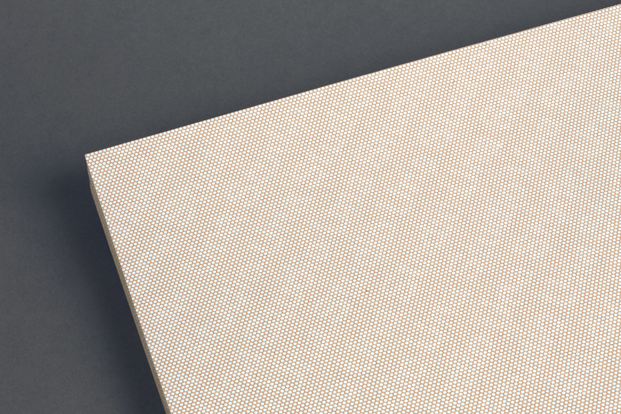
Although robust, economical and practical, the unbleached, uncoated and fibrous qualities of kraft paper and board continues to be associated with contemporary craft culture. This dual notion of utility and desirable aesthetic, as well as the value that this has both communicatively and aesthetically, is fully leveraged by Studio Una, reaching across all printed materials.
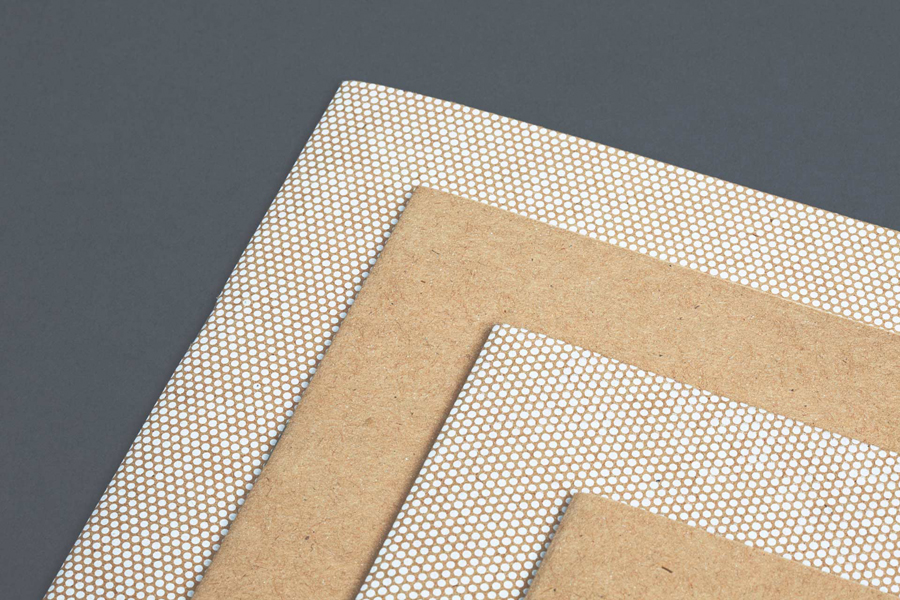
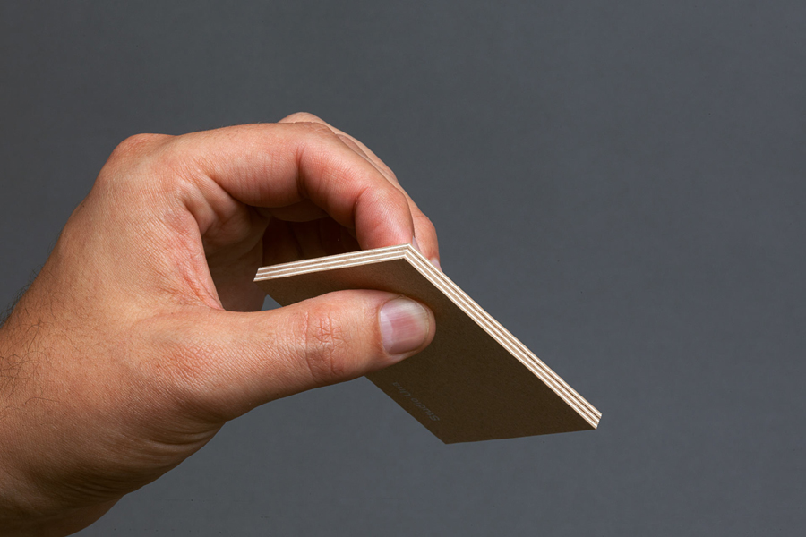
This duality also plays out through a contrast of sans-serif reduction and illustrative ornament, the geometric shapes of the patterns and the organic fibres of the board, unbleached surfaces alongside bright white ink, and the three-ply construction of the business cards.
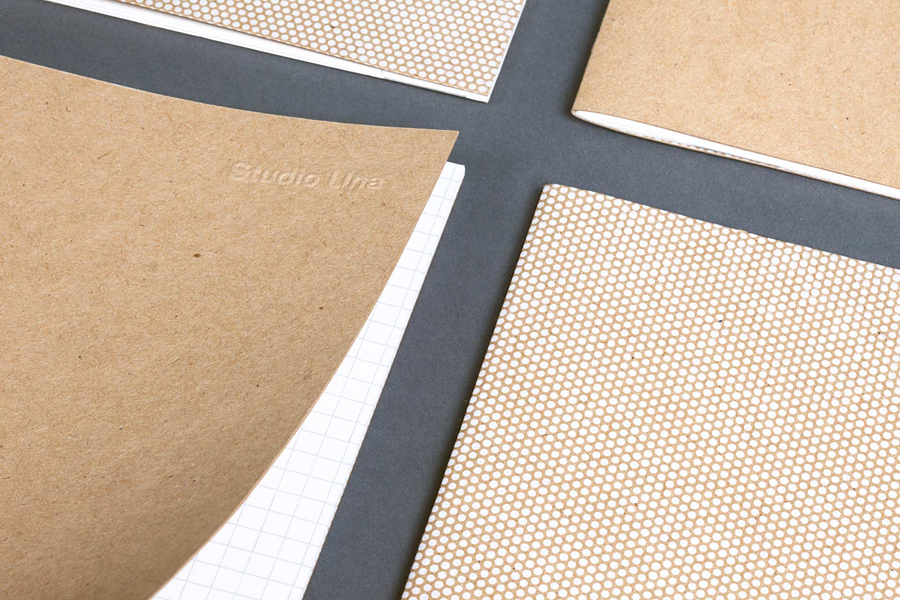
The use of such a familiar and distinctive board, and its consistent and unwavering use, feels overwhelming in places, however, the patterns work well to break this up and add a texture of their own, and the hiding of type within these patterns is a particularly neat and playful detail. While it does go all in for contemporary craft aesthetic, Studio Una manage to stop short at stamps and stickers, instead favouring the subtlety of a blind emboss, which links studio with material and process.
Although far from unfamiliar, the use of white ink across unbleached board, alongside the patterns, type choice, and finishes, and within the context of the studio, manages to express, in simple terms, the nature of brand identity—a balance of aesthetic appeal and a clear communicative intention—and conveys some of the values of the studio.
Design: Studio Una Opinion: Richard Baird. Fonts Used: FF Bau.
