The Best of BP&O — November 2015
Opinion by Richard Baird Posted 1 December 2015
November’s highlights included Glasfurd & Walker’s package design for Park Distillery Vodka, which builds on their brand identity for Park Restaurant, Hey’s work for Barcelona shoe brand Arrels and One Plus One’s brand identity for coffee and donut cafe Bronuts. However, there were five projects that stood out, and have made it into BP&O’s Best Of Series. This feature brings together the most interesting, unexpected or unusual projects published on the site each month for another opportunity to be seen and shared. These typically balance a strong concept with a compelling aesthetic that appropriately plays with colour, texture, layout, form, type and print finish.
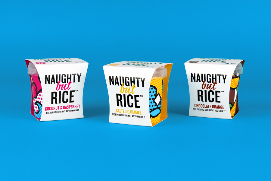
Naughty But Rice by Robot Food, United Kingdom
Naughty But Rice is a rice pudding range created by The Hain Daniels Group in response to an increase in the dessert’s popularity in the United Kingdom. Unlike the product’s of established and mainstream brands, Naughty But Rice, as the name suggests, offers consumers a modern and indulgent twist on the traditional favourite, with flavours that include Coconut & Raspberry, Salted Caramel and Chocolate Orange.
The range features a brand identity and package design, developed by Leeds based graphic design studio Robot Food, that leaves behind what the studio describe as tired category conventions, and instead, embraces the striking and high-contrast, in structure, type, colour, space and illustration. Since its launch, Naughty But Nice has secured shelf space in supermarkets such as Asda, Morrisons, Sainsbury’s and Booths.
This article was updated to include an opinion on the copy component of the project, kindly provided by brand writer Seth Rowden.
See more of this project here
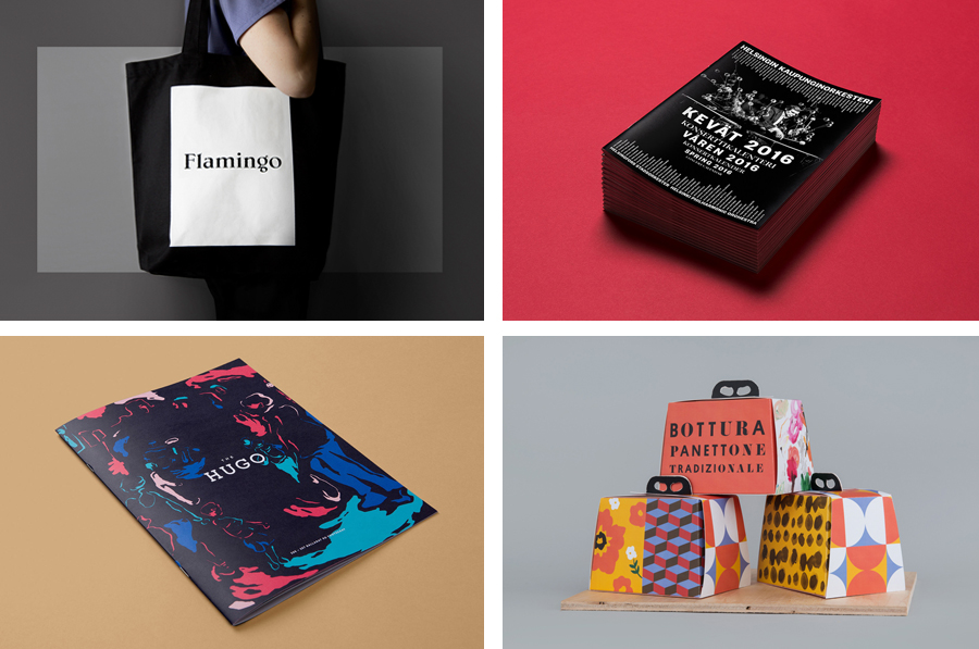
The Hugo by Brave, Australia
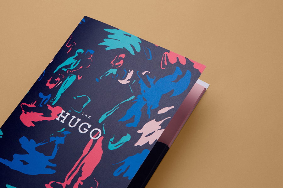
The Hugo is a new residential property development, made up of 23 apartments, located in the Melbourne suburb of Foostcray. It is a hi-tech building with a distinctive perforated façade, and a design that leverages natural light and air flow. Its apartments were designed to be flexible and secure, with a particular focus on livability, functionality and beauty, and feature interiors reflective of Australia. This is characterised by earthy colours, wools and timber.
The Hugo’s brand identity and campaign material, created by Studio Brave, convey the spirit behind the development and the emerging culture and increasing diversity of Footscray through illustrative panels by local artist Andy Murray and photography by Sayher Heffernan. These capture the area’s vibrant lifestyle in image but also through the collaborative nature of their creation.
See more of this project here
Flamingo by Bibliotheque, United Kingdom
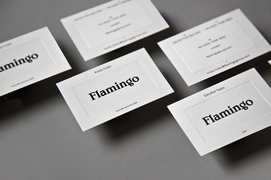
Flamingo is an insight and strategy consultancy, founded by Kirsty Fuller and Maggie Collier in 1997, that works with businesses, and at the intersection of people, culture and brands, to help enrich lives by shaping culture and evolving behaviours. The consultancy is described as a group and not just a network, collaborating and sharing across its seven offices throughout Europe, Asia, India and South America.
Flamingo recently worked with London based graphic design studio Bibliotheque to create a new brand identity and visual language that would better reflect who they are, and would speak clearly about their broad range of specialisations. This new brand identity extendeds to printed materials that included business cards, postcards, book cover and tote bags, and an online presence developed in collaboration with Archive Studio.
See more of this project here
Bottura by Foreign Policy, Singapore
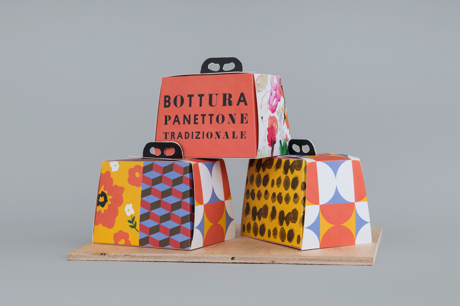
Bottura is an Italian restaurant and food store with space in Singapore’s Suntec City Mall. It has a contemporary interior of exposed utilities painted black, white suspended ceiling and surfaces, dark wood and steel furniture, glass, concrete and steel counters, warm spot and low-hanging lights and an open kitchen working from authentic family recipes rooted in the owner’s hometown of Bologna. This interior is punctuated by a bright, high contrast and convivial brand identity, developed by graphic design studio Foreign Policy, informed by the restaurant’s fusion of tradition and modernity, and extending across menus, coasters, packaging and signage.
Read more of this article here
Helsinki Philharmonic Orchestra, Bond
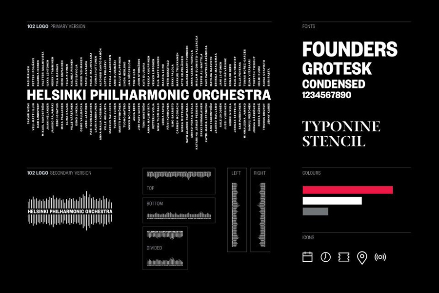
Helsinki Philharmonic Orchestra is a 102 strong ensemble, currently led by chief conductor John Storgårds, with its primary venue being the Helsinki Music Centre. It has a significant history, beginning as the Helsinki Orchestral Society in 1882 and acquiring its current name following a merger with the Helsinki Symphony Orchestra in 1914. In 2016 the orchestra will have its first female chief conductor following the appointment of Susanna Mälkki.
With a desire to strengthen its image and consolidate its overall brand experience, the orchestra worked with Finnish graphic design studio Bond, who in turn collaborated with photographer Marko Rantanen, to create a new visual identity that would communicate the energy and power of its 102 musicians, and that would extended across programmes, stationery, business cards, campaigns and signage.
Read more of this article here

