From Australia
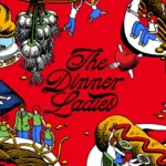
The Dinner Ladies by Universal Favourite
‘Dinner ladies’ doesn’t have the most glamorous connotations in England – depending on your experience at school, it likely conjures up memories of scoops of greying, tepid mash-adjacent slop unceremoniously plopped onto a plate; something to do with turkey dinosaurs; a troop of formidable but visibly jaded people responsible for making every school smell like on-the-turn cottage pie from around...

Antara 128 by Mucho
GT Alpina is described by type foundry and BP&O regular GrilliType as a workhorse serif that also delights in playing with the very meaning of concept, reaching into the ‘grab bag of typographic history to resurrect shapes some may falsely see as too expressive’. This feels an apt description for Antara 128, and the visual identity created by Mucho that...
Blue Mountains by For The People
The Blue Mountains of New South Wales, Australia are not technically mountains at all. They are, rather, a complex labyrinth of dissected plateaus, gorges and valleys of sandstone, formed over 50 million years ago. So far, so deceptive. Fortunately, however, the Blue Mountains are most definitely blue. When the atmospheric temperature of the region rises, a superfine mist of fragrant...
Plume by Human After All
Plume is a Denver-based telehealth service (or ‘virtual-clinic’) tailored specifically to the needs of the trans community across the US, offering a range of services including prescriptions for oestrogen or testosterone. This is a hostile political landscape to step into, but Plume is doing it with bright and bold panache, courtesy of a fresh rebrand from London-based studio Human After...
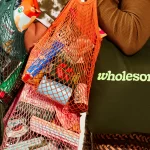
Wholesome by Universal Favourite
Wholesome is a new breed of supermarket that doesn’t fill a gap in a market so much as it positions itself at a nexus of multiple intersecting demands. The pursuit of ethical grocery and household shopping has, for decades, been both deeply commendable and exasperatingly time-consuming, expensive and convoluted. One supermarket will stock Fairtrade products but have a scant gluten-free...
Monkey Baa Theatre Co. by Universal Favourite
Theatre is an artform that relies not only on its visual and verbal performance elements, but the text from which all the rest of the more showy aspects are born. An obvious point, but one that often makes me wonder: why do so many theatre companies have such terrible names? Maybe it’s a sort of in-joke, maybe I’m just missing...
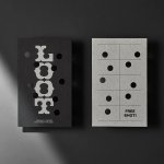
Loot by Seachange
Where have all the simple playful ideas gone? You know the ones, a bit of wit, spun into a multitude of playful expressions across a number of different touch-points? Design craft has gotten so good over the last few years, but I miss the smile-in-the-mind stuff. Paul Belford’s New Chapter, Seachange’s Think Packaging and Mucho’s Art Walk. They’re not strategic...

Great Wrap by A Friend Of Mine
Cling-wrap, cling-film, stretch-wrap, Saran-wrap or food-wrap. Wherever you’re from and whatever you may call the ubiquitous, sticky, transparent stuff, it’s been keeping food fresh since 1949, when the first branded form of cling-wrap made from polyvinyl chloride (PVC) appeared on the market. Once held up as a mould-thwarting modern marvel, the material is now widely derided as an environmental menace....
Ortto by Christopher Doyle & Co.
All systems grow. What a fun line. Setting up and positioning Ortto, formerly Autopilot, as the leading marketing automation solution for business. The name is great, a wonderful move forward for the company, and sufficiently taking something technical and inhuman-sounding and giving it a somewhat anthropomorphised quality, easy to remember and providing room for growth into other technologies and services....
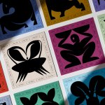
TWELV. by Seachange
Maybe the recent explosion in astrology is thanks to a more secular society; or a post-Covid sense of generalised uncertainty that’s left us grasping for answers. Perhaps it’s the rise of Instagram/TikTok influencers; or maybe it’s just because its foundations lie in astronomical reality that’s been harnessed by civilisations stretching back tens of thousands of years. Whatever it is, where...
Urban Climb by Base Design
‘The weaker the brand character, the greater the need for distinctive visuals’. Said someone, at some stage. And of course, the principle works in reverse. It’s an important point: if the core is strong, the exterior can – and often should – be more malleable, softer, less obviously an exercise in ‘branding’. Countries, cities, communities; we all have a sense...
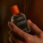
LBDO by Universal Favourite
Self-care is nothing new, but our understanding and appreciation of it as a society has grown enormously in the last half century, and especially recently when it became a trending topic during the isolation periods of coronavirus in 2020 and 2021 (70 million hashtags on Instagram, and counting). In the dawn of this enlightened thinking, products in this space have...