C( )T( ) – Typojanchi 2015 by Studio fnt
Opinion by Richard Baird Posted 5 January 2016
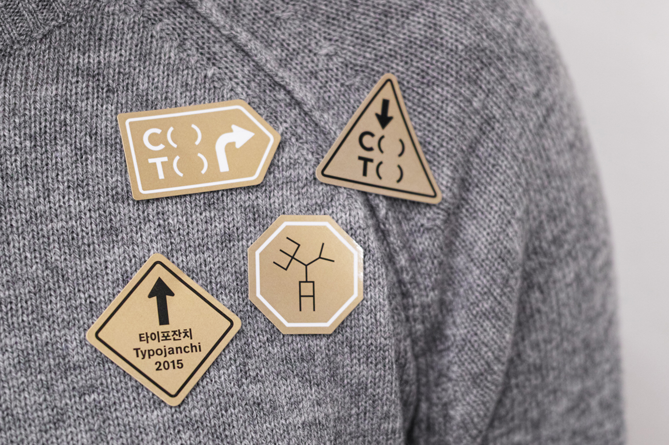
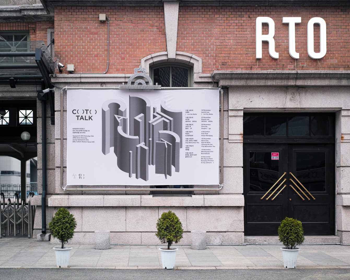
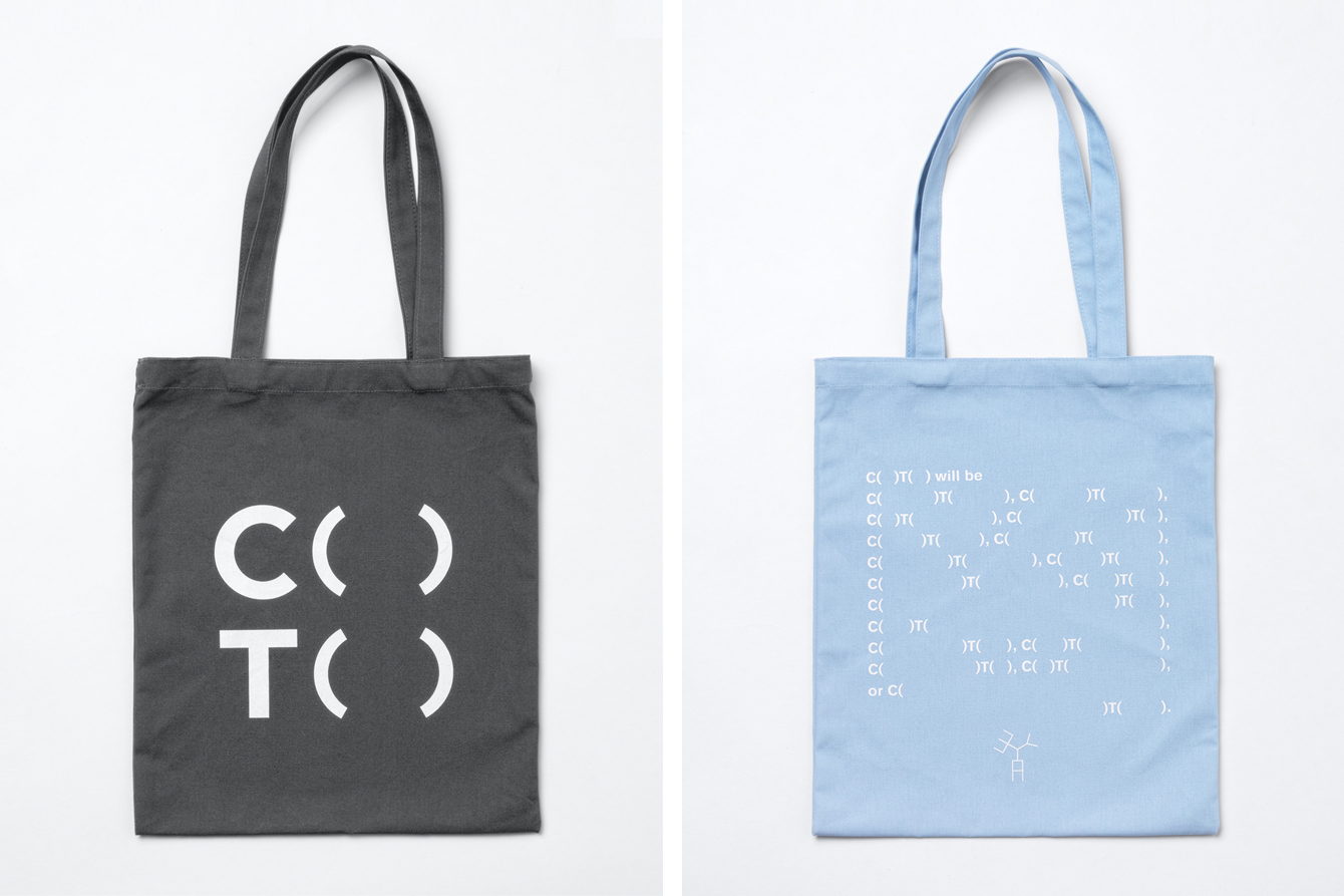
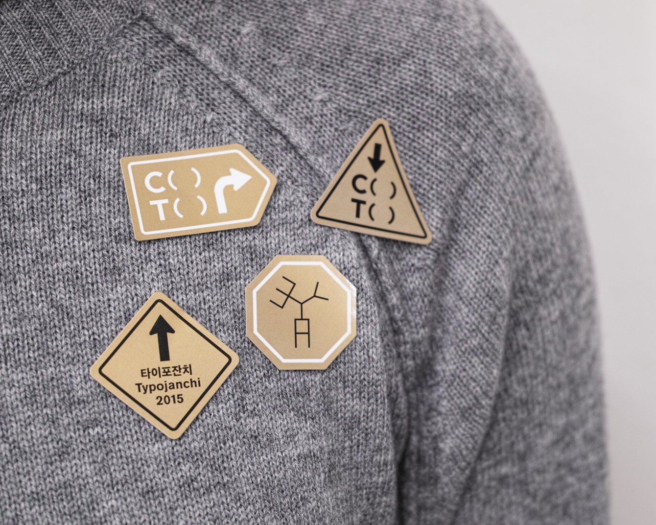
Typojanchi is an international biennale that looks to explore the various intersections at which visual language meets culture, politics and the economy. Its forth event, which took place between the 11th November and the 27th December 2015 in the South Korean city of Seoul, was based around the themes of, and relationship between, cities and typography. This is communicated within its naming C( )T( ), and throughout a visual identity created by Studio fnt which extended across posters, stickers, signage, invitations, tote bags and postcards.
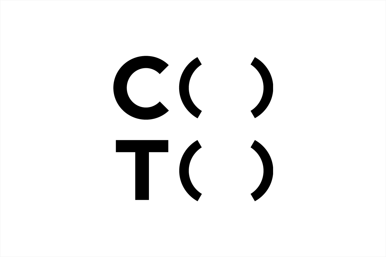
The event name and its formatting looked to make a link between the city (C) (its buildings and infrastructure), the typography (T) and visual language that guides and identifies, and the in-between spaces that give a city its personality ( ).
The logo hints at these ideas through typographic form, stacked structure, space and phonetics. Typojanchi 2015 looked to engage those who might fill or celebrate a city’s in-between spaces and, as such, the parenthesis, absent content, is a familiar yet effective device. Aesthetically, the logo remains simple but informed by concept, that while abstract here, is appropriately and directly expanded upon through posters, stickers and signage.
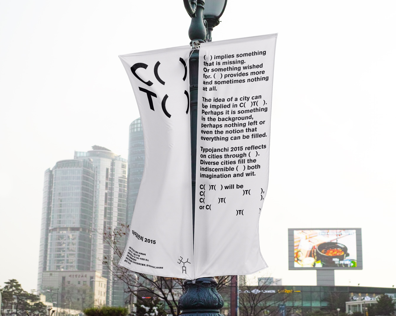
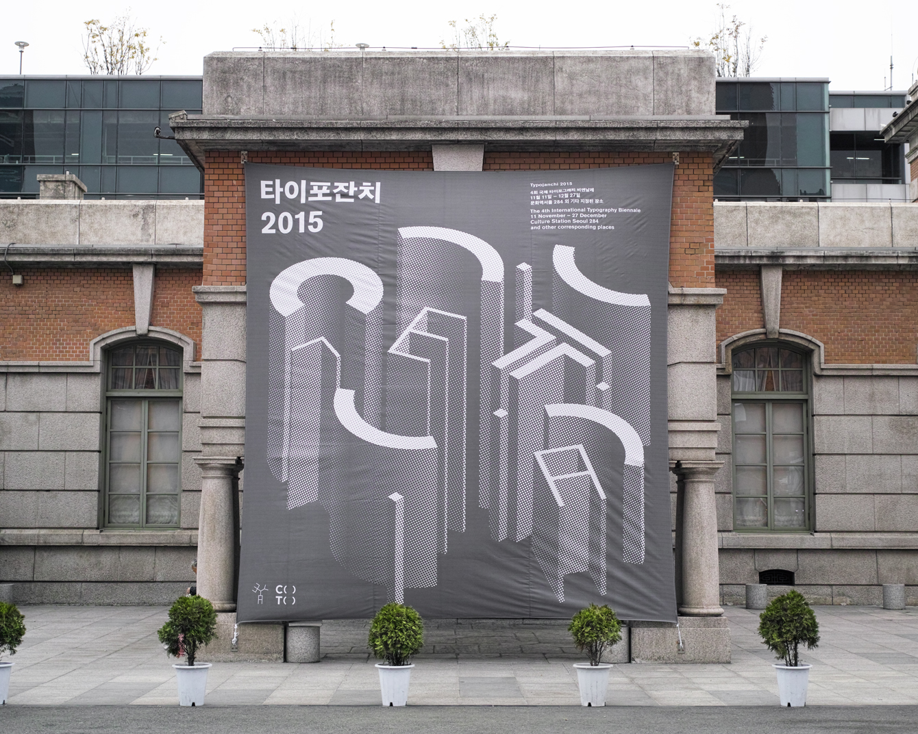
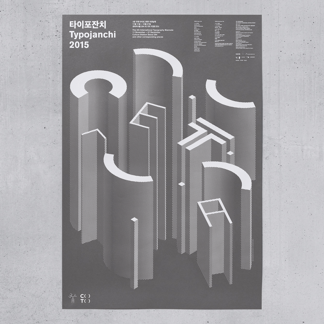
Extruded letterforms draw a sufficiently and identifiable urban quality from typography, which is emphasised through grey ink and a halftone newsprint quality. Although there is little in the way of typographic variety, both as illustration and in the typesetting of content, this works well to emphasise the negative space and make a direct connection between the urban landscape and the visual language explored by the event.
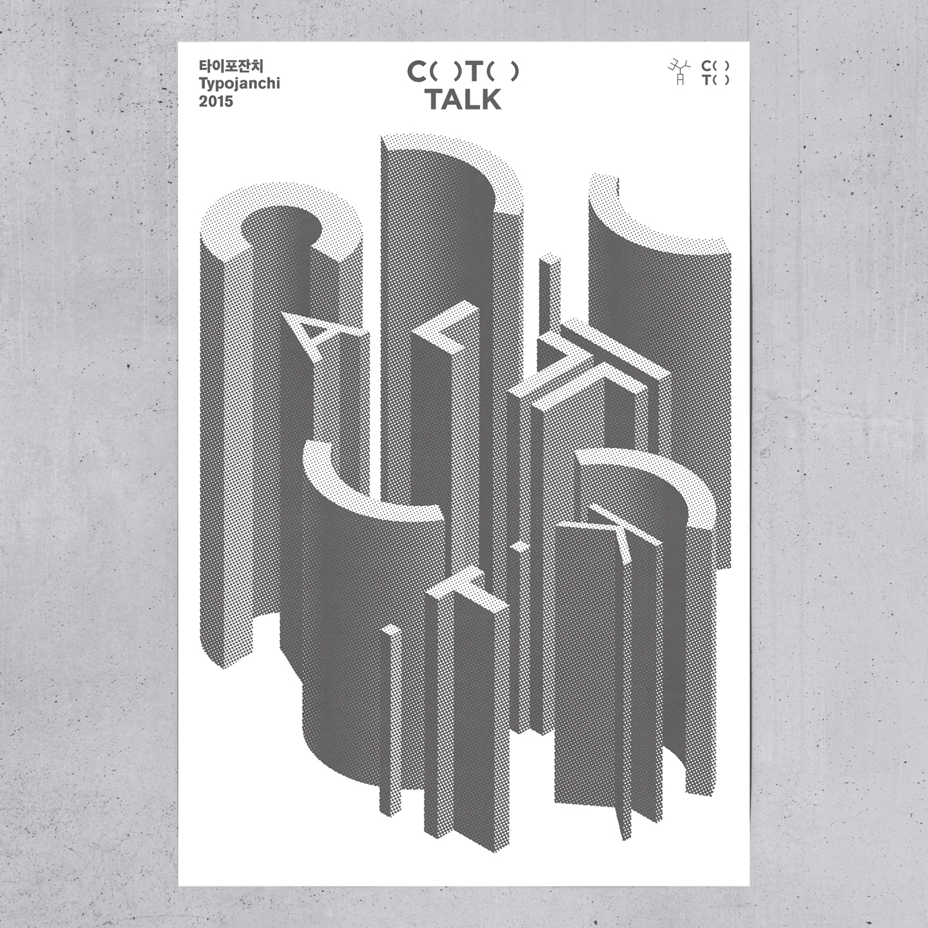
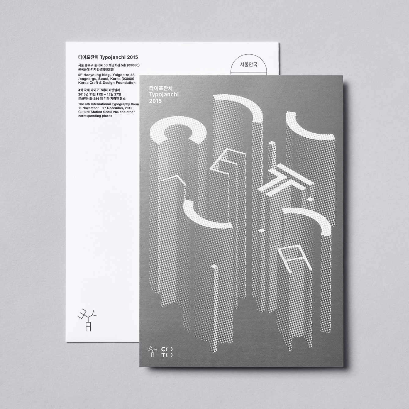
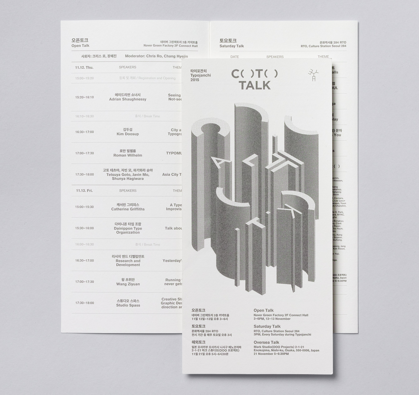
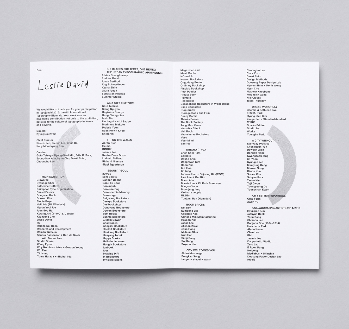
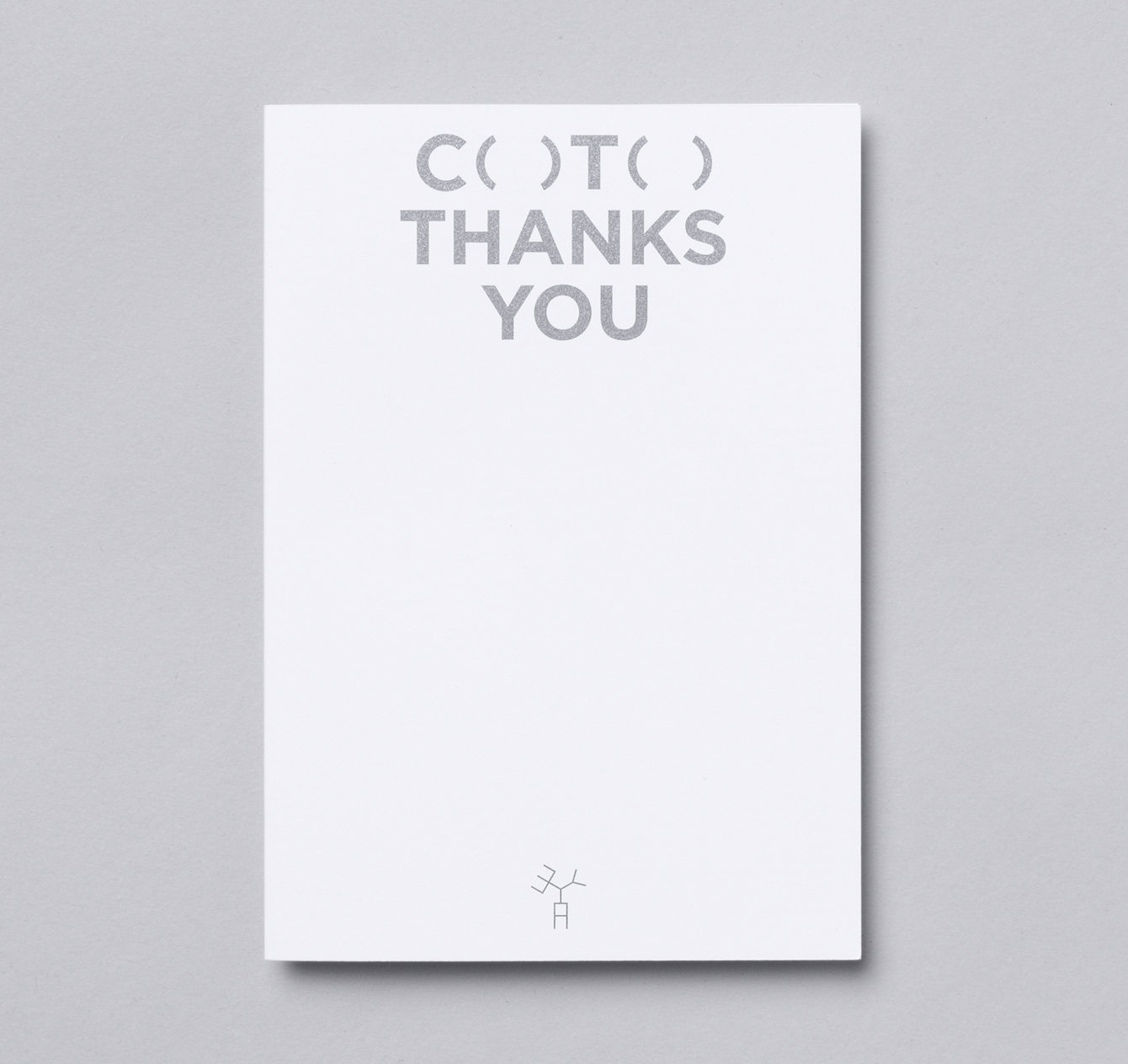
The extruded letterforms work particularly within the context of long vertical banners, and the posters manage to use shorter extrusions to deliver an element of aesthetic impact, absent colour, and balance this with communicative detail up close. Typesetting goes all in for the architectural and unfussy. There is a tension between the uniformity and utility associated with infrastructure, and the individuality and expression necessary for distinctive event identity.
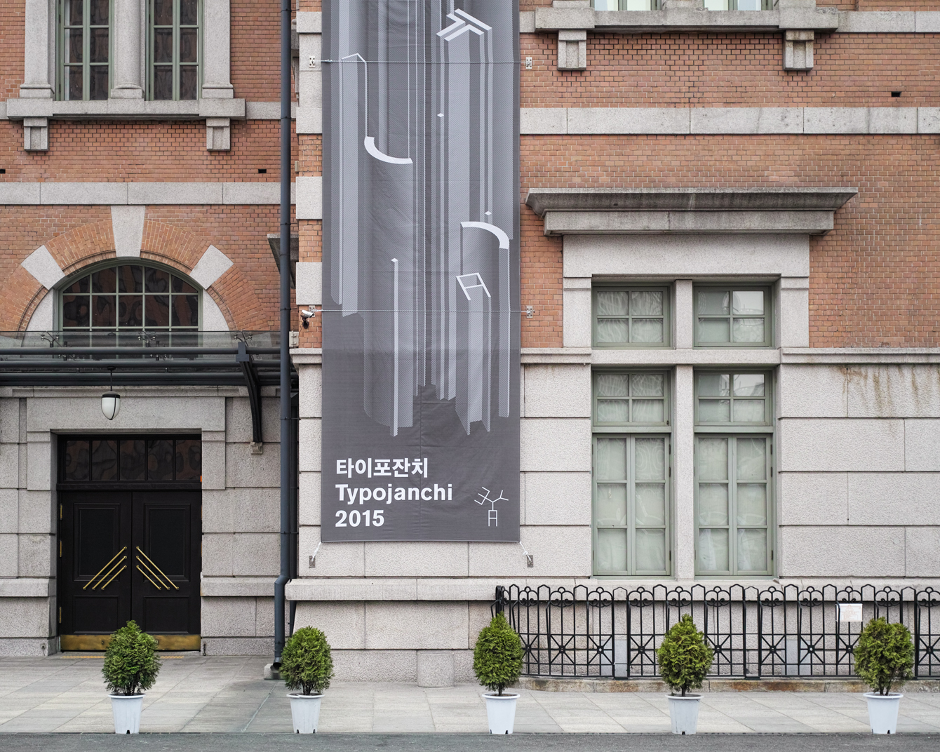
Where the tone largely feels austere, a platform waiting to be filled by people and ideas, there are moments of play, particularly across the blue tote bag, the street sign stickers, and an interesting type-only approach to the map online. These do feel disconnected, few and far between.
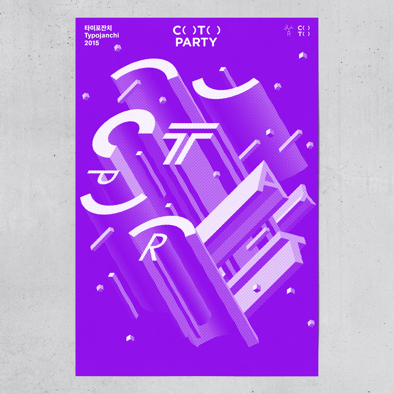
The concrete greys that characterise the event make way for a bright purple identifying its after parties. Alongside a change to the vertical extrusions of type to 45 degrees, these draw an energy from a robust identity, and makes for a neat distinction between formal event and informal party whilst remaining cohesive. More from Studio fnt on BP&O.
Design: Studio fnt. Opinion: Richard Baird. Fonts Used: Founders Grotesk (Online).
