Forgotten Boardwalk Brewing by Perky Bros
Opinion by Richard Baird Posted 21 March 2016
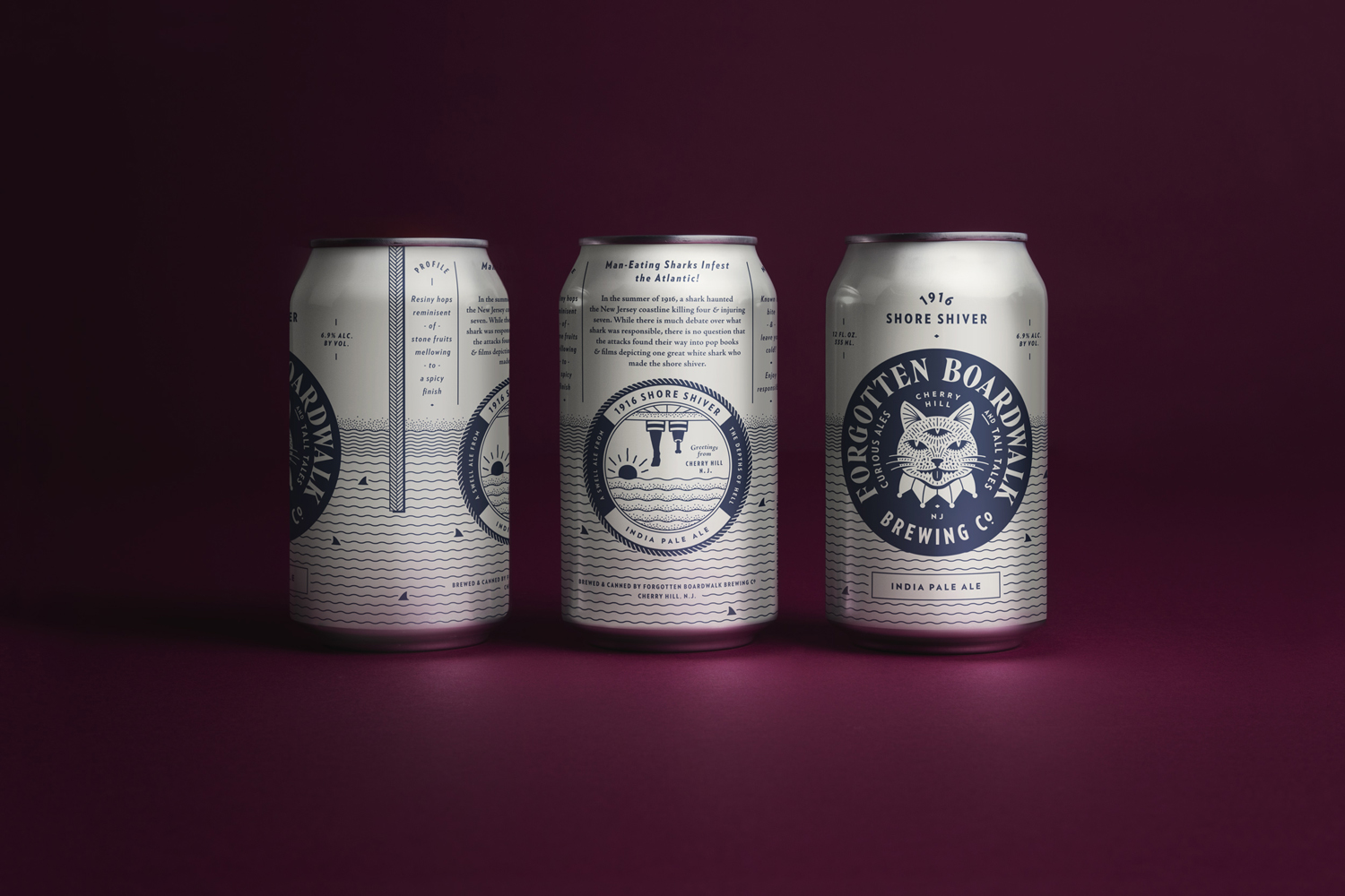
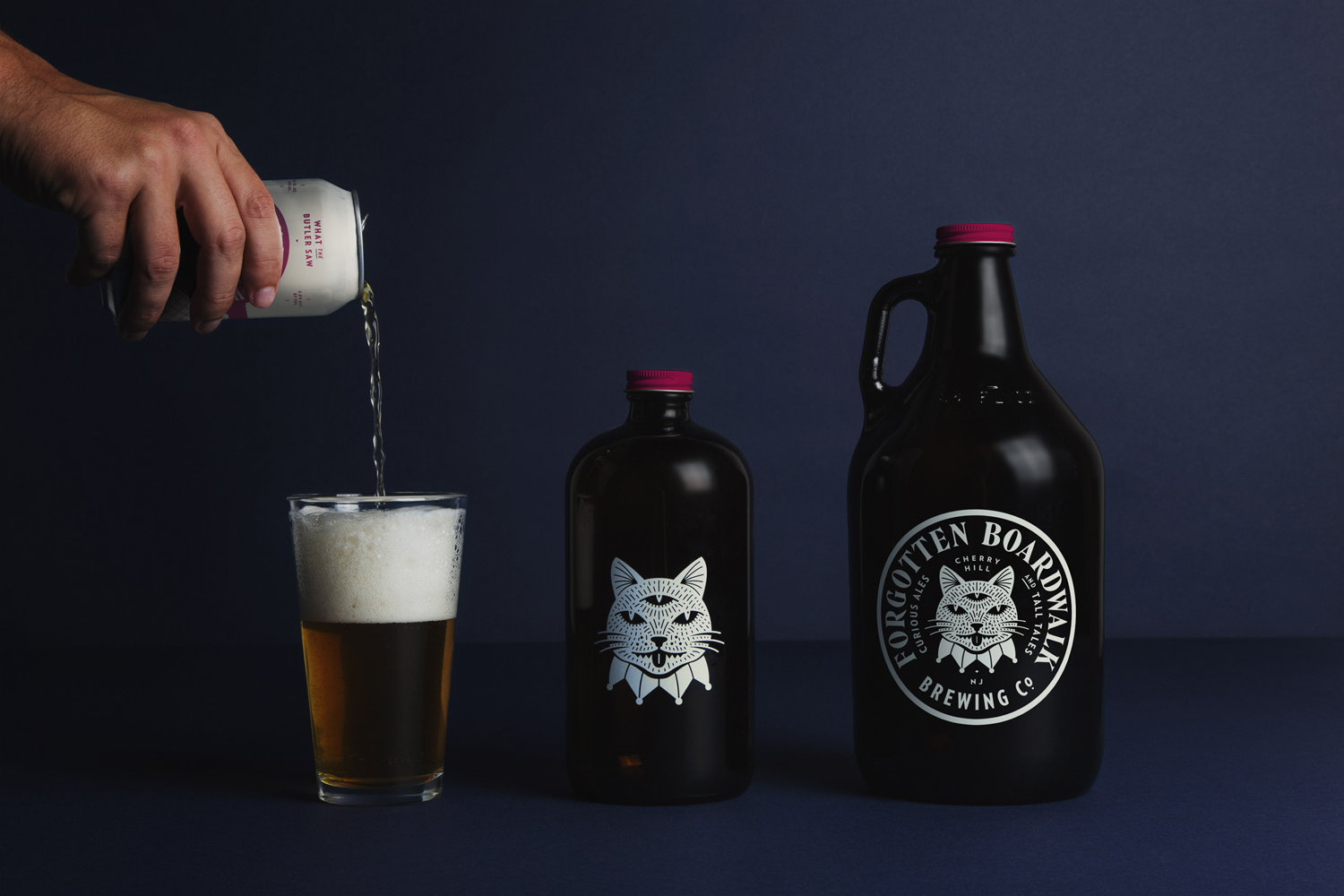
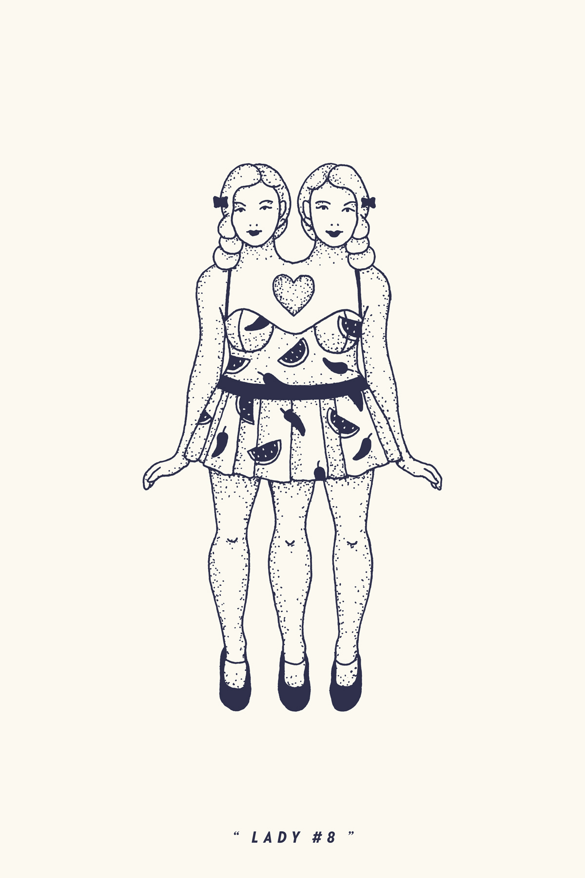
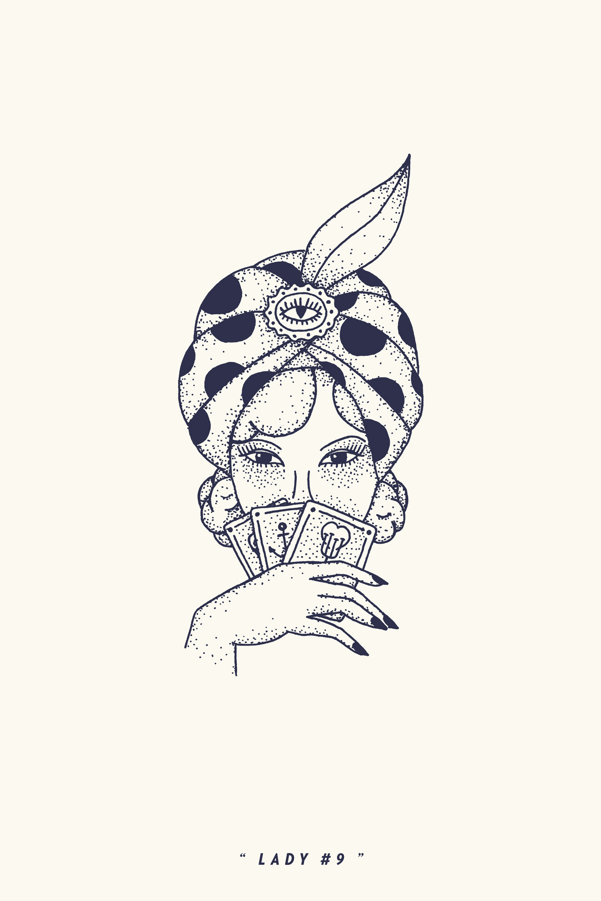
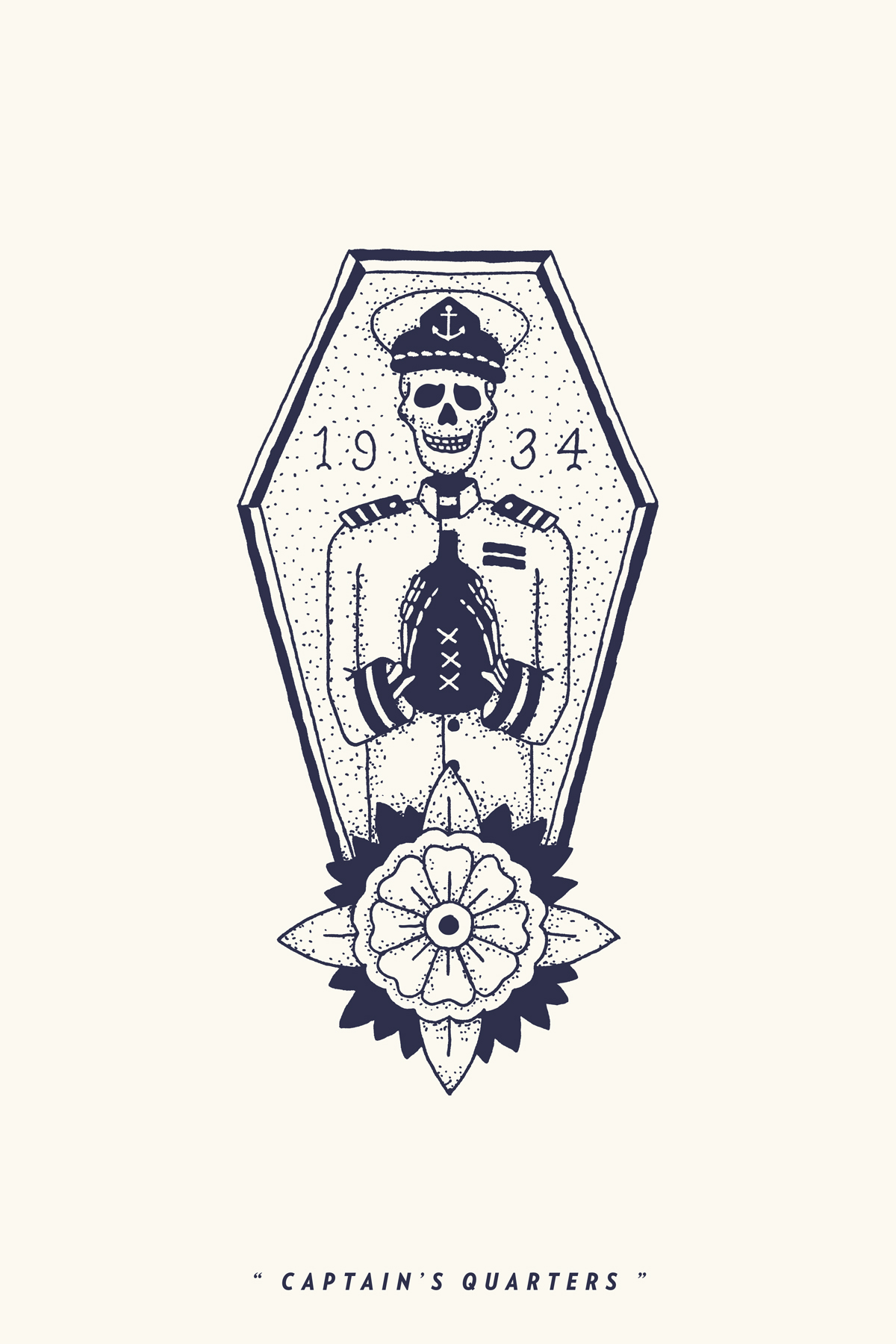
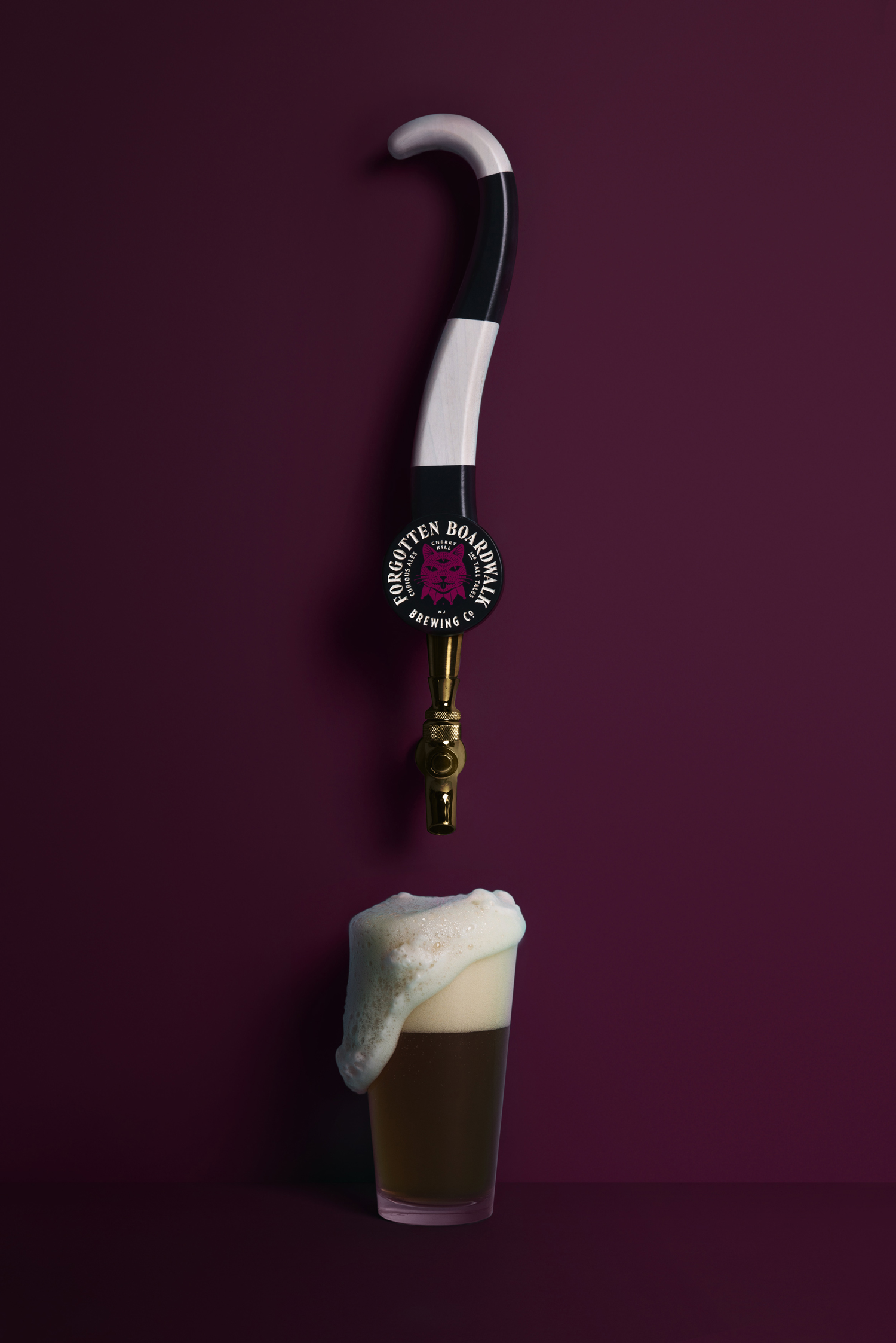
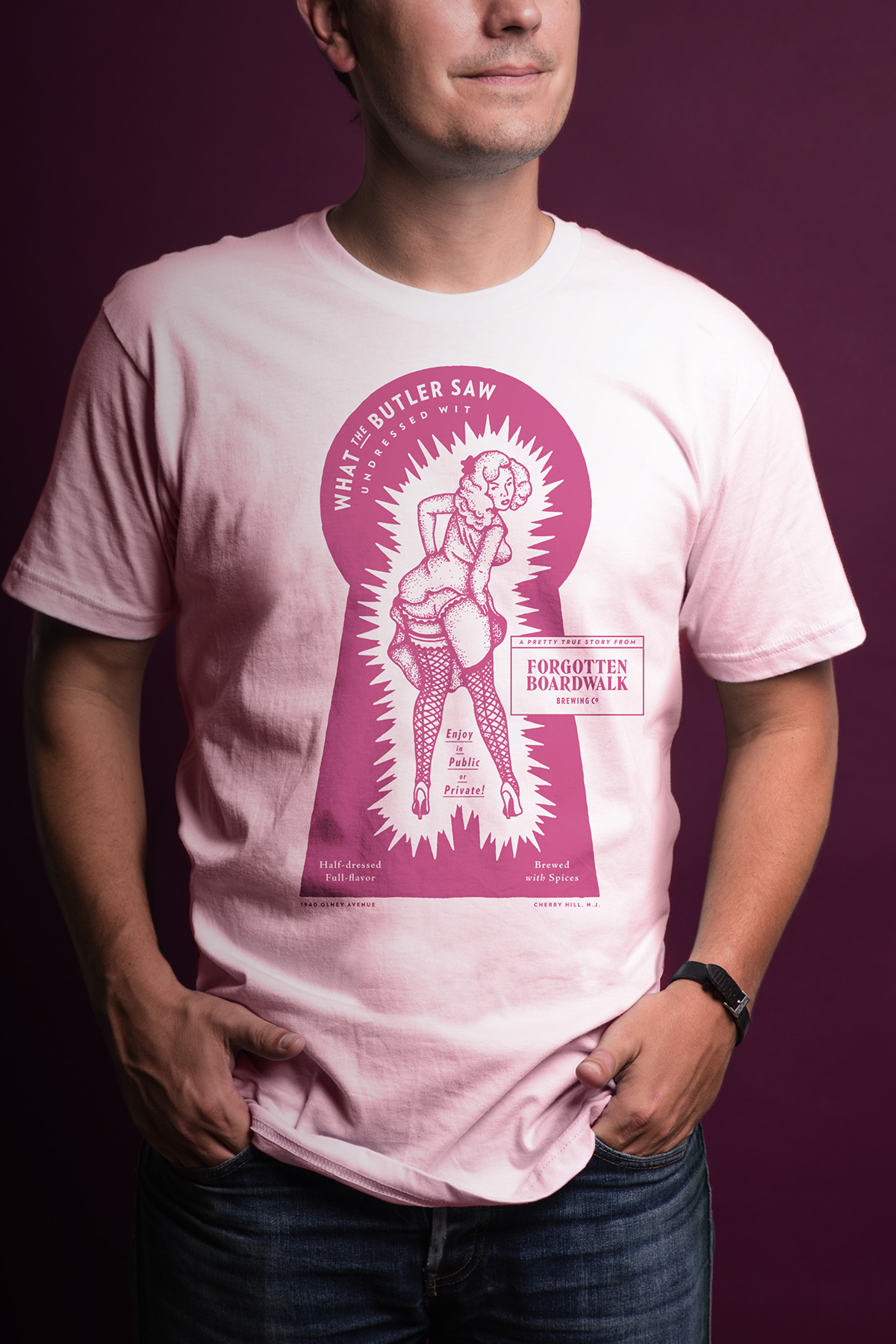
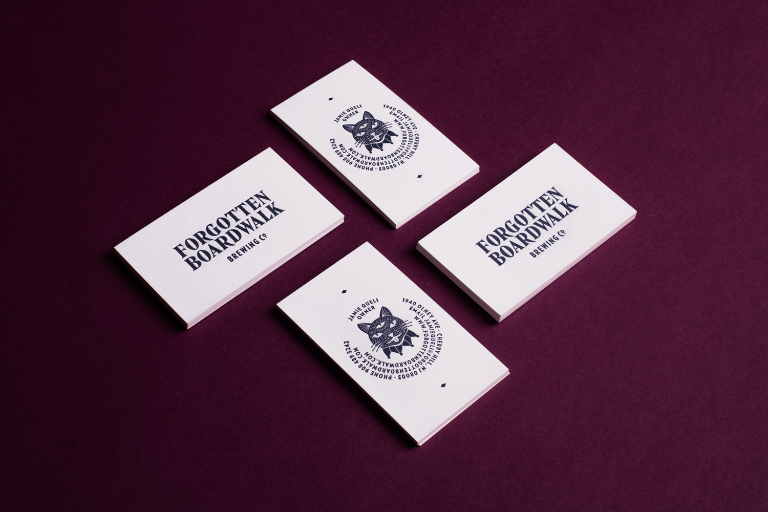
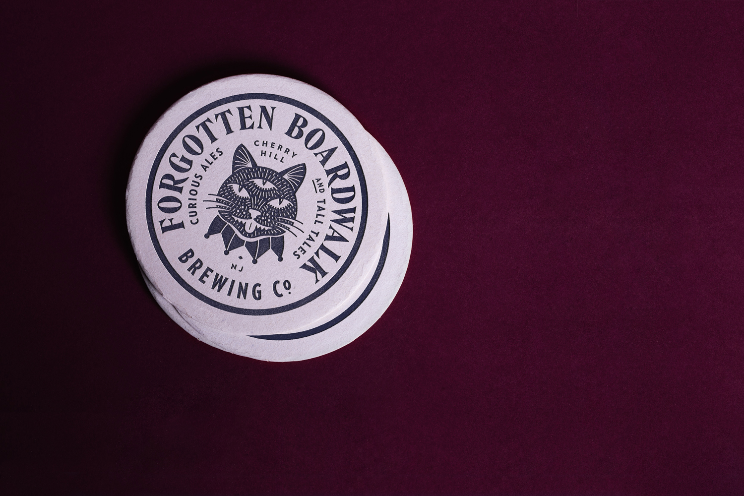
Forgotten Boardwalk is a New Jersey microbrewery producing uniquely flavoured, year-round and seasonal craft beer. It was set up by Jamie Queli, one of the youngest female brewery owners in the US, and draws its name from the folklore of the Jersey Shore Boardwalk. This is the foundation of an extensive new brand identity, designed by Tennessee based Perky Bros, which brings to life the sideshow oddities, historic events and darker side of the boardwalk’s past through quirky and well-realised illustrative detail and storytelling component. This runs across cans and growlers, business cards, coasters and tap handles.
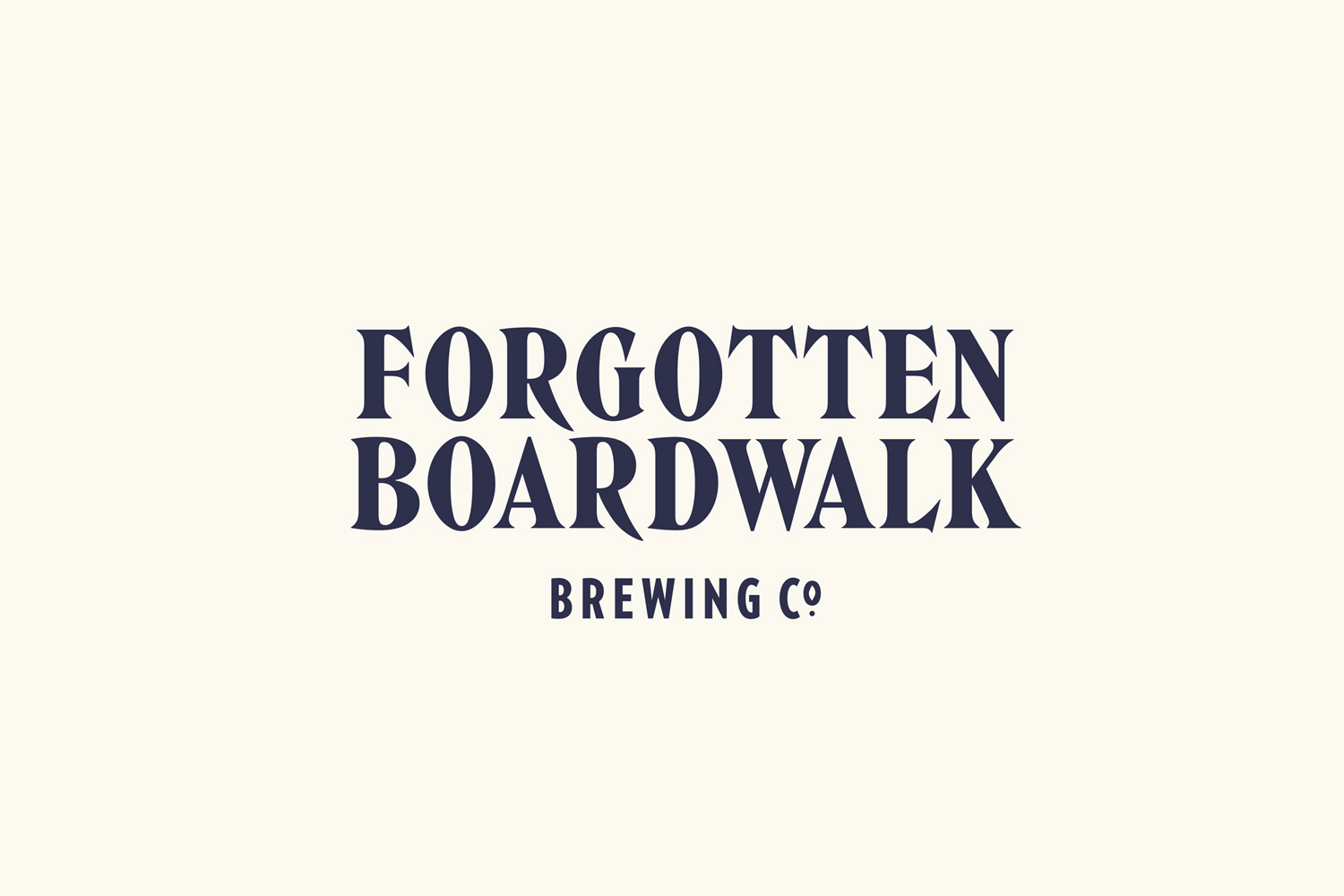
Boardwalk sideshow attractions, history and stories provide a wealth of period imagery and association to draw from. Although not specific to New Jersey, nor does Forgotten Boardwalk have a genuine heritage, the concept and hand drawn aesthetic successfully works together an East Coast provenance and the traditional craft practices of today’s microbreweries.
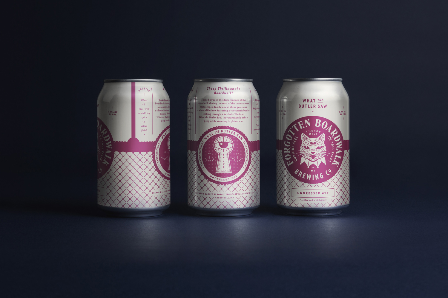
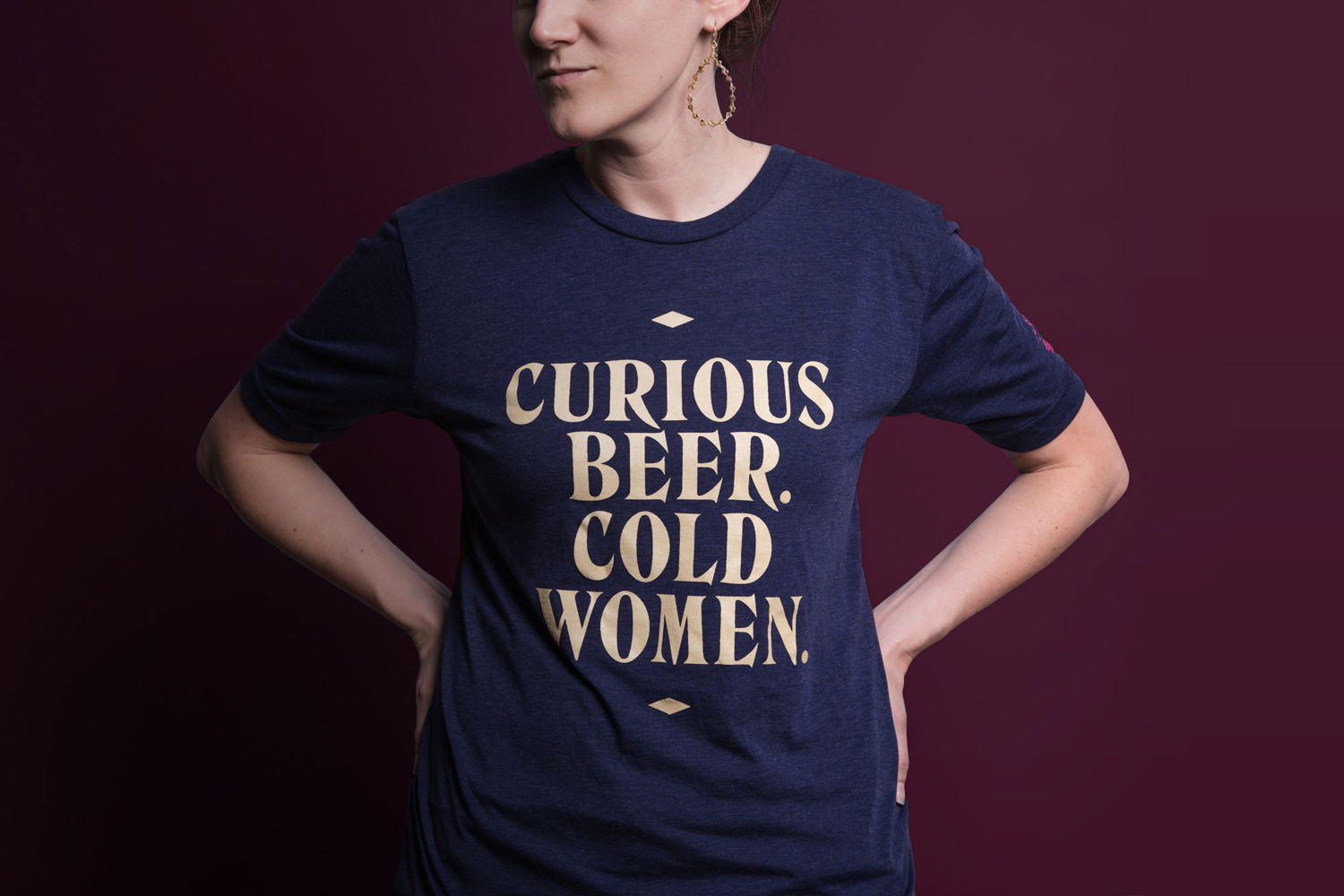
There is plenty of unique character and some exceptional illustrative detail throughout. Hand drawn and striking iconography and a copy heavy design mix craft, retrospection and humour, and are given a thoroughly current quality in the use of a single colour, space and proportion. Although one colour, plus base, there is a pleasant sense of depth in the density of illustration, type and line weight, ornament and reduction, visual texture and areas space.
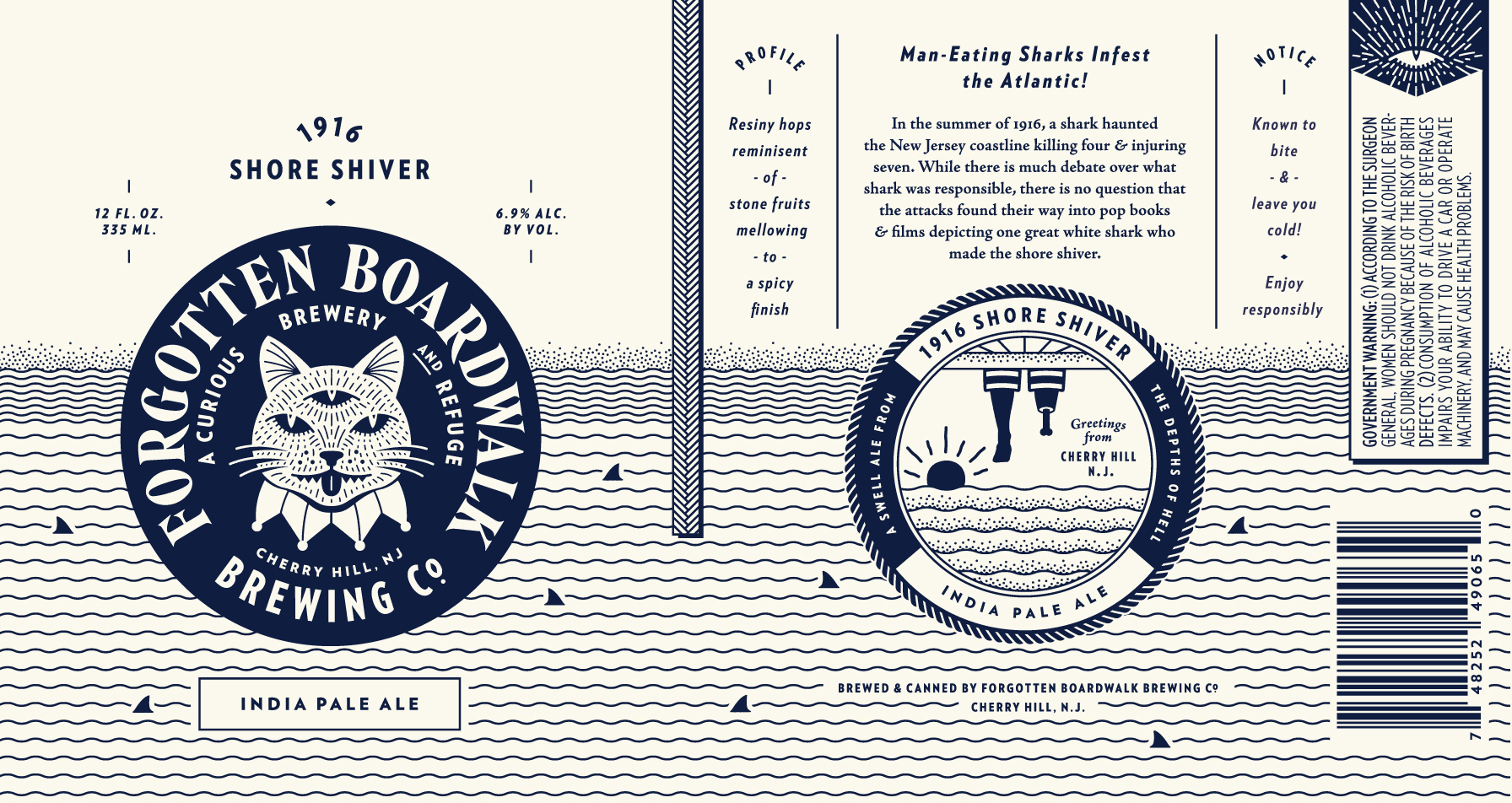
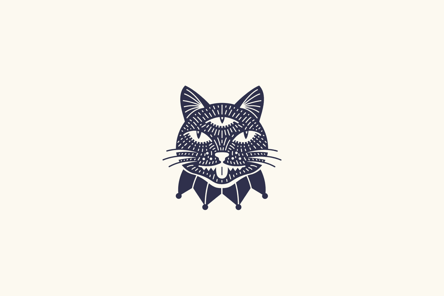
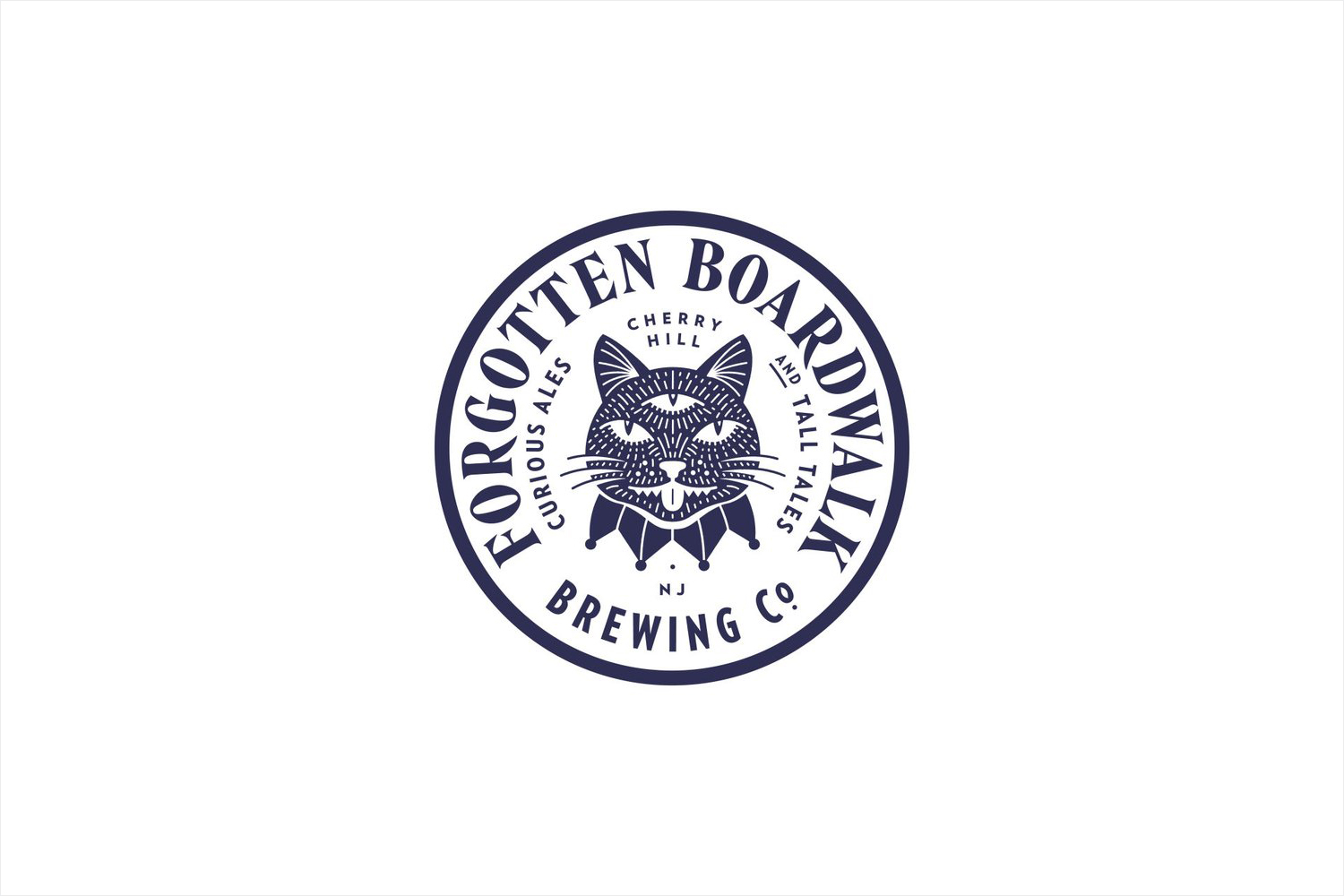
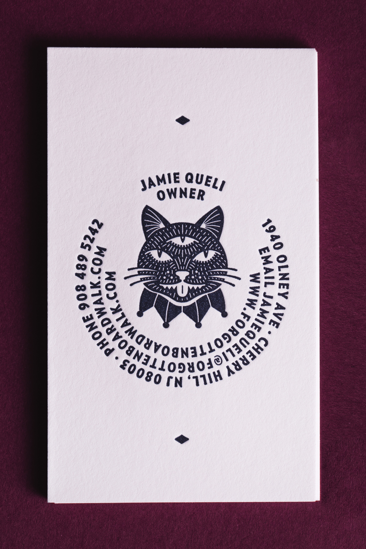
Variation in image and a current colour palette successfully separates different beers and provides a sense of quality, expense and intrigue. These are clearly linked by a consistent structure, a quirky logo that references the feral cats below the boardwalk and the third eye of the fortune-teller, and a lovely, well-set typographical choice.
The initial impact of these is then layered with finer illustrative, typographical and storytelling detail up close. Flavour profile is addressed but secondary to brand personality and storytelling, and sensitive to the target market. Although taking its cues from the past, there remains a youthful and contemporary conviviality in image and colour.
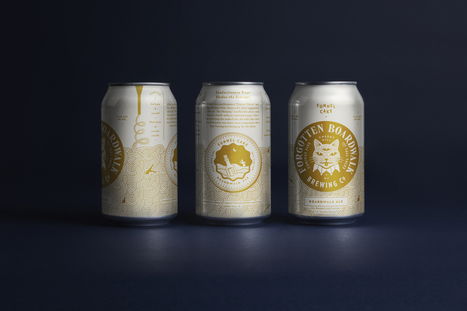
Other highlights include a less familiar typographical choice in the build of the logotype, the curved baselines and typesetting of the roundel—and the way this works across a letterpress business card and coasters—the shading of the illustrations, the stories that these are founded on and the cat tail beer tap.

Although busy at times, requiring focus, there is a precision and skill in the resolution of each detail and, contextually, set alongside other craft beers, likely to appear more restrained and well-composed with both a quality and personality that will stand out. Unfortunately, this balance does not feel as well-addressed online.
The result is the rich brand personality you would expect from a high quality craft brewer, expressed well thorough thoughtful and curious image, good aesthetic sensitivities and copywriting. It plays with initial impact and layers of detail, is grounded in provenance and tradition but contemporary in its execution. More from Perky Bros on BP&O.
Design: Perky Bros. Opinion: Richard Baird. Fonts Used: Hawthorn & Verlag.
