Hermoso Cariño by La Tortillería
Opinion by Richard Baird Posted 20 April 2016

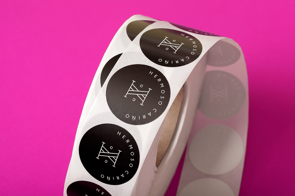
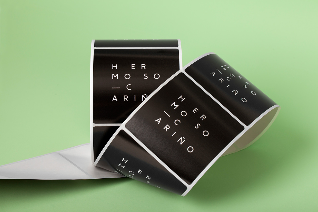
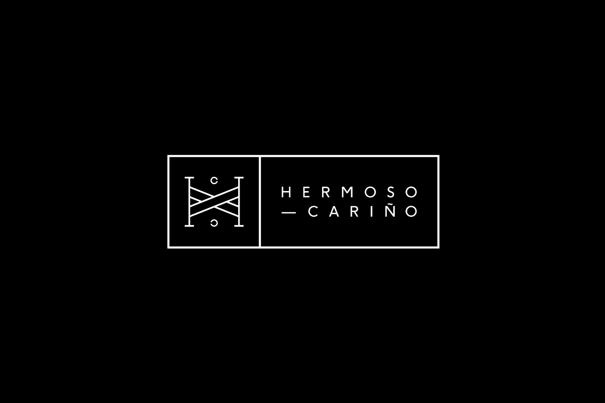
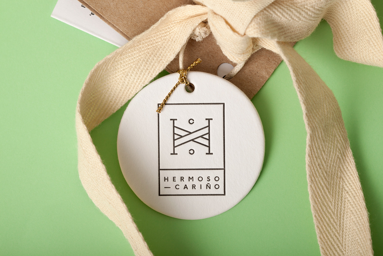
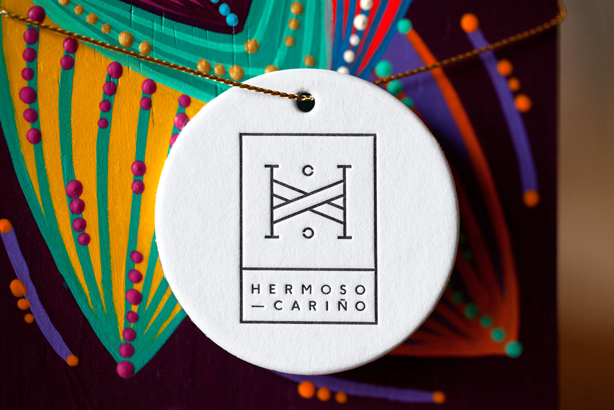
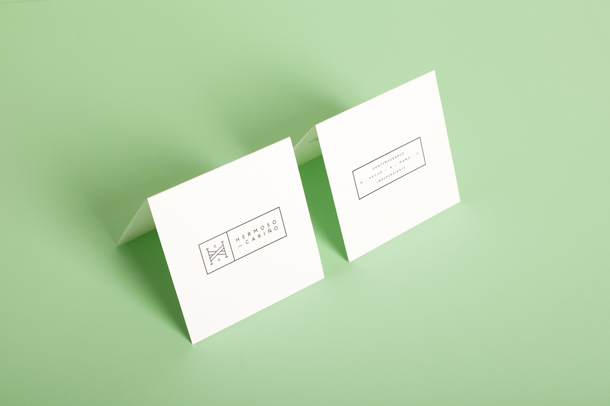
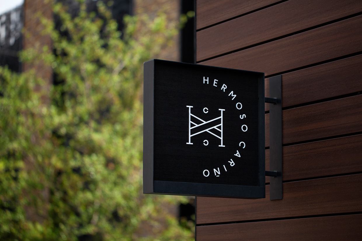
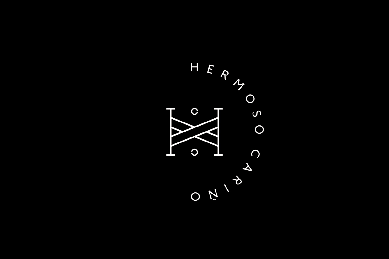
Hermoso Cariño, a name taken from the title of a Mexican love song, is a gift shop with unique line of products. These are described as Mexican in the least expected way, leaning more towards the contemporary, but not forgetting tradition, and crafted by a new generation of designers. This is expressed throughout Hermoso Cariño’s brand identity, created by La Tortillería, through a mix of type, colour, material texture and print finish across tags, bags and stickers.
By pairing a reductive graphic expression, one of monolinear lines, neutral sans-serif type, grid based layouts, plenty of space and a preference for the geometric, with the tactile qualities of uncoated and unbleached papers and boards, stickers and letterpress print finish, alongside the perceived value of a gold block foil, La Tortillería’s concept comfortably plays traditional craft, modern design practice and high-value in a discernible and visually compelling way. Although there are few components, these are remixed and restructured across tags, bags, stickers and signage as squares, circles and rectangles, providing some variation but with a clear continuity.
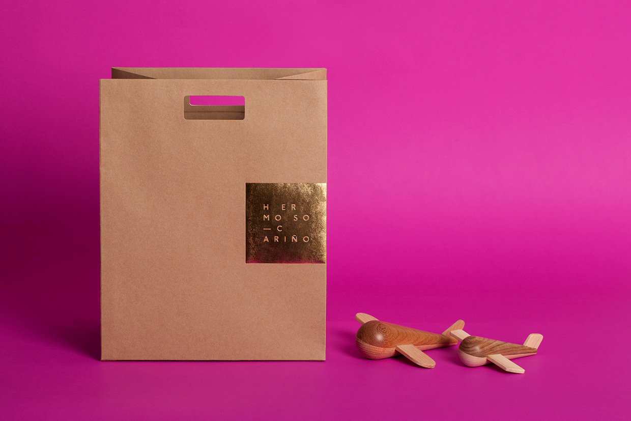
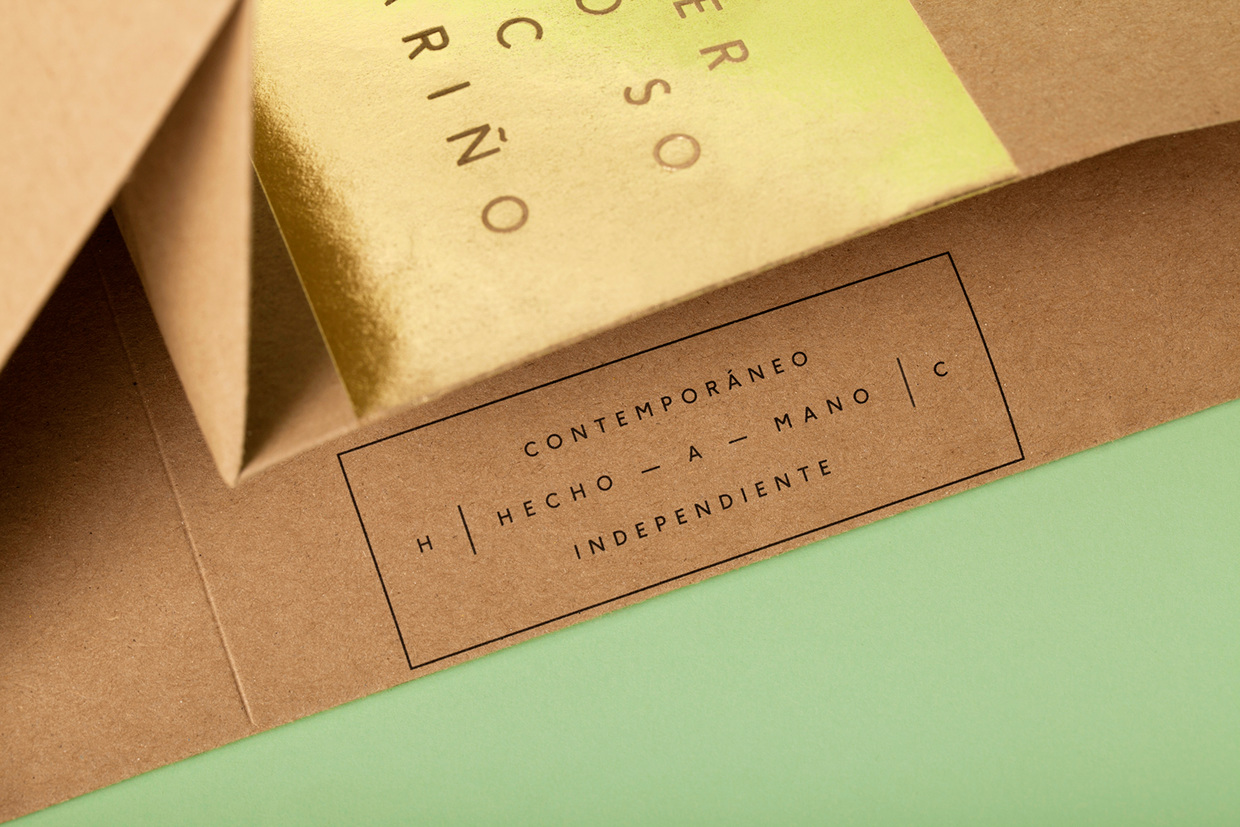
The concept is by no means unique, and individually, the assets and finishes are familiar, not particularly creative or specific to Mexico, however, implementation is well-handled and secure a pleasant and memorable balance between graphic design and materiality, appropriately rooted in the products and philosophy of the store. More from La Tortillería on BP&O.
Design: La Tortillería. Opinion: Richard Baird.
