Huckleberry Roasters by Mast
Opinion by Richard Baird Posted 21 April 2016

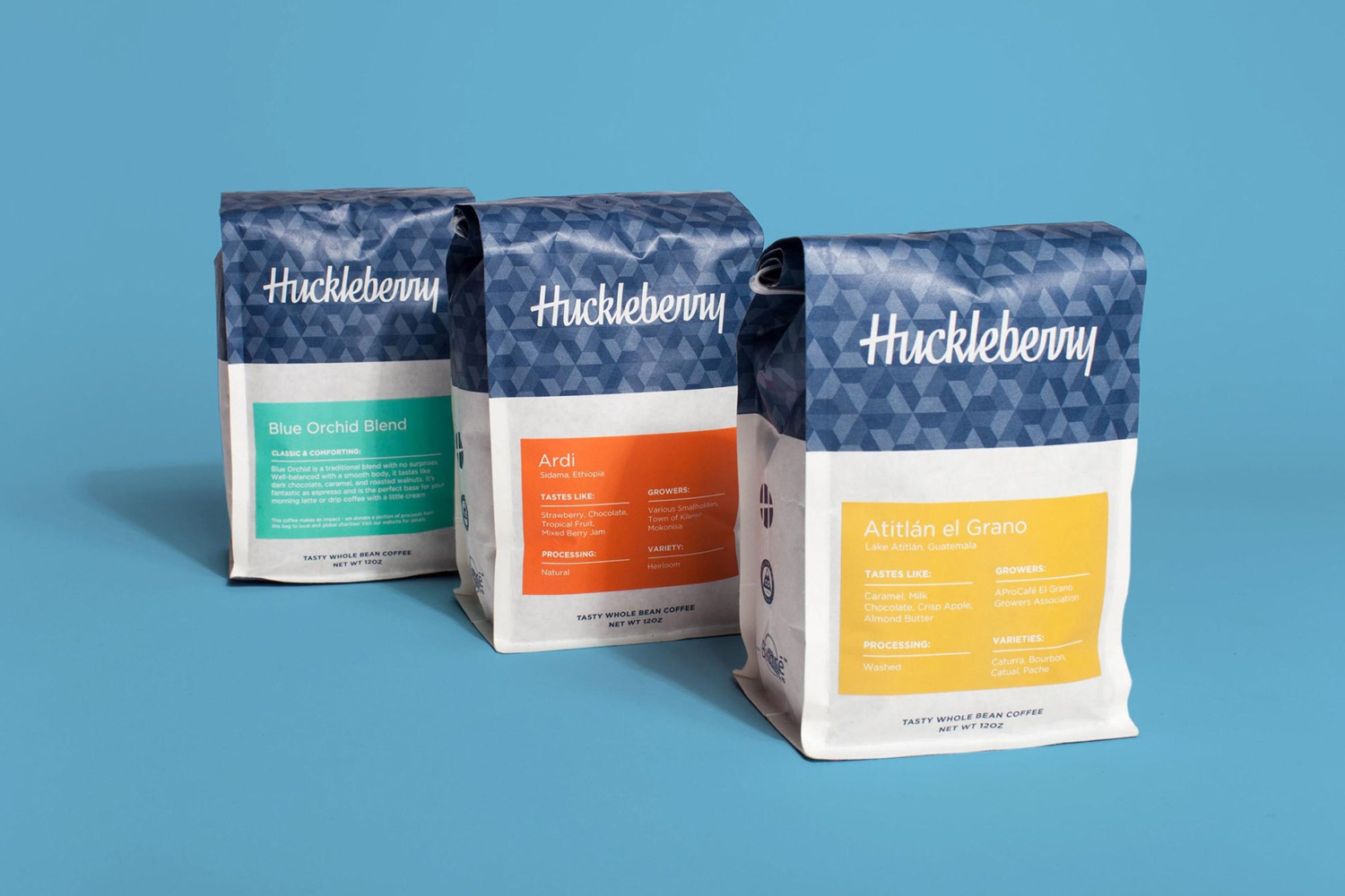
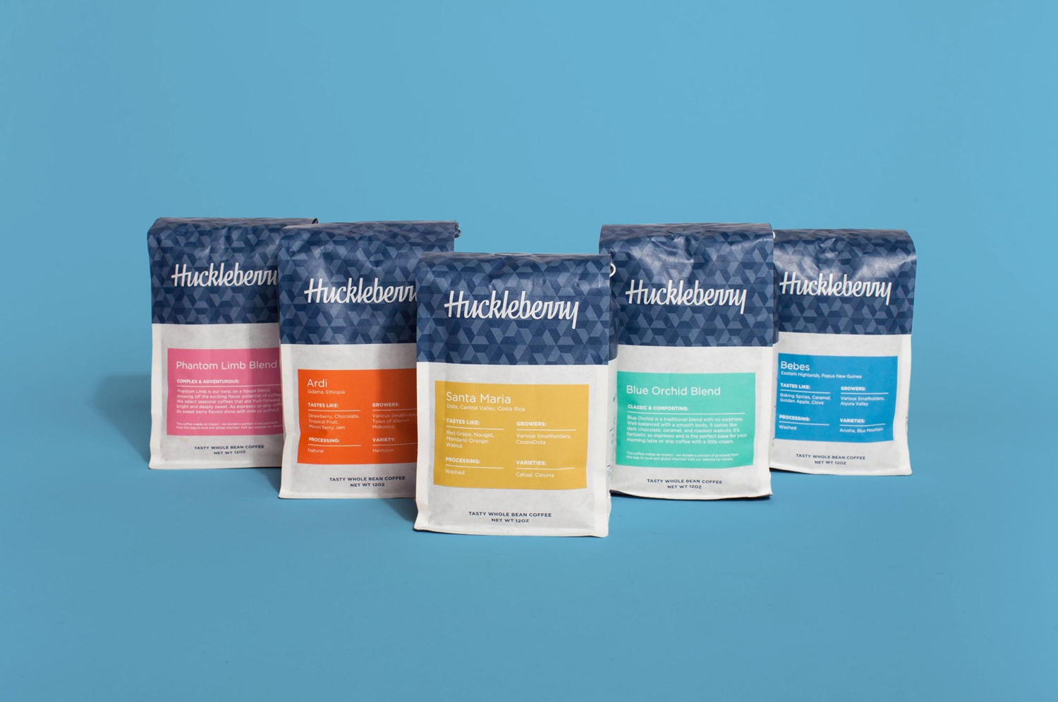
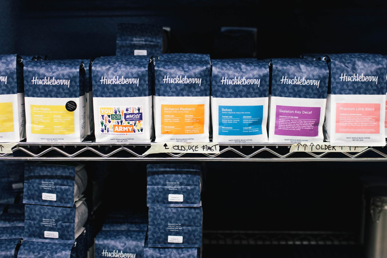
Huckleberry is a Colorado-based coffee roaster established in 2011 by Koan Goedman and Mark Mann. Huckleberry worked with local graphic design studio Mast to rework their packaging in a way that would make the most of some well-established assets which included Mackey Saturday’s logotype, and would introduce more of the personality of its founder’s. This was achieved through the introduction of bright spot colours, geometric pattern in conjunction with the hand drawn logotype, playful copywriting, and a naming convention based on Goedman and Mann’s personal musical inspirations.
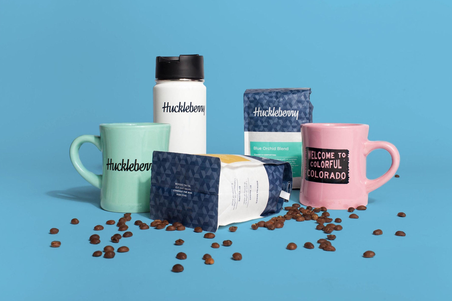
This post was updated October 2017 as Mast continue to work with the roastery refining visual identity, introducing a new animated logo, calligraphic logotype, and colourful merchandise.
The primary intention for Huckleberry’s redesign was to address a confusing labelling system, and convey a little of the company’s personality, one that is both serious in its responsibilities to sustainability and good quality coffee, but also did not take itself too seriously. This is addressed in the move to a biodegradable material, clearer structure, and a more restrained but impactful use of colour and pattern.
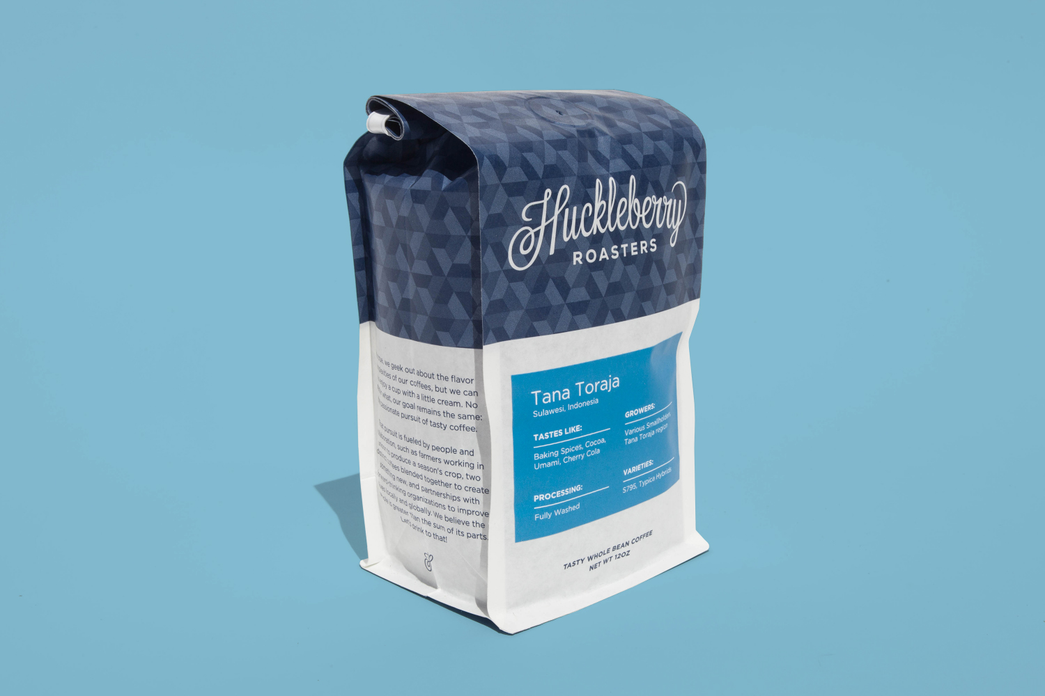
Contrast is used to good effect, dividing and highlighting key information and securing visual impact. These include the detail of pattern alongside unprinted space, hand drawn wordmark alongside the more reductive qualities of a sans-serif, bright spot colours framed by white, and straightforward insight into flavour profile and origin yet a playful naming strategy. These are brought together with a good sense of proportion and structure, an appreciation for aesthetic flourish and the need for character in image and words, as well a communicative clarity.

Mast draw a little more proprietary character from a hexagonal motif from previous brand communications by turning it into a pattern. Although this does add texture, contrast and a continuity, where previously there was abundance, diversity and ultimately distraction, it feels in competition with a well-drawn logotype. This logotype may well have been better served by a solid colour or a dialled down background, which is where the previous packaging worked well. However, there remains a distinction and clear intention behind each choice, dividing each product, brand personality and product information, but also unifying these under a cohesive and memorable aesthetic.

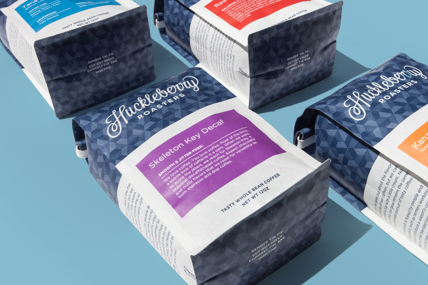
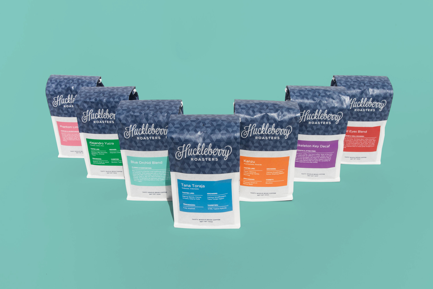
Huckleberry Roasters, 2017 by Mast.
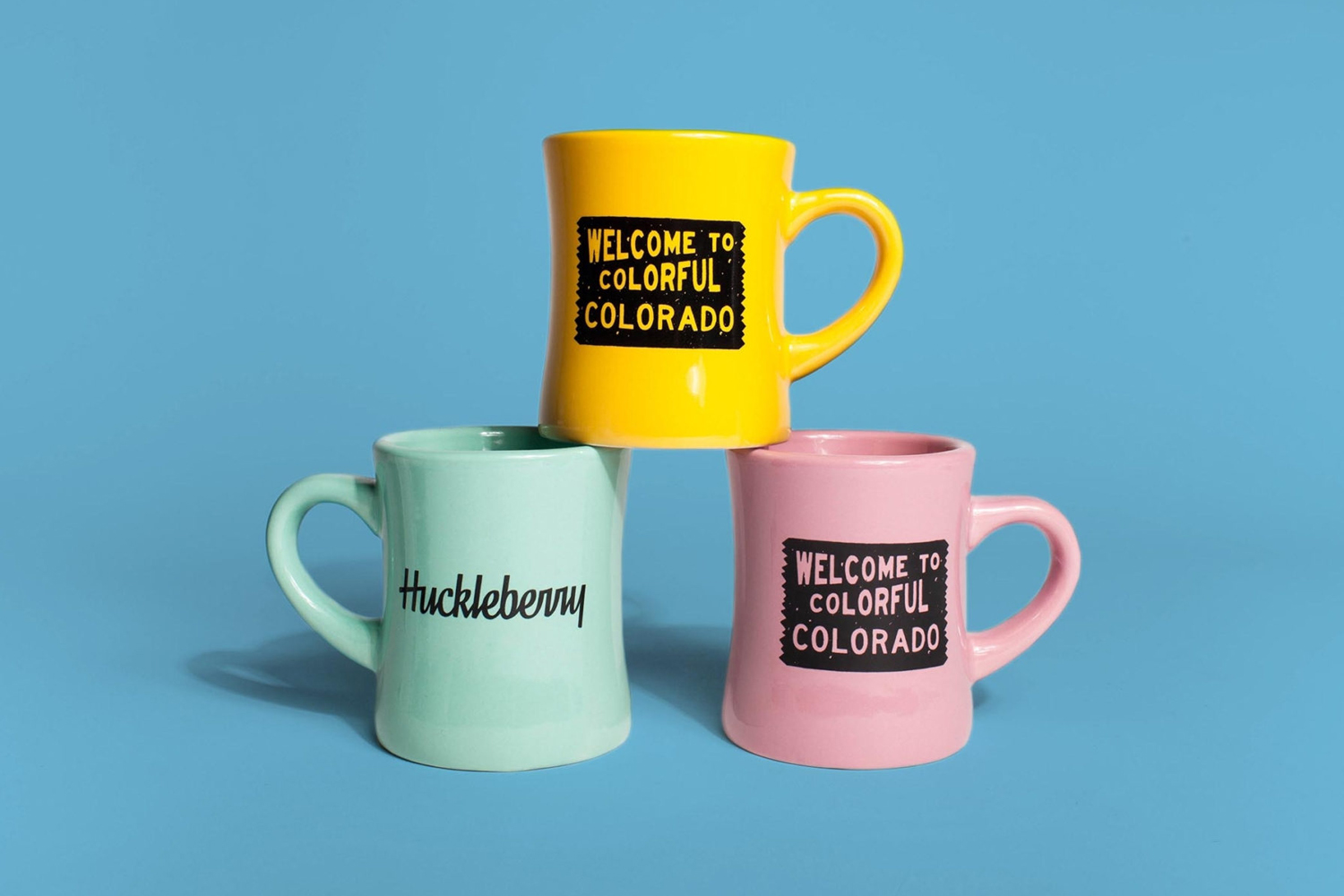
Mast continue to work with Huckleberry Roaster’s into 2017, this time changing logotype, creating a variety of additional printed assets and animated logo, and drawing out the bright labels of the bags onto a range of bespoke branded mugs. Check out more project shots here.
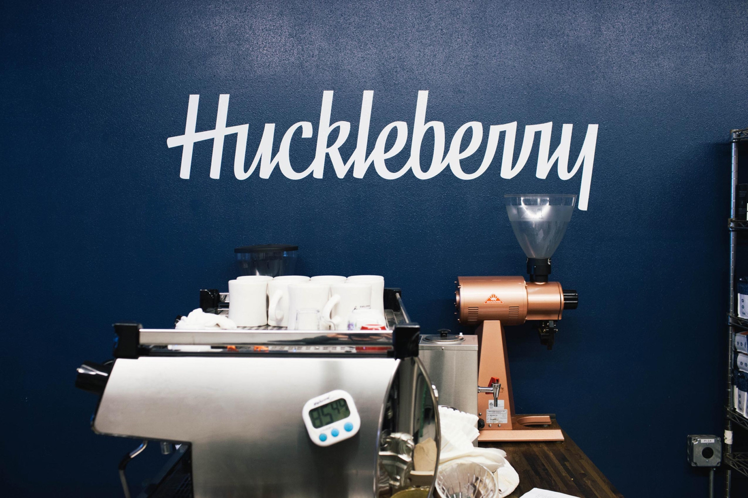
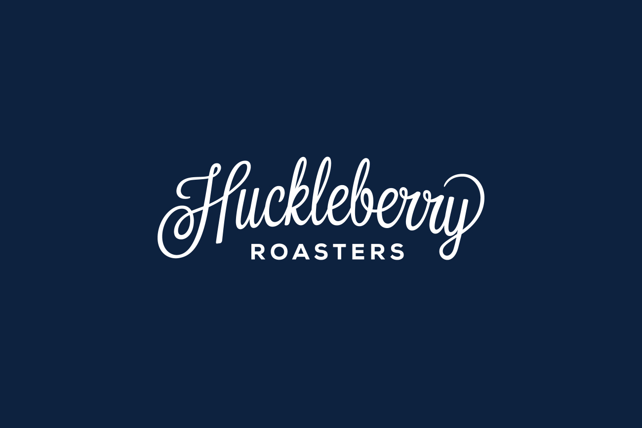
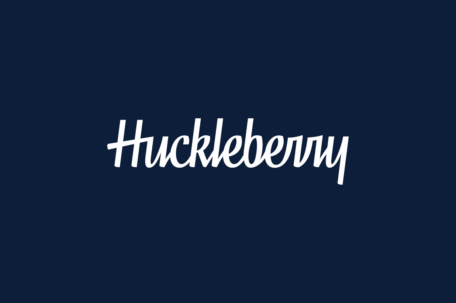
“In need of a more universal, subtle, updated wordmark we developed a custom script unique to the Huckleberry brand with a typographic structure heavily influenced by traditional calligraphy. Our result balances bold and thin stroke weights with legible structure that can scale to fit all digital and production media.”
The original logotype, a hold over from Huckleberry Roasters’ earliest identity, co-oped by Mast in their 2016 redesign of packaging, was a cheerful mix of tall characters, loops and ligatures. It was personable, well-drawn and of its time, a period that saw a resurgence in the hand lettering of the past.
Just as the first was a product of its time, so is the new logotype, in its high contrast calligraphic strokes and square junctions and terminals. It is well-rendered and its linear baseline and strong vertical lines more in tune with the patterns and layout of packaging. Where the flourishes of the previous logotype felt tied more to past, the simpler liners and the marker rather than brush-based association has a more modern, lasting and youthful appeal. More from Mast on BP&O.
Design: Mast. Opinion: Richard Baird.

