Social Enterprise UK by Paul Belford Ltd.
Opinion by Richard Baird Posted 11 May 2016

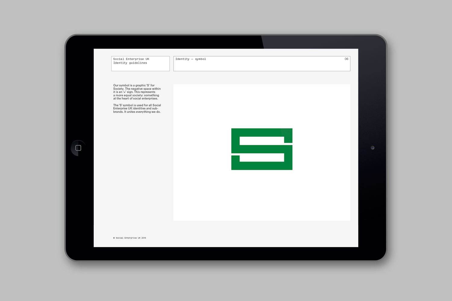
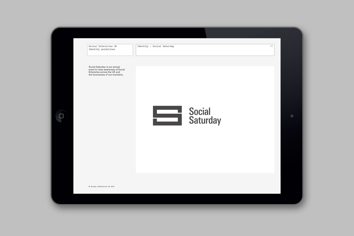
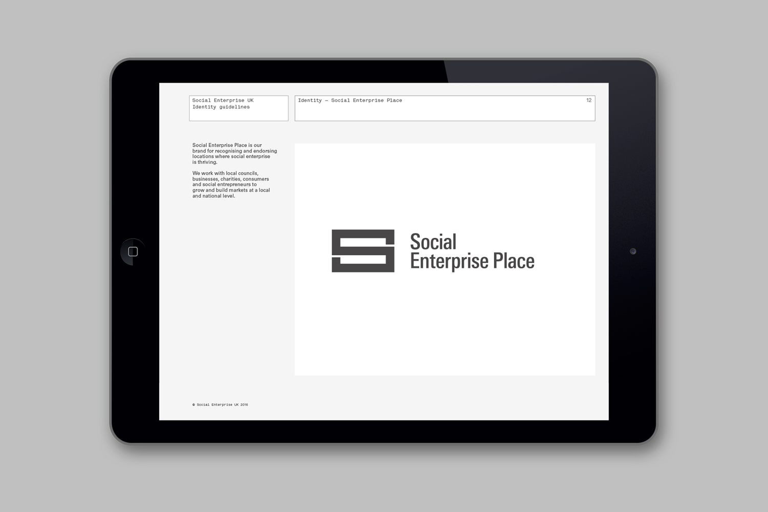
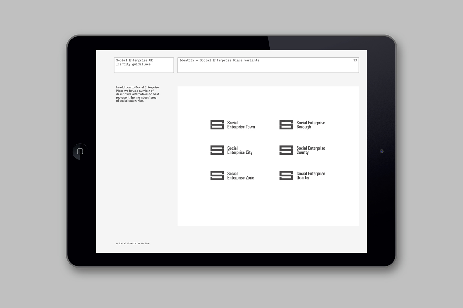
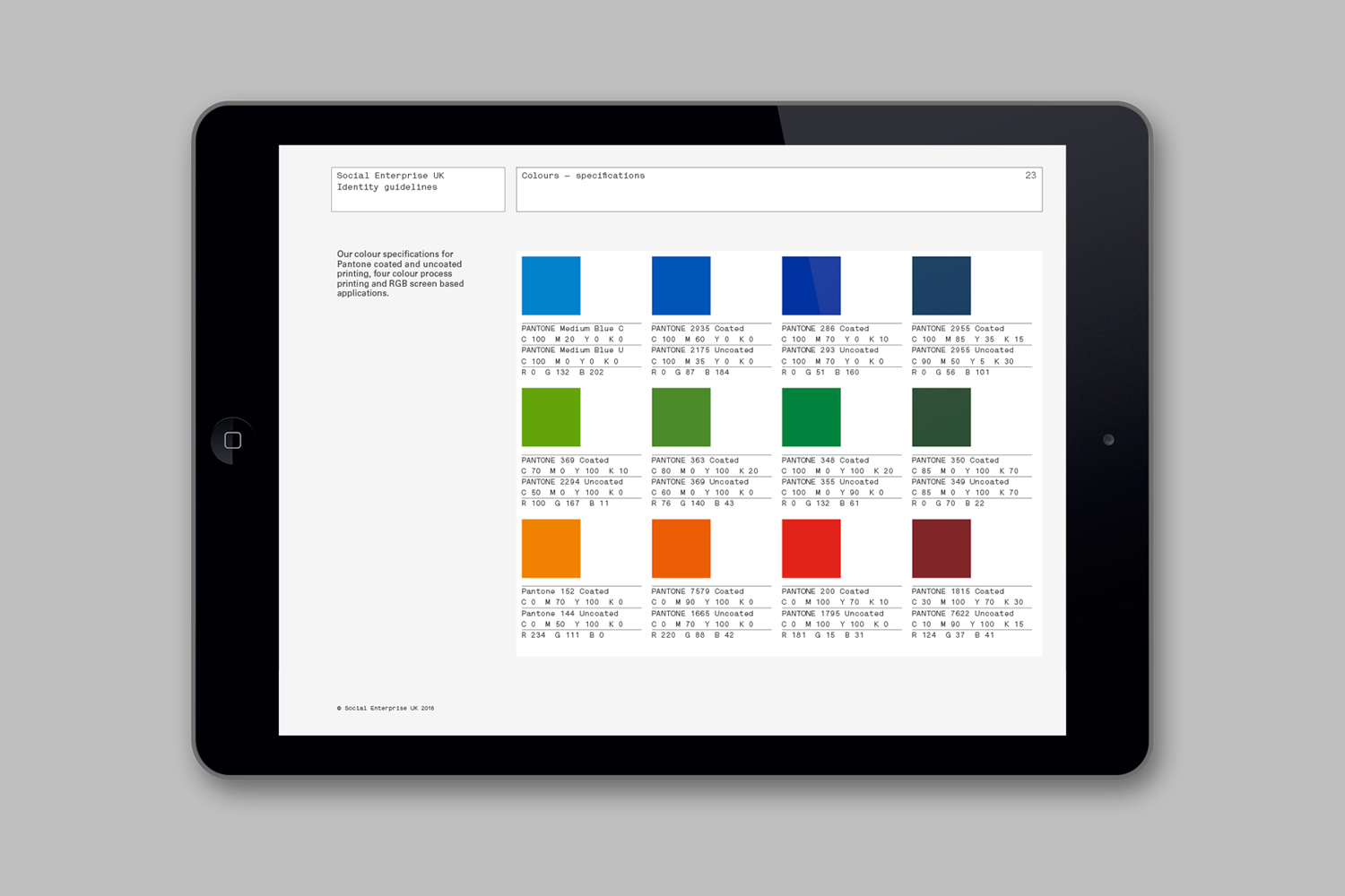
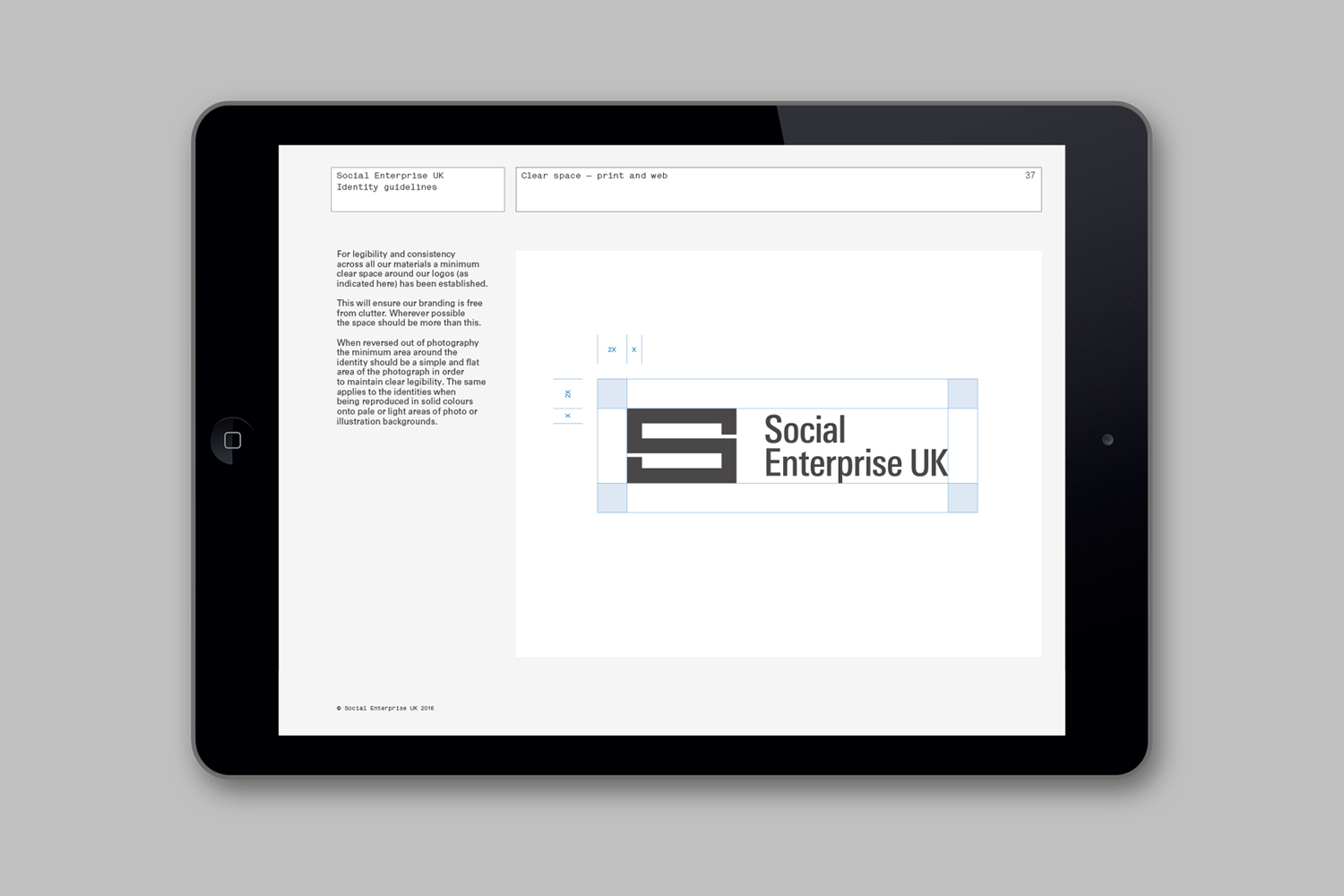
Social Enterprise UK is an organisation that represents those that use the power of business to bring about social and environmental change. With the intention of dramatising the organisation’s investment in, and contribution to, developing a fairer society, London-based graphic design studio Paul Belford Ltd. created a logo that draws an equals symbol from an S, links a number of sub-brands and differentiates these through colour.
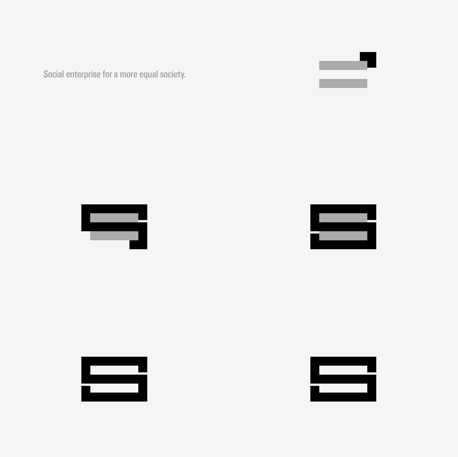
BP&O tries to avoid the deconstruction of individual assets and leaves the fetishization of logos to LogoArchive, instead choosing to look at context and a variety of communicative intentions delivered through multiple touch points. However, in opposition to those that say the logo is dead, there remains, in my opinion, a value in a simple, unifying and memorable mark. This brings us to Paul Belford’s work for Social Enterprise UK. This manages to draw value from a ubiquitous symbol through a genuine intention and a relevant context, clearly expressed through form language, a straightforward naming strategy and the strap line “Social enterprise for a more equal society.”
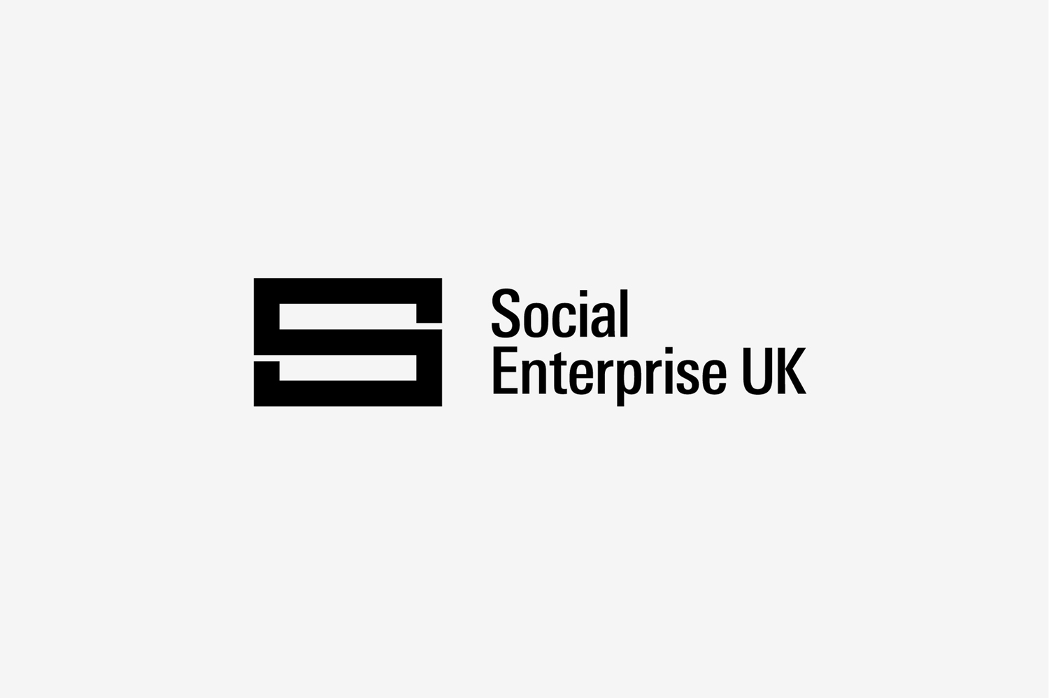
Aesthetically, the logo is simple with a clear focus on emphasising negative space whilst retaining the S. Where mark is broad, type is condensed, adding a moment of contrast. Both type and mark, when locked-up, appear well-balanced, and conceptually, feel appropriate and universal in their expression. Brand guidelines ensure an unwavering consistency, and much like the logo, have a simplicity and clarity of purpose. More from Paul Belford Ltd. on BP&O.
Design: Paul Belford Ltd. Opinion: Richard Baird.
