Collected Coffee by Fivethousand Fingers
Opinion by Richard Baird Posted 27 June 2016
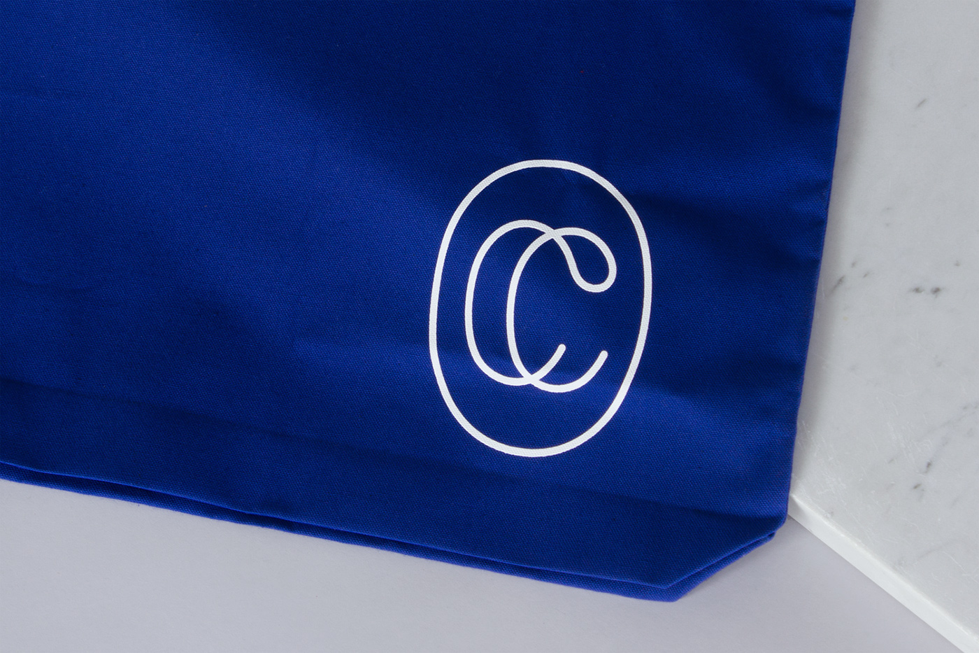
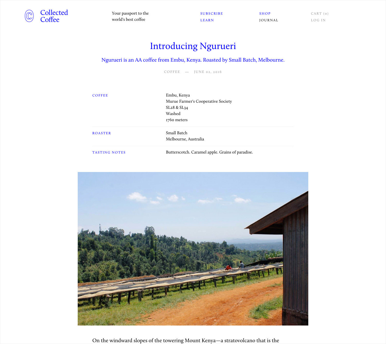
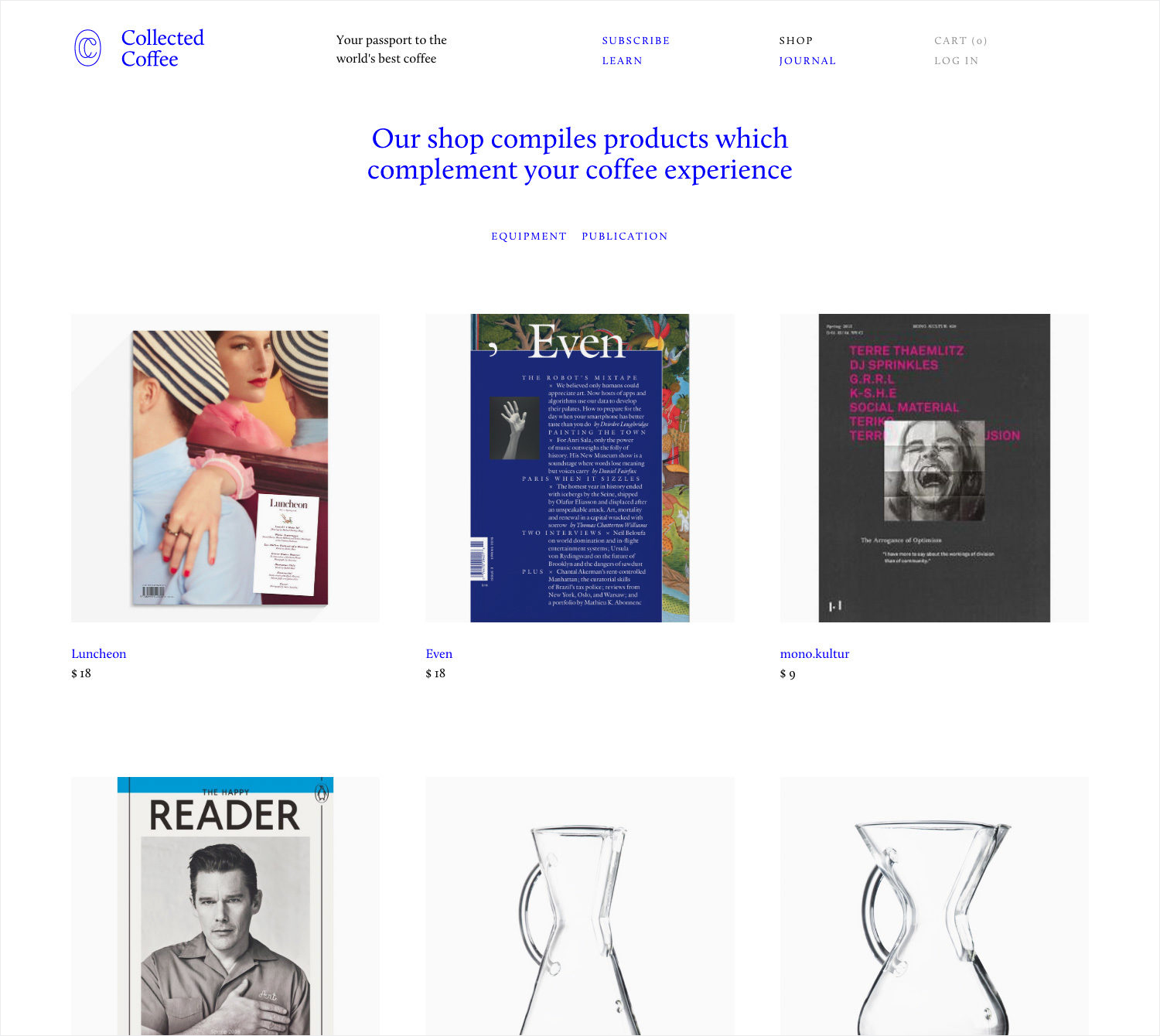
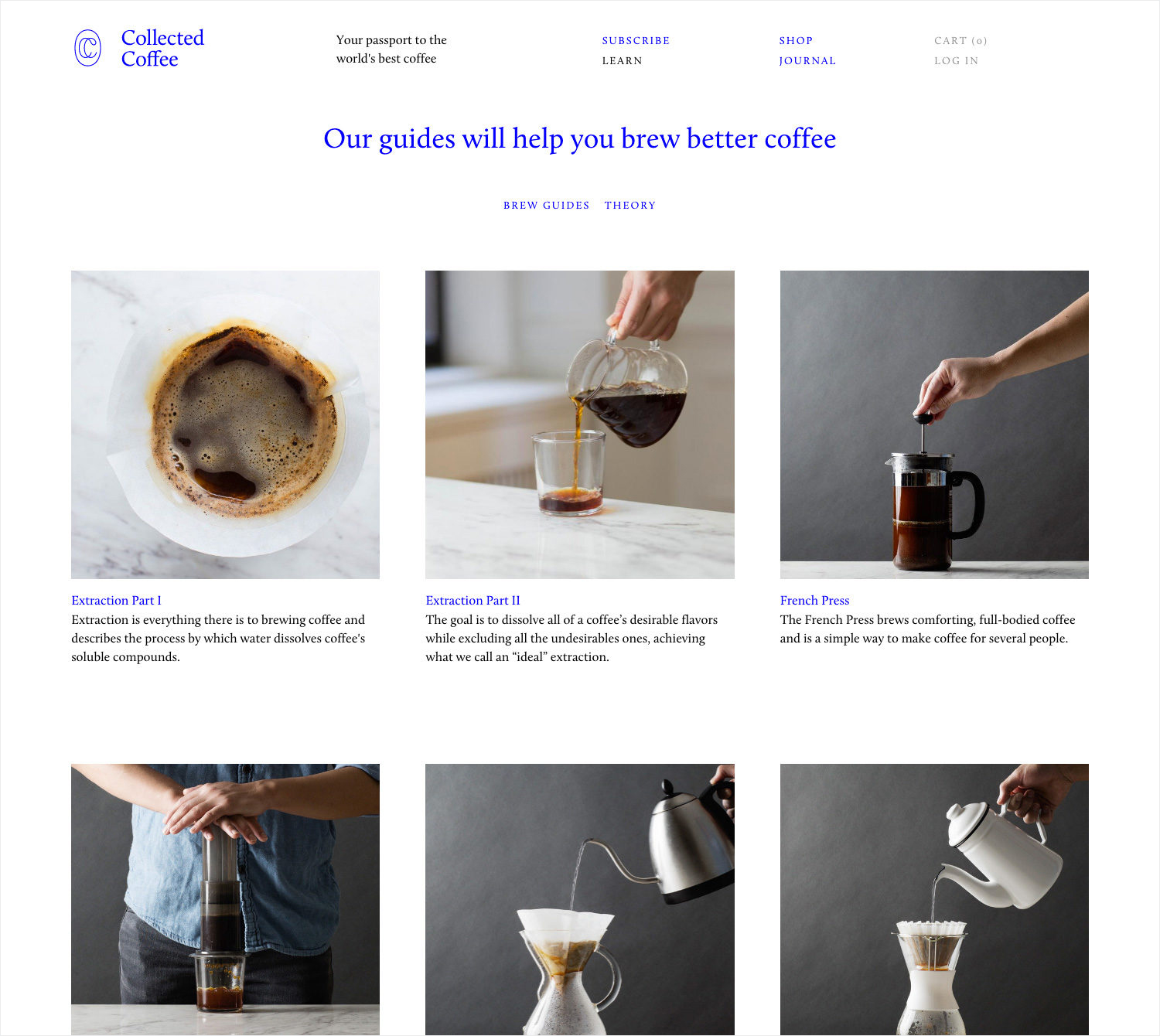
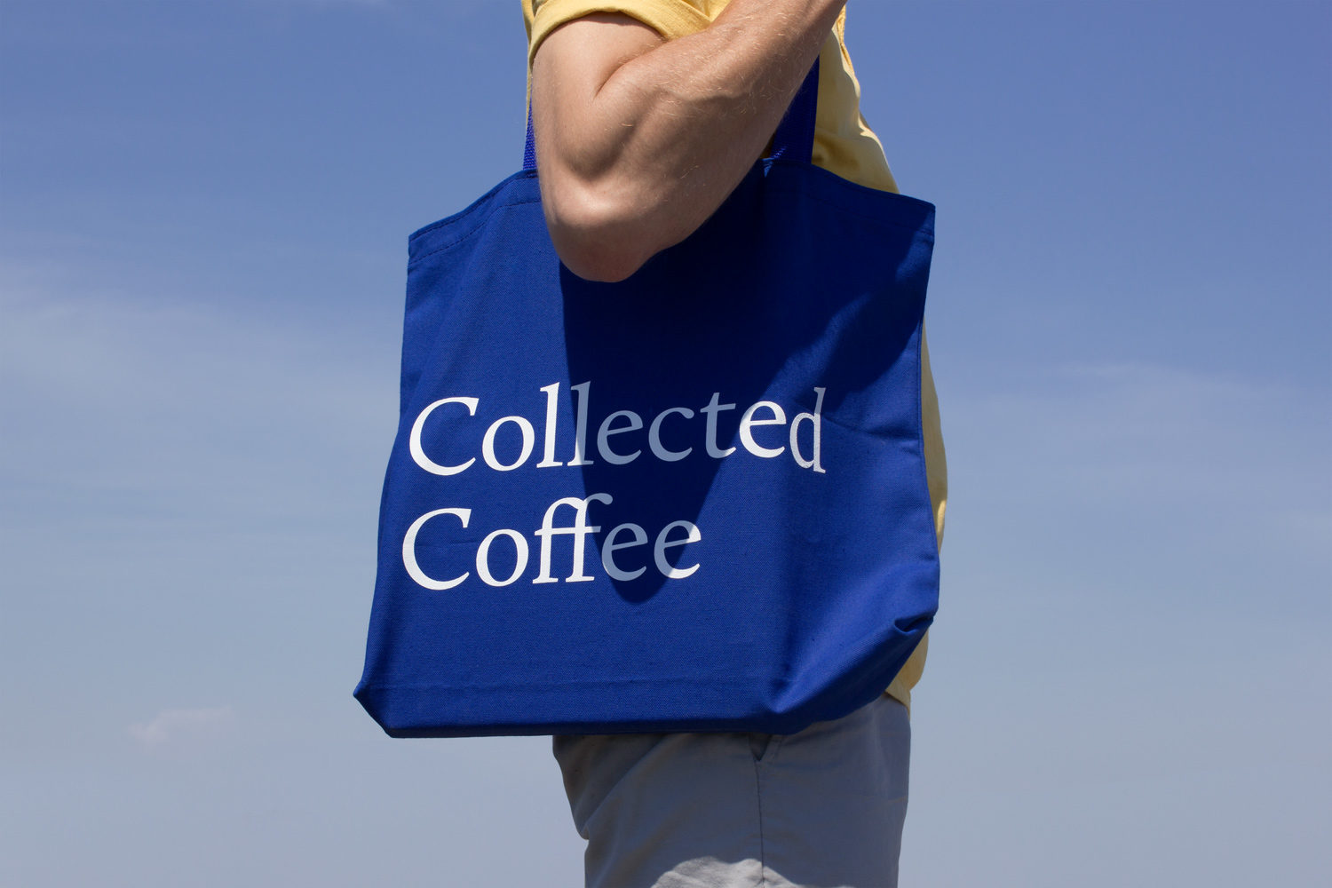
Collected Coffee is a New York-based coffee subscription service committed to sourcing the world’s best coffee beans, prepared by speciality roasters. The service worked with Canadian design studio Fivethousand Fingers to develop a brand identity, which included logo, packaging, tote bag and web design, that would be perceived as intelligent, cultured and curious to a sophisticated coffee enthusiast. This was achieved through a contemporary gallery-like aesthetic of plenty of white space, still life photography and clear product insight, consistently expressed using Calluna, that builds on the curatorial nature of name and service.
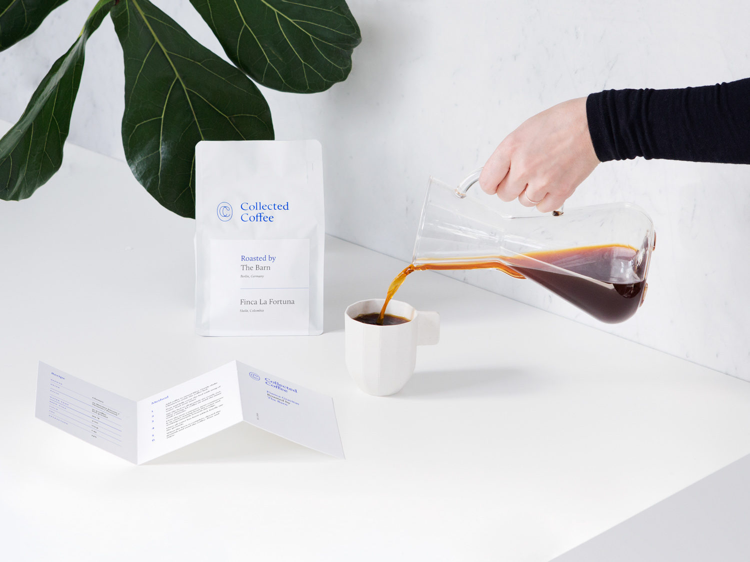
As a subscription service, shelf convention—things such as impact from a distance and traditional value cues like tactile materials and finishes up close—make way for a more restrained approach and value cues based around reduction and a clarity of expression.
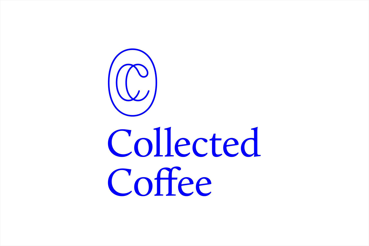
Collected Coffee’s logo is well-rendered, with a smart juxtaposition between the consistent line weight of the monogram and the stroke contrast of the logotype. This effectively plays with the traditional and personal mark of a craftsman and leverages the more formal qualities and experience associated with gallery curation. Alongside a bright blue ink across a bright white substrate, brand identity in print is distinctive, current and a departure from the often rustic qualities of batch produced coffee.
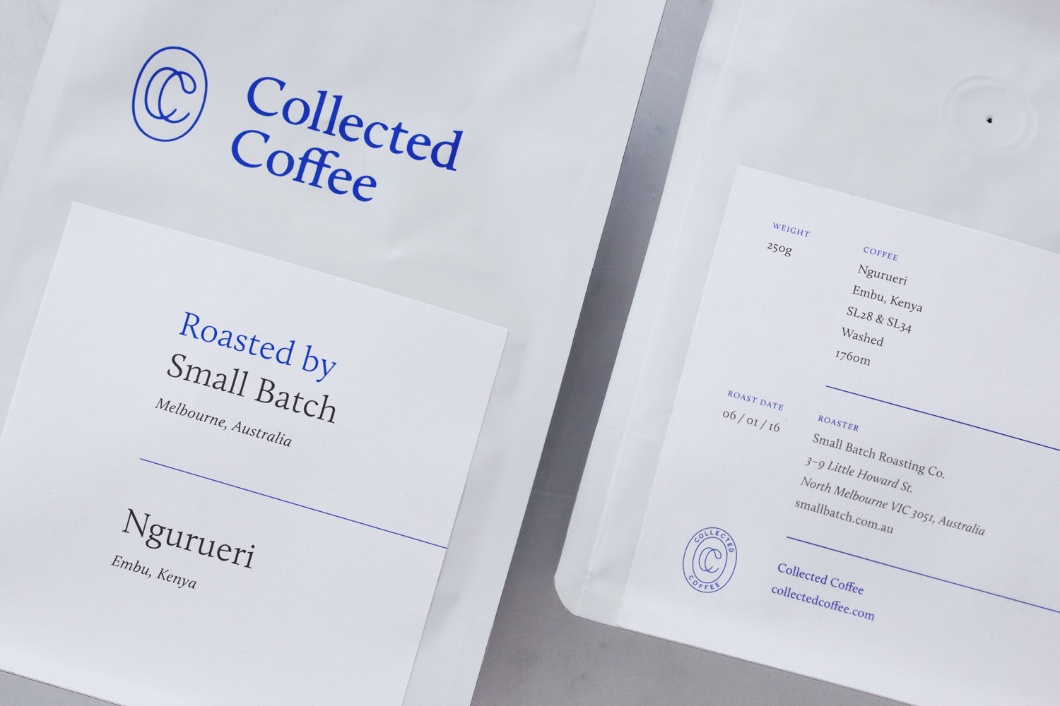
Product insight is brought together through a clear pack architecture, and benefits from some solid typesetting and a good eye for proportion and balance, which also informs the structure of print communication. This is reminiscent of plaques set alongside the artwork of a gallery, ignoring the earthy and hand prepared and moving coffee more towards art form rather than craft, and an intellectual as well as a visceral experience.
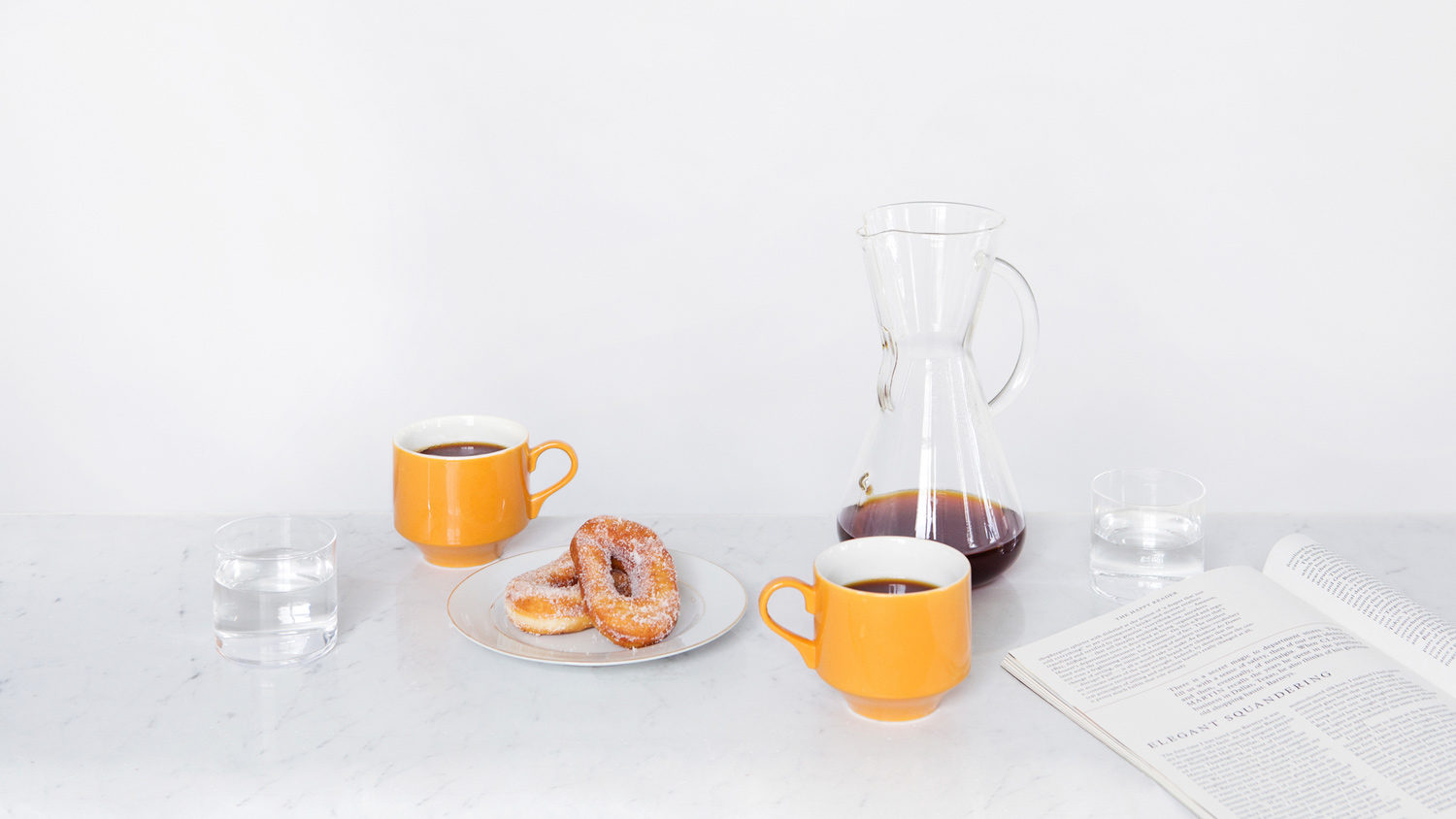
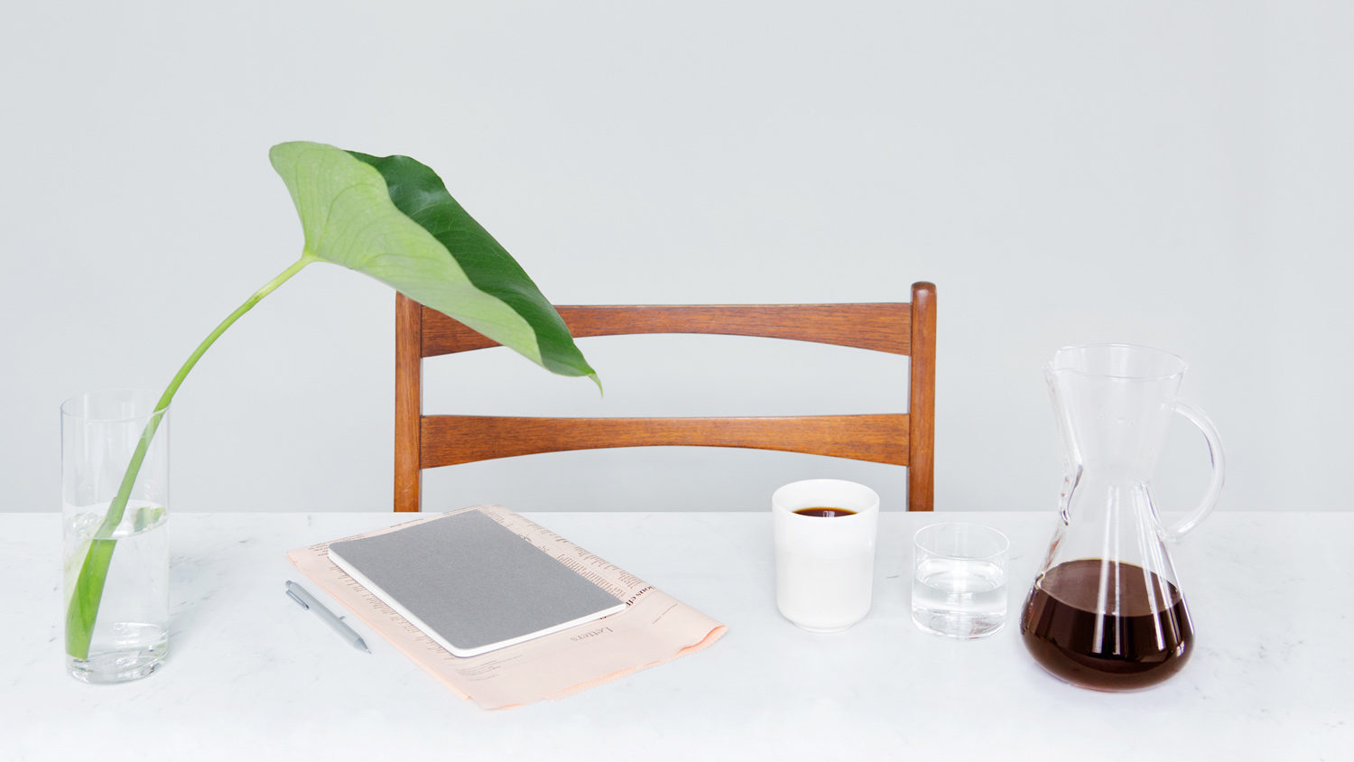
Although packaging is simple and concise in its aesthetic expression and content, there are a few other neat details that build out brand. Perhaps the most prominent of these is the art direction and scene setting of the photographs. Like pack design and logo, these play with a contrast of form and colour in set dressing, the intellectual in the editorial-led reading material, retrospection, modernity and curation in objects and is smart in its non-verbal communication. These are well shot, and pretty clear in their lifestyle intentions.
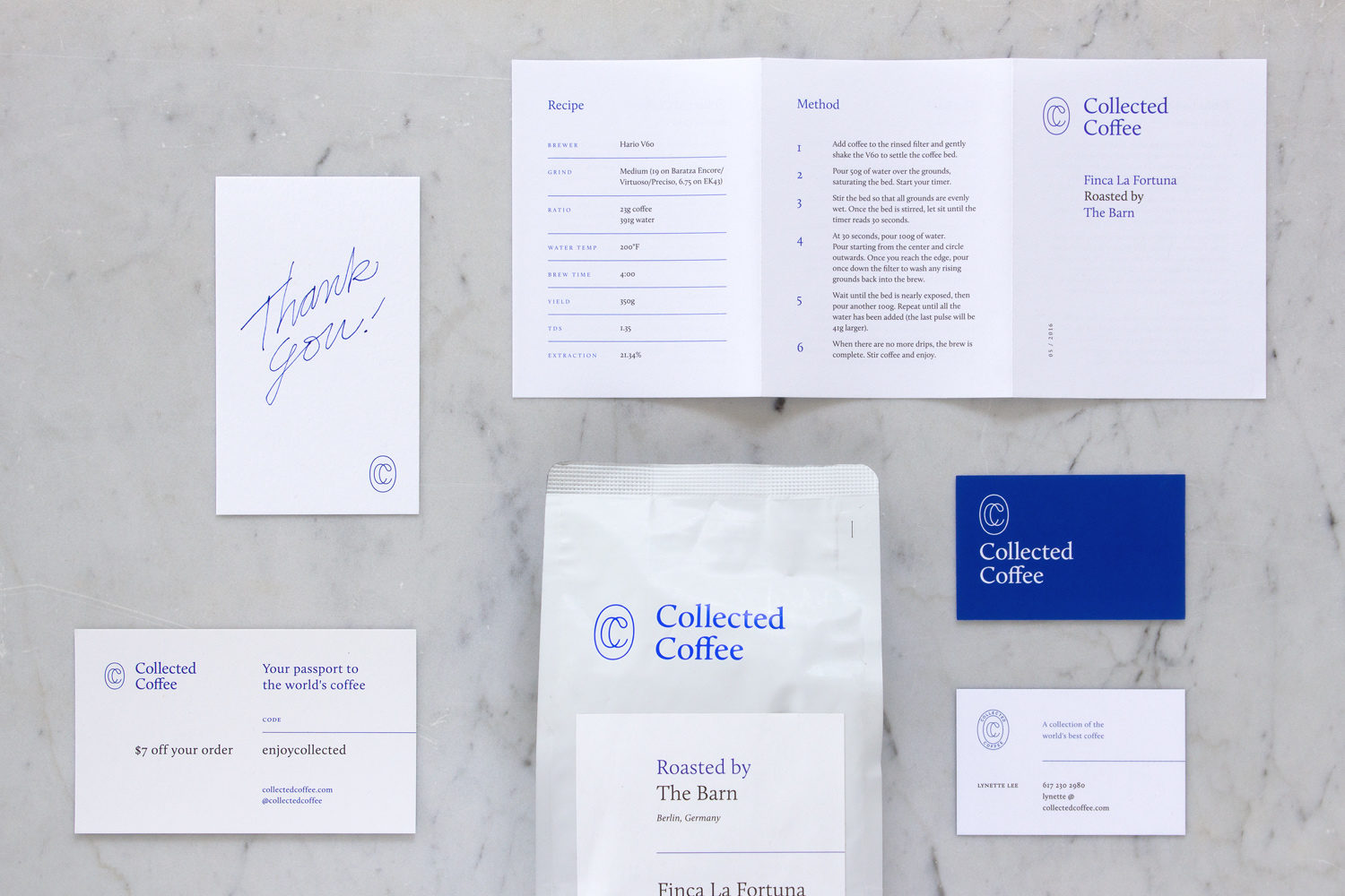
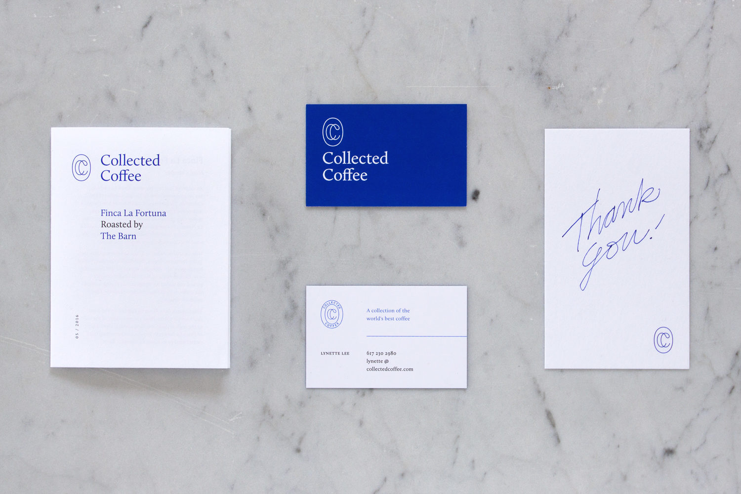
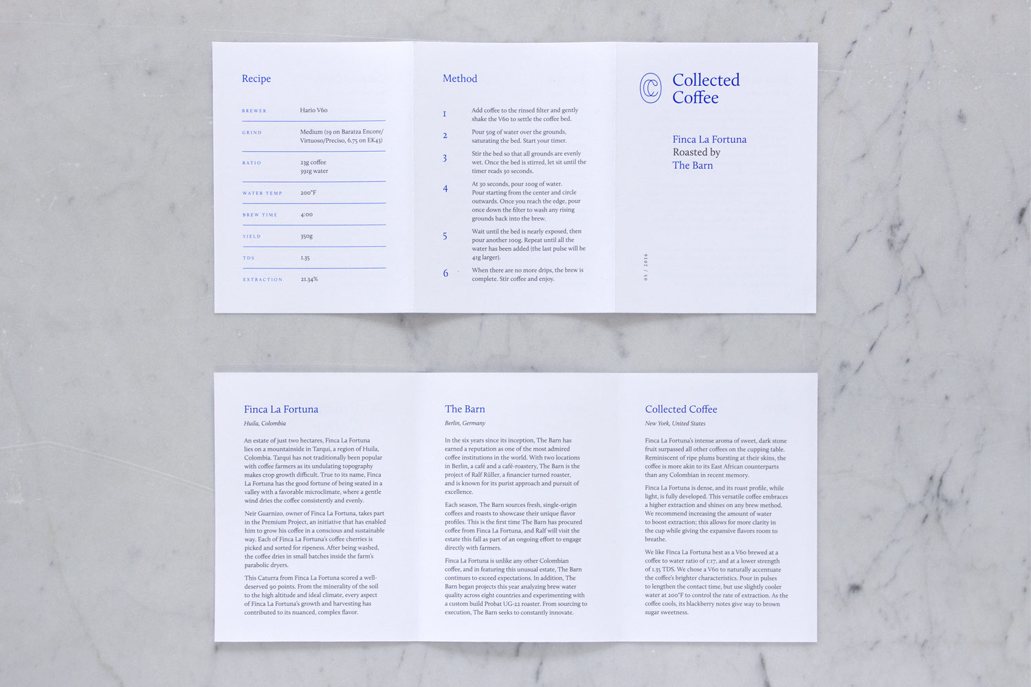
Illustration expands on the forms of the monogram and adds a little more visual character to identity, conveying its three key values; to explore, to experiment and to enjoy. A storytelling component online expresses Collected Coffee’s passion for its products and provides insight into those that produce it.
For many, the concept will seem pretentious, the photography blunt in its positioning, and aesthetic sparing, but together these appear distinctive, grounded in communicative intentions and well-pitched at a very specific group of people.
Design: Fivethousand Fingers. Photography: Cindy Boyce. Opinion: Richard Baird. Fonts In Use: Calluna.
