Neighbourhood by Ahoy
Opinion by Richard Baird Posted 29 June 2016
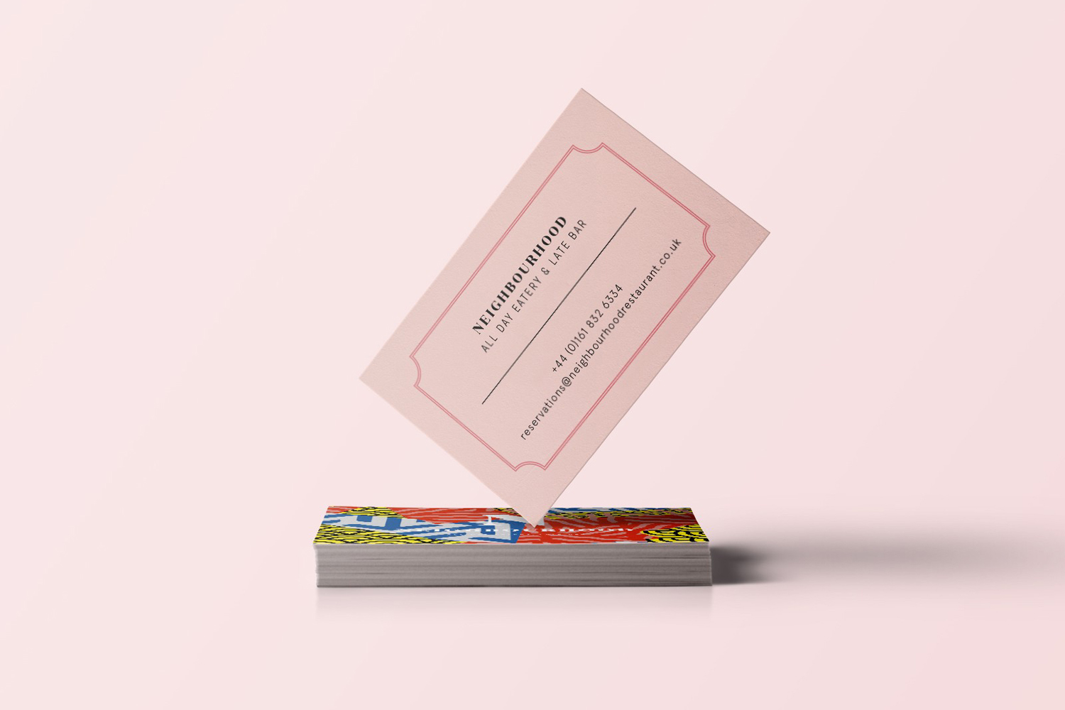
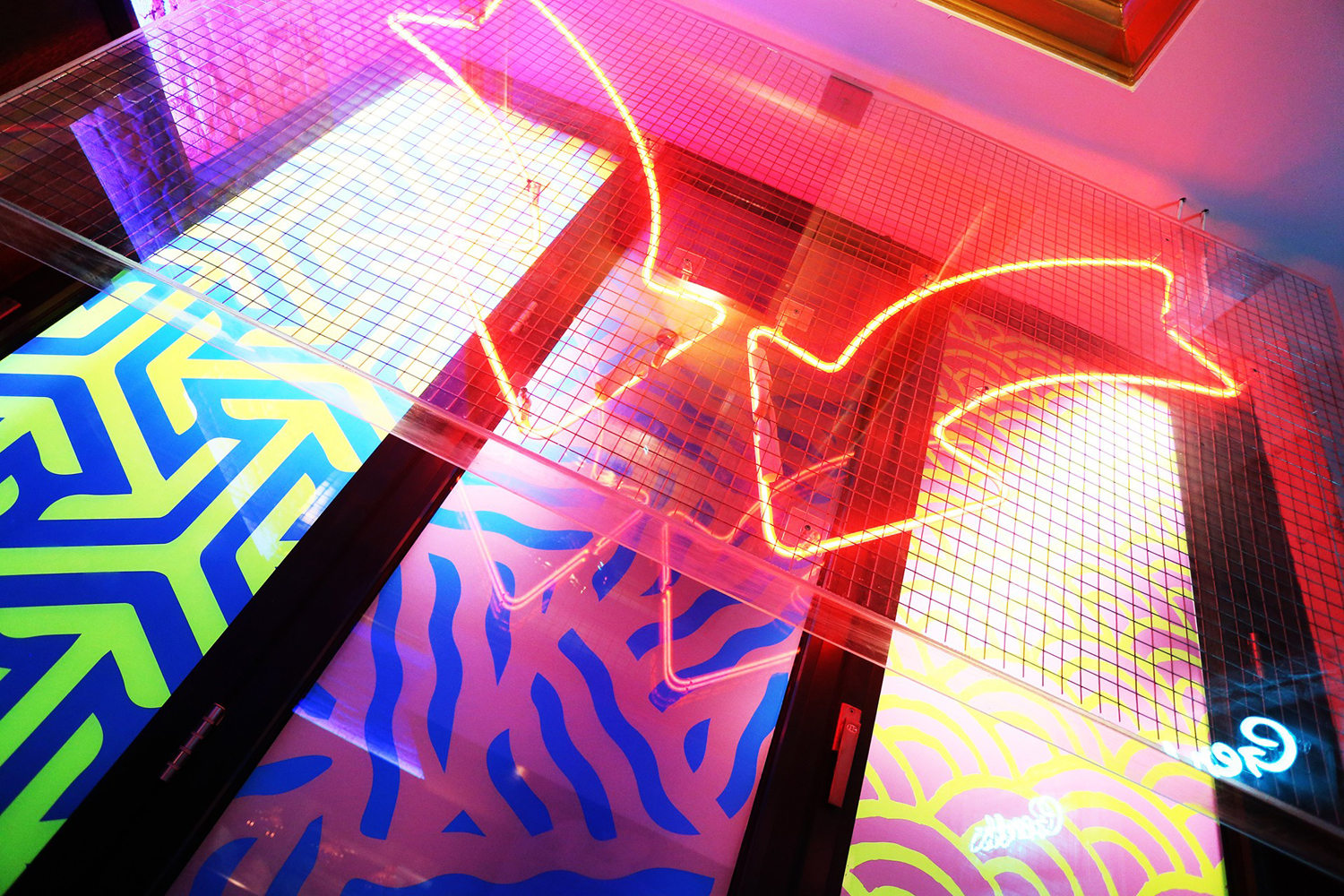
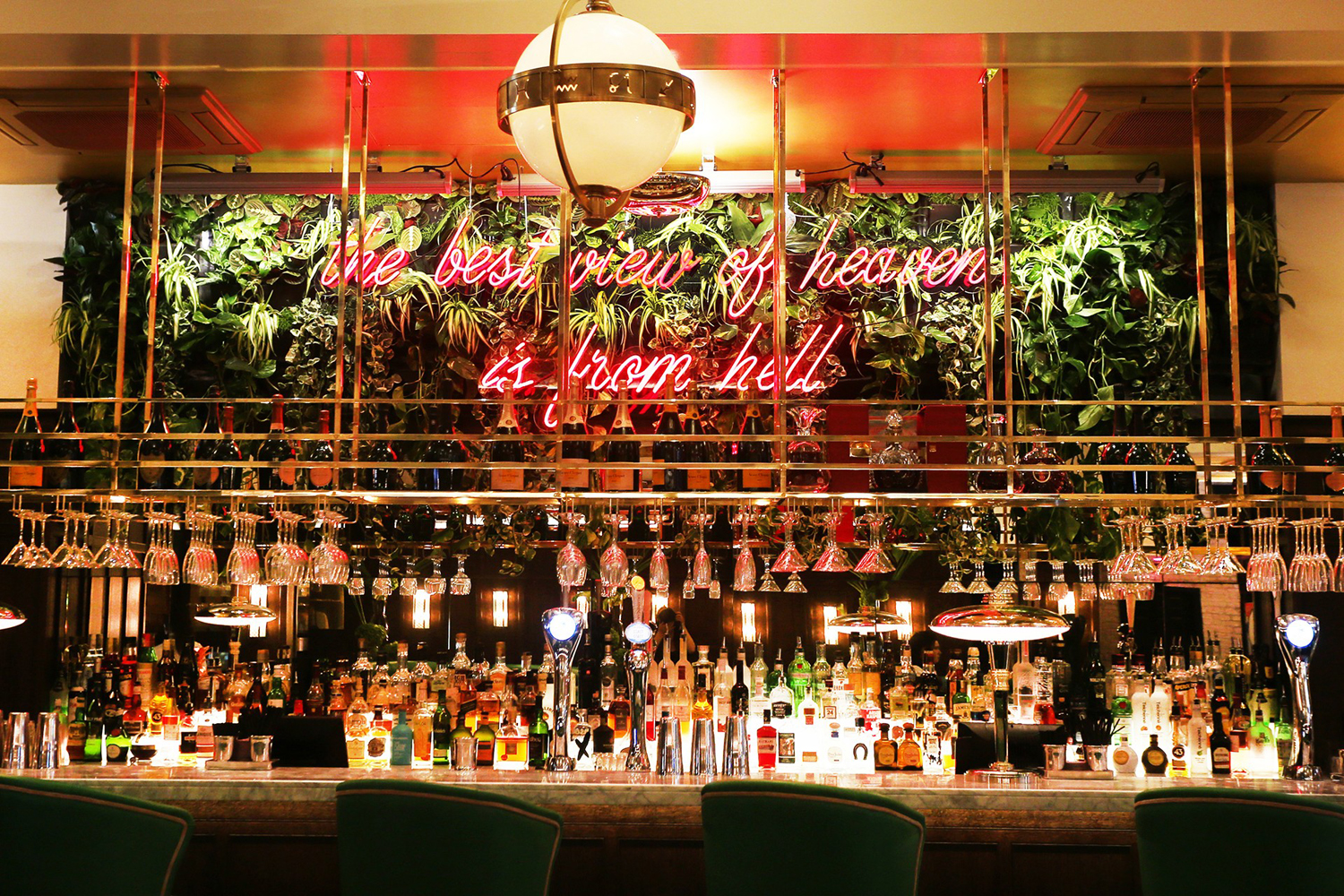
Neighbourhood is a restaurant, bar and club, located in the centre of Manchester, with a vibrant and eclectic interior inspired by New York, Los Angeles and Las Vegas dining scenes. This is brought to life through the juxtaposition of bright neon signage and indoor foliage alongside the more classical qualities of copper fixtures and fittings, marble surfaces and velvet upholstered furniture. This contrast is also expressed throughout Neighbourhood’s brand identity, developed by Manchester and Liverpool-based studio Ahoy, in contrasting colour choice, type and pattern. This links business cards, packaging, menus and interior graphics, and coincided with an extensive refurbishment of the restaurant.
Contrast is frequently used to give visual impact and communicative breadth to brand identity, Ahoy’s work for Neighbourhood is no different, except to say that the two opposing elements, that of extended serif type and traditional typesetting alongside irregular and bright pattern, drawing on the work of contemporary artists, is as disparate as it comes.
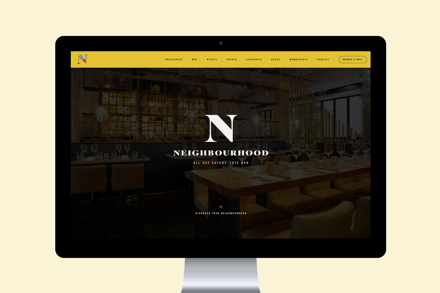
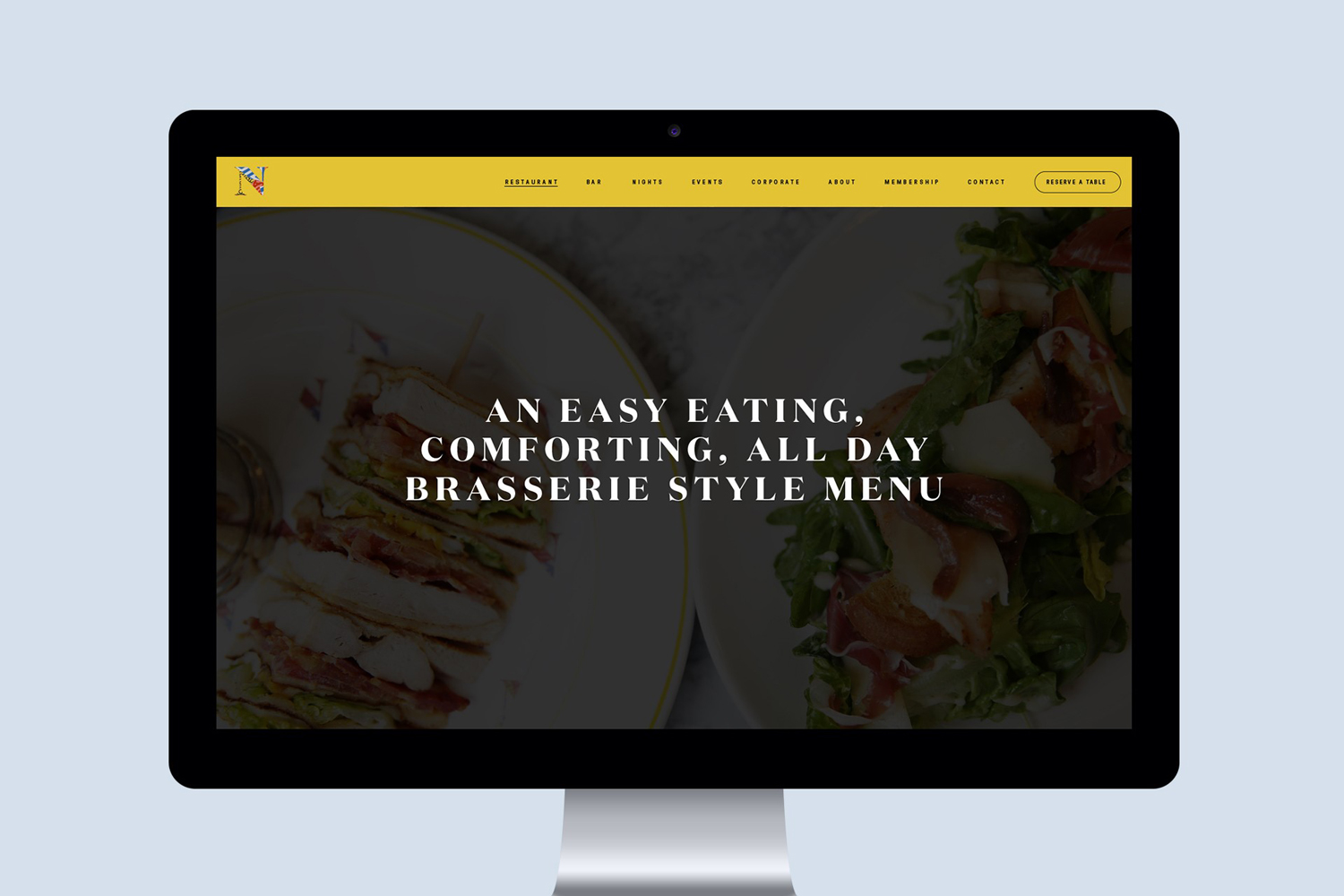
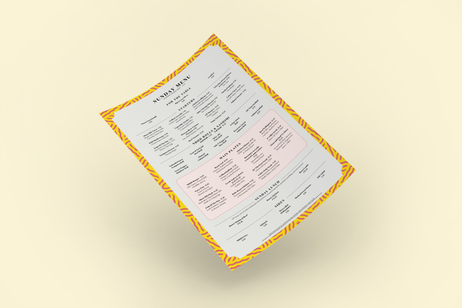
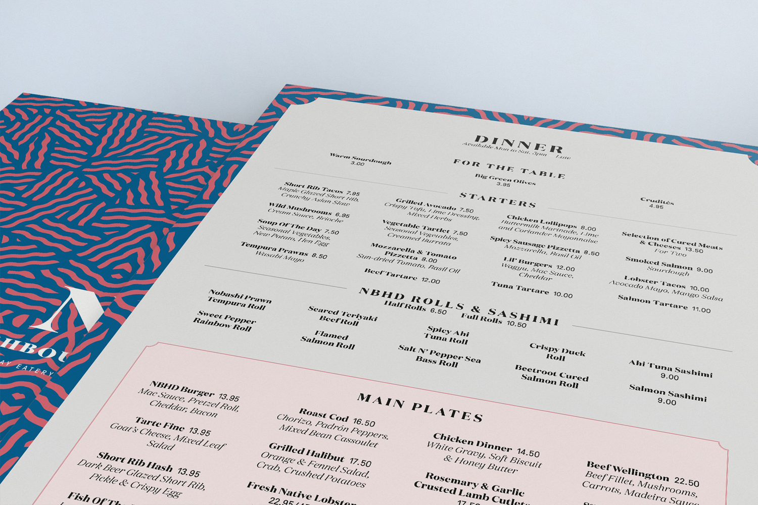
In print the menus are perhaps the most explicitly realised expression of this, and the degree to which Ahoy have managed to balance these two references. Continuity between restaurant experience, brand identity (as it exists in print) and website is to be commended. It could have been chaotic, but for the most part feels well-resolved.
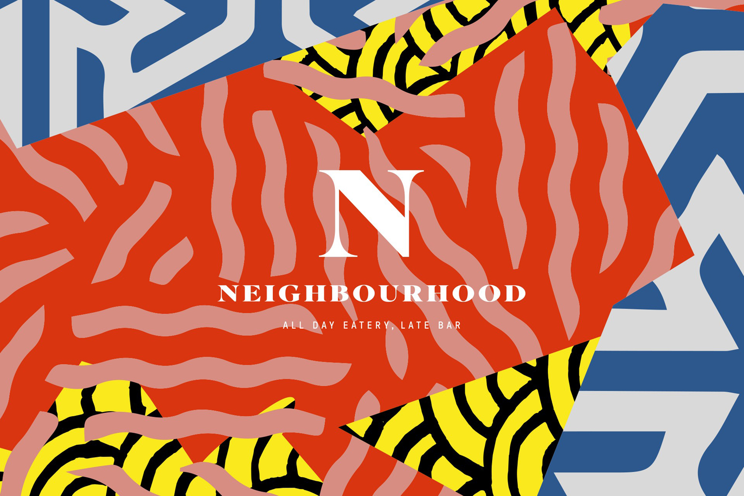
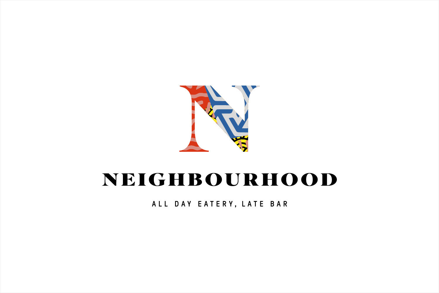
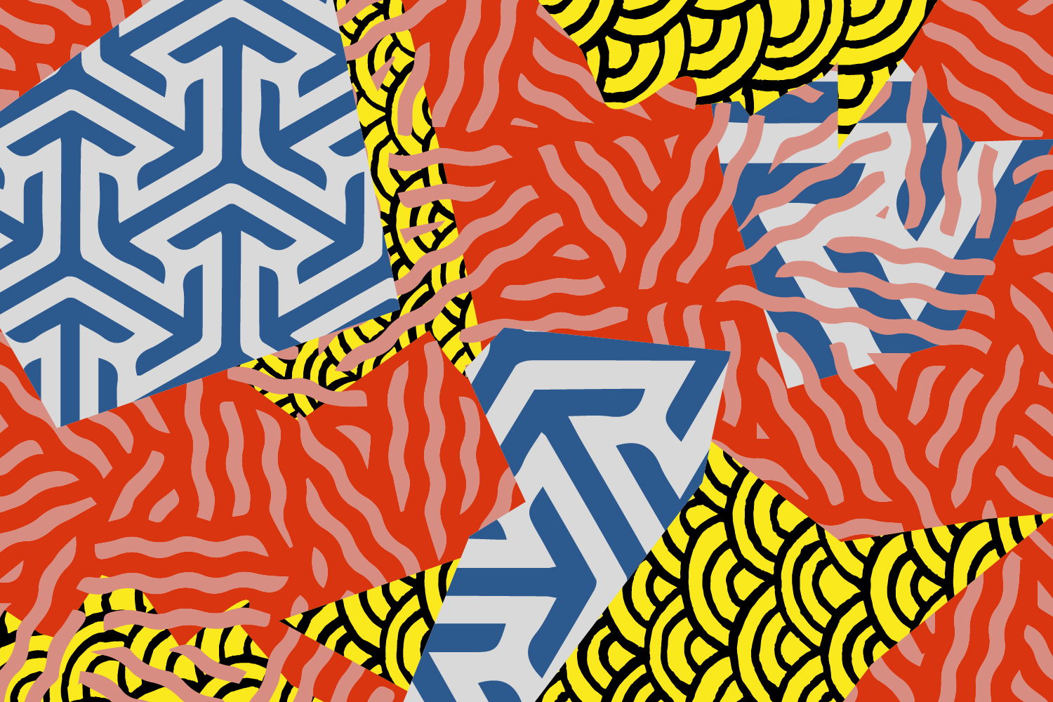
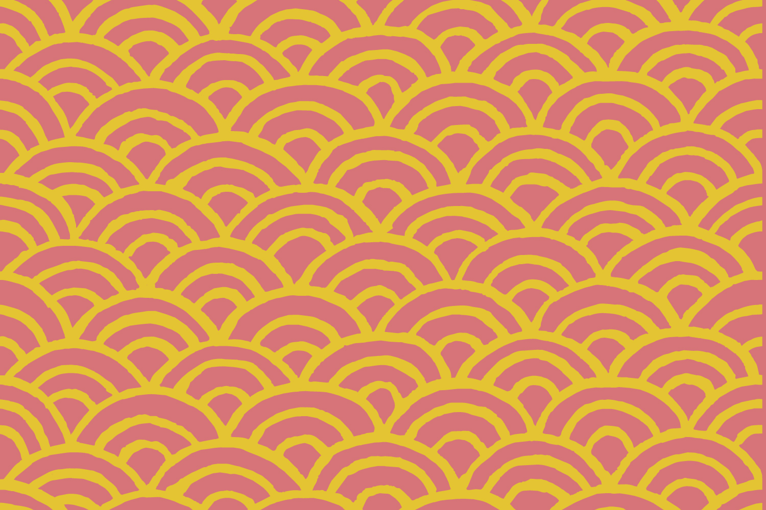
The patterns are eye catching (particularly when cut together), distinctive and referential, familiar yet difficult to place, while Domaine from Klim balances a familiar classical quality with moments of the more unusually characterful, and Grilli Type’s Pressura, a typeface absent flourishes, introduces a more practical and less distracting communicative element.


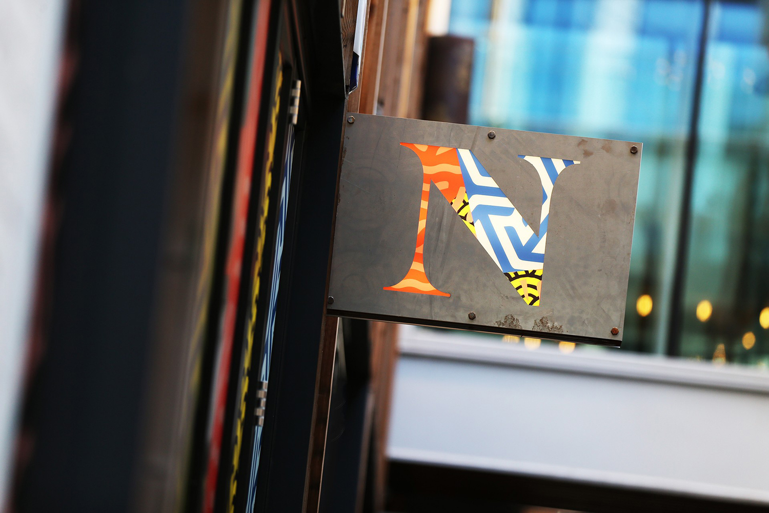
The collision of colour form and type also continues through to signage, which places the ornamental, colourful and energetic patterns within a robust and industrial frame that feels like it is referencing Manchester’s past without overdoing it.

Whether you like the project or not will depend entirely on personal taste and the environments you choose to frequent. Although straightforward it is conceptually and strategically appropriate, functioning as an effective distillation of a visually rich experience. It secures a thoroughly distinctive and impactful aesthetic rooted in the energy and interior of the venue, complimenting it in context and standing out elsewhere, whilst working in a classical element that is reassuring in its association with quality. Do check out the Neighbourhood website, the screenshots below do not really do it justice.
Design: Ahoy. Opinion: Richard Baird. Fonts Used: Domaine & Pressura.
