Hato by Allink
Opinion by Richard Baird Posted 4 July 2016
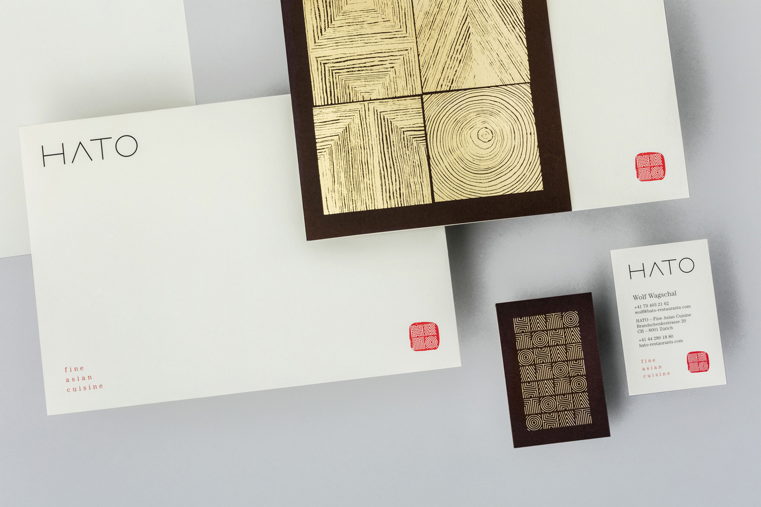
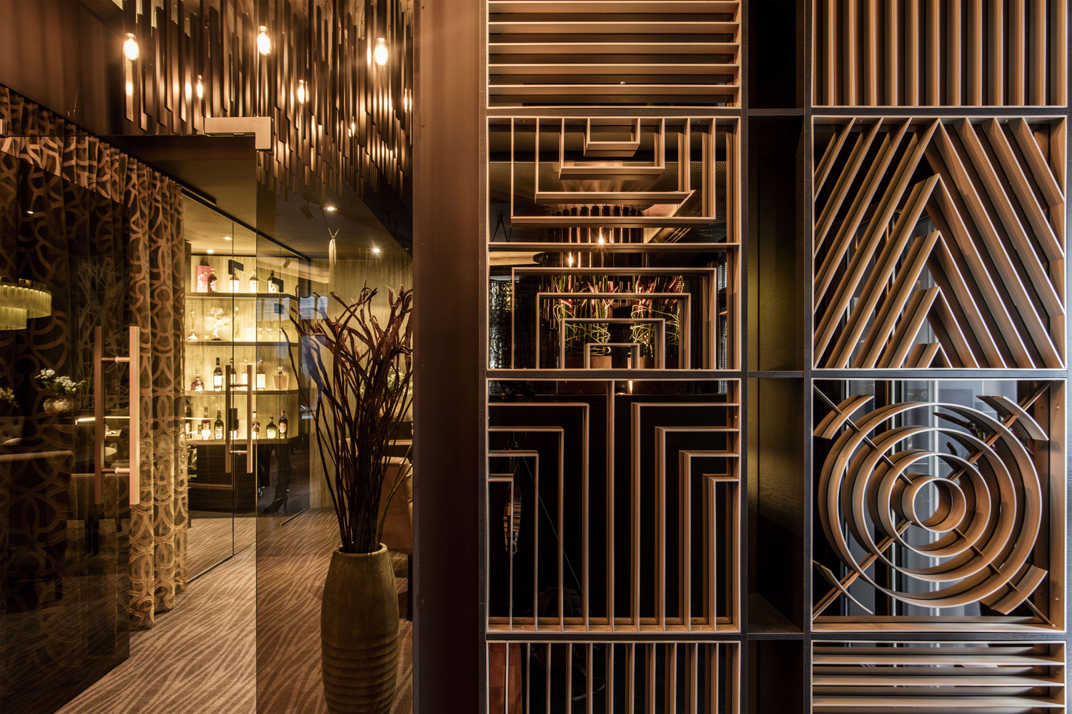
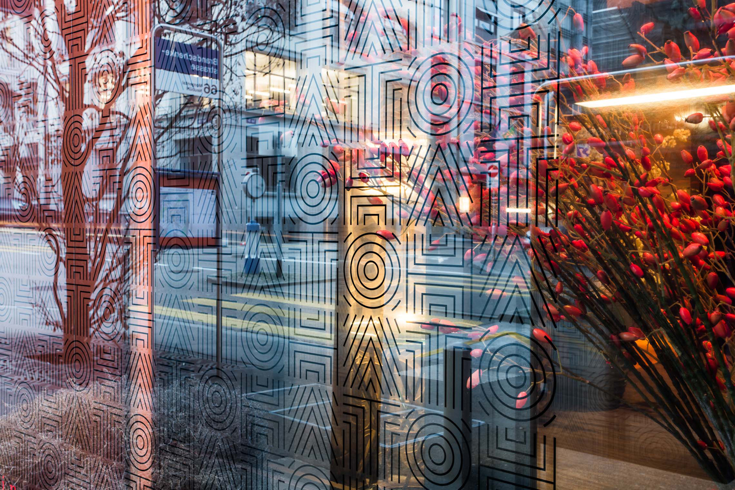
Hato is a fine dining restaurant with locations in Zürich and further south in the resort town of St. Moritz. It has a menu of refined Asian cuisine, a rich interior design and a brand identity, created by Swiss graphic design studio Allink, inspired by the creativity of chef Nathan Dallimore. Allink describe their work for Hato as expressing playful and artistic qualities. This links a variety of printed collateral, which included stationery, menus and business cards, but also permeates interior, with the logo worked into partitions, table surfaces and window decals.
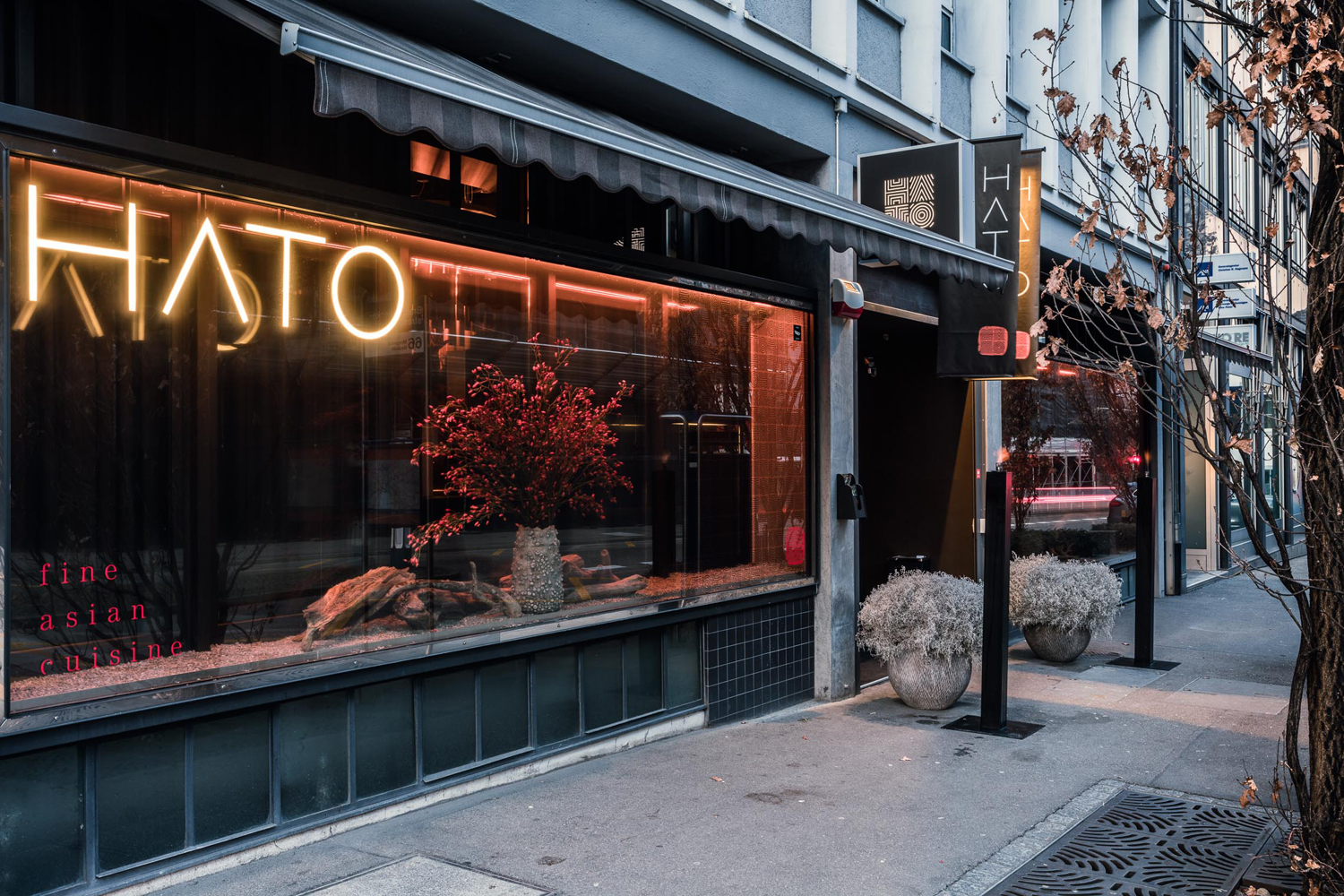
Duality and contrast has been weaved throughout Hato’s brand identity, which does a neat job of bridging the rich detail and ornament of the restaurant and the simpler graphic expressions of printed material. As brand identity exists within the context it is complimentary, and outside, conveys some of the qualities of the restaurant in a visually interesting, impactful and high-quality way.
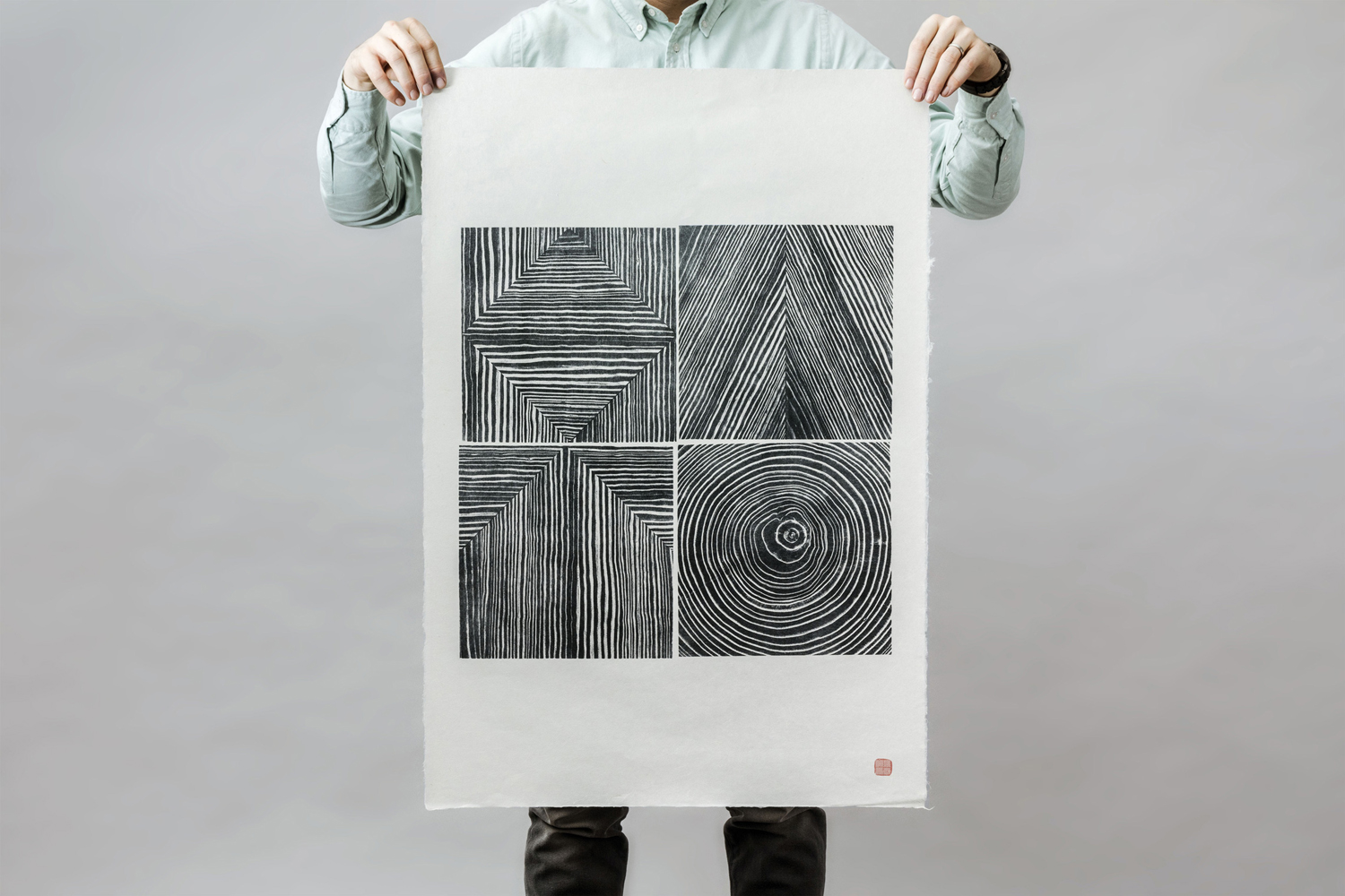
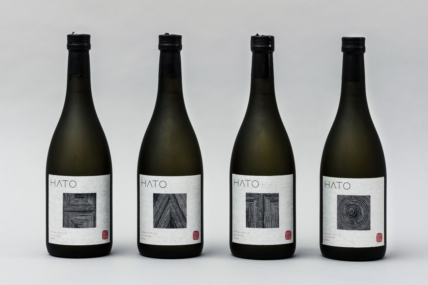
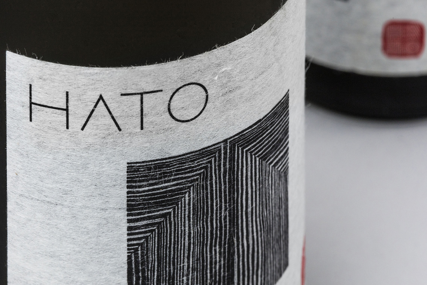
Natural and irregular lines and forms sit next to the monolinear, geometric and concentric, and uncoated material textures are given a glossy gold block foil print finish. These find a comfortable meeting point between the crafted and the sophisticated, and captures the movement from the raw and earthy to the more refined and structured, which is well-suited to a fine dining restaurant. This is explored more explicitly through food imagery and the use of motion online.
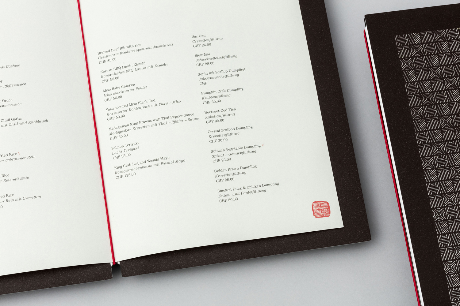
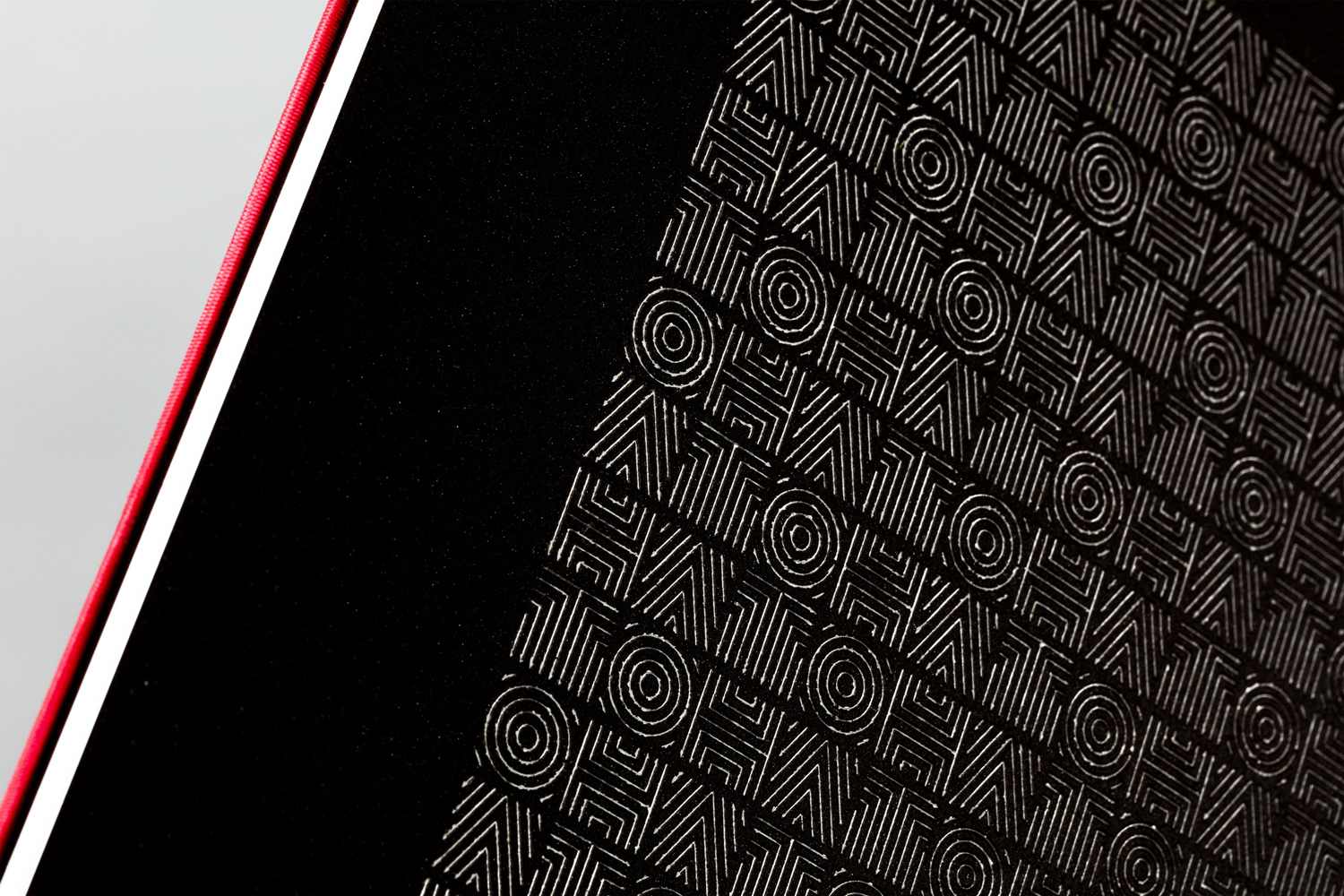
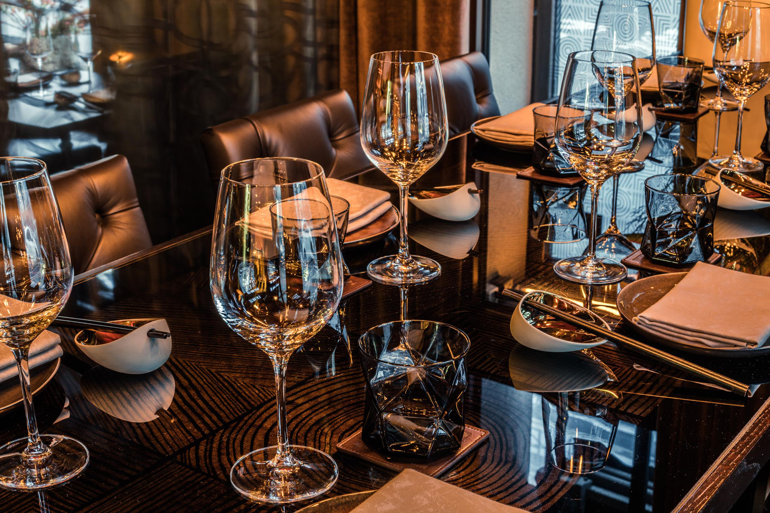
The recurrence of logo is tempered by the variety of its implementation, both in print and throughout interior. This includes adding a structural quality over natural window dressings, the rendering of the logo as concentric lines, much like a Japanese rock garden, but also as a wood texture across menus. Other highlights include the way logo has been built into the partitions of the restaurant and under the surfaces of the tables. It is unusual to see logo appear so regularly in the interior of a fine dining restaurant, but it works.
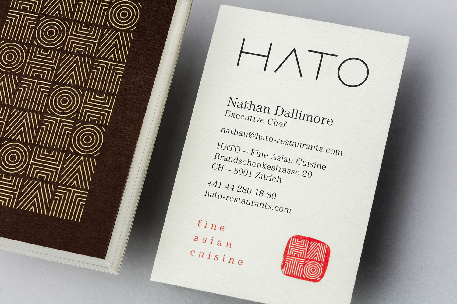
There is a really pleasant balance that exists between the materiality of identity, restaurant interior and the visual texture given to menus and stationery through pattern, and the way that pattern exists somewhere between ancient inscriptions and the more modern.
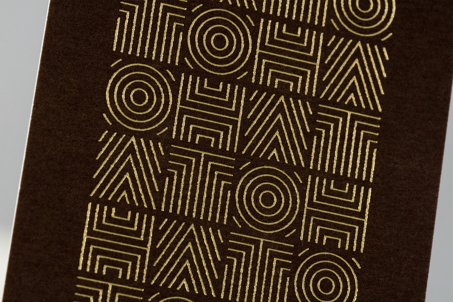
Type choices continues to play with duality, and functions as an expression of Hato’s interior, and the use of modern and classical cooking techniques. The combination is not particularly unusual or communicatively unexpected, however, serif flourish and a contemporary sans-serif reduction feels well-intentioned and clearly referential. This also goes for a colour palette which mixes an earthy brown with the perceived luxury of a gold foil and the red associated with the far east.
Design: Allink. Opinion: Richard Baird.

