The International by Studio South
Opinion by Richard Baird Posted 5 August 2016

The International is a new apartment complex, located not far from Auckland’s Albert Park, with 88 luxury residencies. The building, a repurposed former office, is currently being transformed into an iconic structure with a contemporary exoskeleton of elongated beams. To promote the building and help sell apartments off-plan, the graphic designers at Studio South worked with the developer behind The International to create a holistic brand identity and marketing package.
Alongside a variety of printed assets, which included brochures, stationery, business cards, event invitations and floorplans, Studio South were also involved in the spatial design of an apartment showroom, informed by the earthy tones of Rufus Knight’s interior design and taking their cues from luxury brands. This post features some extensive specification insight so be sure to scroll down to the bottom of the article.
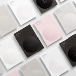
Studio South delivered a brand identity that aligns itself with the high-end minimalism of luxury brands; well-suited to a target market of high-wealth, premium buyers, whilst also working in an strong architectural and property development component. This comes through in the use of simple, strong, vertical forms, an abundance of space, grid-based layouts and the perceived value of tactile material choices and print finishes.


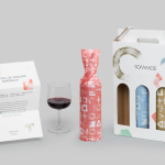
The logo’s slim shape and the logotype’s tall structural qualities, appearing to draw on the unique exoskeleton of the building, is sophisticated in its restraint yet memorable in its use. Studio South have managed to get quite a lot of visual equity from a very simple mark. Its diversity and creativity of use gives the generic quality of its form distinction. There are some neat ideas. These include the logo drawn out through the threading of ribbon across the invitations, the clock faces, elongated iconography and the labelling of event wine bottles.


As you would expect from a contemporary and luxury apartment complex, a minimal graphic expression is paired with strong material component in the choice of boards, fabrics, print finishes and construction. It is great to see a graphic design studio exercise its interior design abilities, and develop a continuity between showroom, brochures and other printed materials and graphic assets. The balance between geometric exterior structure and high quality finishes of its interior design are reflected throughout Studio South’s brand identity work. Highlights include the embossed fabric sleeves and covers of the brochures, and the strong linear cut qualities of natural materials.


Brochure layouts are simple and spacious, with a strong grid-based layout and a good tension between image and text. There is not anything particularly challenging in these, however, property is easily read as contemporary. A full bleed metallic copper ink functions to break up sections with a luxury quality, while the use of orientation subtly links back to the tall and slender forms of logo and logotype. More from South on BP&O.
Design: Studio South. Opinion: Richard Baird.


Material & Print Specifications:
Sales Brochure 80pp:
Cover: Matte silver foil on Arjowiggins Keaykolour Recycled Hazel & Camel 300gsm
Text: PMS 877U, hazel/camel spot & CMYK on Sappi Tauro Offset 150gsm
Introductory Brochure 16pp:
Cover: Matte silver foil on Arjowiggins Keaykolour Recycled Hazel 300gsm
Text: PMS 877U, hazel/camel spot & CMYK on Sappi Tauro Offset 150gsm
Brochure Cases:
Debossed 2.5mm board wrapped in Brillianta 4192, (matched to Keaykolour Camel)
Folder:
Matte silver foil & PMS 877U on Arjowiggins Keaykolour Recycled Hazel 300gsm
Floorpans:
PMS 877U, hazel/camel spot & CMYK on Sappi Tauro Offset 150gsm
Stationery:
Letterhead: PMS 877U on Sappi Tauro Offset 120gsm
Business Card: Matte silver foil & PMS 877U on duplexed Sappi Tauro Offset 190gsm
Invite:
Cover: Diecut and silver silk ribbon on Colourplan Ebony Black 270gsm
Text: Black on Sappi Tauro Offset 150gsm
Display Boxes:
Debossed 2.5mm board wrapped in Colourplan Ebony Black 135gsm
A3 Sales Book:
Cover: Debossed 2.5mm board wrapped in Brillianta 4192, (matched to Keaykolour Camel)
Text: CMYK digital on matte laminated Sappi Tauro Offset 170gsm