Designed by Studio South
Old Elephant House by Studio South
Old Elephant House is a new brasserie and courtyard bar in the former elephant enclosure at Auckland Zoo. It offers an à la carte menu and set three-course meals made up of light and elegant dishes. It is a building that is distinct in its proportions and location, with tall doors and windows from which to hear the distant calling siamang...
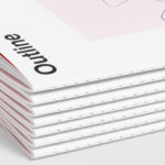
Outline by Studio South
Outline is a six lot freehold property development opportunity from Fearon Hay Architects located on Kings Road on the border of Mount Eden and Mount Roskill in a culturally and historically rich neighbourhood in Auckland. Each lot is 95m2 with the capacity to build four levels and include a roof living space totalling 300m2 of floor area. Studio South worked with Fearon Hay...
The Conference Company by Studio South
The Conference Company (TCC) specialises in the design, organisation and execution of large-scale conferences throughout New Zealand and Australia. They also apply this expertise to award ceremonies under the trading name The Awards Company. It is a strategically interesting delineation yet a straightforward naming practice. Expressing what either company does was clearly not an issue, however, in a fast moving...

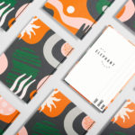
GoGo Daddy by Studio South & Egle Zvirblyte
New Zealand based Studio South worked with Lithuanian illustrator Egle Zvirblyte to build a graphic identity up of colourful characters for Mark Wallbank and Che Barrington’s new Thai canteen Gogo Daddy which is located in Ponsonby Central, Auckland. GoGo Daddy’s menu is inspired by Mark and Che’s extensive travels, and is a take on the rustic Thai street food they experienced throughout Thailand;...
Edition by South
Edition is a new property development by LEP Construction. It will be located in Parnell, a suburb of Auckland, New Zealand, and made up of 18 luxury apartments designed by architects Monk Mackenzie with a eye for flexible space and changing natural light. Edition will make the most of a sloping site, feature three levels cantilevered above ground and create what are described as...
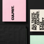
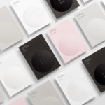
Culprit by Studio South
Culprit is a bar and restaurant located on Auckland’s Wyndham Street. It has a menu made from ingredients supplied by local New Zealand producers, growers and farmers, and is inspired founder’s Kyle Street & Jordan MacDonald’s travels across the United States and Europe. Culprit has a modern interior design in a converted loft space created by Kirsty Mitchell. This is characterised by large exposed beams and brick...
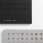
Verso Architecture+Interiors by Studio South
Verso is a small Auckland-based architecture and interiors business working within the residential and commercial sectors. Drawing on the oppositional nature of name and using a mix of simple typographical form, high-quality materials and print finish Studio South developed a new visual identity for Verso that is described as being both sophisticated and playful, whilst effectively working in some universal architectural principles. This links a variety of printed...
Meg’s Tailoring by Studio South
Meg’s is a tailoring service, established by Megan Kenny, that began as a single store on Garfield Street in 1995. Meg’s now has two locations in Auckland, New Zealand, provides a broad range of services; from hems to full garment design, and works on large projects with high-end designers and labels such as Hugo Boss, Prada and Gucci, and on smaller jobs from High Street drop-ins....
The International by Studio South
The International is a new apartment complex, located not far from Auckland’s Albert Park, with 88 luxury residencies. The building, a repurposed former office, is currently being transformed into an iconic structure with a contemporary exoskeleton of elongated beams. To promote the building and help sell apartments off-plan, the graphic designers at Studio South worked with the developer behind The International...
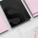
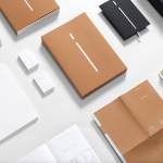
Studio South by Studio South
Studio South, formerly APLUS, is graphic design studio working within the fields of brand identity and packaging from their office in the city of Auckland, New Zealand. In conjunction with a new name and site launch, which coincides with the expansion of studio space, South have also developed a new visual identity treatment. This extends across business cards, folders and headed paper, a...