Francina Models by Mucho
Opinion by Richard Baird Posted 6 September 2016

Francina Models is a Barcelona-based fashion agency, led by Mireia Verdú, with over 30 years of experience. It was the first modeling agency in Spain to offer an acting and training academy and, over recent years, has began to diversify, committing itself to the discovery of new talent and the representation of a variety of fashion profiles and international models. With a desire to express this diversification, its 30 year legacy and a well-respected position within the industry, Francina Models approached graphic design studio Mucho to develop a new visual identity system that would reach across model and business cards, stationery, signage and online presence.

Mucho’s work for Francina Models appears as a fairly clear articulation of the agency’s commitment to new talent, prestige and legacy, as expressed by the energy and youthful qualities of brush stroke, spray paint and torn paper that intersect a classical typographical choice. Each variation on the logo is largely well-resolved with a pleasant sense of space and proportion, colour and form contrast.
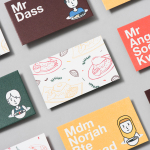
Where often you would expect an economy of expression from a fashion-related business, here, there are plenty of flourishes, with the different stroke styles of the F punctuating the pages of the model cards, stationery, signage and website.

There is a well-intentioned visual language to the work, with colour, texture and stroke style calling out different departments, the characteristics of each, and also functioning within a variety of contexts, be that in print, on social media or across the agency’s website, to differentiate.
Although grounded by concept and functionality, aesthetically, the changes in logo and the ornament of print provide variety whilst remaining cohesive. Occasionally these strokes and their placement on page and screen can feel a bit intrusive, particularly if you have a small screen when viewing the Francina Models website.
Other appropriate details include the contrast serif and sans-serif type, which continues to play with legacy and modernity, a stacked approach to layout which mirrors the form of the F, the use of proportion; one that favours the expressive nature of the logo, and the juxtaposition of uniformity and the more spontaneous, which lends the work it a sense of adaptability.

Although much of this works to build up personality, it also acknowledges some basic and useful conventions. Large model shots, heavy white boarders and plenty of unused space are all familiar yet necessary tools to call out the diversity of the agency’s roster.


Essentially, Francina Models’ brand identity system is built around a small visual gesture that lends classical type a modern, youthful and proprietary quality. This is thoughtfully underpinned by a useful, distinctive and expressive system, grounded in communicative intention with a creative and lively side that diverges from the often austere approach within the industry. More from Mucho on BP&O.
Design: Mucho. Opinion: Richard Baird.