Mathias Dahlgren Edition by Essen International, Sweden
| Author: Richard Baird | Filed under: Food and Drink, Packaging Reviews | Tags: Best Packaging Designs, Creative Packaging, Design For Print, Design Opinion, Design Reviews, Designed by Essen International, Fonts in Use: Maax, From Scandinavia, Graphic Design, Graphic Design Blog, Logotypes, Minimal Design, Minimal Logos, Minimal Package Design, Minimalist Brand Identities, Packaging Company, Packaging Design, Packaging Design Blog, Packaging Design Resource, Packaging News, Sans-serif Logotypes, Sans-serif Typography, Silver Ink, Smile In The Mind, Swedish Design, The Best Packaging of 2016, The Very Best of 2016, Typography, Uncoated Papers & Cards |Opinion by Richard Baird
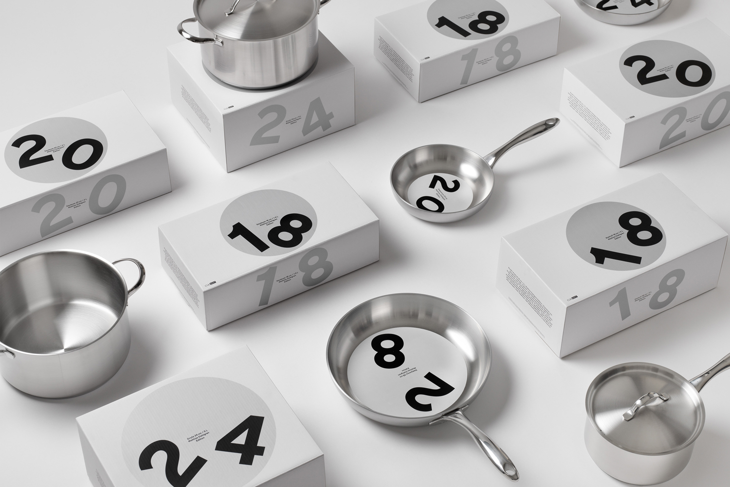
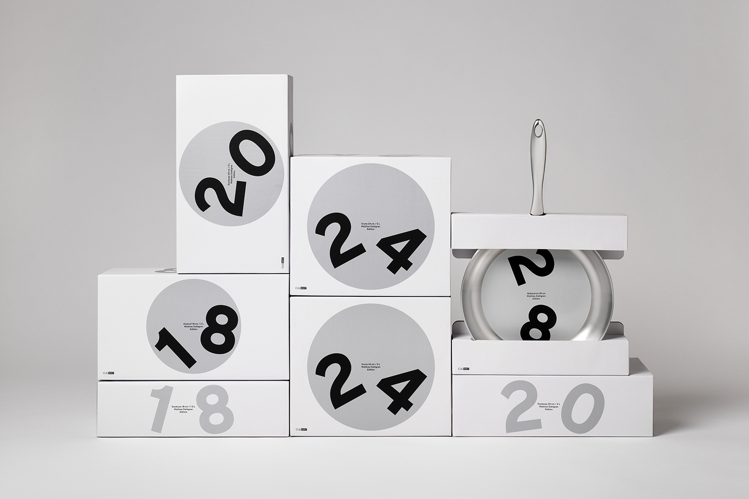
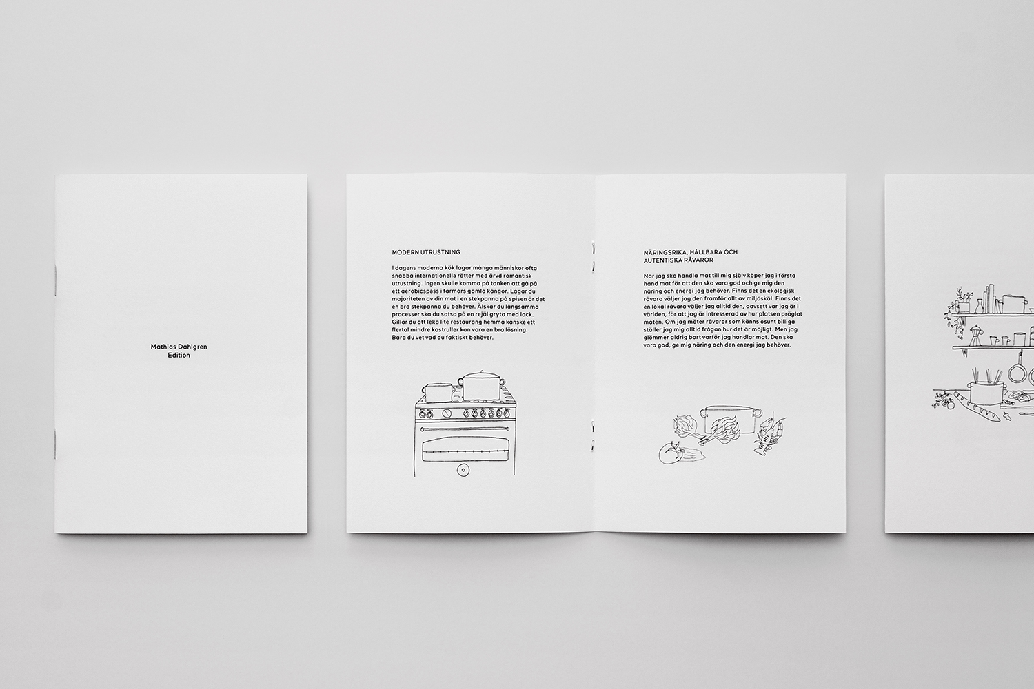
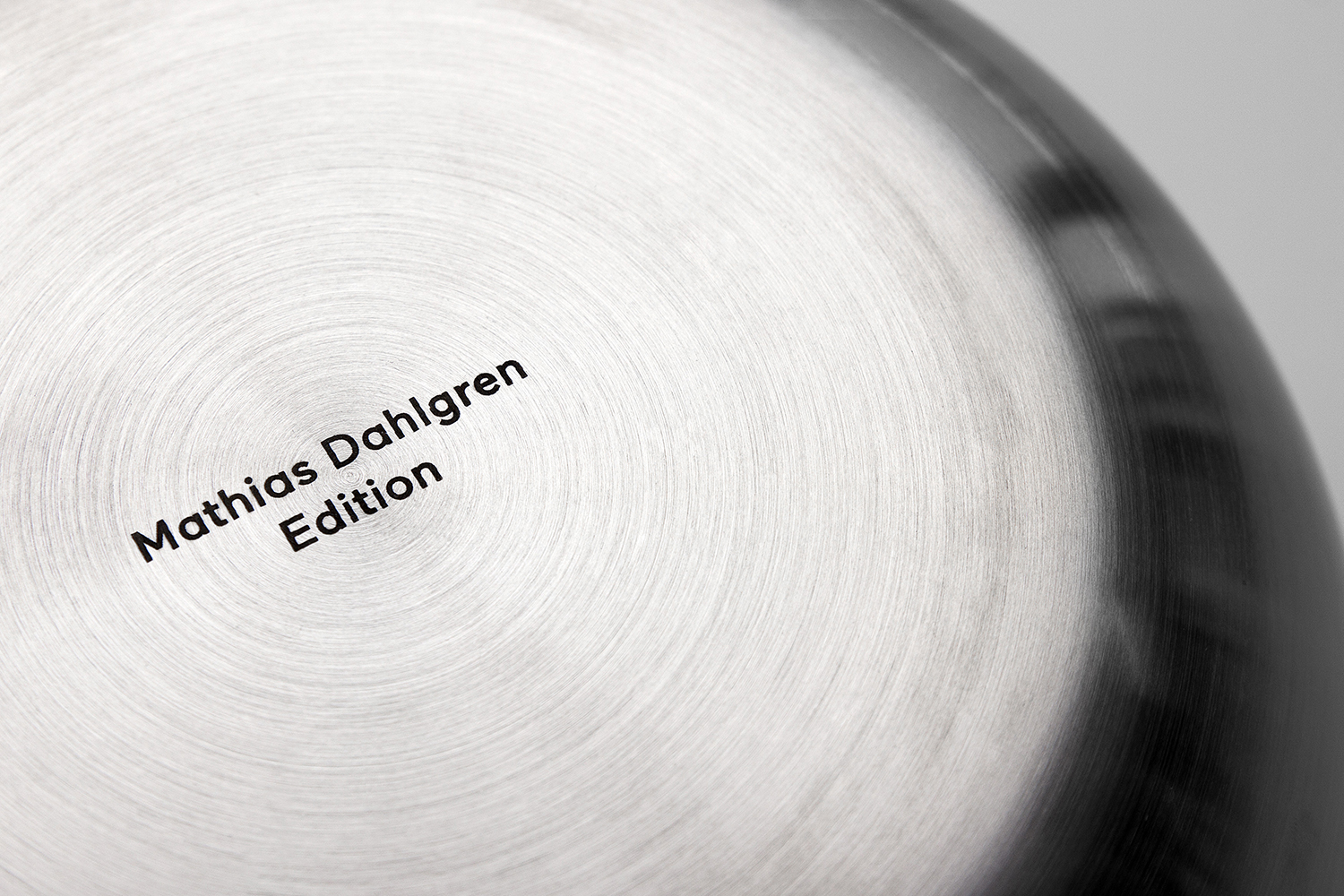
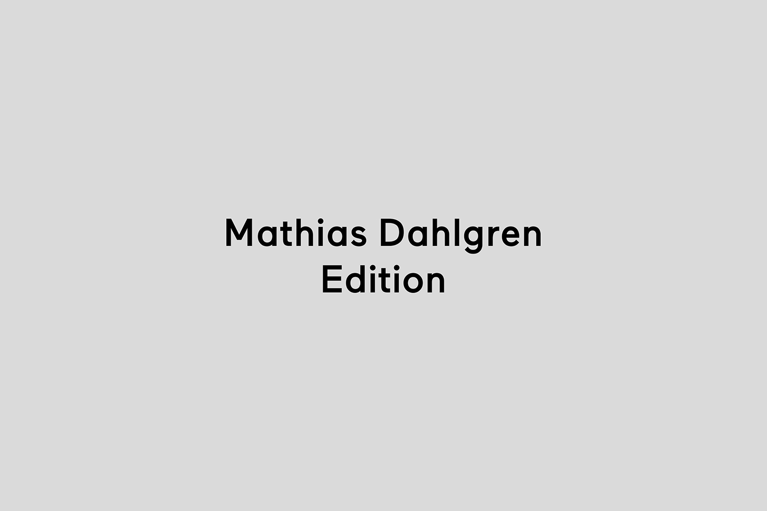
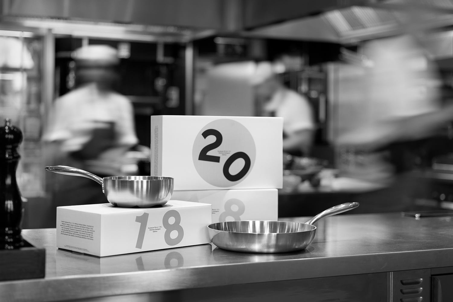
Mathias Dahlgren Edition is a set of contemporary kitchen appliances which are the product of a collaboration between the Grand Hôtel Stockholm, its renowned Swedish Michelin starred chef Mathias Dahlgren, and kitchenware retailer Dafra. Scandinavian graphic design studio Essen International worked with the trio to translate the culinary vision and creativity of Mathias Dahlgren into a modern graphic expression and packaging solution that would be perceived as creative and timeless, whilst working across a variety of boxes as well as pan and pot inserts.
Essen International use of simple forms and the robust sans-serif characters of Maax, implemented with a quirky, off-kilter and tossed food quality, work together something of the reliability and kitchen utility expected of contemporary cookware and a nod to the creativity of chef Mathias Dahlgren. There is a smart play between form and proportion, a metallic silver spot colour and white space that quickly calls to mind the surface and size of the pans, while type blurs the line between practical information (pan size) and a playful, immediate and distinctive visual gesture.
Design: Essen International. Opinion: Richard Baird. Fonts Used: Maax.
If you liked this then you may also like:

Support BP&O
Thank you to everyone who has visited BP&O since its beginning in 2011. As many of you know, BP&O has always been a free-to-access design blog that seeks to offer extended opinion on brand identity work. It has sought to be the antithesis of the social media platform that often disentangles form, context and content. Writing articles can take 2-4hrs and are carefully researched.
I am passionate about design writing and believe that spending time to write about work, rather than just posting images, furthers design discourse. If you have enjoyed this article, have been with the site from its early days and would like to help contribute to its future, please consider supporting the site with a small PayPal donation. This will go towards the costs of hosting, CDN (to make the site quick to load) and Mailchimp, and cover some of the time it takes to research, write-up, format and share posts.