Primary by DIA
Opinion by Richard Baird Posted 14 September 2016

Primary is a new co-working space in New York that introduces health and wellness into the workplace. This can be seen in the approach to interior design; a mix of wood, contemporary soft furnishings and greenery, experienced in the fusion of office space, business events and relaxation classes, and expressed throughout Primary’s brand identity, created by graphic design studio DIA.
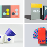
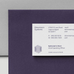
DIA were tasked with establishing a sophisticated and approachable system that would appeal to a health conscious and savvy entrepreneurial audience. This is achieved in the simplicity of form, both in type and mark, a generative component that adds a breadth of colour, and the way that this then reaches across lighting, signage, website, scheduling tool, social media, business cards and brochure.
Space, strategy and brand identity are described as being informed by one another, with DIA collaborating with Primary prior to a location being settled on, and it shows.
Where environment is fixed; a lovely blend of neutrality and the natural, soft furnishings, machined fixtures and greenery, all of which are thoroughly contemporary and calming, brand identity is dynamic, colourful and expressive, not only in its range and gradation of colour but also in its implementation as illuminated signage, the lighting control and moodsetting of individual spaces, digital and print-based assets.


DIA manage to draw distinction and usefulness from a simple and generic form using colour and its associated psychological influence, its relationship with activities; the calmness of meditation or the heat of a Bikram yoga class, and the extent to which this is then applied; shaping the mood of a room or as an expression of the time of day. As a less urgent alternative to traditional clocks, particularly within the context of wellness and working, this is a particular highlight.


Breadth of colour not only serves to identify and distinguish Primary, where others might settle on one, two or three, but also functions as a tool to involve employees; conveying a little of their temperament or character through “personal spheres”, to divide and visually characterise some of the activities available within the space, and has a broad and expressive quality whilst remaining cohesive. Plenty of white space serves to enhance this intention both in print and online.

The shaping of mood through lighting, the design of the scheduling tool and the app that generates logos, and the use of modern printing technologies that allow for lots of variation, alongside an overall restraint, lives up to the desire for a sophisticated yet approachable identity, and establishes a smart relationship between distinctive visual expression and some useful tools rooted in the unique concept of Primary.

While colour adds contrast there is a continuity in the simplicity of the logo, the structure of layouts, the lightness of type, and the forms that populate interior. There are moments that appear almost clinical like wayfinding, have the softness of a spa environment in the use of shape, colour and colour transition, or lean more towards the corporate through type and typesetting. These feel subtle, balanced and well-suited to a space where wellness, health and work intersect.


Where there is often a favour for establishing corporate colour, diversity and variation wins out, however, there are perhaps areas where difference may not be pronounced enough to be as efficient as a solid colour, particularly in the scheduling of events and classes.
The way transitions between colour have been managed within the app generates a pleasant mix of abrupt and gradual changes, with some appearing flat and solid while others have a depth and fluidity. Both in print and in motion, these transitions contribute as much to mood as their colour.

It is an ambitious project with a visual simplicity hiding a thoughtful, creative and extensive system that appears distinctive, makes the most of new technologies, and spans familiar brand identity assets, environmental control and online presence, all clearly grounded in the concept of Primary. Aesthetically, it is neat and unusual to see colour dominate form language, although that does have its place, and gradients used in a smart and compelling way. More from DIA on BP&O.
Design: DIA. Opinion: Richard Baird. Fonts Used: Plain.