Casa Bonay by Mucho
Opinion by Richard Baird Posted 5 October 2016

Casa Bonay is a unique hotel destination in the neighbourhood of Eixample Dret, Barcelona, housed within a historic nineteenth century building with a neo-classical façade. Although the setting has a strong historical value, inside and out, the hotel experience makes a connection with the creative talent that populates the city today. This is achieved through collaboration with pioneering chefs, young designers, renowned furniture brands and an independent publisher to create menus, interiors and books.
Casa Boney’s brand identity, created by graphic design studio Mucho, is a visual articulation of the hotel’s free-spirited attitude and the coexistence of disparate personalities and styles. Where the hotel’s interior features classical masonry, period furnishings and darker hues alongside areas of modern restraint, utility and light, Mucho’s brand identity is colourful, eccentric and playful. This reaches across coasters, packaging and a variety of other printed materials.

It is worth checking out Casa Bonay’s interior design to really get a sense of the extent to which Mucho’s brand identity work introduces contrast and attitude. Where often hotel’s look to reassure through a continuity of identity and experience, here, graphic design introduces a very different and unexpected layer to what is already an interesting mix of interior detail.


Mucho placed value on expressing attitude over a more formal approach, although there is a clear and consistent system at play. This attitude manifests itself through the juxtaposition of image built from collections said to speak of the “irony of the city” with the intention of establishing a sense of humour while, much like the hotel itself, avoiding tourist clichés. The dual and disparate nature of collage are effectively enhanced and emphasised through colour.

The tinting and arrangement of different images feels familiar and likely to be divisive, but gain a lot from the context of the hotel, itself underpinned by juxtaposition but with more restraint.
The meeting of disparate image is pronounced, helped by some lovely colour combinations. Photography is converted to single colour effectively, collages are well-composed and white space is used to temper, on occasion, what is busy.
The rocky is set alongside the fleshy, the serious next to the humorous, the historical superimposed over the contemporary. Much of this looks like it could be deciphered, a second meaning hidden beneath a loud visual style, but for the most part these function to build in a convivial and whimsical tone grounded in the concept of coexisting personalities and styles.

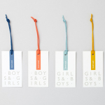
There is a variety of assets, each with its own visual quality, but bound a consistent contrast of image and colour. Highlights include the coasters, the fabric covers of books, and the tone of voice across door hangers.

The juxtaposition and disparate quality of image, and the contrast of colour continues in the choice of Grouch, an adaptation of turn-of-the-century Caslon, and Brown, a very current monolinear sans-serif. Their obvious aesthetic difference, reference points and unmistakable duality manage to make a connection between interior (classical flourish and modern utility) and the attitude that proliferates brand identity. More from Mucho on BP&O.
Design: Mucho. Opinion: Richard Baird. Fonts Used: ITC Grouch & Brown.