DOIY by Folch
Opinion by Richard Baird Posted 7 November 2016
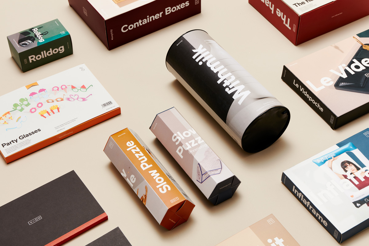
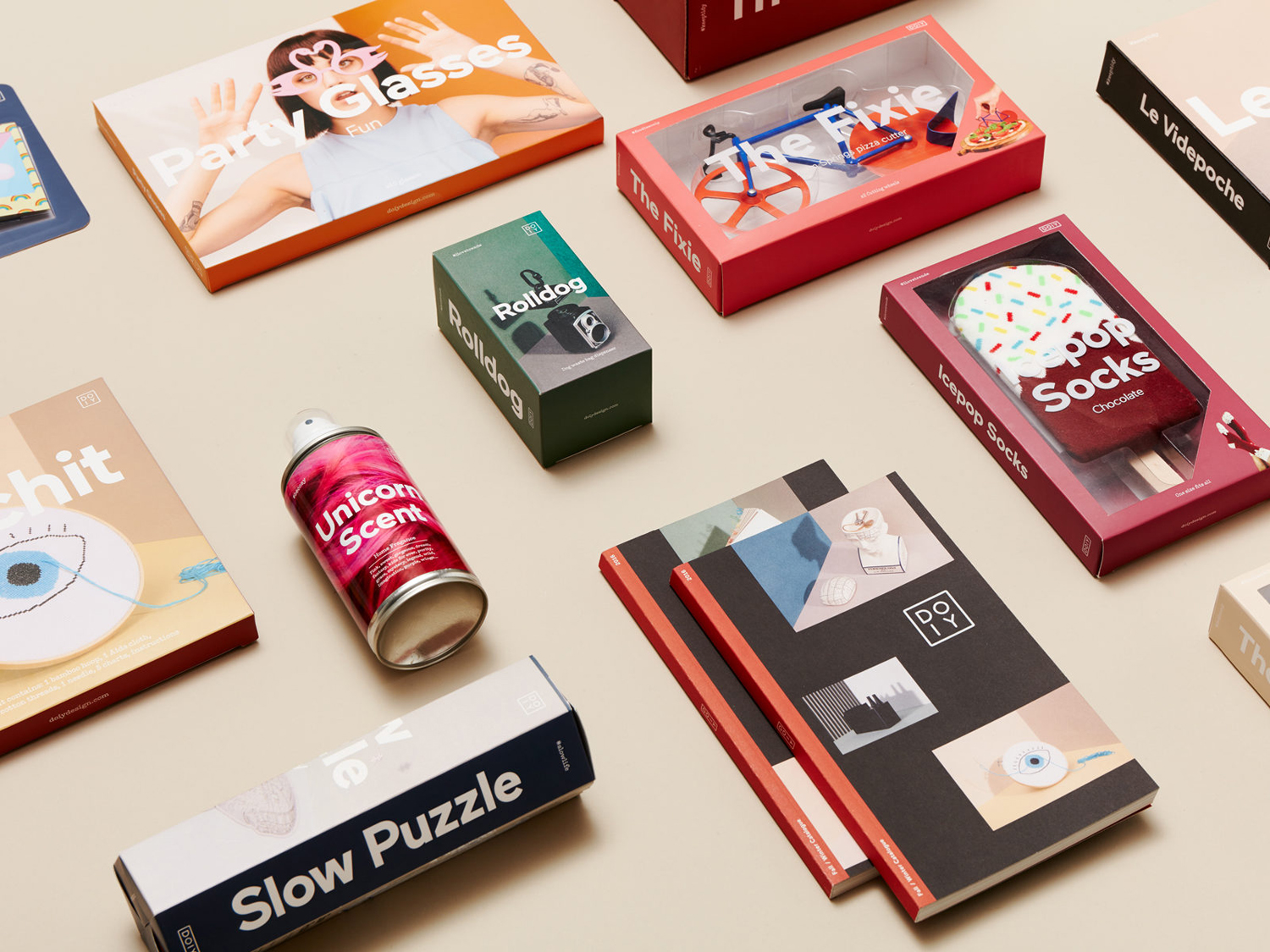
DOIY is product design company creating playful objects that move between the useful and the more whimsical. These include items such as icepop socks, bicycle pizza slicer and unicorn scent. Much of this is firmly tongue-in-cheek but good quality, retailing in high-end and design-focused stores as well as larger chains.
With the introduction of materials such as ceramics, woods, metal and porcelain across its new ranges, and a desire to reach a wider market whilst retaining its current customers DOIY worked with Barcelona-based studio Folch to mature its brand identity. This included packaging and print communication that share a new and distinctive approach to photography; a collaboration between Folch, paper and set designer Raya Sader Bujana and photographer Leo García Mendez.
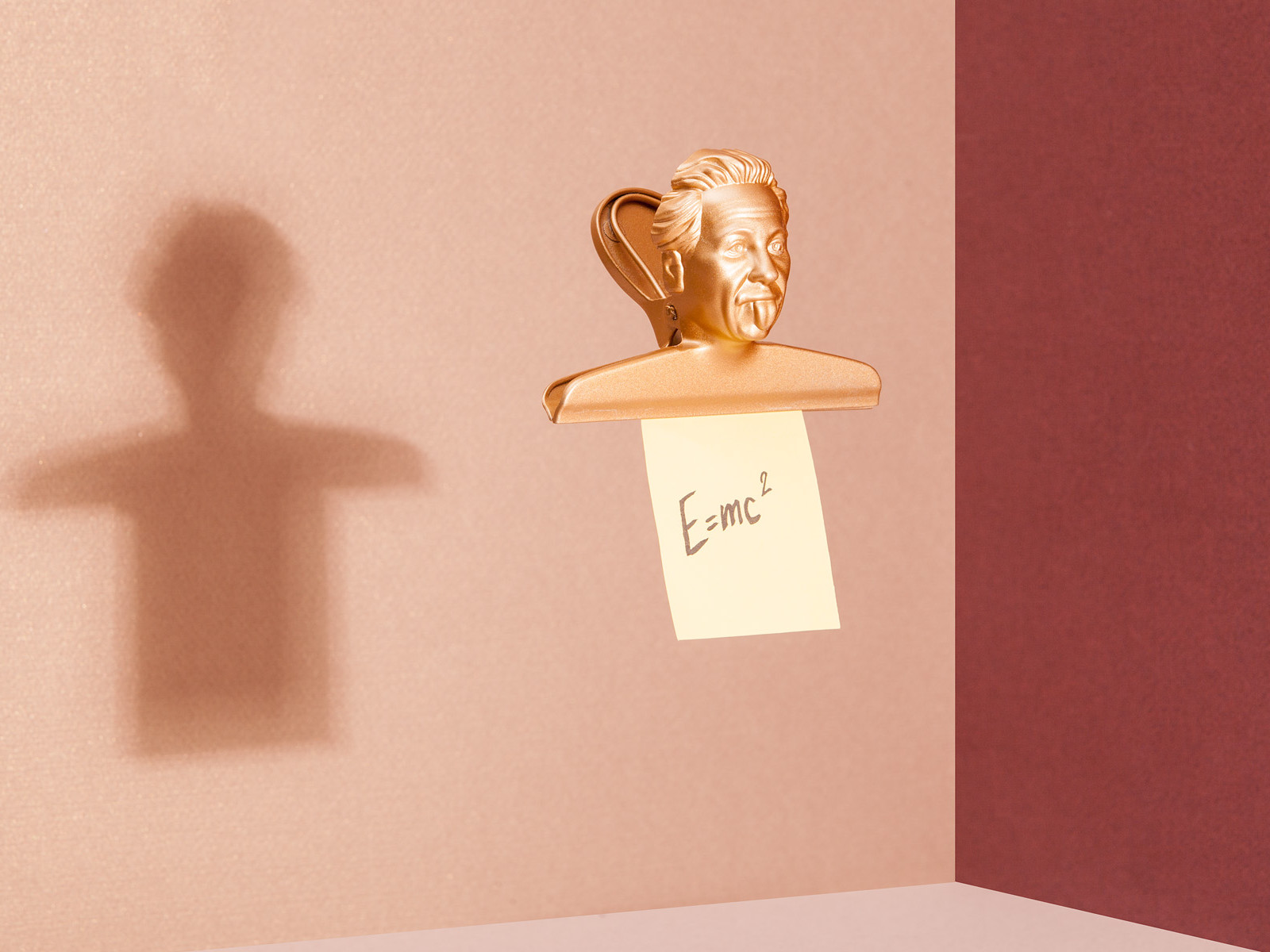
The prevalence, affordability and reach of social media, as well as the metrics these platforms afford businesses over traditional advertising channels, is shaping the composition and colour of product images. This can been seen here in Folch’s work for DOIY but also in Collins’ packaging for Room Essentials.
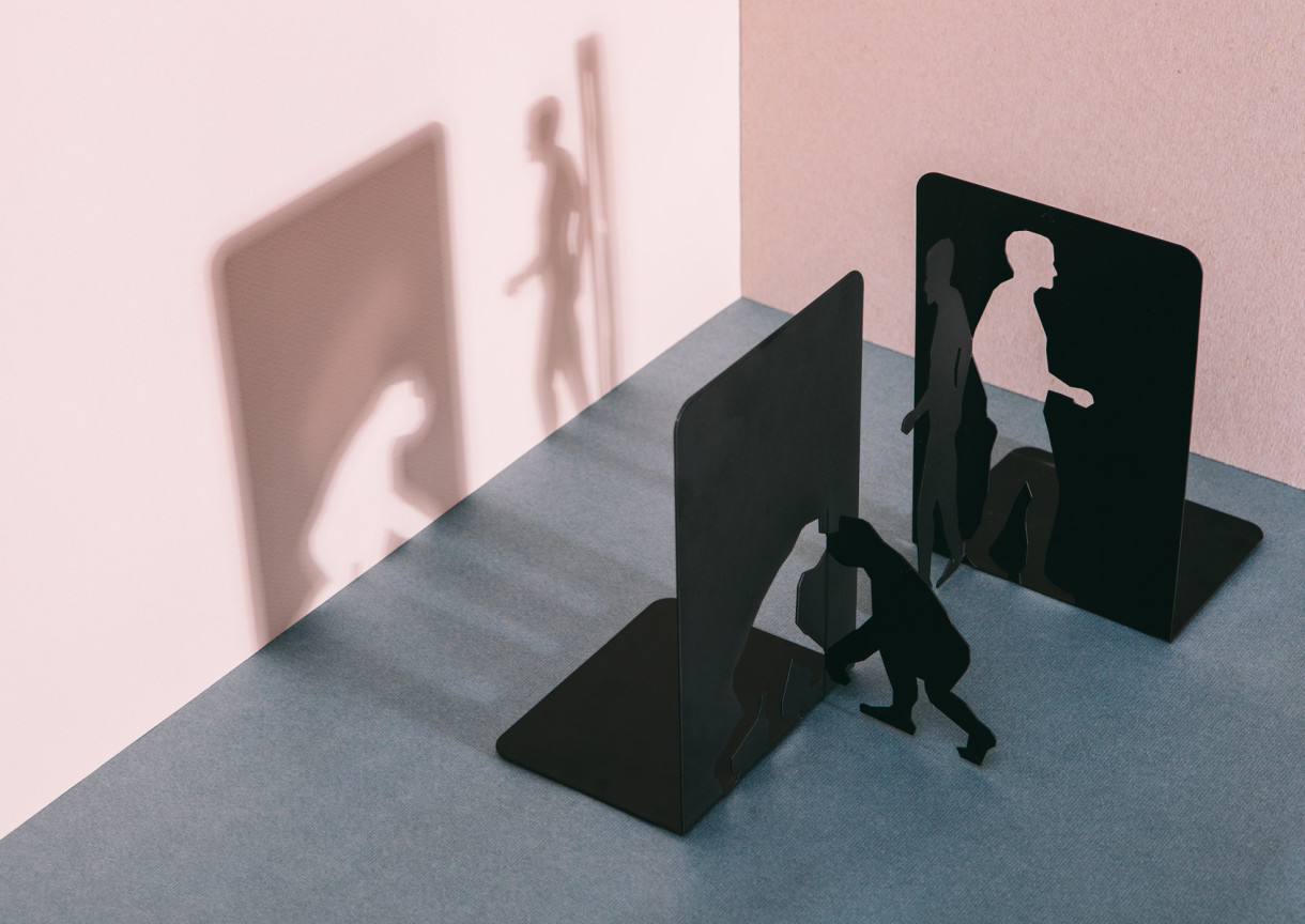
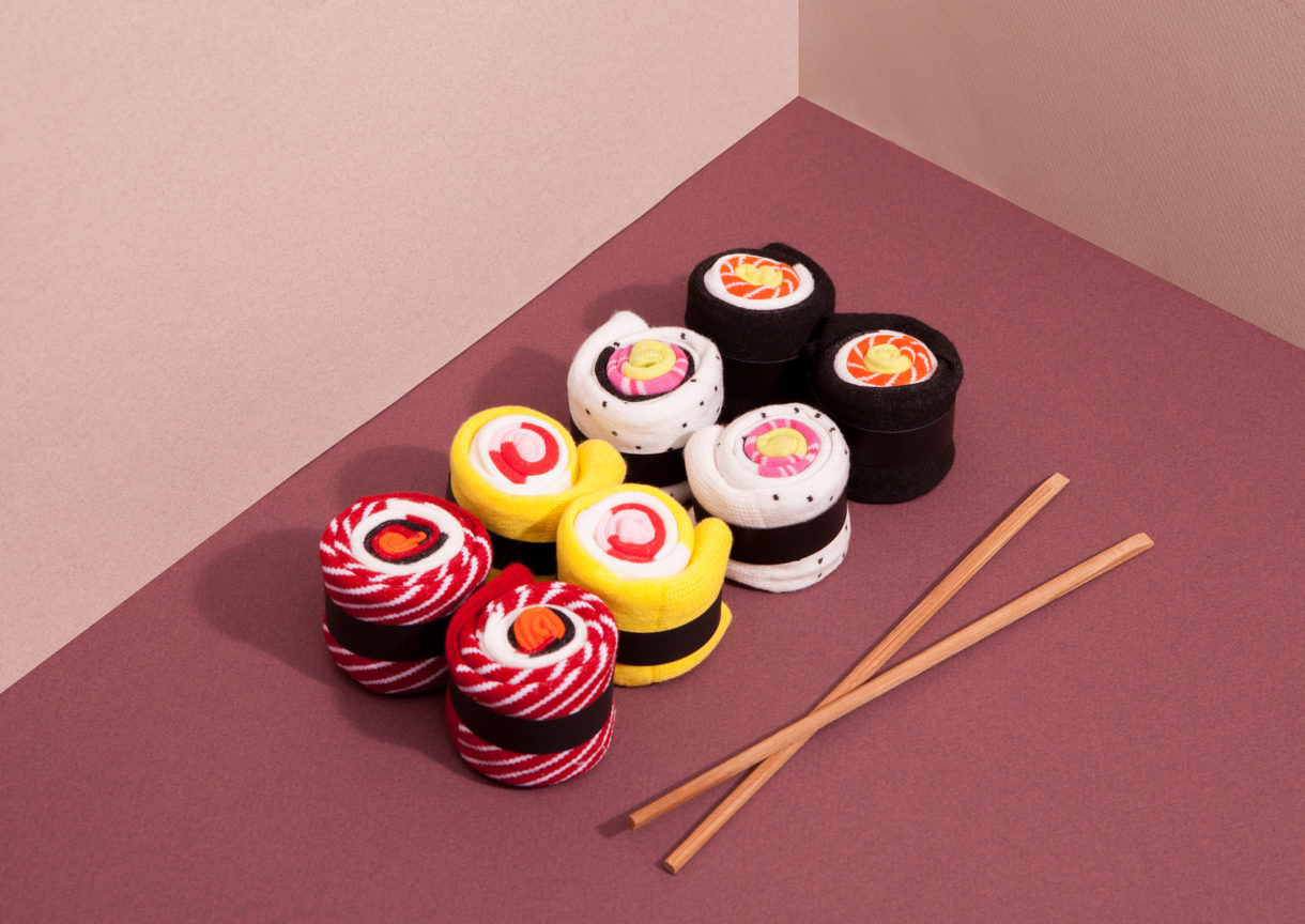
The detail, playfulness and accuracy of production throughout DOIY’s products drew Folch to Japanese culture, and in particular, the precision of origami and paper crafts. With this in mind, Folch commissioned paper and set designer Raya Sader Bujana to create colourful visual landscapes to display and photograph products.
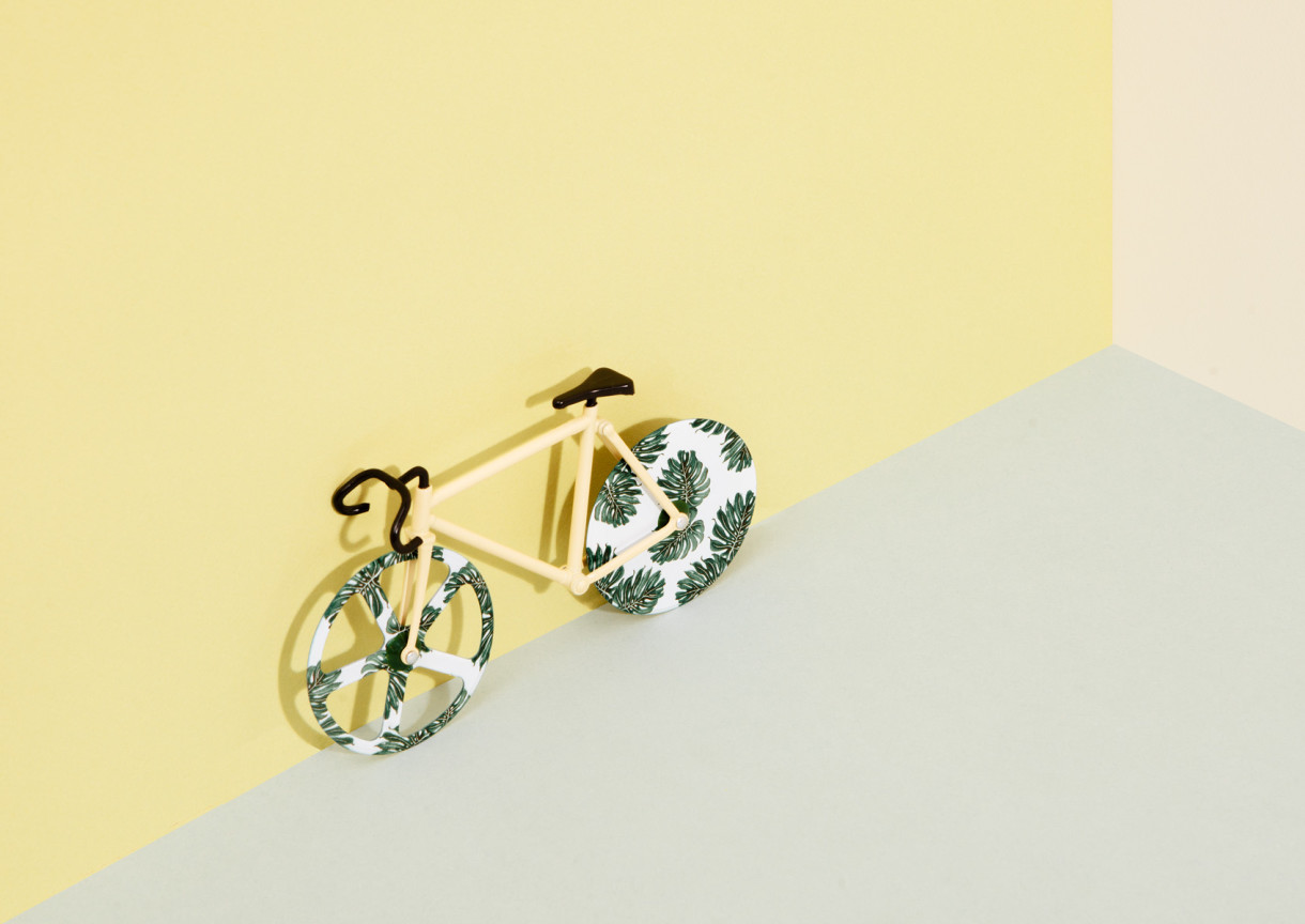
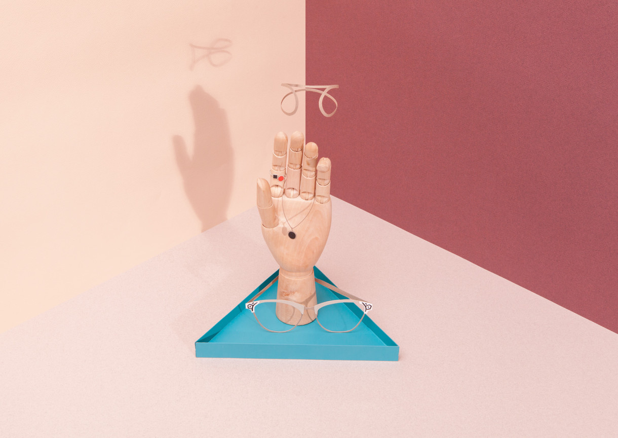
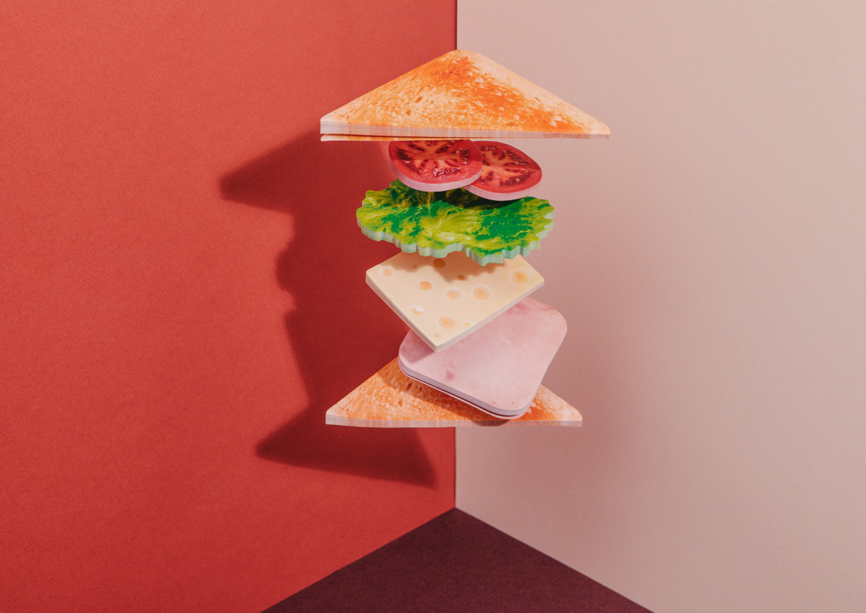
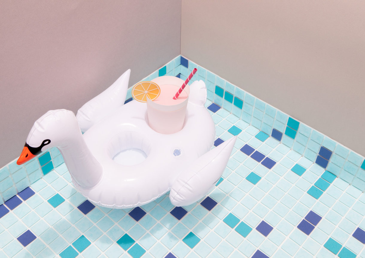
The compositions feel firmly rooted in the playful, contemporary and crafted. This can be clearly seen in colour pairings, uncoated and dyed papers, the use of paper craft props and a good eye for light, shade, space and perspective. These effectively emphasis the forms and materiality of DOIY’s objects, make a connection with their production and create a composition that is eye-catching but simple within a social media context that reduces images down and places these amongst others that are often busy.
Compositions move between the minimal and slightly more detailed, each constructed with a good sense of space and structure. Alongside the choice of materials and colour these choices help to unify a diverse catalogue of products but also, through the addition of props, to differentiate between those that are materially different.
The Japanese influence also plays out within the DOIY wordmark; a dynamic build of monolinear letterforms that change from a horizontal to a vertical lock-up, a reference to the neon signs of Japan’s cityscapes. Letters are also rearranged to form a face. This mix of basic shapes, the dynamic and the personable appear as a fair expression of brand and its products. In its simplicity, wordmark sits comfortably to the side of more compelling image but is practical for more limited contexts.

The composition and colour of images establish a clear continuity between what is seen on social media, packaging and brochure, and likely to extend to website once it goes online. Across packaging images function more to make a connection between the digital and physical. This digital-first approach, brought into print, lend packaging something of a quirky and unexpected quality.
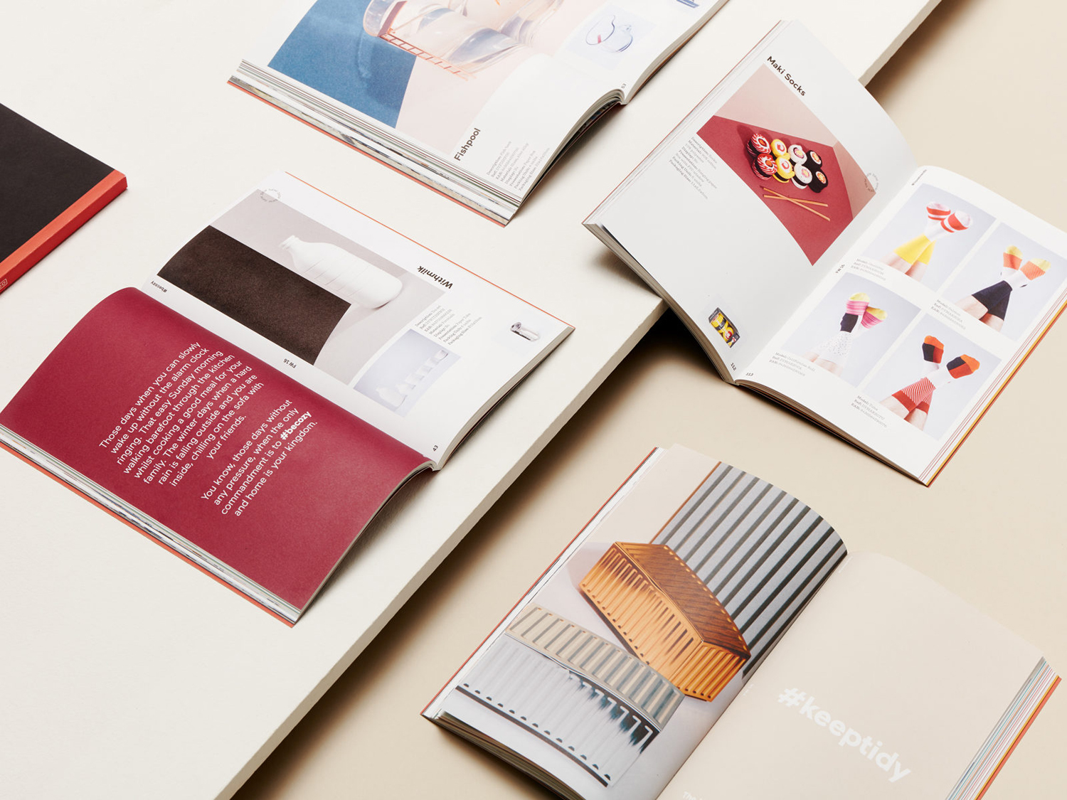
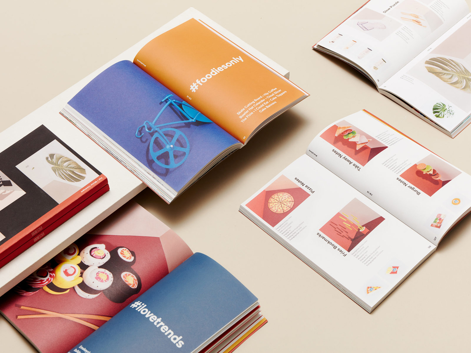
Images hold up well across the catalogues, both full page and within smaller, off-grid and scrapbook-like layouts that borrow from and make a connection with the value associated with art and design magazines.

Copywriting that “seeks interaction with the reader by speaking directly to them, using inclusive verbal forms and expressions coming from the spoken language”, and the use of hashtags, like image, is a good example of the digital world making its way into the physical and establishing personality beyond that of image. Copy is delivered through the contemporary sans-serif letterforms of Maax which sits well over detailed imagery whilst retaining legibility, with its own blend of simplicity and contemporary character. See more work by Folch on BP&O.
Design: Folch. Set Design: Raya Sader Bujana. Photography: Leo García Mendez. Opinion: Richard Baird. Fonts Used: Maax.
