Hidden Characters by RE
Opinion by Richard Baird Posted 24 November 2016

Hidden Characters is the latest PR offering from international advertising agency network M&CSaatchi. It replaces/is an evolution of Bang PR, developed in response to the changing public relations landscape.
With the advent of social media and the subsequent growth of non-traditional influencers and an increase in inauthentic product placement, Hidden Characters intends to make sure that their client’s reach is handled in an ethical and authentic way.
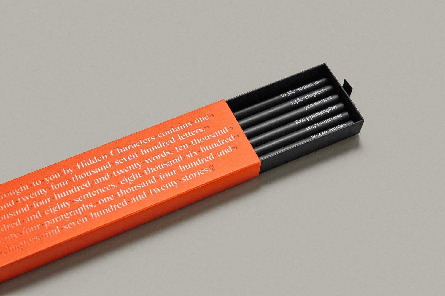
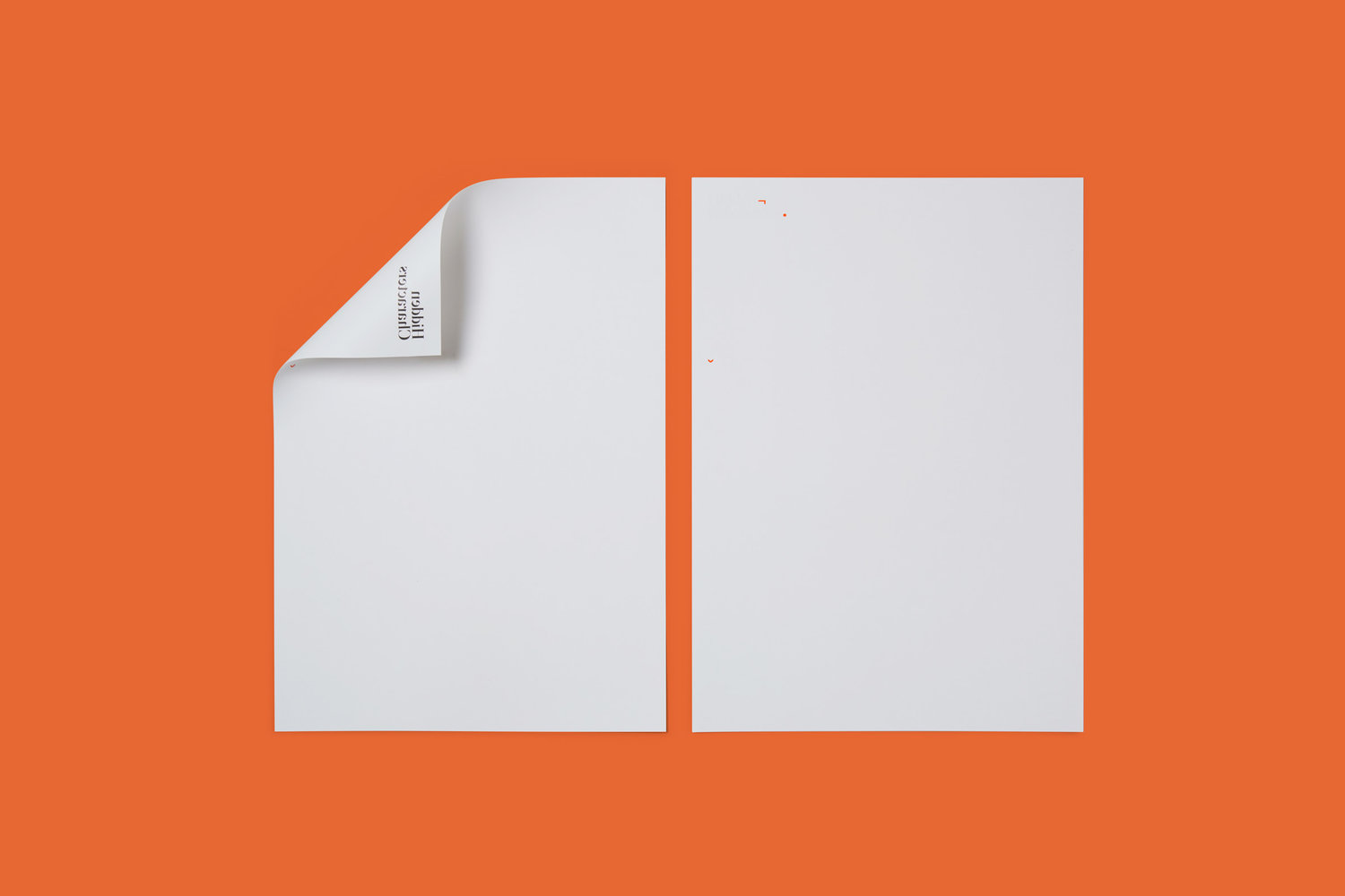
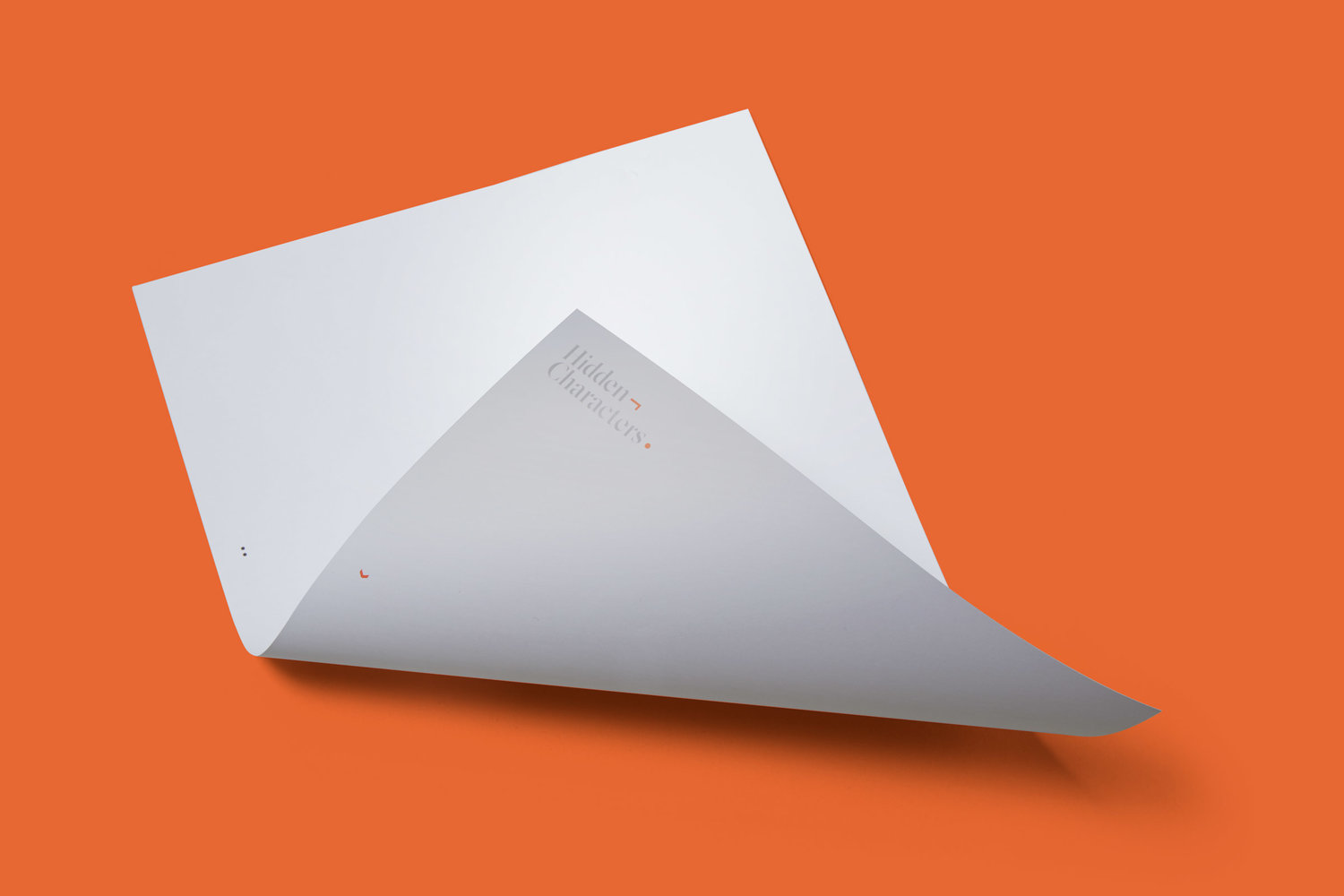
Sydney-based graphic design studio RE worked to created a brand identity for Hidden Characters that articulates this intention with a concept that makes a connection between the hidden characters that shape how text appears and the creative behind the scenes shaping of a brand’s public perception. The idea of the seen and unseen plays out in a number of ways in print, and links business cards, headed paper, stationery and brochure.
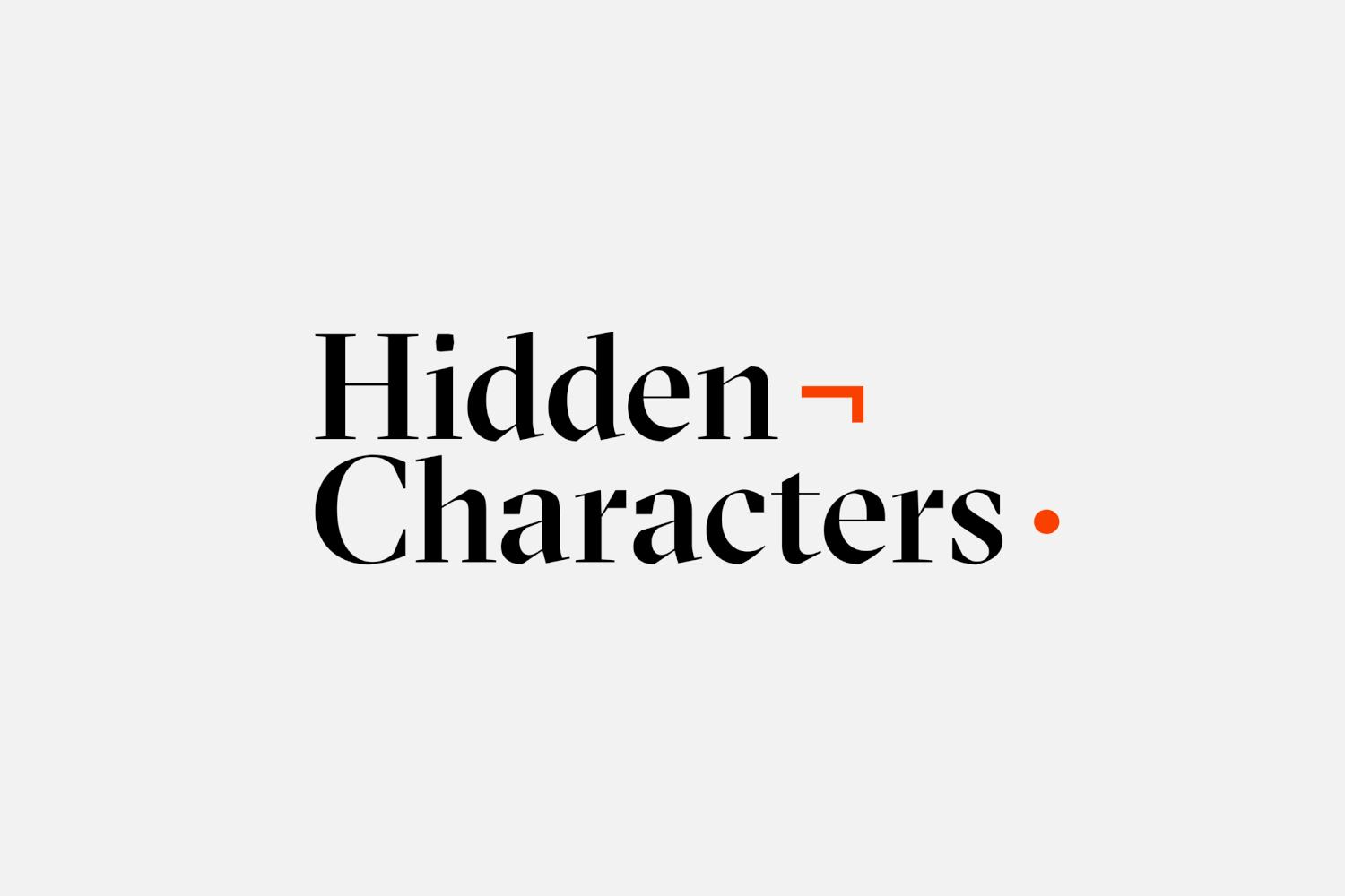
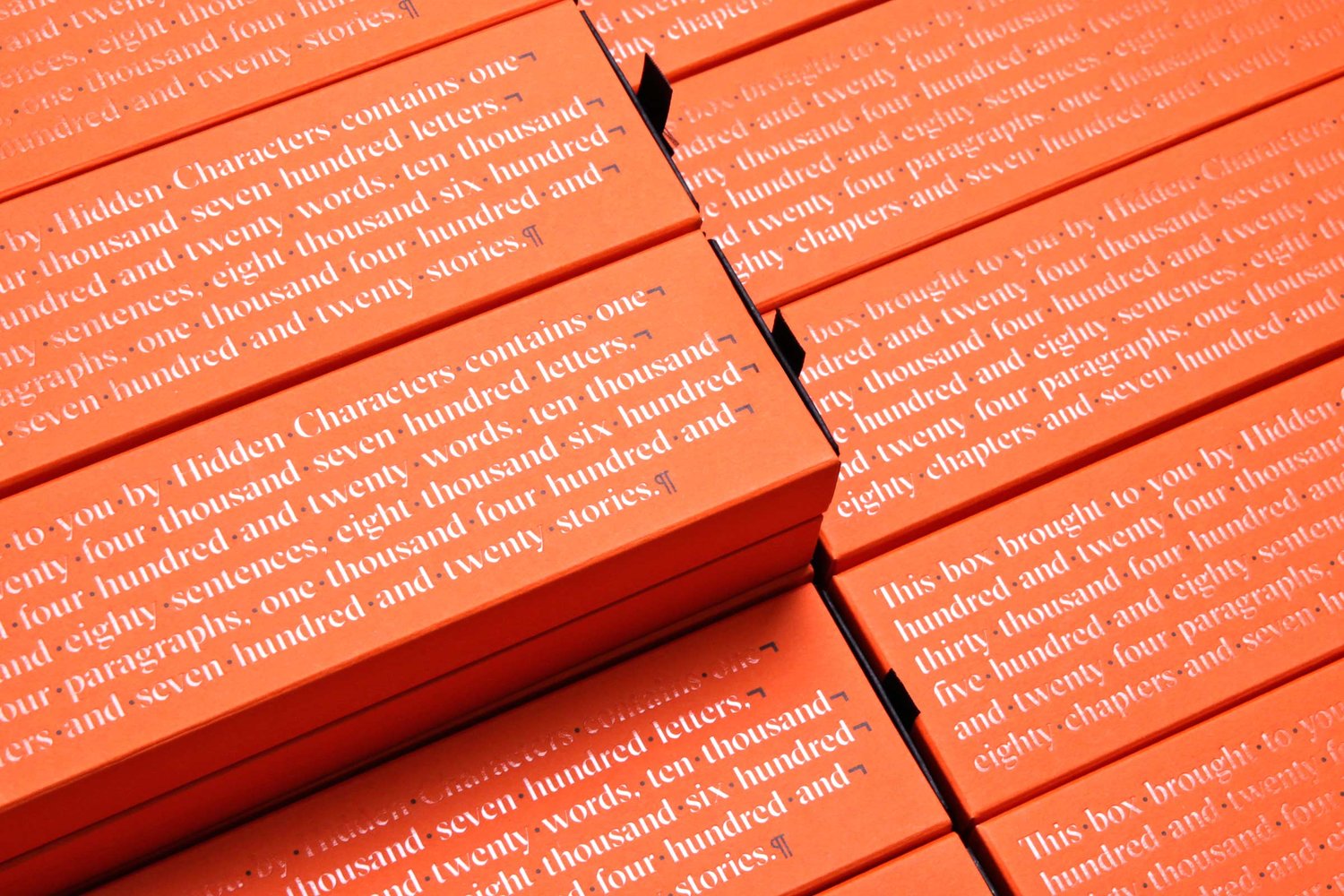
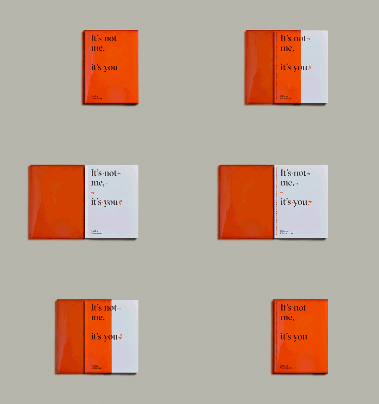
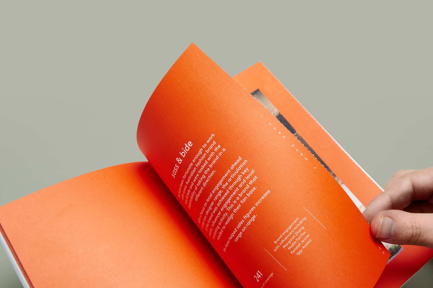
RE built a brand identity for Hidden Characters made up of lots of small visual tricks, linked by a relevant and clear concept, helped by naming, and a cohesive aesthetic of type and colour pairing. These visual tricks include French folded paper with text concealed inside, clear gloss printing that reveals type when caught in the light, sealed but perforated pages within the brochure and a red transparent sleeve that hides red ink.
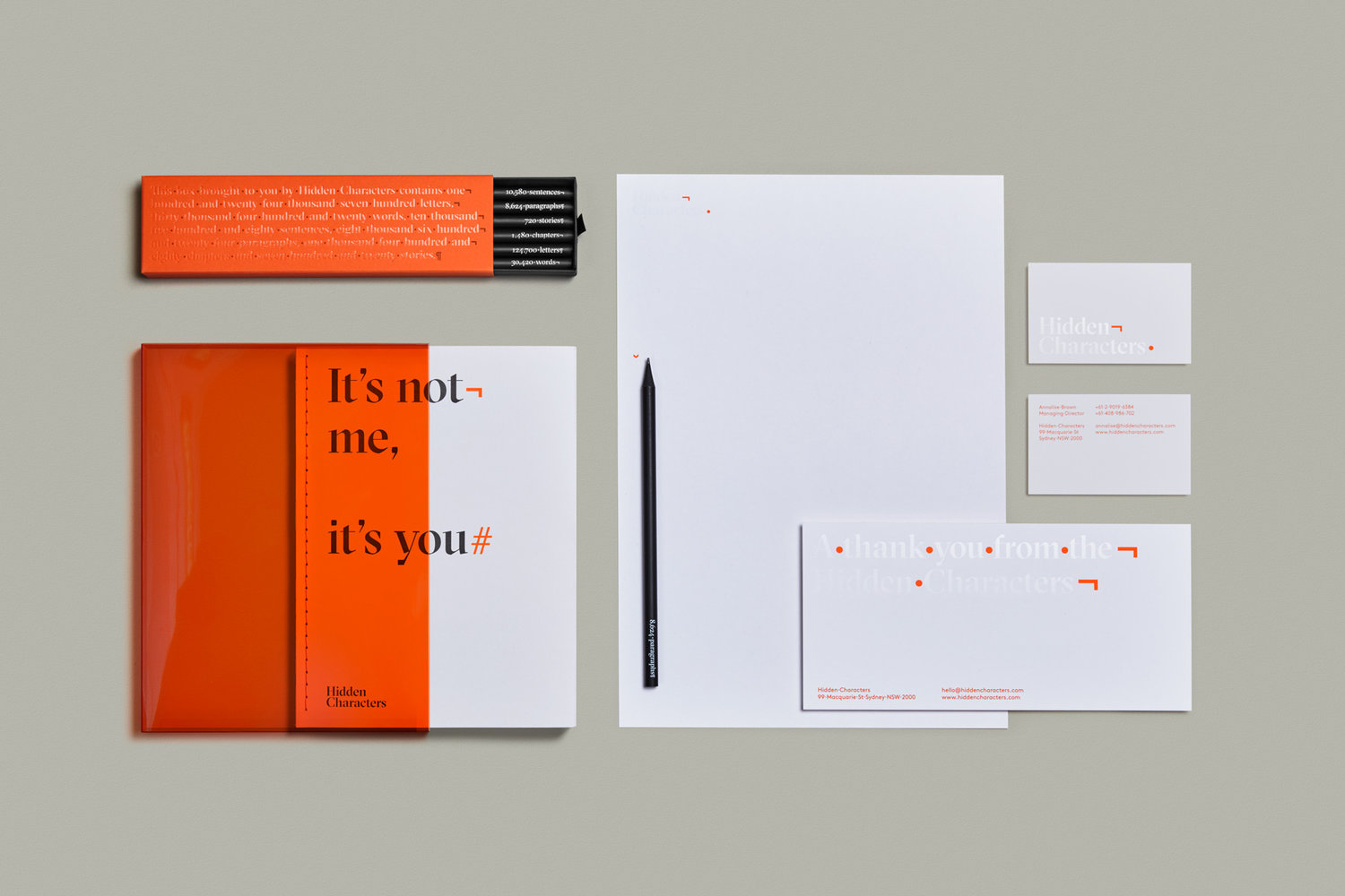
The sense of play that exists throughout identity feels well-suited to expressing a more creative approach to engaging with consumers, and replaces the dynamic and youthful qualities of Bang PR with the more sophisticated and current, in concept and in type selection.
Typographic form, few colours and plenty of space functions to link these small creative moments together and keeps identity from appearing busy of over-designed. Dyed papers and boards, and the concept-centric approach to print finish lends the work a tactile material quality without feeling superfluous or excessive.
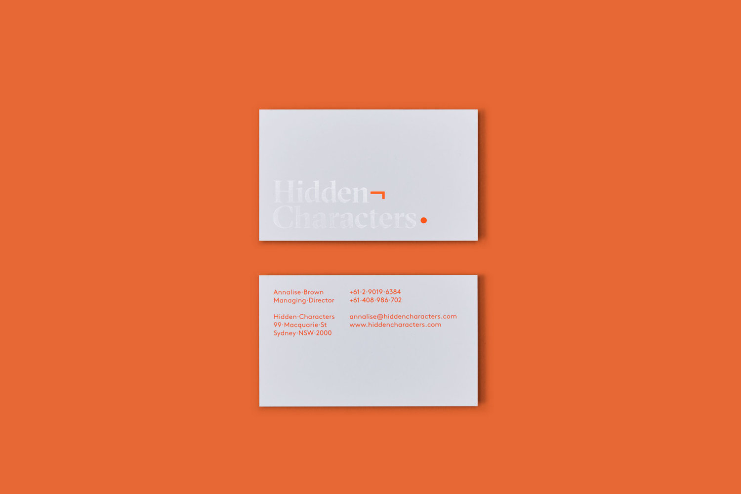
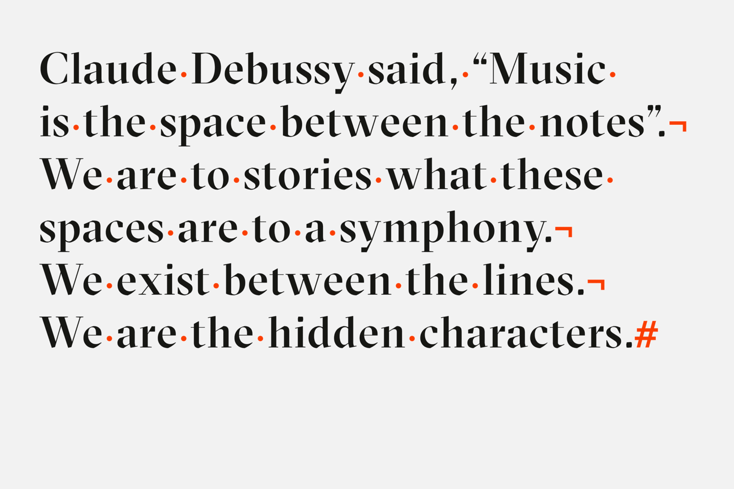
Grilli Type’s Sectra and the symbol set from Lineto’s Brown’ work well together within logo and copywriting. Brown takes over online, and in conjunction with site structure appears thoroughly current. There is a sense of legacy and authenticity to GT Sectra and a modernity, practicality and more personable quality to Brown. Although a familiar approach to pairing it is visually impactful in their disparaty, and conceptually, manages to augment the authentic and traditional communication of calligraphic strokes with forms associated with more recent technologies and the way these proliferate our everyday lives. More from RE on BP&O.
Design: RE. Opinion: Richard Baird. Fonts Used: GT Sectra & Brown.
