Brewdog Abstrakt by O Street
Opinion by Richard Baird Posted 25 November 2016

Brewdog’s Abstrakt is a limited edition craft beer concept that has released 20 different varieties since it began in 2010. Each beer is bottle-conditioned (bottled with a small amount of yeast, providing further fermentation and maturation), brewed and released just once, individually numbered and known only by their release code. It is a concept described as more art than beer, as boundary pushing and blurring the line between categories.
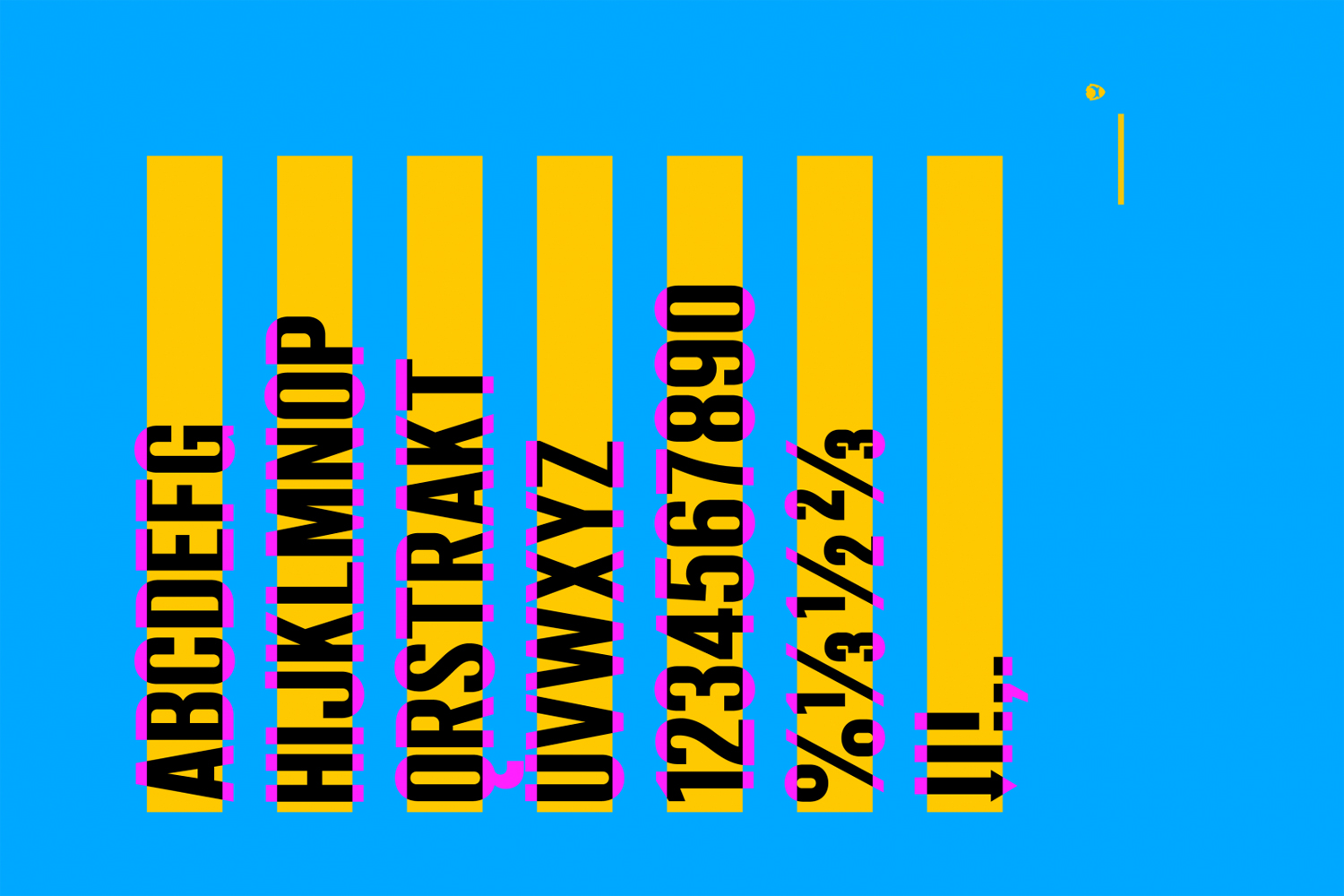
Graphic design studio O Street worked with Brewdog to create a new brand identity and packaging system for Abstrakt, informed by its creative, limited edition concept, flavour varieties, individually crafted nature and the use of release codes rather than names. This is expresses through colour, typography, print finish and structural design.
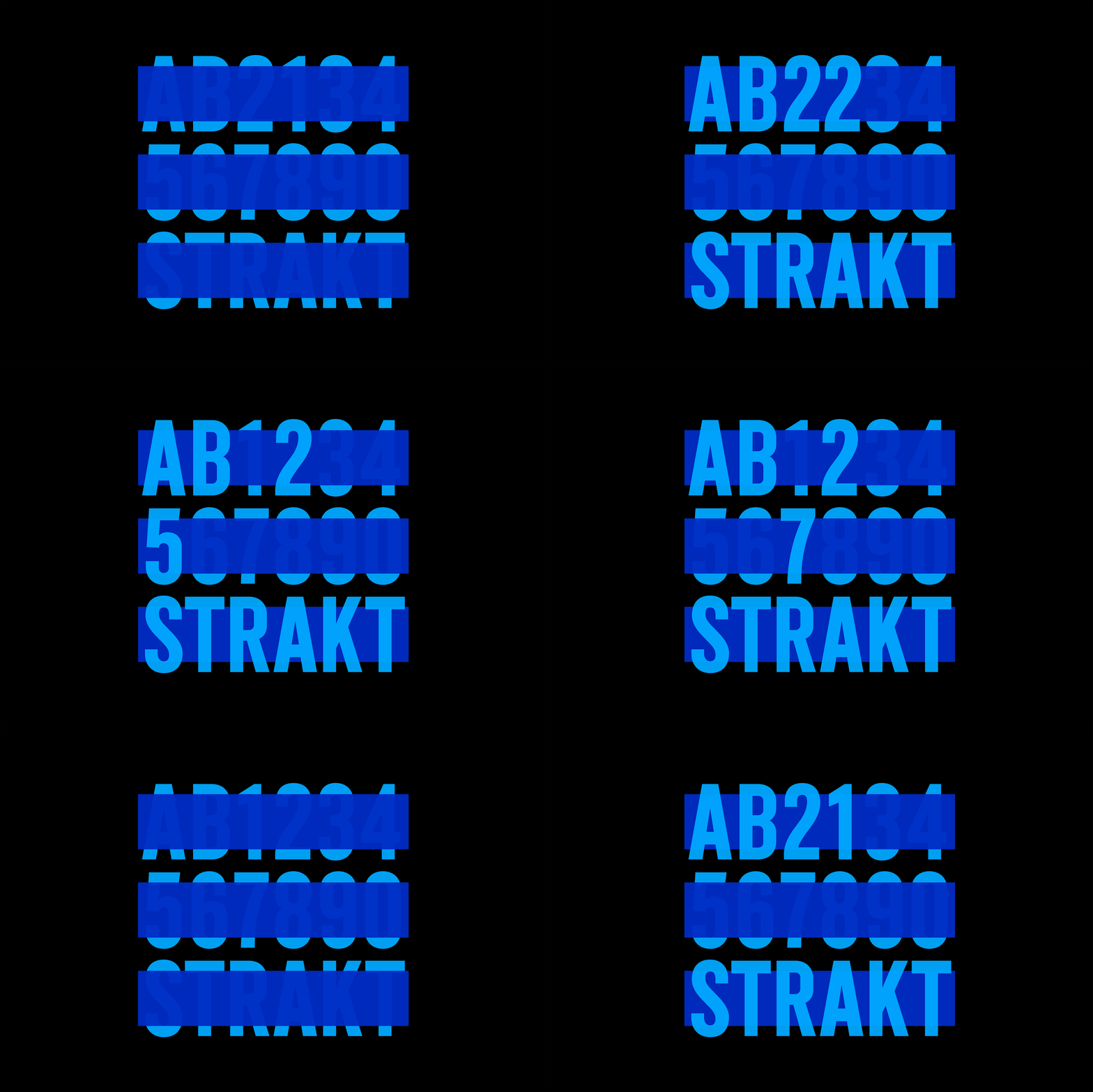
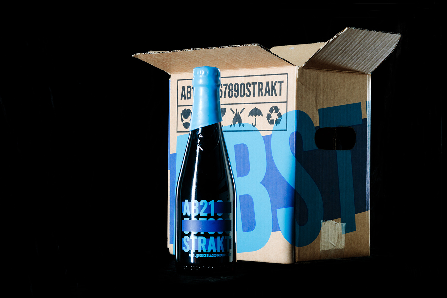
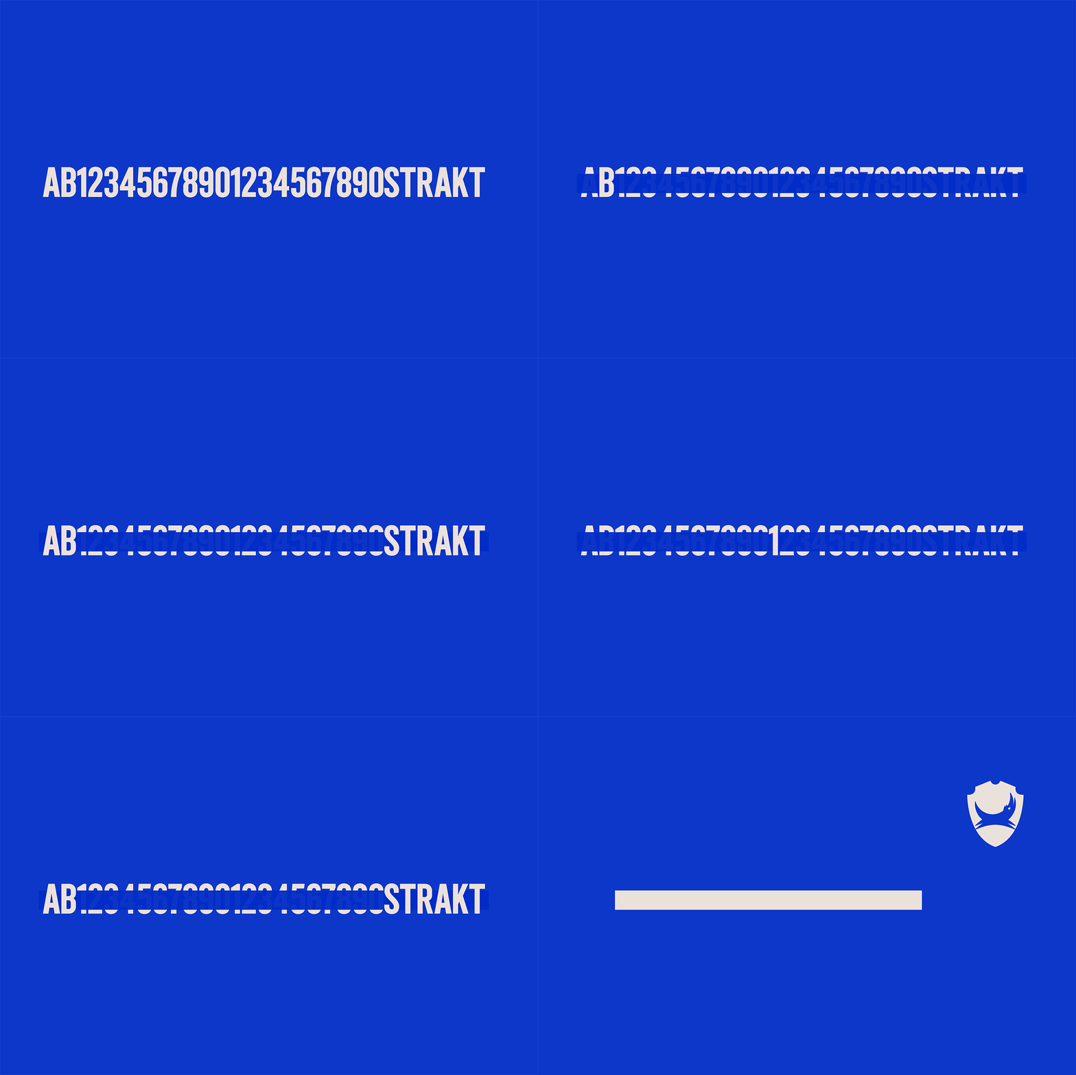
Although good brand identity and packaging design work is typically systematic in nature, O Street draws this out and pushes it front and centre with a bold new logotype and labelling system. Glyphs are stroked out to highlight the batch code of the latest release, with differentiation between batches and flavours further emphasised through colour. AB21, a Liquorice & Blackcurrant variety and the first to feature the new design, features a two blue screen print.
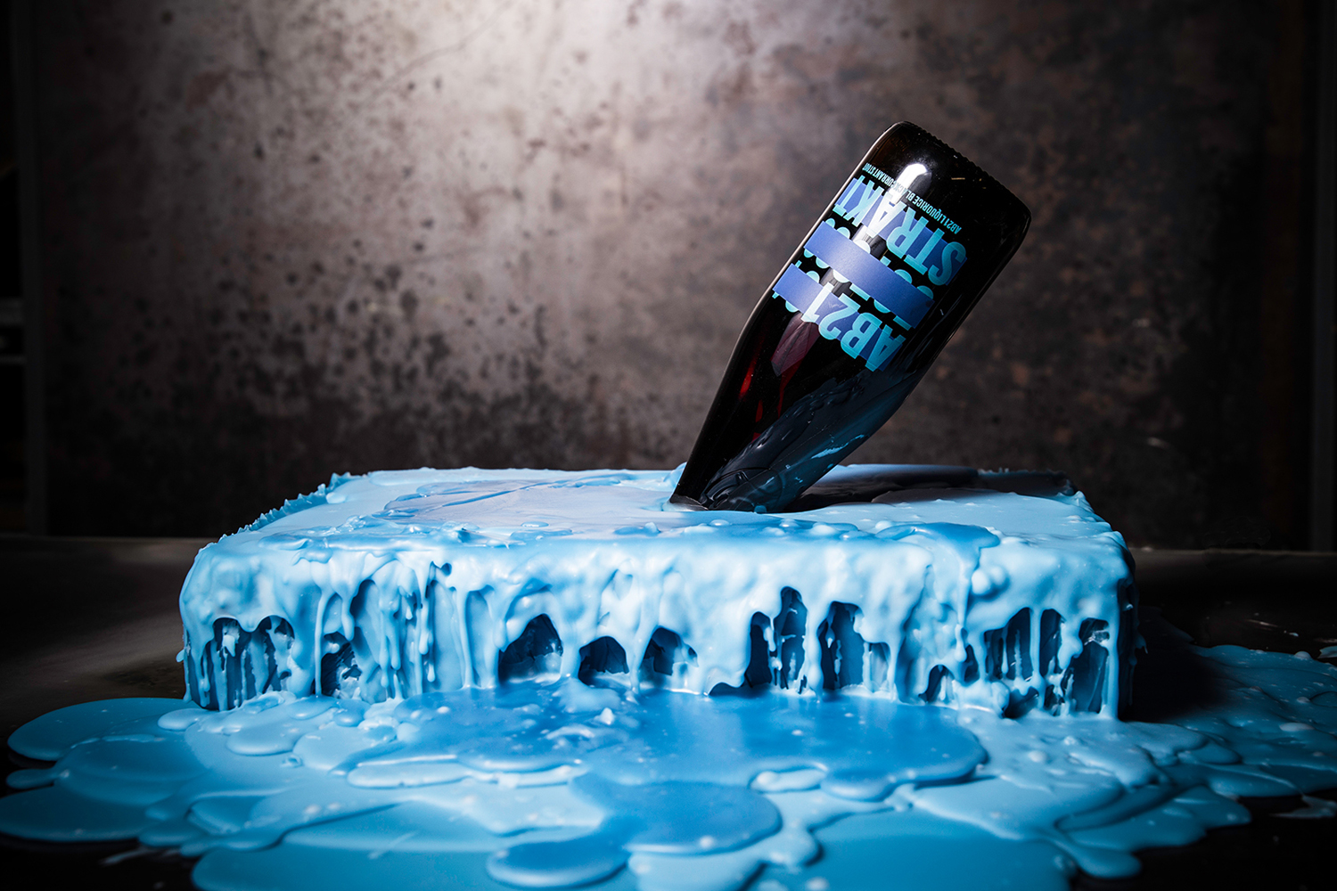
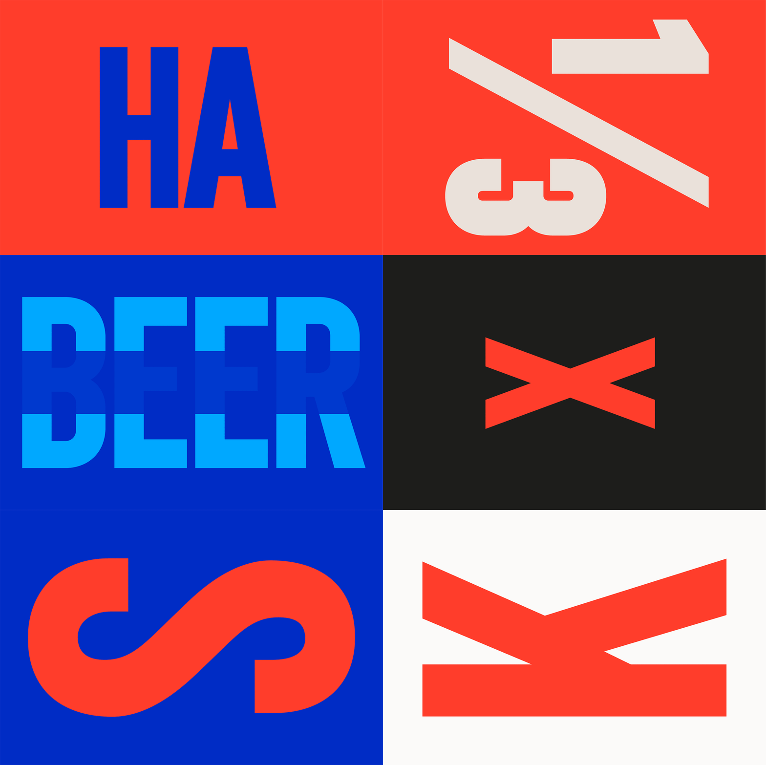
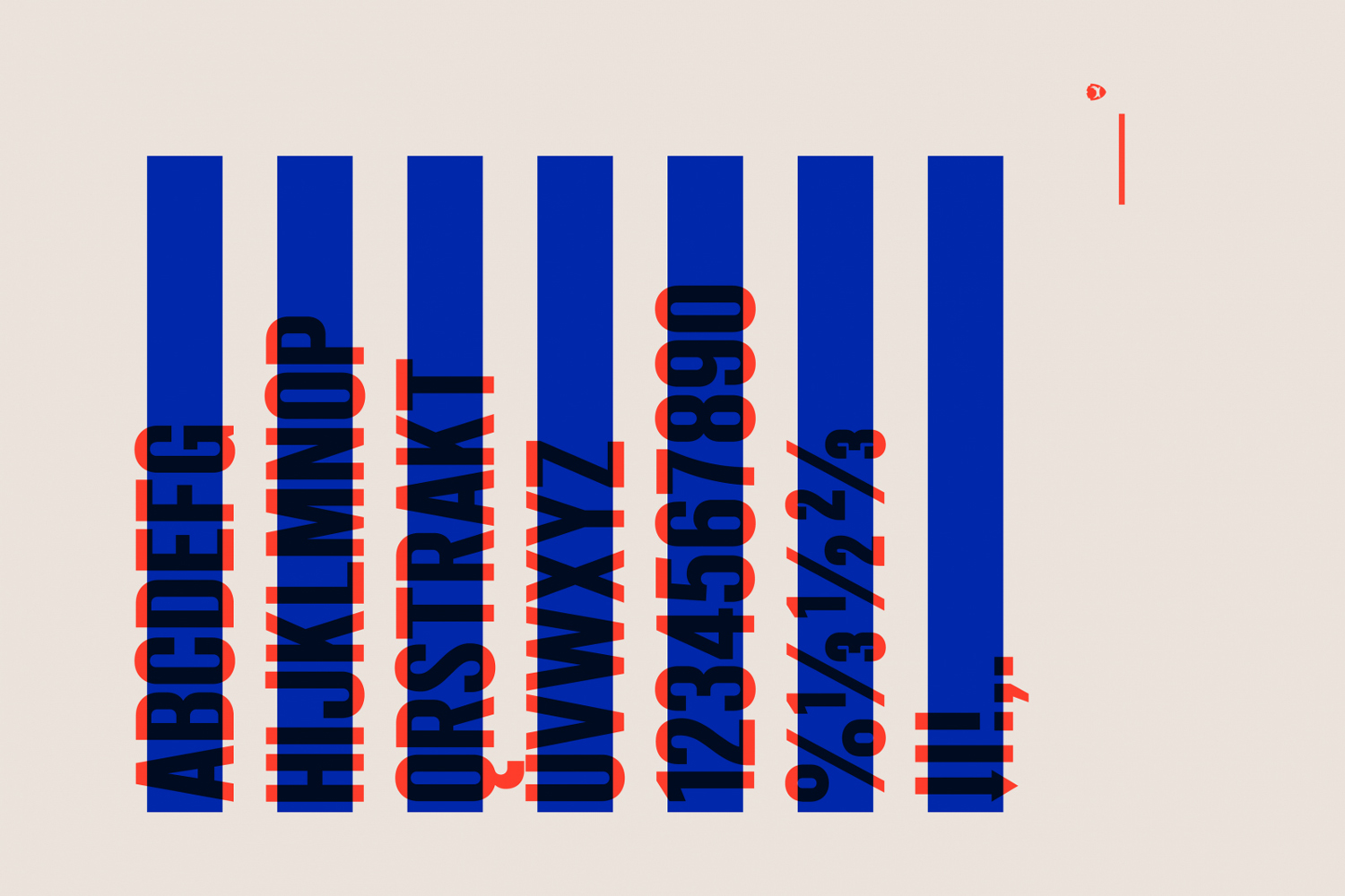
The direction is impactful and distinctive, more in line with the loud character of Brewdog, where previously it was trite and forgettable, but with its own more conceptual quality rather than the brewery’s no-fuss foundations. The crafted and limited nature of the range underpins the design of a custom typeface, a screen printed finish, wax dipped neck and a structural design with an embossed Brewdog shield.
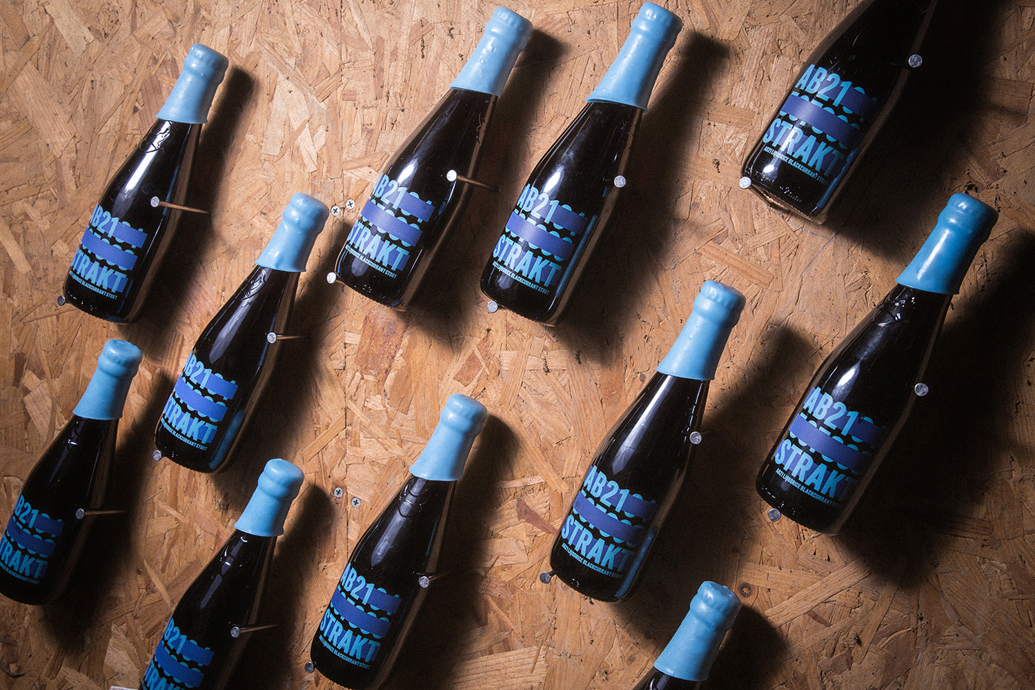
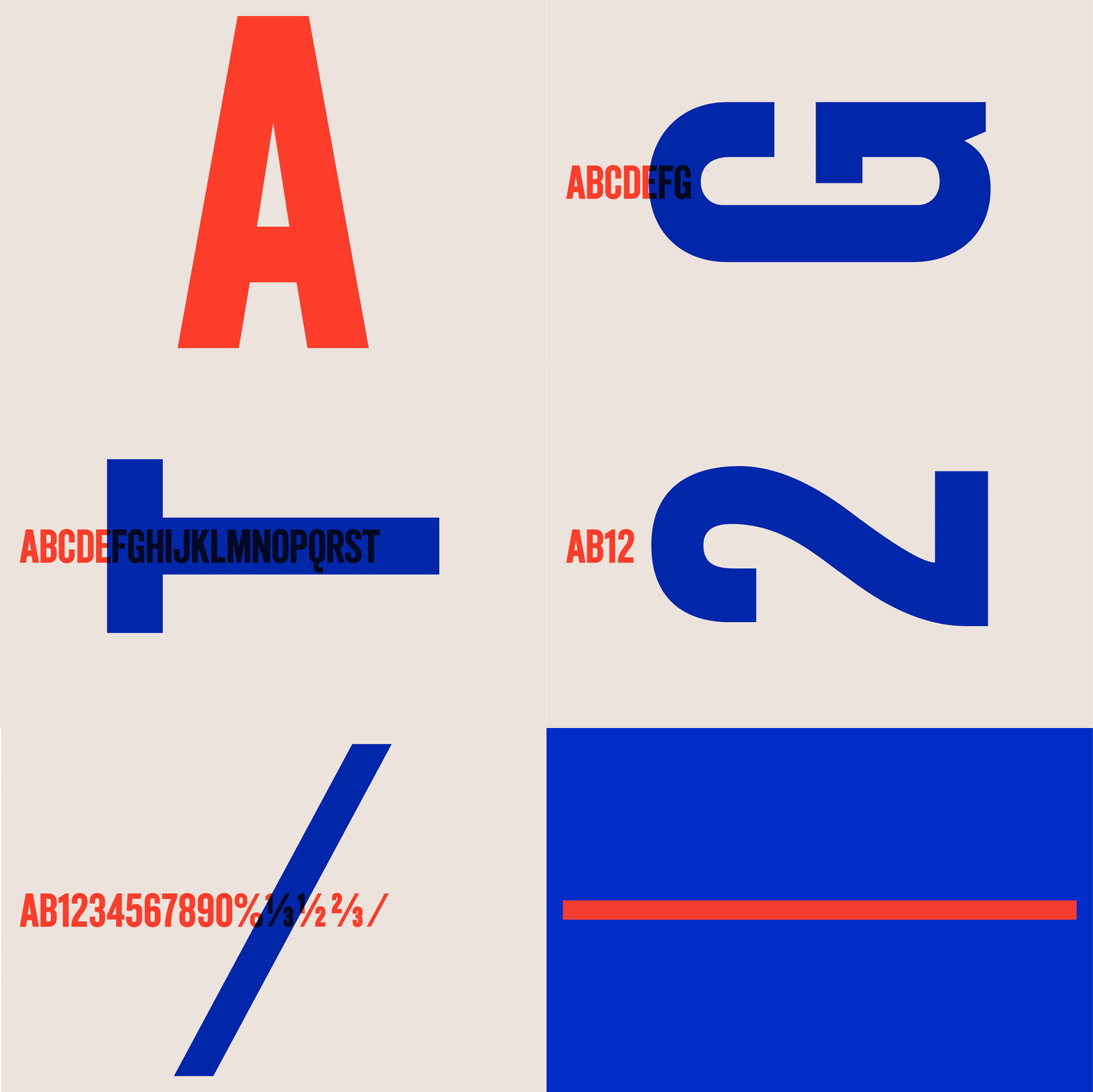
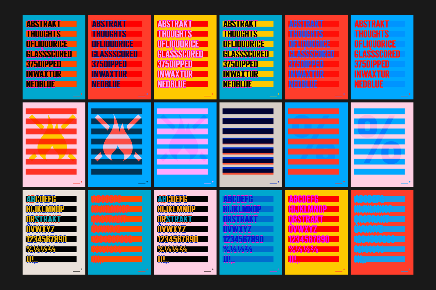
Initially, the condensed uppercase sans-serif characters appear to lack a true distinctive character to justify their custom build, however, and given consideration to typesetting on bottles and posters, feels justified, both stacked and as a single horizontal line, characters feels balanced, readable and in service of system.
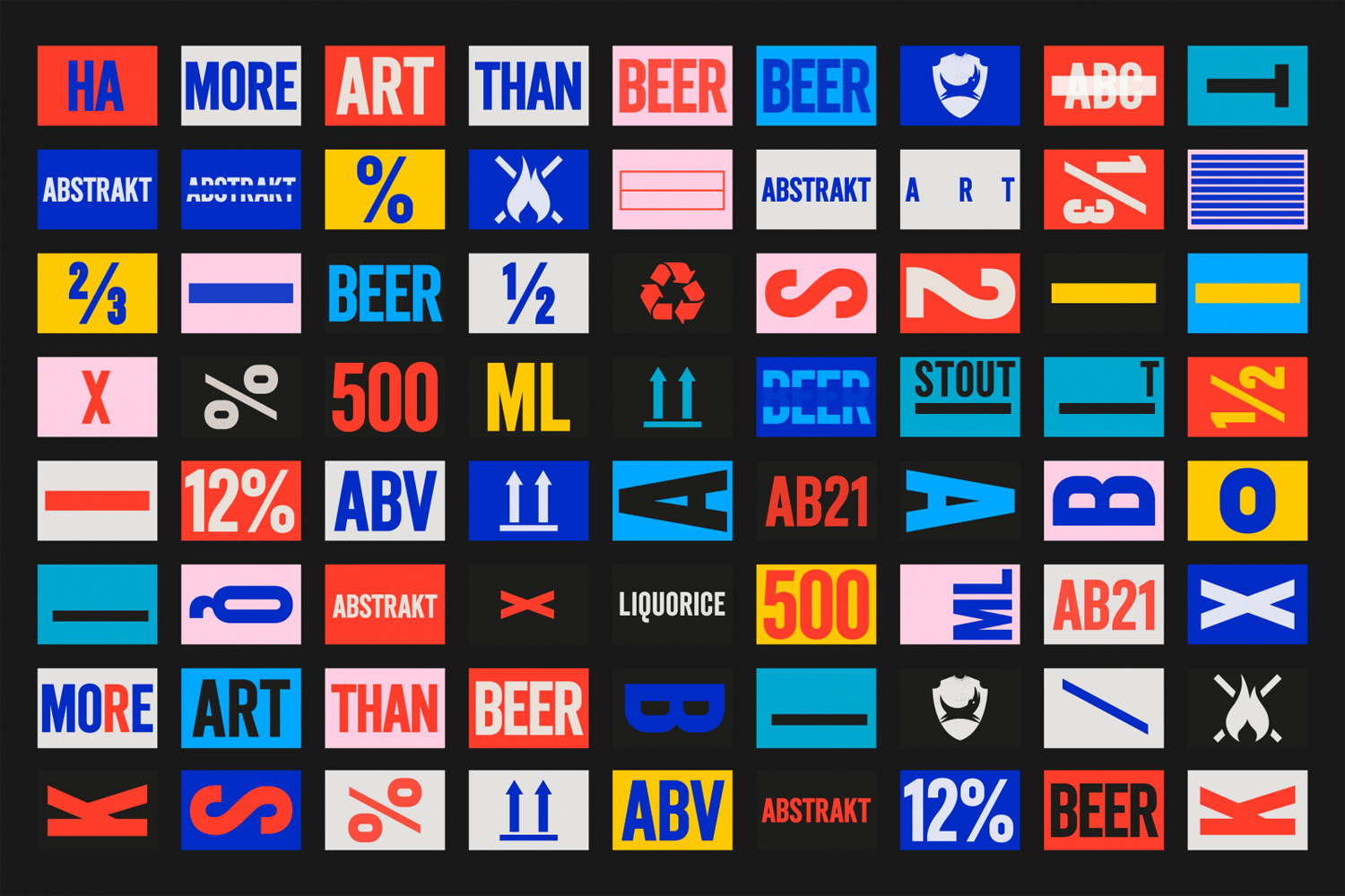
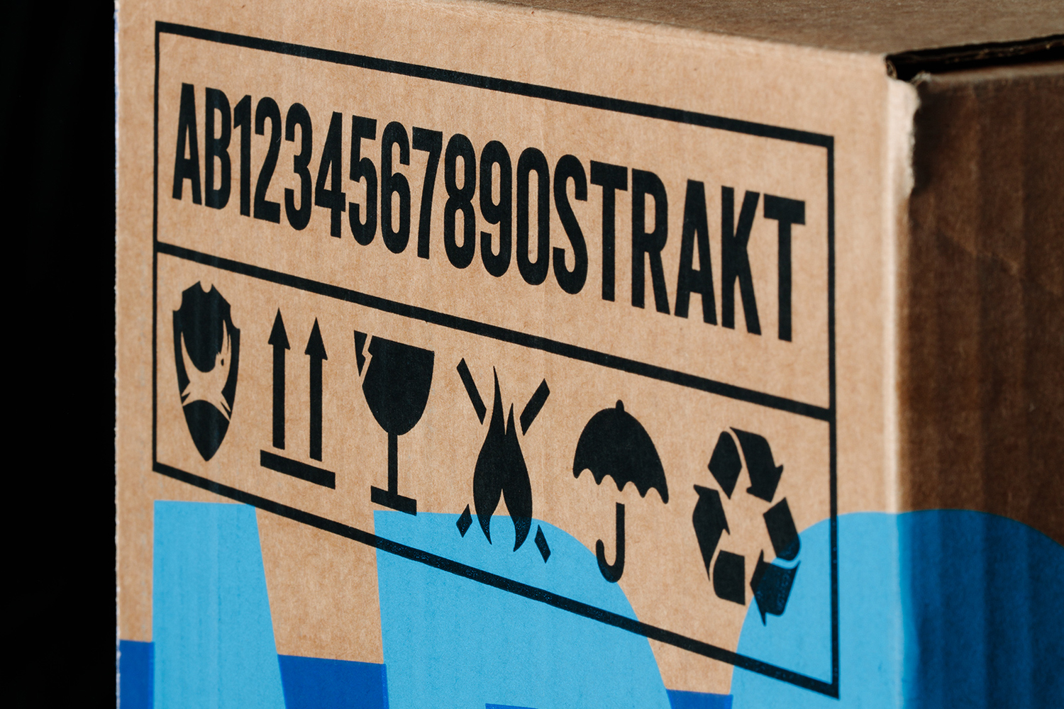
Logotype is paired with the iconography of shipping and brewing, and drawn out into a series of graphic assets. These are remixed to deliver a sense of variety and distinction; a principle of the brand, and function to visually articulate a sense of diversity of bold flavour across posters. More from O Street on BP&O.
Design: O Street. Opinion: Richard Baird.
