Erik Penser Bank Cookbook by Bedow
Opinion by Richard Baird Posted 12 December 2016

Erik Penser Bank provides its clients with independent financial advice and a high-level of personal service. While large banks do provide similar services, Erik Penser Bank is Sweden’s only dedicated private banking business.
Professionalism, experience and an individualised service practice is expressed throughout the bank’s visual identity, created by Swedish studio Bedow, in the personable and less corporate association and aesthetic qualities of a new monogram. This then informs some distinctive pictograms, is paired with a custom typeface and set across uncoated papers and boards.
Bedow continue to work with Erik Penser Bank, drawing its brand identity across a Christmas gift for the bank’s clients; a cookbook that holds eighteen recipes from the resident chef. Titled Matnyttiga råd, this is a limited edition 130×210 mm hardbound book of 32 pages with a green fabric cover and a white block foil print finish.
As noted in BP&O’s review of Bedow’s brand identity for Erik Penser Bank, the build of the monogram is a pleasant and personable mix of monolinear lines and loops that manages to balance a little of the current in its rendering, individuality in the looseness of lines, and leverages the distinction and craft associated with monograms.
A custom typeface, developed in collaboration with Íñigo López Vázquez, introduces significant contrast, a more formal quality and a sense of legacy in its antiqua influences, yet is linked to monogram in its crafted design and overall concept in its individual nature. This tension between image and type also plays out across the cookbook.


The cookbook is a great canvas to further expand on the individual qualities of both image and type but within a new context. The convivial drawing of corporate iconography gives way to those of food and food prep. For the most part, these are well-rendered with a clear continuity throughout and an explicit connection with Erik Penser Bank’s brand identity. Where the proportion of type to illustration was appropriately in favour of the former across corporate documents, here, illustration is more prominent. Typesetting finds a meeting point between traditional cookbook layouts and something of the corporate banking component that makes up the identity system.
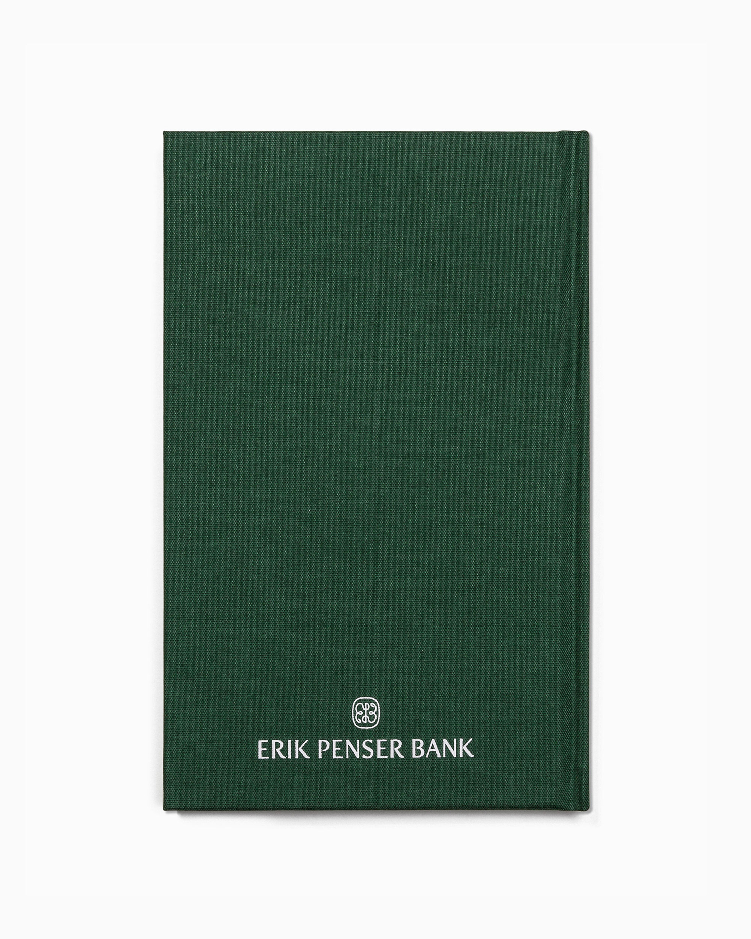
The craft you might associate with a monogram is also drawn out in the binding of the book. This brings together a green fabric hardback cover and a white block foil print finish. A cookbook is a smart choice. It has qualities that compliment the concept that underpins brand identity; the personable and the guiding, feels individual and nicely built with a legacy element in type, typesetting and format.
Design: Bedow. Typeface: Íñigo López Vázquez. Opinion: Richard Baird.