Erik Penser Bank by Bedow
Opinion by Richard Baird Posted 2 June 2016
Erik Penser Bank provides its clients with independent financial advice and a high-level of personal service. While large banks do provide similar services, Erik Penser Bank is Sweden’s only dedicated private banking business.
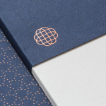
Professionalism, experience and an individualised service practice are expressed by the bank’s new brand identity, created by Stockholm-based graphic design studio Bedow, through the personable and less corporate qualities of a monogram, which informs some distinctive pictograms, custom typeface, an earthy colour palette and some good quality papers, boards and print finishes. These are implemented across business cards, folders, forms and print communication.
The personable is perhaps must clearly expressed in the build of the monogram, an ambigram of monolinear lines and loops. This manages to balance a little of the current, both in its creativity and rendering, individuality in the looseness of lines, and leverages the distinction and craft associated with monograms.
As an aesthetic piece, it is nicely balanced with a pleasant mix of space, detail in shape and simplicity in the continuous line weight, and feels largely unforced as an ambigram which lends further uniqueness to mark.

Logotype and extended typeface, developed in collaboration with Íñigo López Vázquez, introduces significant contrast, a more formal quality in its uppercase letterforms and a sense of legacy in its antiqua influences, yet is linked to monogram in its crafted and custom design, and overall concept in its personalised nature.
Contrast between type and monogram functions well to deliver visual interest, distinction and to communicate positioning, however, locking these two assets up, particularly when logotype is so long and monograms are there to function as a shorthand, feels unnecessary, and forces logotype and monogram online and in print down in size, where either logotype or monogram might have been sufficient.
There is a pleasant and unmistakable continuity between monogram and the pictograms that illustrate products and services. These draw distinction from a very current monolinear quality, show a good use of interior space and, for the most part, work in the loops of the monogram in a natural and unforced way. Their animation, while it is difficult to really appreciate their applicability, have a drawn quality that again ties back to the customisation of product and services.

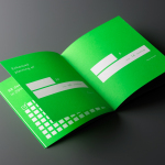
The high contrast numbers of Klim Type Foundry’s Domaine Display find a meeting point between some the legacy of Erik Text and the loops and flourishes of the monogram and pictograms. These numbers are described as being used as a strong visual element through the identity and work well to break up some fairly austere layouts, lending them a little charater but not at the expense of a necessary formality.

Bedow have done a lovely job expressing the personable and individuals qualities of a private bank and blending this with the sense of legacy, experience and professionalism you would expect from larger establishments. There are a few different components, with both contrast and continuity in mind, yet weaved together with a Scandinavian lightness of hand. More from Bedow on BP&O.
Design: Bedow. Typeface: Íñigo López Vázquez. Opinion: Richard Baird. Fonts Used: Domaine Display.