Someone Somewhere by Sociedad Anónima
Opinion by Richard Baird Posted 11 January 2017
Someone Somewhere is a clothing and accessories brand. Each of its products are designed and made in Mexico by small communities of textile artisans. The social and cultural contexts that are the foundation of brand are expressed by its new visual identity, created by Mexico City-based graphic design studio Sociedad Anonima, through naming and a graphic device that calls out maker and origin.
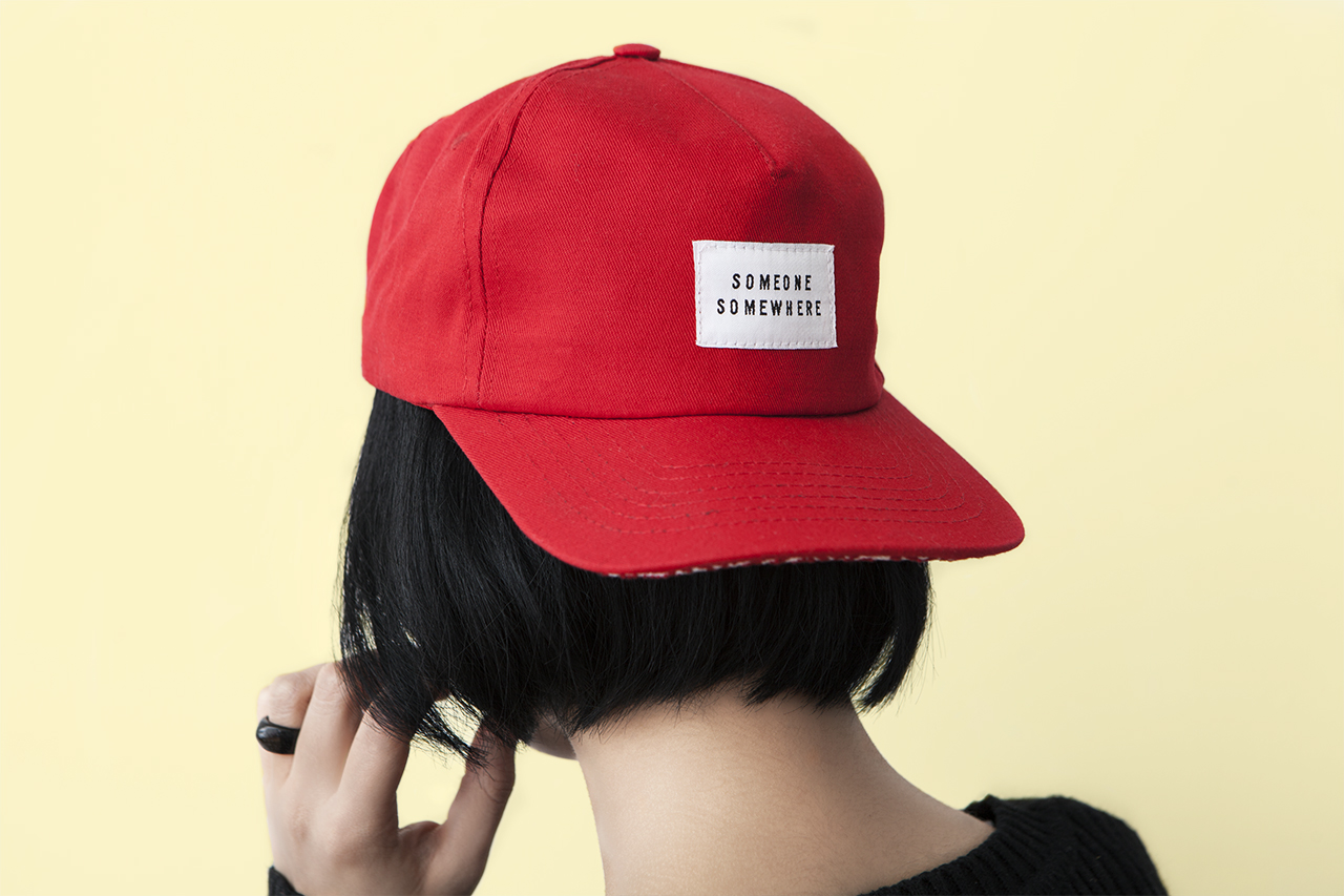
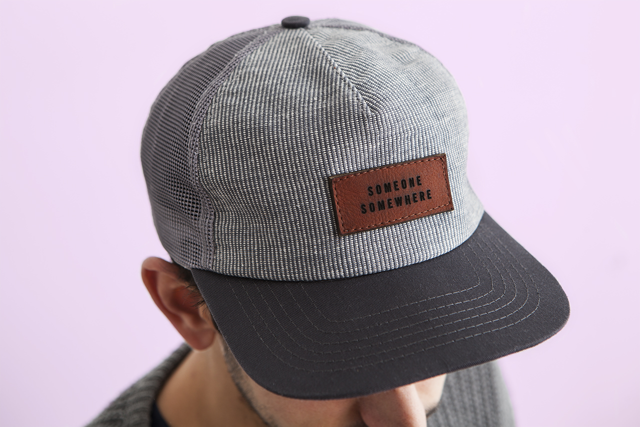
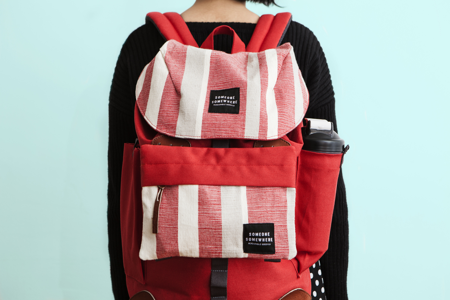
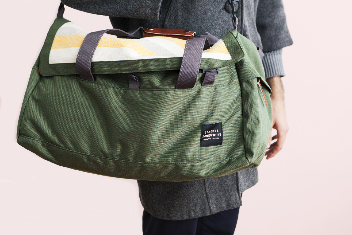
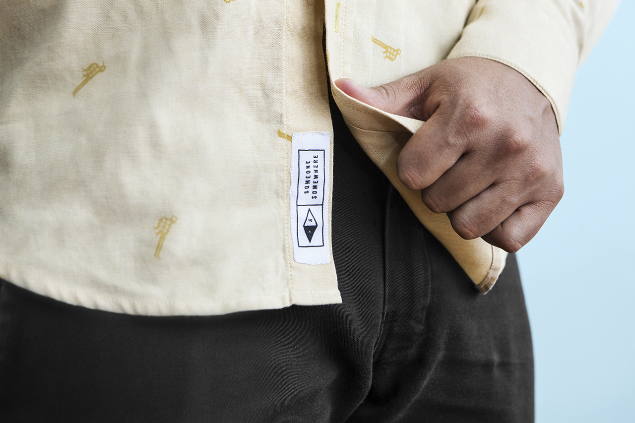
Sociedad Anonima delivered a simple typographical treatment that holds up well within different material contexts. There some nice variation in its implementation across garments and accessories. Naming, and the way this is expanded upon across on the inside label is a neat device, placing value on people and places with a concise and understandable visual expression, emphasised by typographical contrast. This works consumers and creators, and is explored in greater detail using videos, stories and image online.
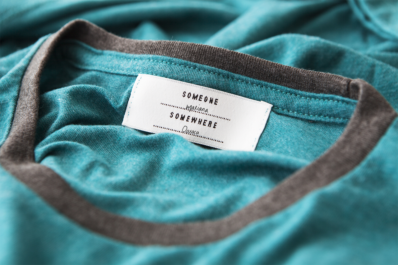
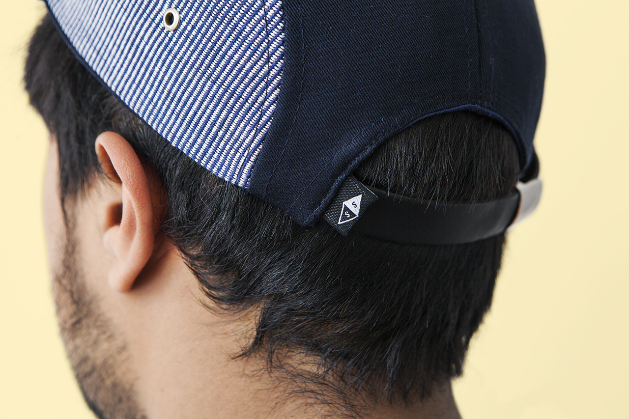
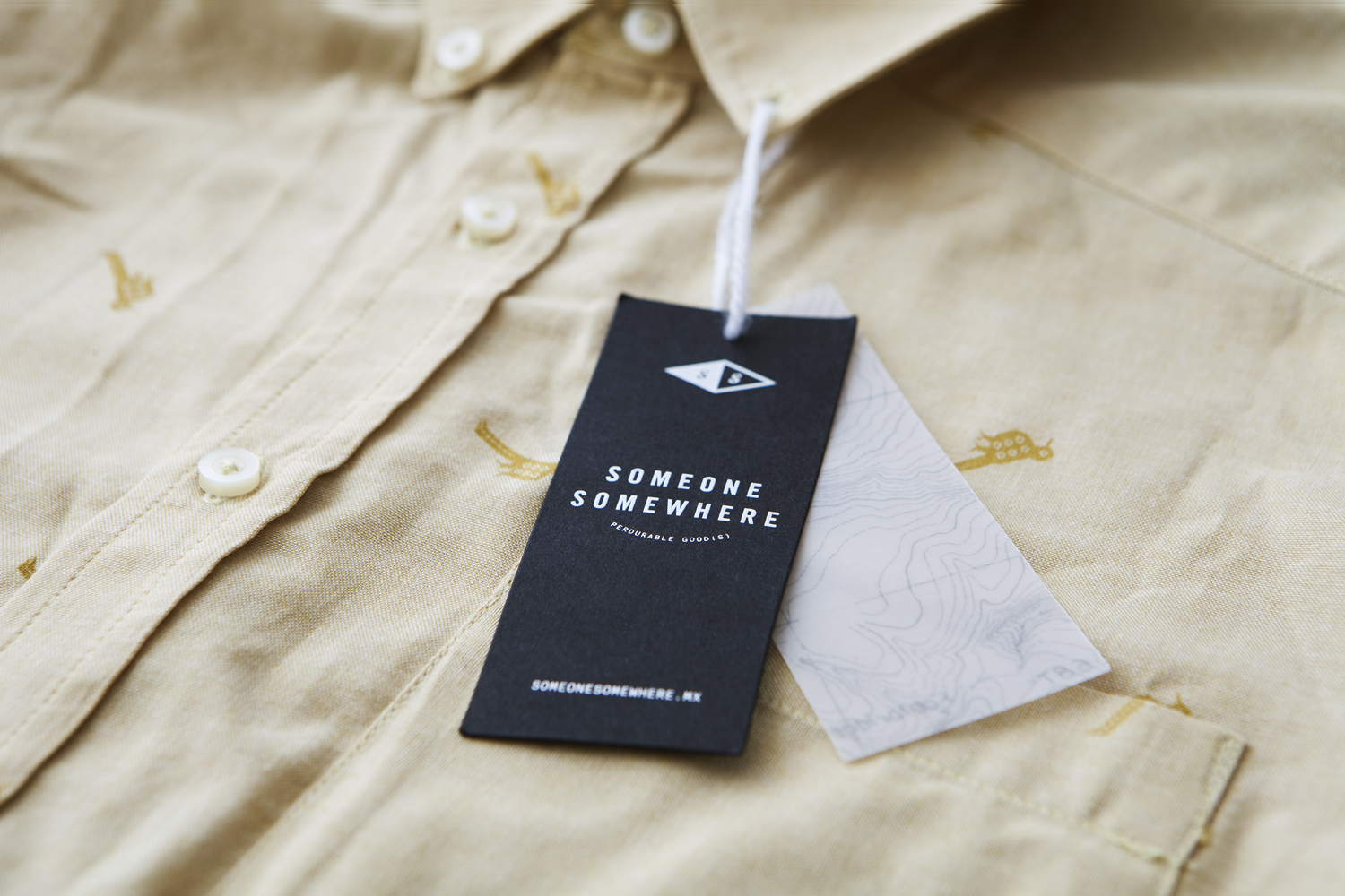
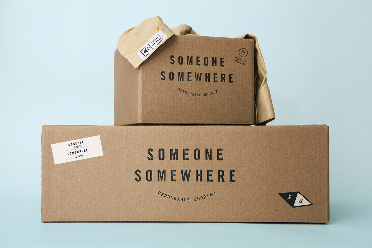
Brand identity does lean on a few conventional visual elements. This includes a mountainous geography in the use of topographical map across tags, a compass motif, and the export utility of untreated corrugated card boxes, stamps and stickers. As secondary elements to a neat logotype concept, these do not distract, but do reinforce the theme of origin.
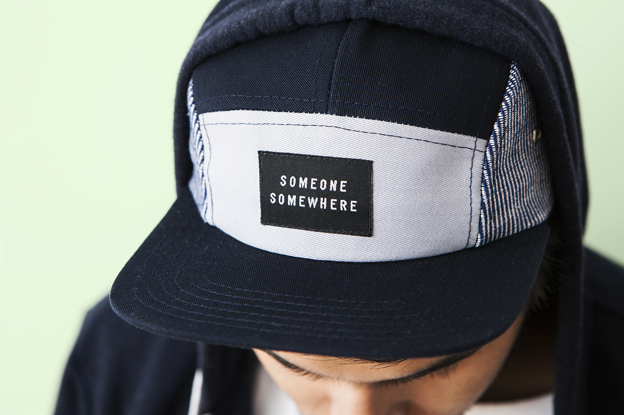
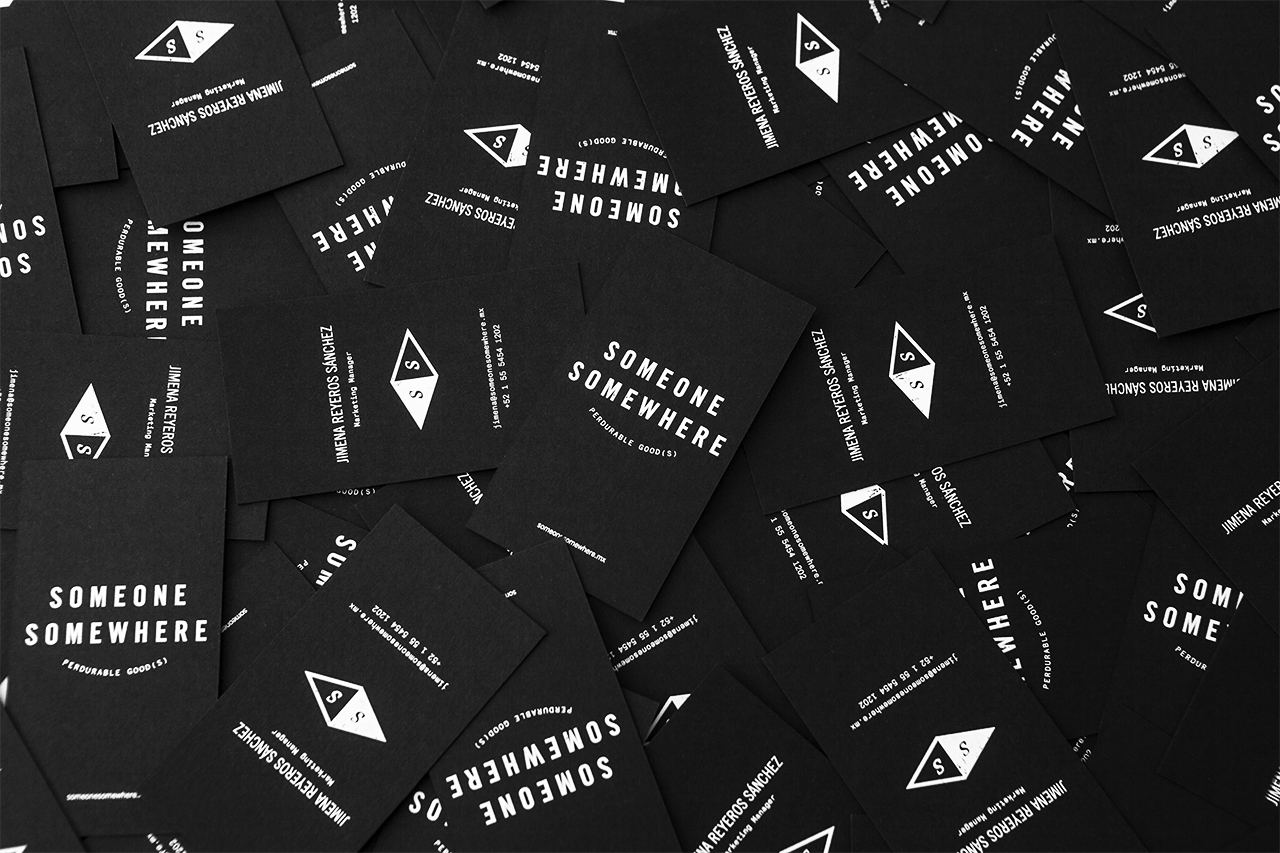
Logotype, its composition, letterforms and placement and spacing within a box, establish a consistent and current visual language, which continues through to art direction and colour. It shares a commonality in the modern shapes, panels and construction of garments, bags and accessories, while material, pattern and texture work in a more provincial and crafted quality.
Design: Sociedad Anonima. Opinion: Richard Baird.
