Printed by Somerset by Leo Burnett
Opinion by Richard Baird Posted 10 January 2017

Somerset is described as being Canada’s top printer, known for its precision, attention to detail and ability to pull off complex jobs. Alongside reproduction services, Somerset, a family-run business, also provides extensive print finishing services. Inspired by this, the stacked paper of the press, and with the intention of engaging a new generation of designers, Toronto based studio Leo Burnett developed a new brand identity for Somerset that showcases its capabilities and establishes an impactful and distinctive continuity between print and website. Although this project was launched last year, after three years of development, it has recently been documented by Leo Burnett online to coincide with the launch of their new website.

BP&O has, over the last six years, reviewed a number of brand identities for printers. Check out Cerovski, Generation Press and Minke. Each leans on the showcasing of capabilities yet manage to draw something distinctive and unusual from a common but useful practice. This one is no different.
Somerset’s brand identity is characterised by a single printed sheet that showcases the studio’s capabilities, through words, print and print finish, and the way that this structured as a web page and been literally translated online through photography and motion.
The project stands out for three key ideas. The working together of print technique and finish on the one sheet, the impact drawn from monochromatic colour palette when you would expect lots of colour, and the way that this has been translated online, retaining a strong material and interactive quality.


The stacked paper that informed identity, the way that this makes up a variety of panels across the sheet, how this is literally translated on screen, and the use of a monochromatic colour palette also calls to mind early digital user interfaces. This could perhaps be a legacy reference, the move from mechanical to digital print reproduction, a bit tongue-in-cheek in its retrospection, or something to engage designers with but it certainly lends the work a visual distinction, particularly when competitors are almost likely to be using an excess of colour.


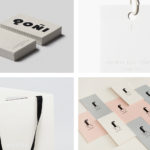
The sheet features some neat details that, while high quality in their finish, were clearly challenging in their preparation. This included an animation component created by printing on a transparency (above), and the gluing and perforation of tear-off panels. There is a pleasant commonality found between website windows and typically printed materials. The proportion of business cards and bookmark work particularly well.


Where the sheet above is limited to a single board, stationery; which included business cards, envelopes and letterhead utilise a variety of print finishes and dyed, coated and uncoated card stocks.
The build of the logo, its consistent lines and the continuity between border and monolinear type, function well as a frame for material and to contain finish. The way that this has been cut precisely (below) from paper, without any irregularities, the effective combination of form and material language to reinforce name and offering, and a type choice that is thoroughly current, all feel grounded in the values of the business and its desire to engage with new designers.
Design: Leo Burnett. Opinion: Richard Baird. Fonts Used: Circular. Papers: Arjowiggins.