Konserthuset Stockholm by Kurppa Hosk
Opinion by Richard Baird Posted 19 January 2017

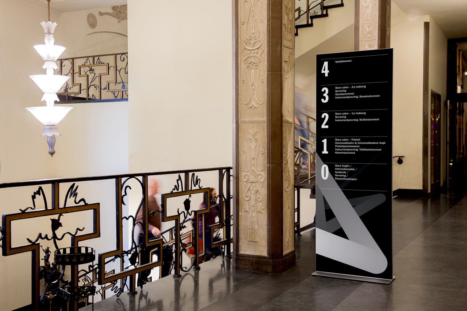
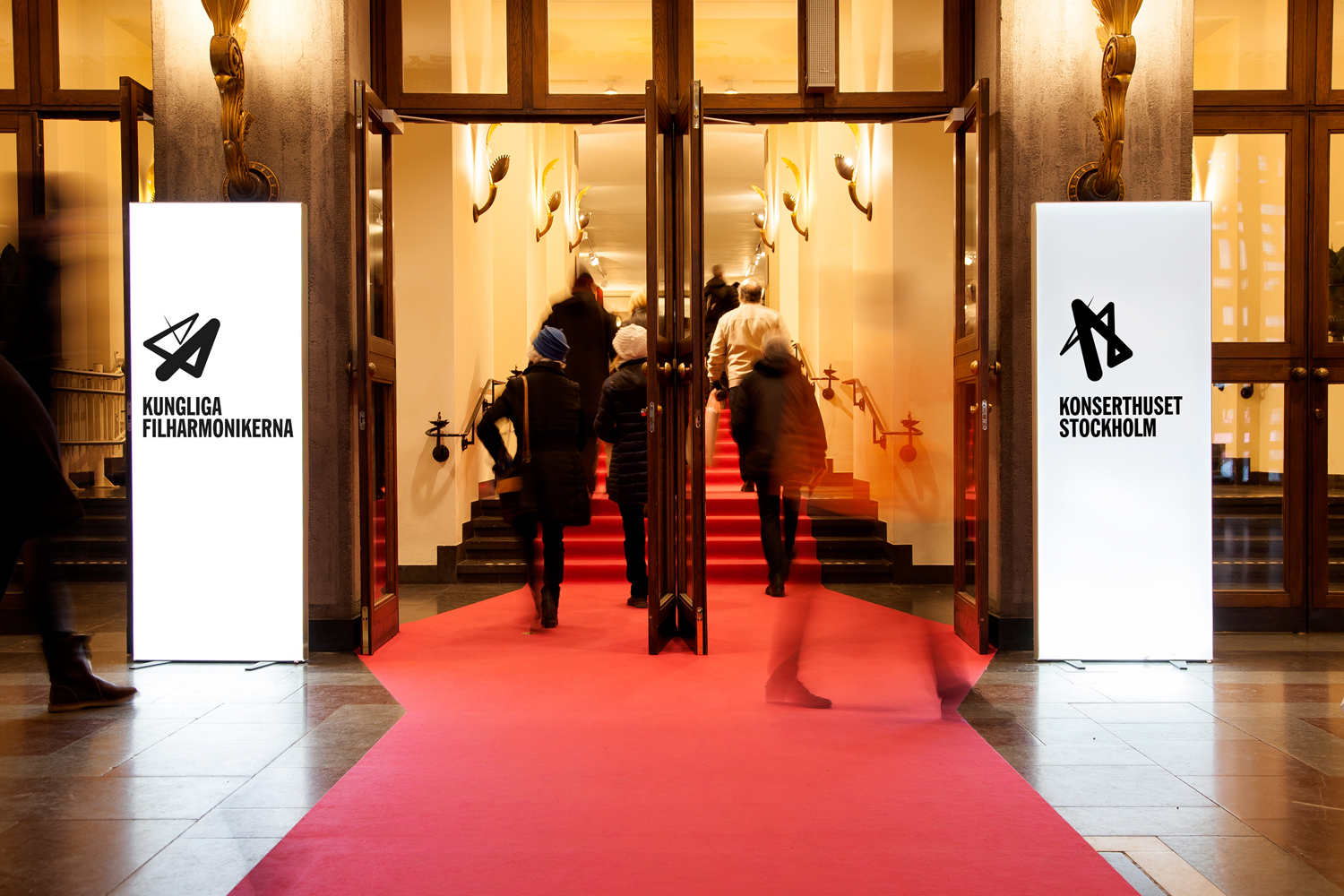
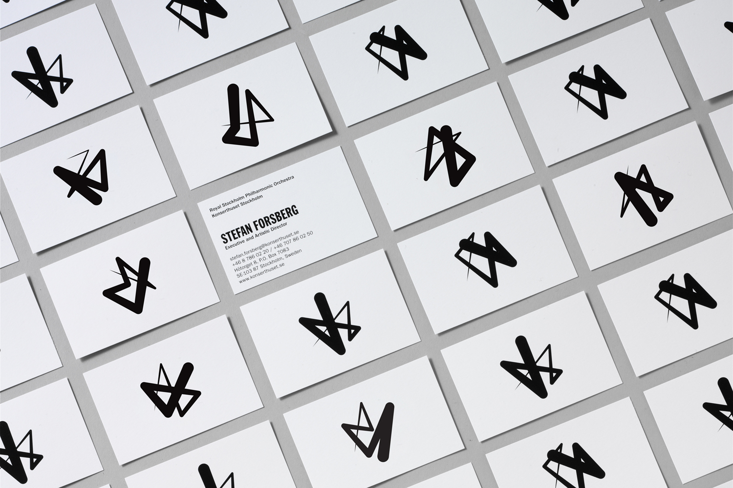
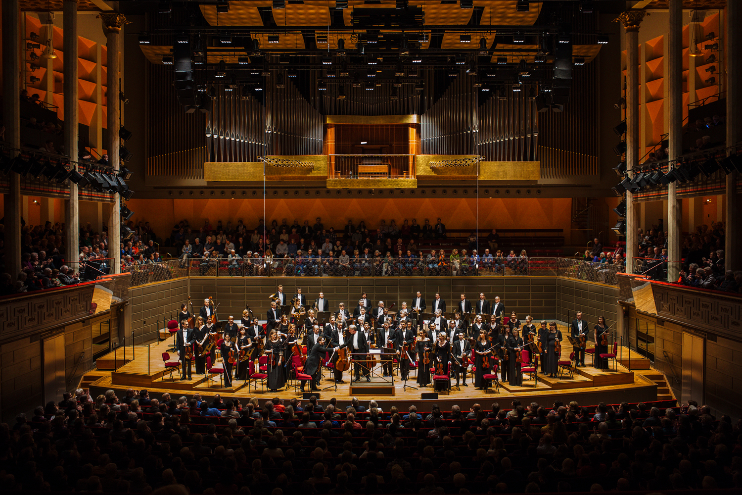
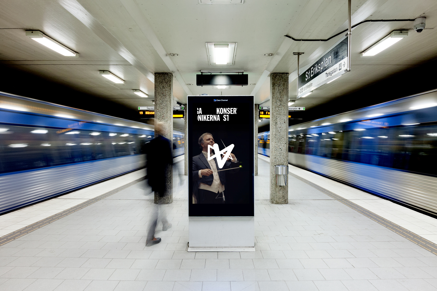
Konserthuset Stockholm is home to the internationally recognised Royal Stockholm Philharmonic Orchestra, and is described as one of Sweden’s most famous and important cultural institutions. Graphic design studio Kurppa Hosk worked with the institution to create a brand identity that would integrate the corporate aspect of venue, one of iconic status and significant cultural legacy, with the passion and dynamism of the orchestra it plays host to. This is achieved through imposing typographic scheme, colour palettes, use of grids and a logo that gives physical gesture graphic form. Brand identity links a variety of assets. These include stationery and business cards, bags, programs, posters, ad campaign, signage and website.

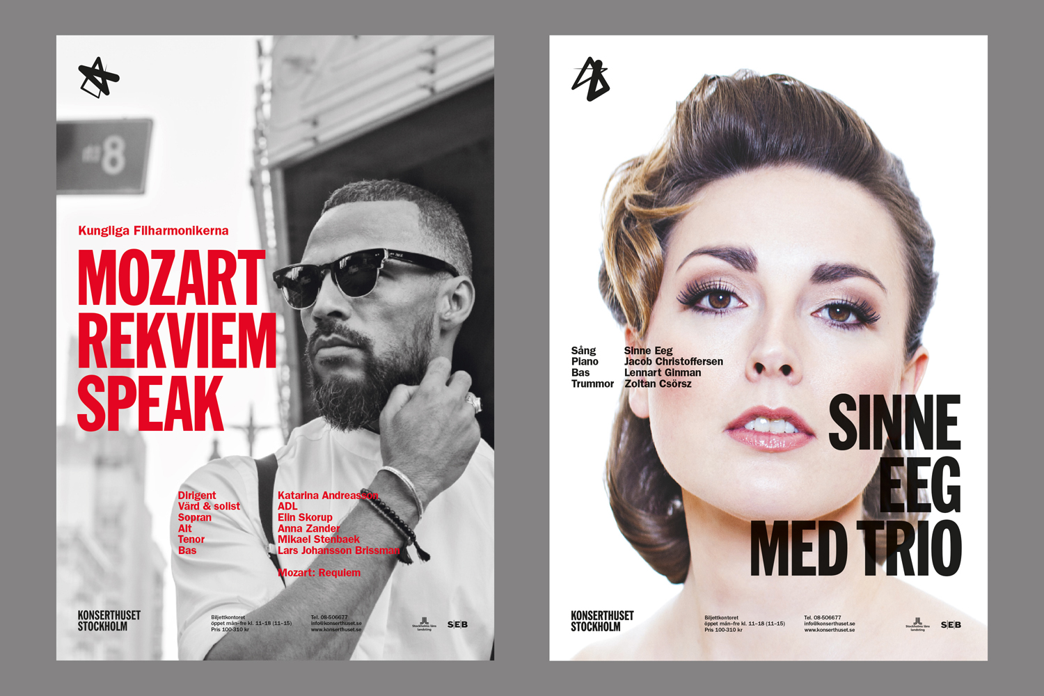
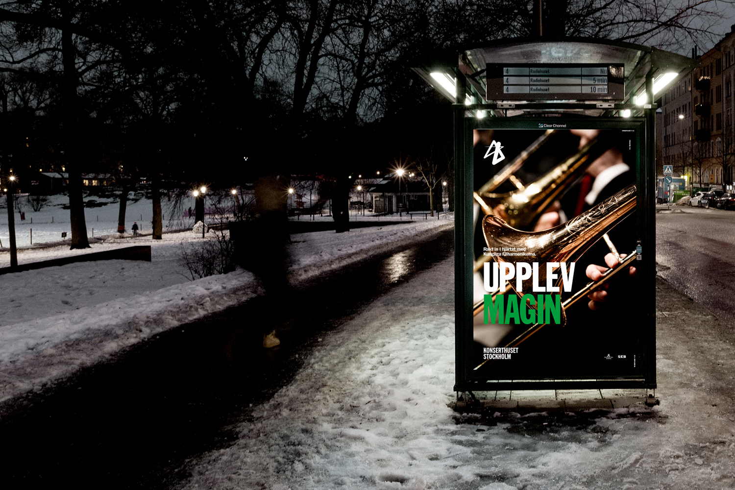
The dual nature of the project, one that intended to work together the corporate activities of venue and the public facing nature of orchestra, can be perhaps most acutely observed in the use of colour, with the former being one of primarily black ink and white boards, and the latter working colour into headlines, ads, posters and programs. It is a bit of blunt tool but an important distinction to be made. While logo has something of a dynamic and individual quality, its relationship with colour significantly broadens tone. Head over to the Kurppa Hosk website and check out the video to get a better sense of how identity uses colour.

Although type and layout establishe a strong visual language between the corporate and public facing aspects of brand, there is a logo-centricity to the work. It hinges on a form that, whether large and cropped across program covers, or small across the face of a business card, has a presence that really draws the eye.
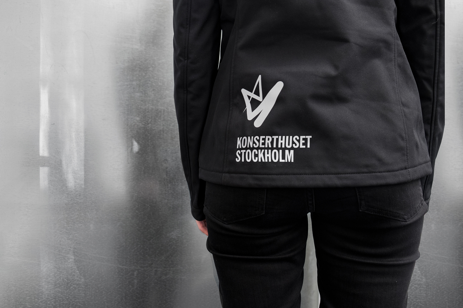
There is some effective form language at work. Abrupt angles create a sense of energy and movement, and line weight (and gradation across bags) delivers flow and progression within three dimensional space. Isolated, it is an interesting form, but it gains much of its value from association, the movement of the conductor’s baton. It is beautifully obvious in its simplicity and confident in its prominence and repetition across much of Konserthuset Stockholm’s communications.
Although it is neat to see an underlying grid-system, one that generates alternatives, these do not provide much in the way of real variation. It is limited to the emphatic, and lacks the nuance and range to either capture something of a musical variety or deliver a clearly defined visual variation to justify outputting more than one logo file. However, and more importantly, freed from the confines of the grid, zipping across screen and in conjunction with the emotive cues of colour, it gains more of a spectrum of feeling. Again, check out the video on Kurppa Hosk’s website.
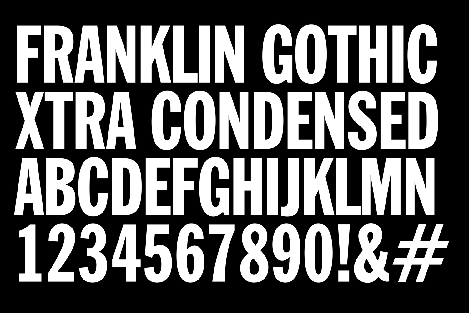
Type offers something by way of the oppositional. Where logo is thoroughly dynamic in its gesture, even as a static symbol, Franklin Gothic Extra Condensed, is robust and unmoving. There is a volume and stature to type where there is movement and energy in logo, which is a particular highlight. It provides, alongside logo, and in conjunction with its proportionality in print, something of the communicatively impactful. Its weight, lettershapes and typesetting, within grid, works well over photography to establish a strong sense of foreground and background. Art direction feels a touch formulaic. It lacks the energy of mark (check out Bond’s work for Helsinki Philharmonic Orchestra), any kind of distinction in framing, composition and colouring, or offers anything that alludes to place, particularly for an internationally recognised institution.
The corporate side is somber and a touch repetitive in its use of logo and economy of colour, but that is perhaps to be expected. Logo is interesting but its form is limited to a very specific expression even in the multiplicity of its rendering, but again, seems sensible for the corporate world. Colour, as seen in Kurppa Hosk’s presentation video, alongside image, brings a lot more life into public-facing communication. It is a solid foundation to build from, and there is definitely a lot of promise within system. A sense of place might have helped draw further value from the musical references, but it is modern and concise, and the oppositional nature of type and logo, colour and the absence of colour bring a thoughtful depth of expression and functionality to the work. More work by Kurppa Hosk on BP&O.
Design: Kurppa Hosk. Opinion: Richard Baird. Fonts Used: Franklin Gothic.





Follow BP&O:
Twitter
Feedly
Facebook
Instagram
