Bespoke by DIA
Opinion by Richard Baird Posted 31 January 2017

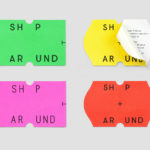
Bespoke is a New York-based boutique digital retouching company working within the fashion industry and moving into its tenth year of business. With a desire to appeal to an increasingly more commercial clientele while not undermining their roots Bespoke commissioned graphic design studio DIA to develop a new brand identity. With a strong favour for contrast; in colour, proportion and type, DIA establish a bold visual expression for Bespoke that, aside from acknowledging past clients and with an eye for future ones, intends to help them stand out from their competitors. This runs across stationery, business cards and tote bags, down the side of portfolio pages, and sitting well at the foot of Bespoke’s new website.

Time has clearly and appropriately been given to crafting a noticeably bespoke font family. It is impactful and differentiating in its shapes, weight and build. Where retouching is often about nuance and fine detail, the Bespoke font family is heavy and mechanical and technical in its Eurostile references, architectural in its heavy lines, tight margins and adherence to grid. This works to both provide immediate visual impact and differentiation, suggests something of a methodology and makes a connection to the fashion industry; think independent boutique publishers and magazine mastheads.
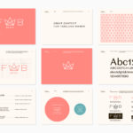
Proportionality, colour palette and a contrasting serif works well to further emphasise the qualities mentioned above. Strategically, a type-based system and a use of black and white (a nod to Bespoke’s previous identity and perhaps a reassuring note to current clients), feels smart within the context of a digital retouching service where high quality portfolio images offer a lot in the way of visual interest and positioning within the fashion market. Where type speaks of the methodical, image is far more visceral, communicating something of the more subtle qualities of Bespoke’s craft.


Although there is an unwavering commitment to simple typographical form, consistent letter widths and limited colour palette, brand identity functions as both a bold visual statement across stationery, and holds up well, due to its weight and extended characters, when small and running vertically down the side of an image. Again, this preference for the bold and extended functions to mark Bespoke out, and is distinctive enough to establish a clear and recognisable continuity of expression in the typesetting of headlines, even when wordmark is absent. More work by DIA on BP&O.
Design. DIA. Opinion: Richard Baird.