Fab Media by Bedow
Opinion by Richard Baird Posted 1 February 2017
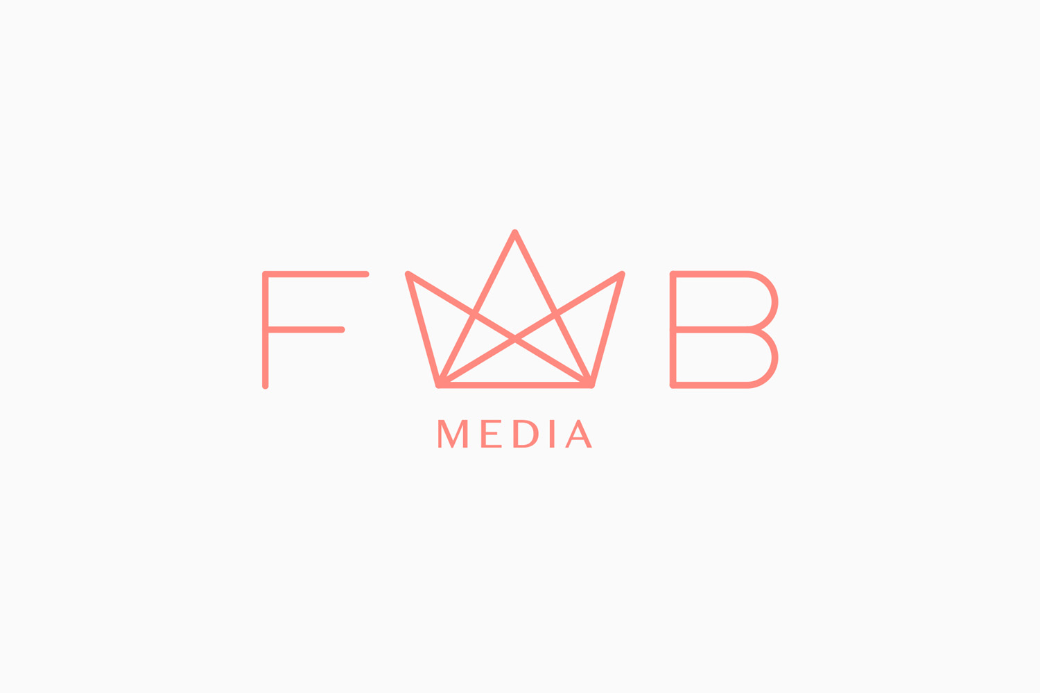
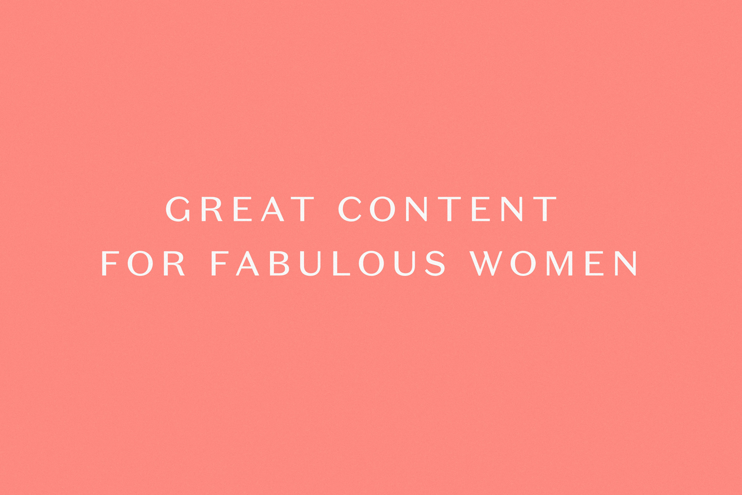
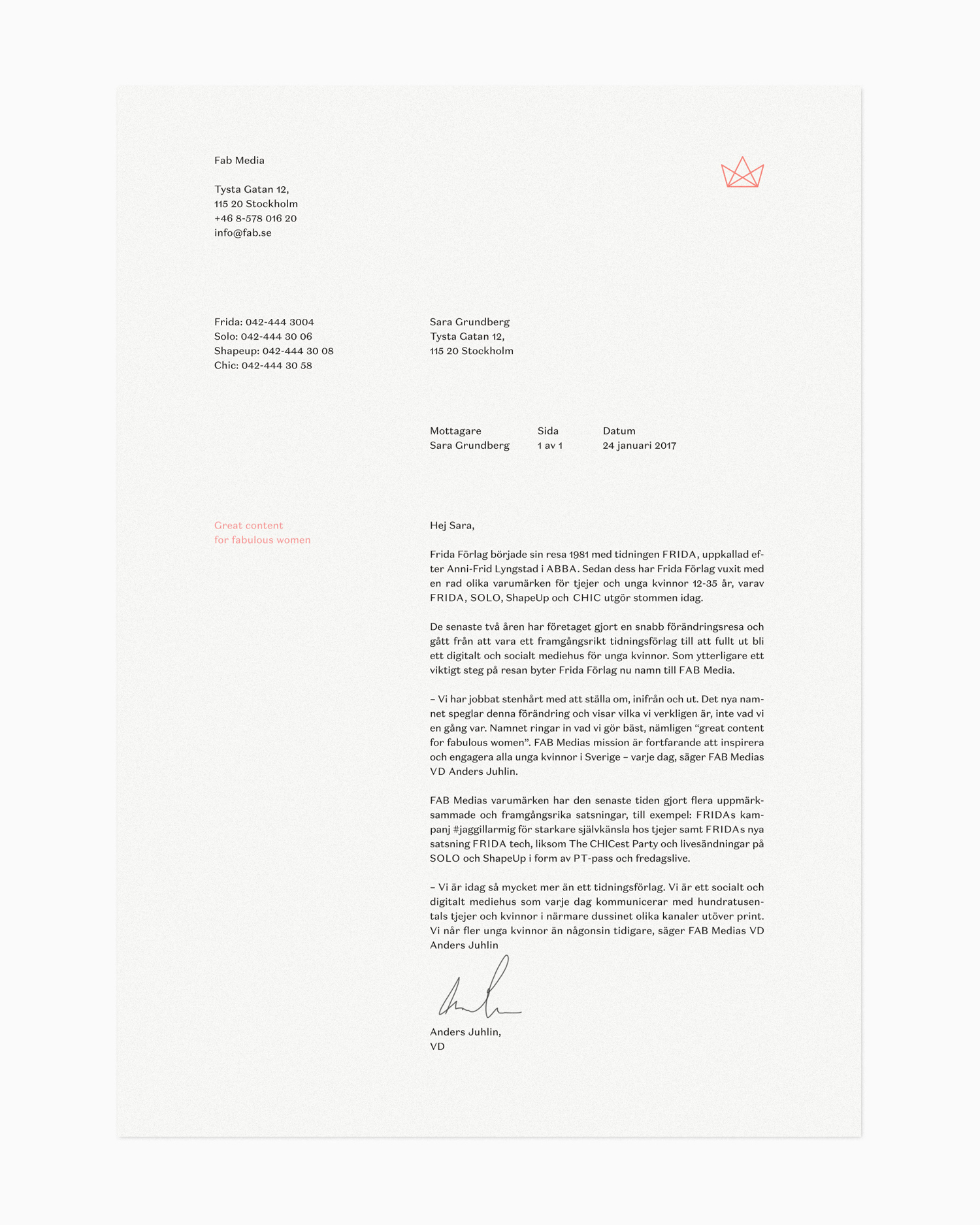
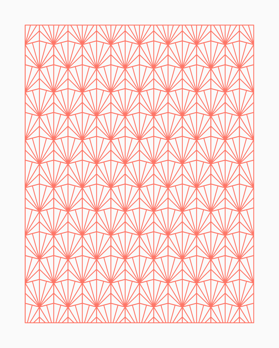
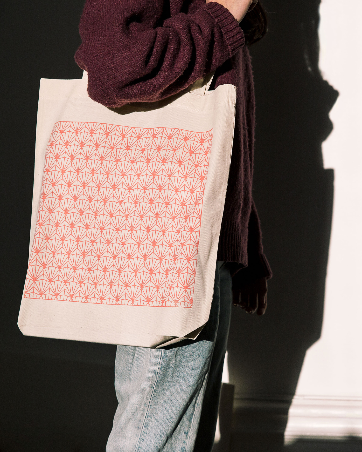
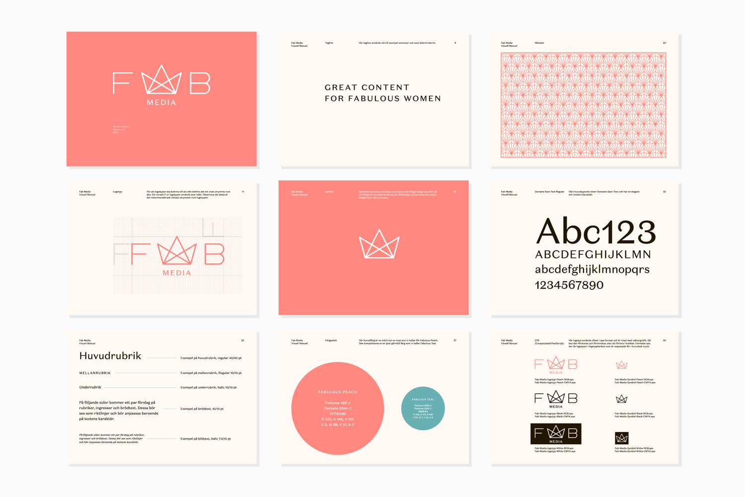
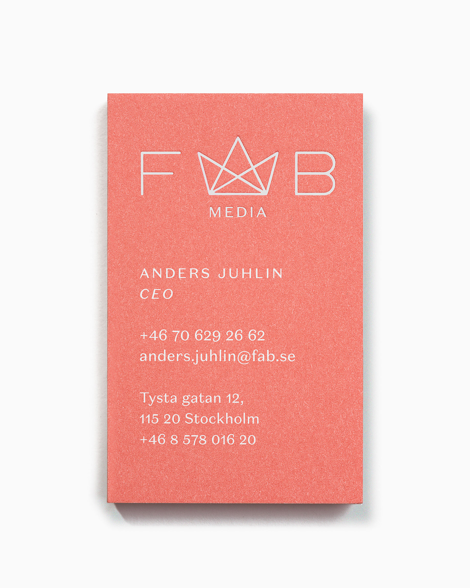
Fab Media is one of Sweden’s leading media companies. It produces inspiring and entertaining content aimed at young women, and owns a variety of multi-media brands made up of websites, social media platforms and magazines. Fab Media’s specialisation, engaging exclusively women and the creation of modern cross-platform brand experiences, is expressed by their new visual identity, created by Stockholm-based graphic design studio Bedow, in the combination of colour, type and pattern. This links stationery, business cards and tote bags, and also included illustration, pictograms and website.
Fab Media is engaged in a variety of activities and owns a number of different brands. Three of its most successful, SOLO, FRIDA and Shape-Up, are multi-media platforms made up of print and digital magazines, apps and native content for a variety of social media profiles. Between them these cover age groups from 12-18, 18-30 and 20-35.
Although not a public facing business, its brand identity does follow some of the conventions, communicating something of a very specific insight within the modern multi-media landscape and its female market insight, rather than a more neutral corporate overview. Strategically this should help to set it apart from its competitors.
Bedow find a pleasant balance between modern and technological (platforms) and the elegant and feminine (market). This can be seen by the monolinear lines that link logotype and pictograms, and in the contrast and flourish of Klim Type Foundry’s Domaine Sans Text, its typesetting and the layout of stationery. This intersection can also be seen in the crown at the heart of logotype, a simple geometric and single line width rendering, and the way that this then informs the basis of a pattern with a more ornamental and slightly art deco quality. Colour palette does a similar thing, straddling the tech and the feminine, although this feels more in line with the current, than a desire to be heavy handed in its use of colour-gender association. More work by Bedow on BP&O.
Design: Bedow. Opinion: Richard Baird. Fonts Used: Domaine Sans Text.
