Croxley Park by Blast
Opinion by Richard Baird Posted 10 February 2017
Croxley Park is a business park located two miles from the town of Watford, United Kingdom, with good local public transport links and twelve minutes from the M25, an arterial route that encircles Greater London. Although strategically placed to make the most of these networks, Croxely Park also has a unique 25 acre parkland setting. Currently, this is home to both multi-national companies and small start-ups, which make up the park’s 2,600 inhabitants.
With the aspiration of becoming one of the top UK business parks, and the intention of competing on a national and international scale, Croxley park worked with London-based graphic design studio Blast to conduct a strategic review, help clarify its positioning and create a new brand identity.
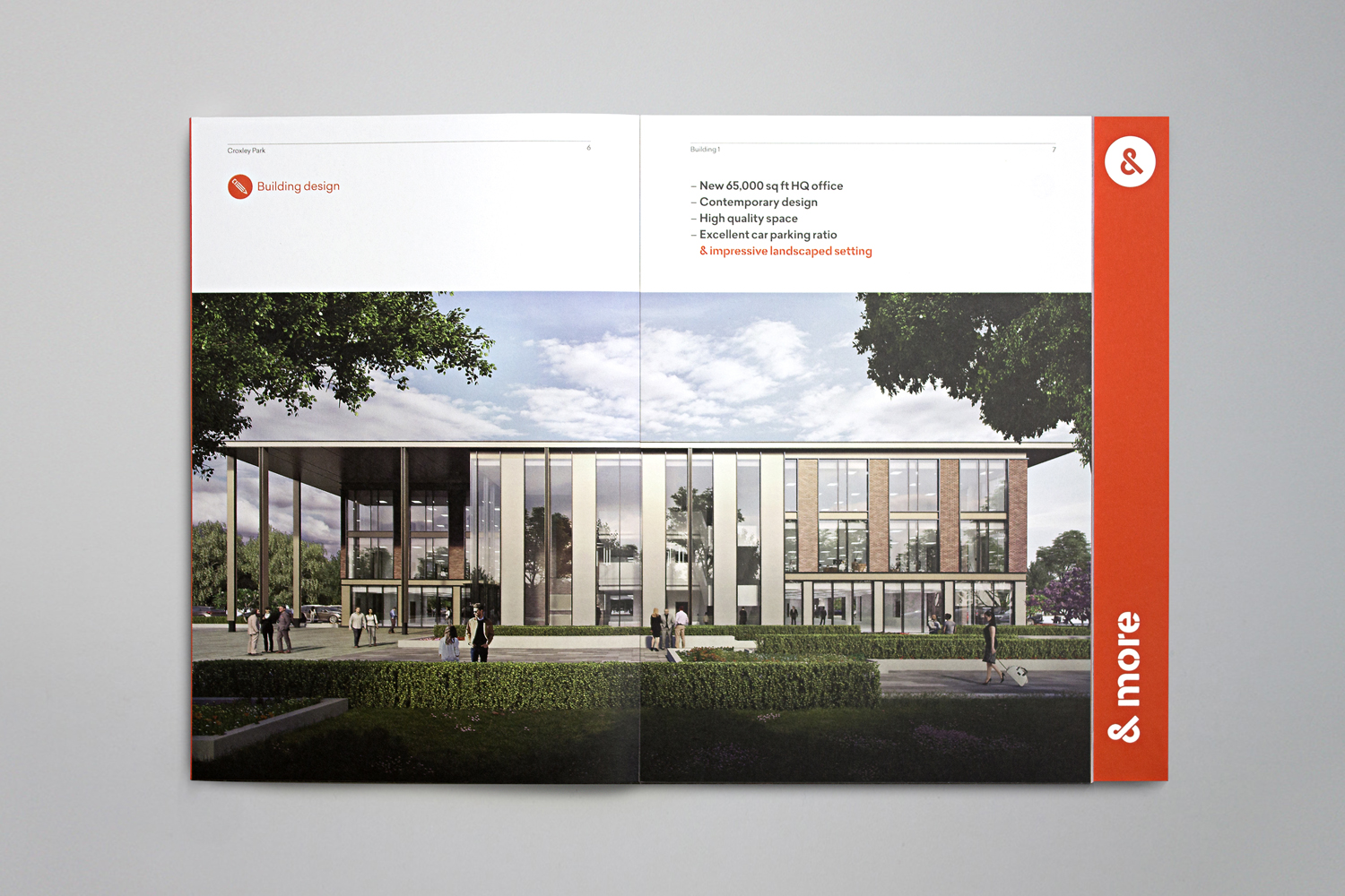
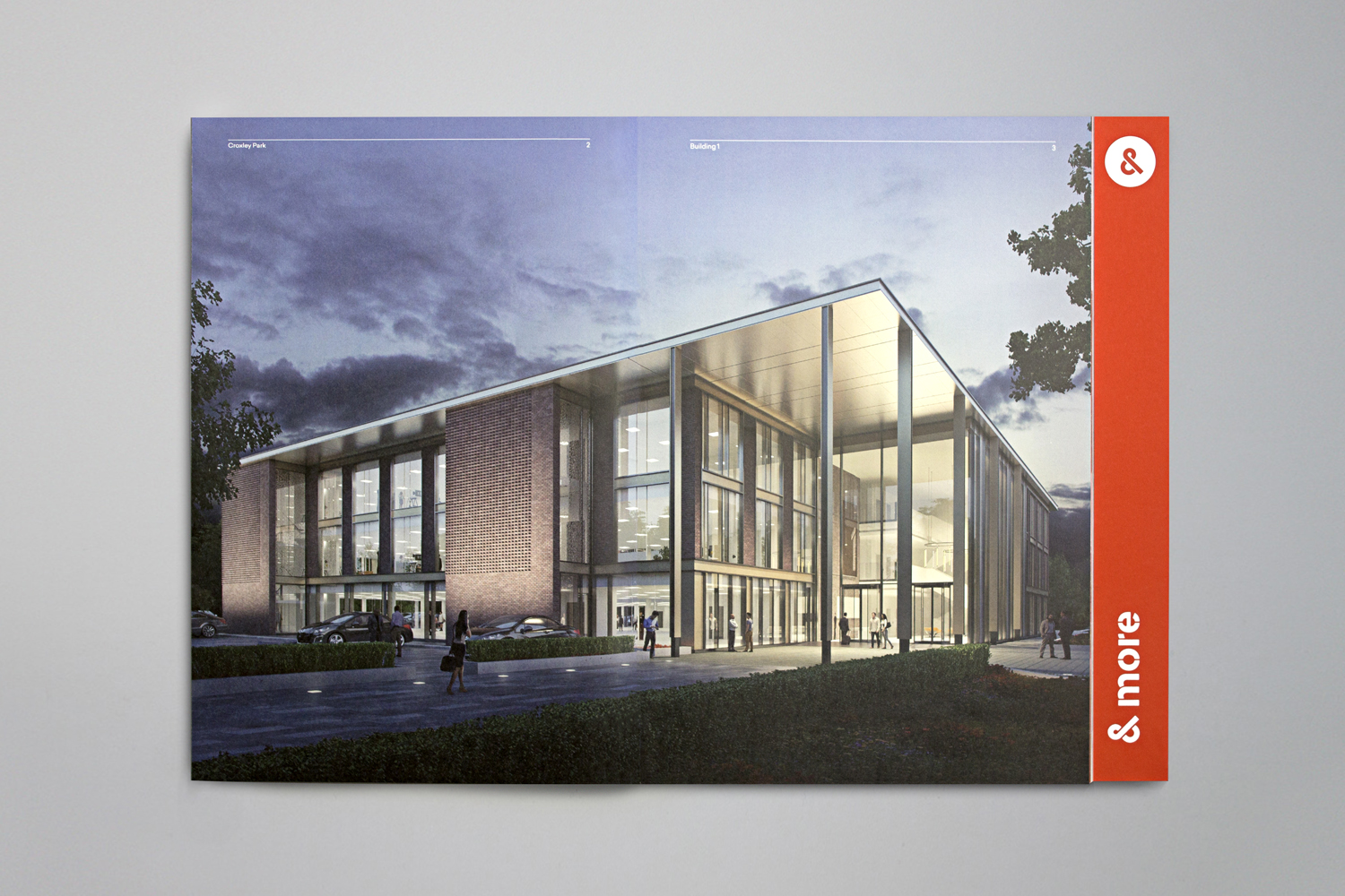
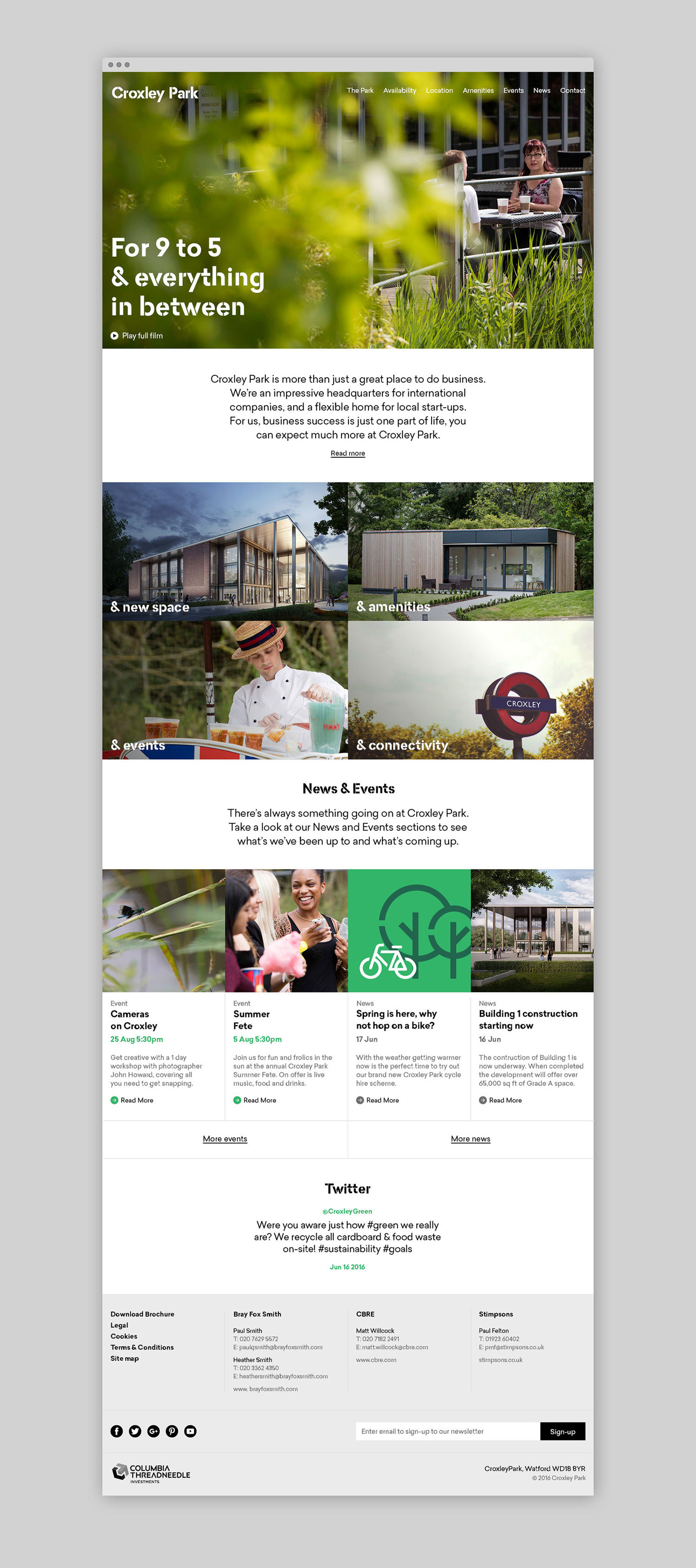
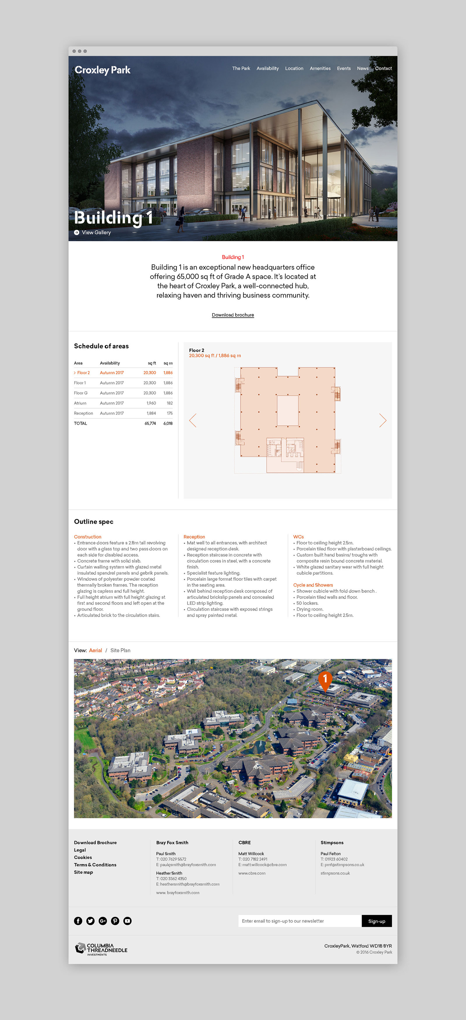
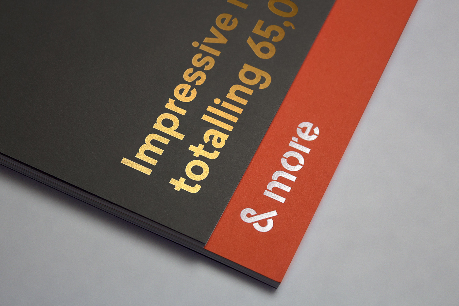
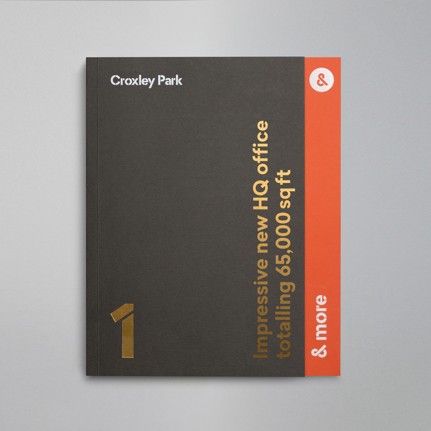
Based around the concept “&More”, Blast developed a solution that brings to life the environment and culture that surrounds the park, its amenities and high-quality service. This is brought together and expressed through cheerful colour and illustration, custom type treatment, photography and moving image, copyrighting, symbol and the materiality of brochure.
“&More” is a simple concept, but one that holds together a multiplicity of visual expressions. Where BP&O looks for something of note within a project, particular highlights that elevate a piece of work, the way Blast weaves together language and type, colour and illustration, static and moving image in a way that feels balanced and communicatively precise is the real highlight.

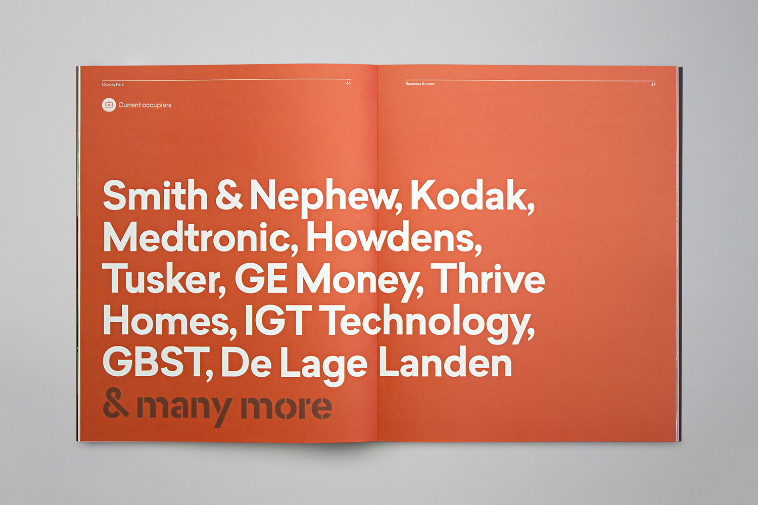
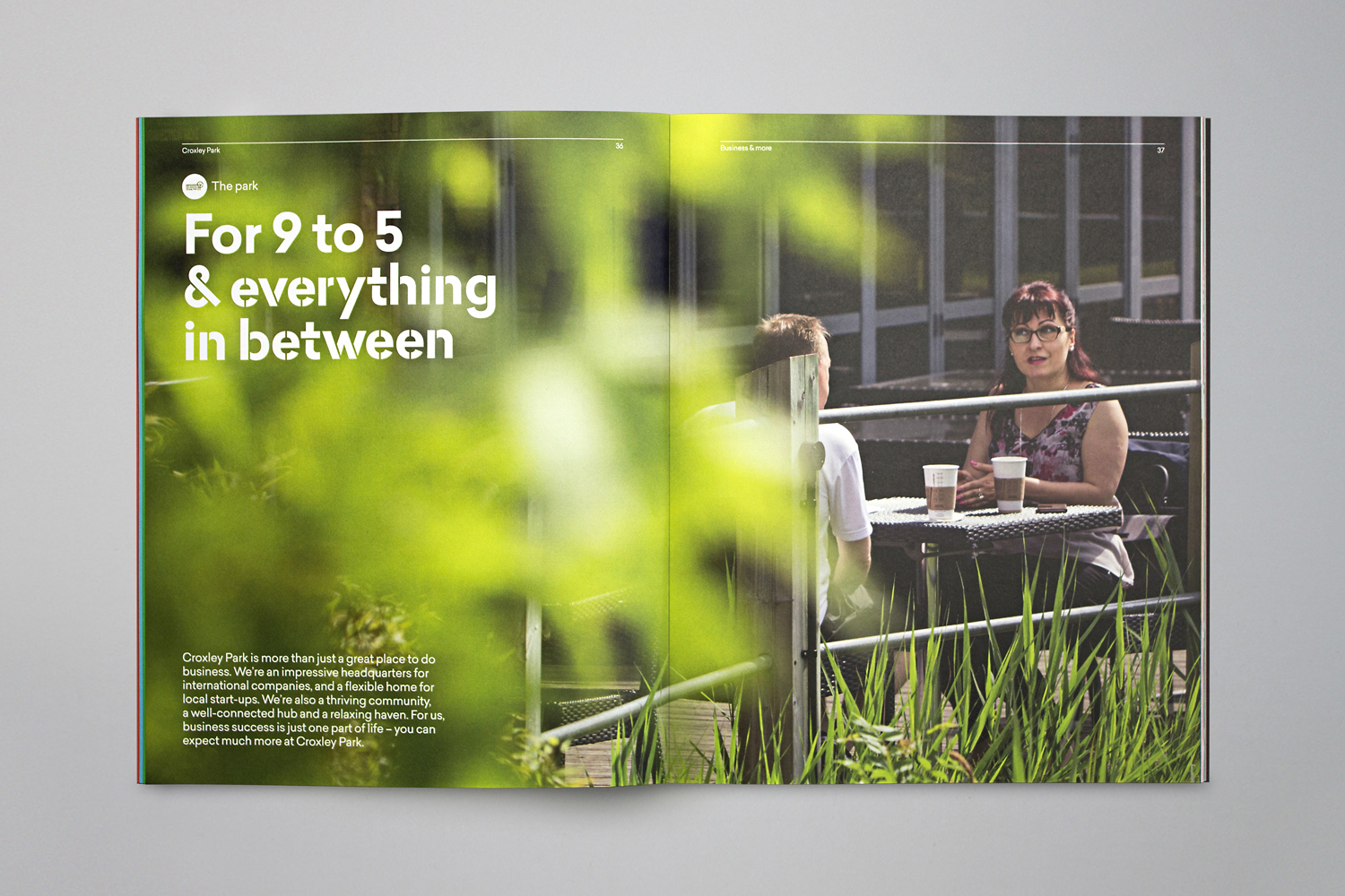
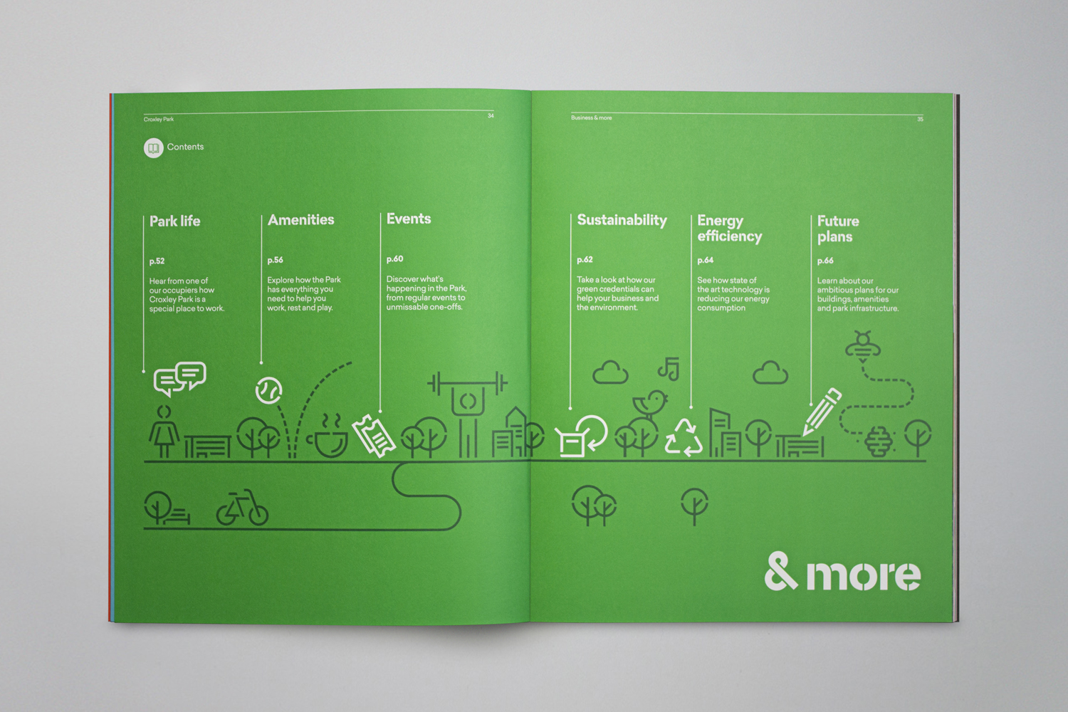
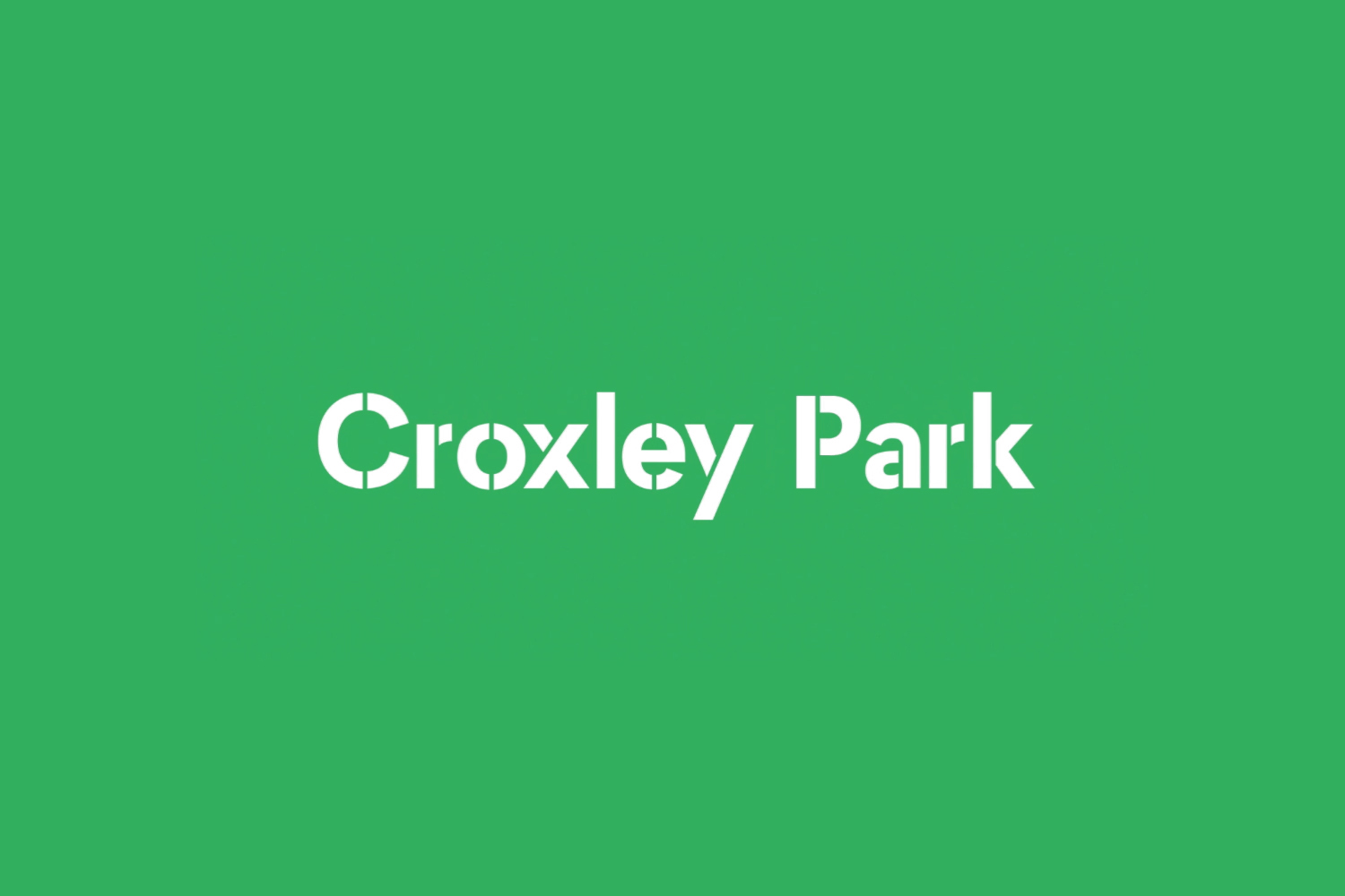
Copywriting is perhaps the most explicit articulation of concept, with an ampersand / CP monogram distilling this down into a neat and satisfying visual shorthand. Blast draw a lot of value from juxtaposition. Elevating two opposing ideas; the quantifiable and practical nature of amenities, and the more visceral qualities of setting and culture. These are resolved through a type choice of simple forms and stencil cut utility, and rich parkland and inclusive community photography and video. The interplay between the two is the basis for much of the park’s visual language, with these intersecting frequently in print, online and in motion.
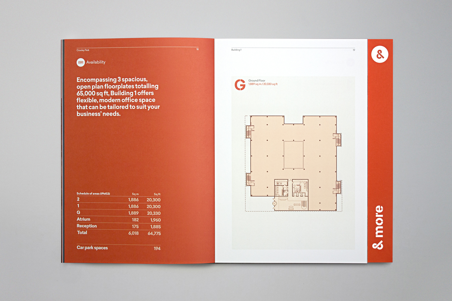
Like Croxley Park and its surroundings, brand identity has been created from scratch, with a clear purpose rooted in concept. Custom type finds a comfortable balance between the utilitarian and personable in its cuts and lettershapes. Art direction of static and moving image captures the park’s greenery, landscaping and wildlife but also its modern built environment and inhabitants. Colour palette plays with an earthy brown and a cheerful mix of green, blue and orange. Illustration, which shares a commonality with type, does a good job of working together community and amenities, while materiality touches upon the high quality in its uncoated boards and mix of print finishes.
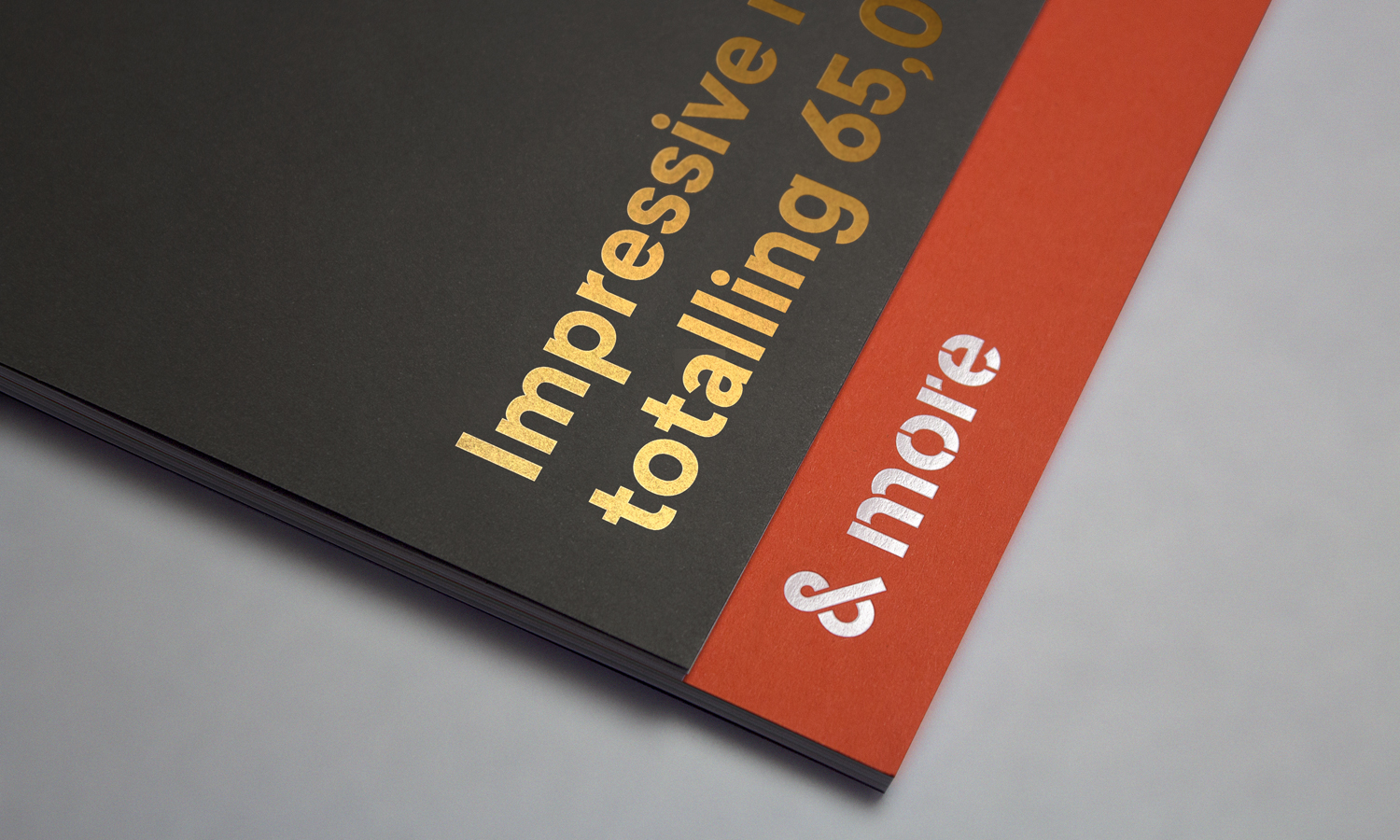
Moments of solid colour and type and followed by double page spreads of full bleed photography, and then by a mix of both type and image, provide plenty of variation but consistency. Each component is individually distinctive, well-intentioned and weighted in print and online, and collectively used to reinforce the park’s positioning and compliment the more direct nature of copywriting. Although made up of quite a few different components, overall, there is a simplicity and a universality to many of these choices (ideal for the national and international market) that makes the work communicative and visually interesting. More work by Blast on BP&O.
Design: Blast. Opinion: Richard Baird.
