Fabric of Onehunga by Richards Partners
Opinion by Richard Baird Posted 21 February 2017
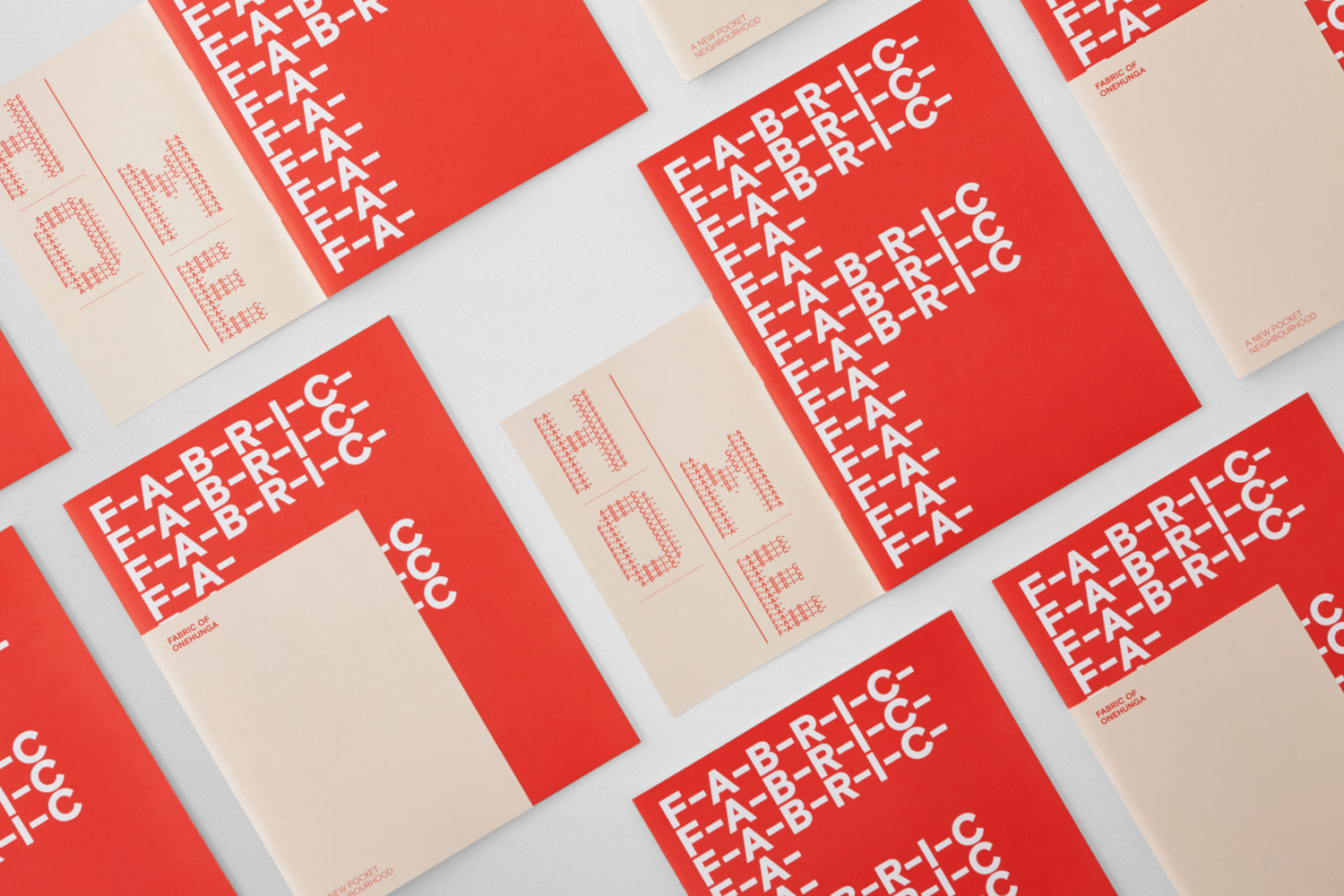
Fabric is a residential property development project and new pocket neighbourhood within the area of Onehunga, one of Auckland’s oldest suburbs and a brownfield site of warehouses with a light industrial heritage. Developers Lamont and Co., alongside Colliers International, commissioned graphic design studio Richards Partners to create a brand identity for the development that would link brochures, specifications pack, website and a variety of print communications for the showroom.
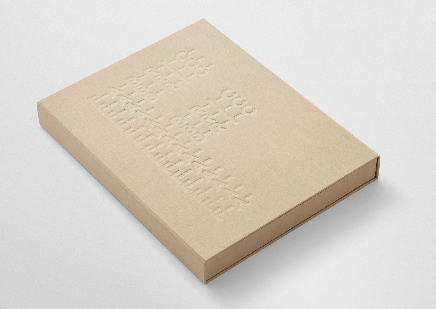
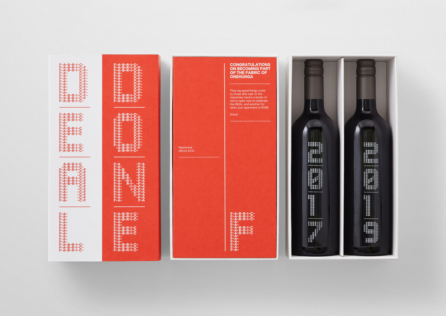
Richards Partners’ concept reflects the architecture and surrounding context of Fabric, which takes its name from the historical use of the site as a clothing factory, through logotype connected by the thread-like qualities of hyphens, built up into a custom display typeface, and the material quality of uncoated dyed papers, fabric cover and blind deboss. This post was updated August 2017 with a bunch of new images.
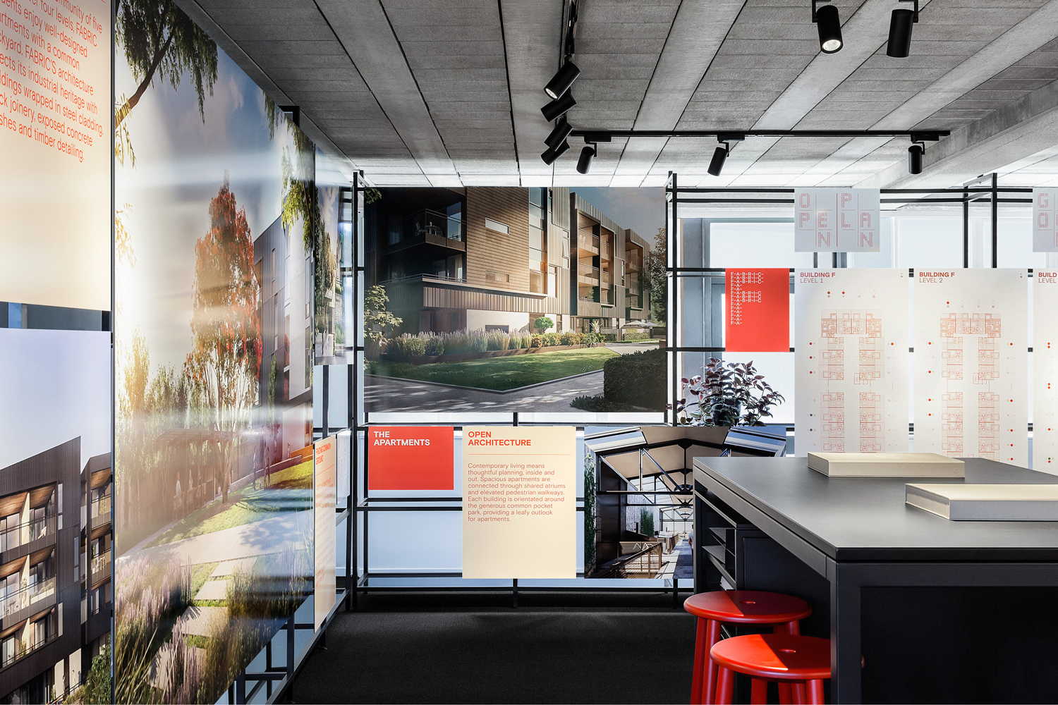
Fabric is made up of five buildings over four levels which house modern apartments with a common backyard and an approach to architecture that draws on the industrial heritage of the area, with buildings wrapped in steel cladding and featuring black joinery, exposed concrete finishes and timber detailing.
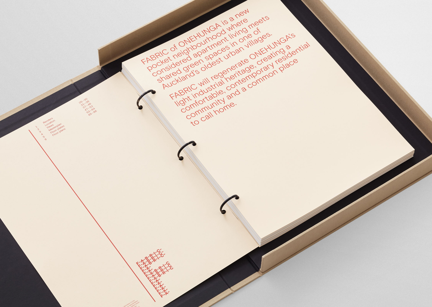
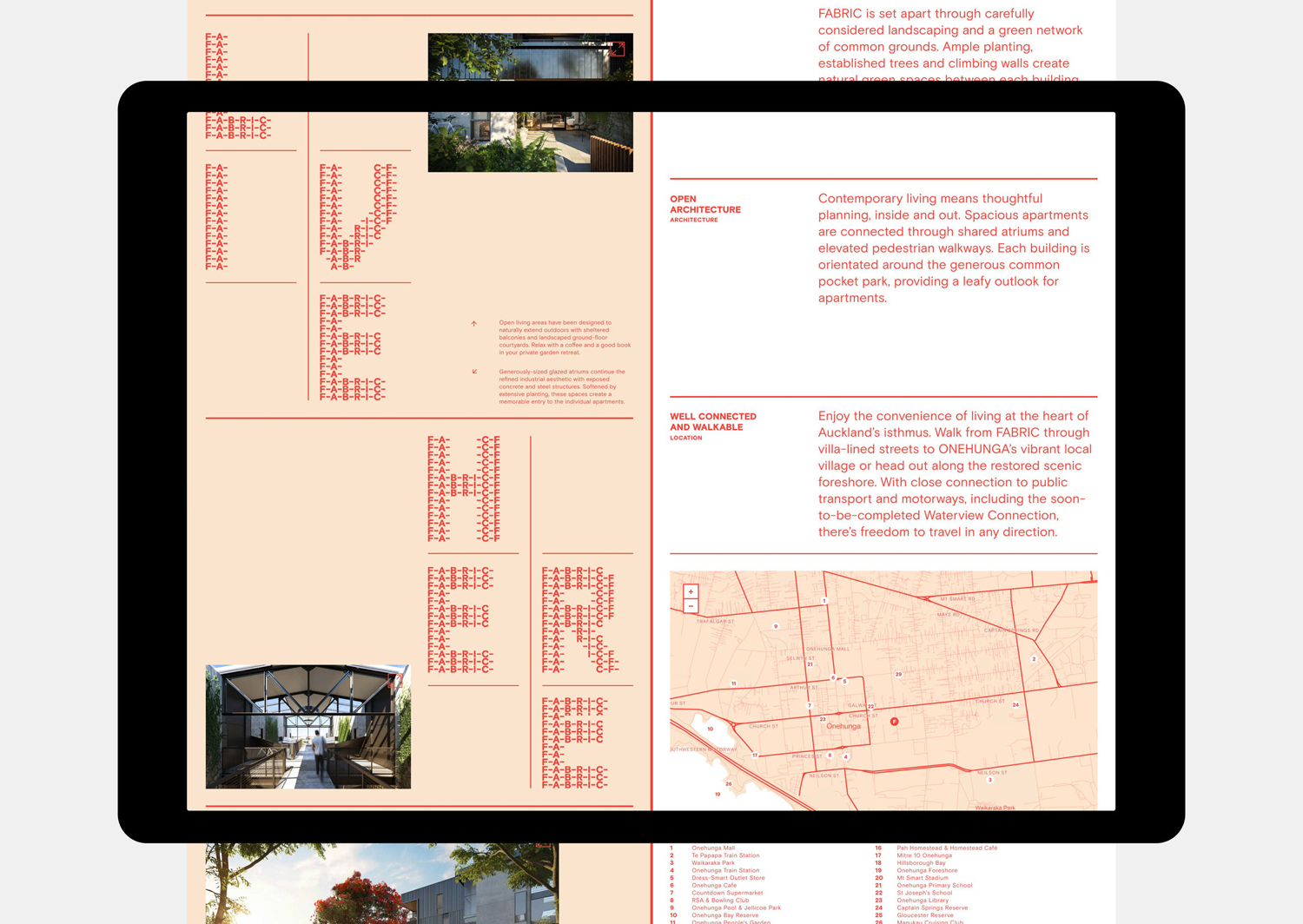
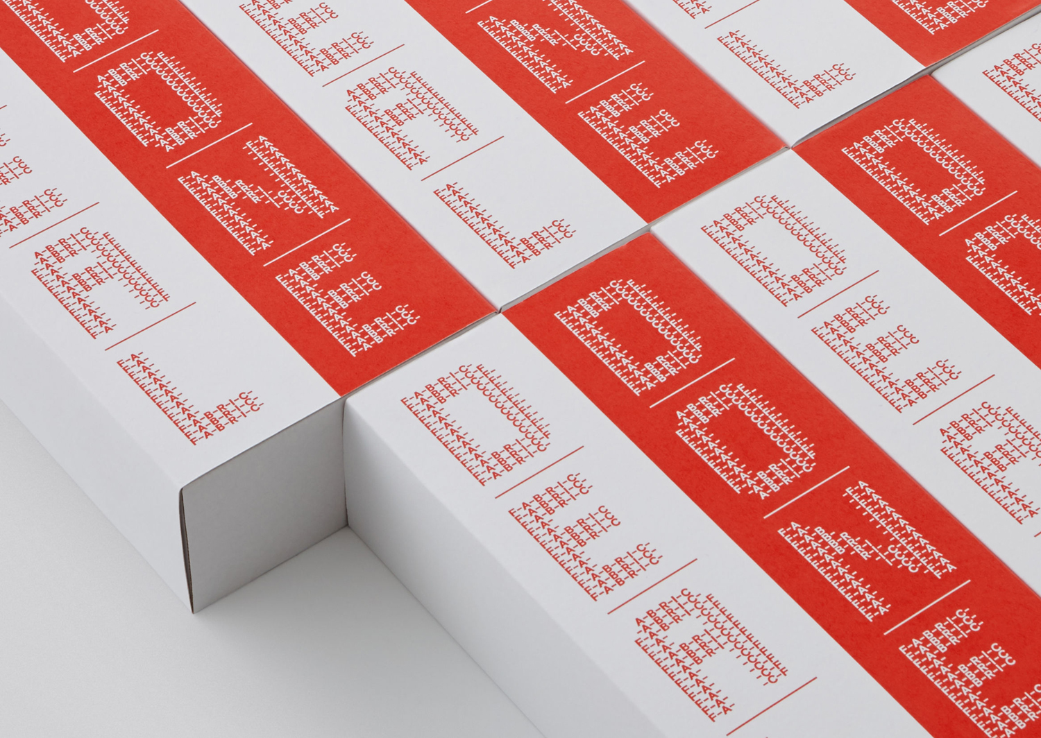
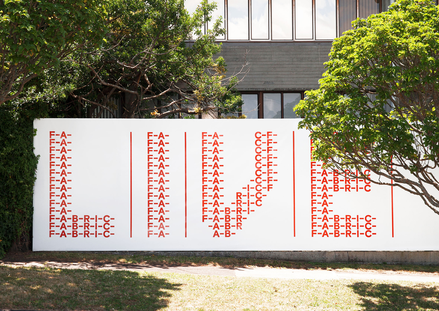
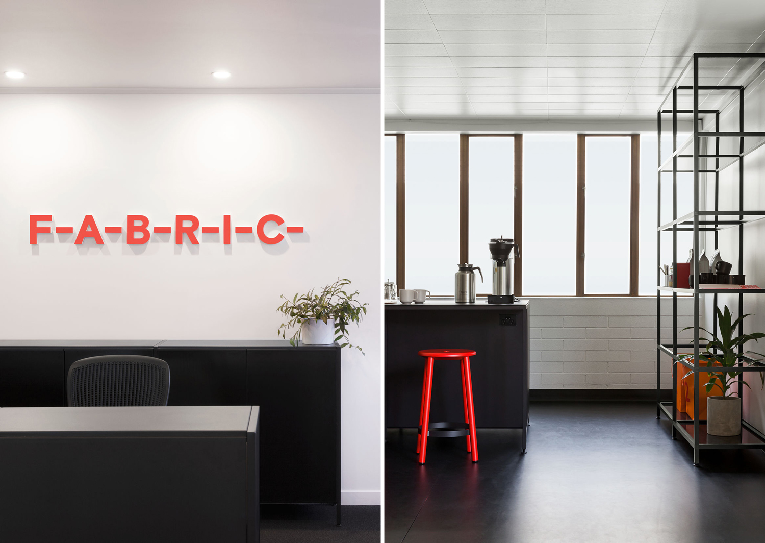
This meeting of contemporary living and industrial past; robust premises producing fine textiles, is captured within Richards Partners’ brand identity work. This comes through in the choice of the bold, monolinear and sans-serif characters of Colophon’s Basis Grotesque, the connective lines that join individual letters, and how these build up into the larger letters of custom typeface Fabric Display.
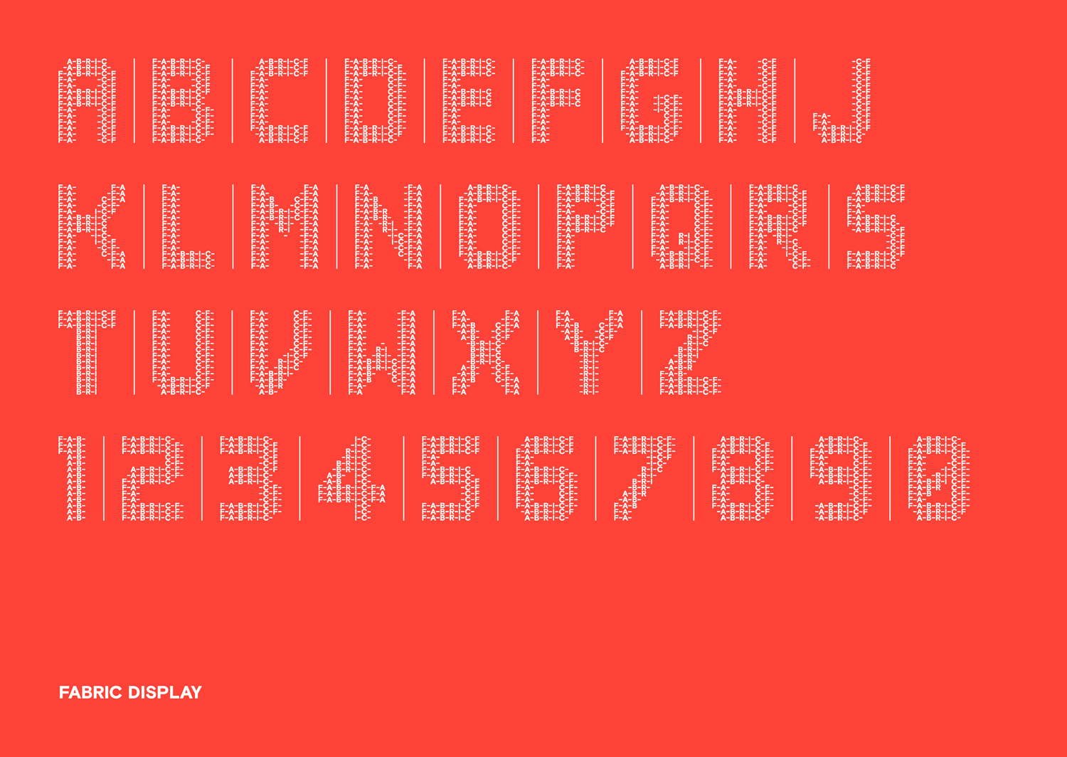
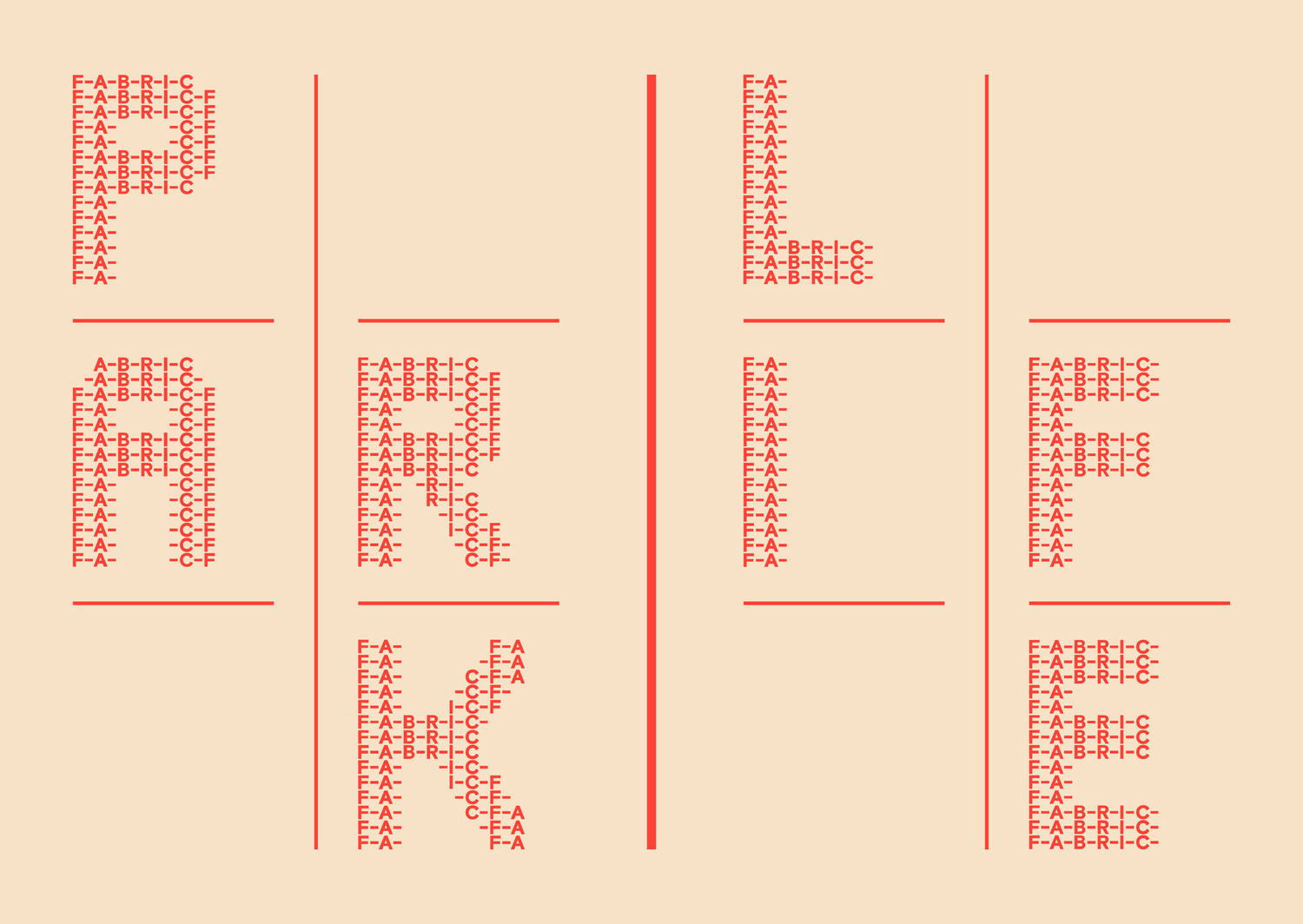
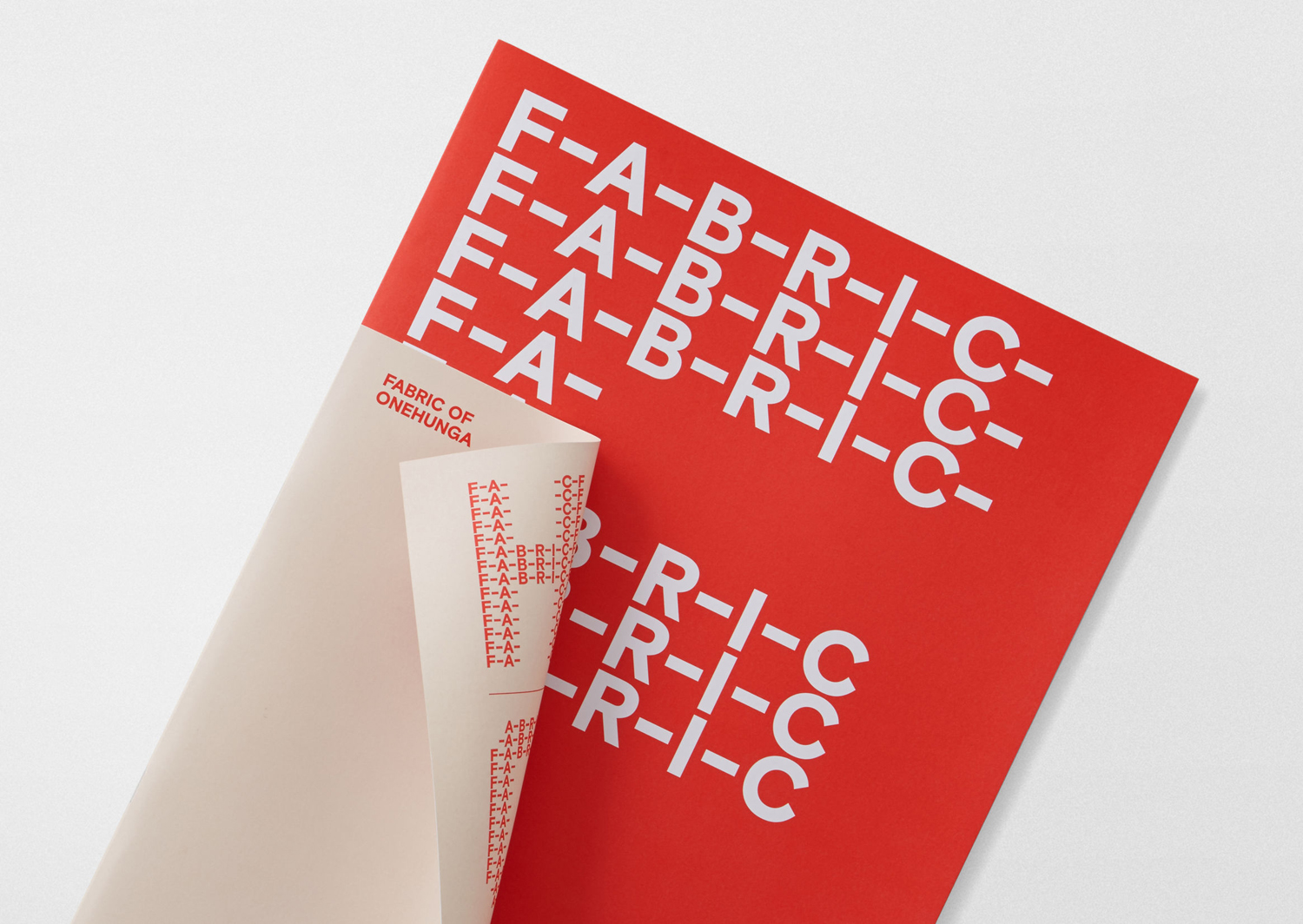
The strength of the work lies in the simplicity of naming and implementation of concept. If there was any question of discernibility, the connections looking to be made between textile past and modern architectural considerations, name, typographical form and typesetting make this clear, with the textile qualities of Fabric Display working well from a distance and scaled down.
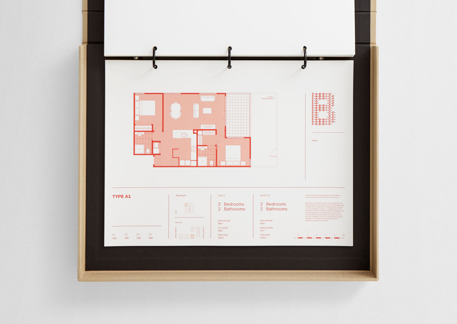
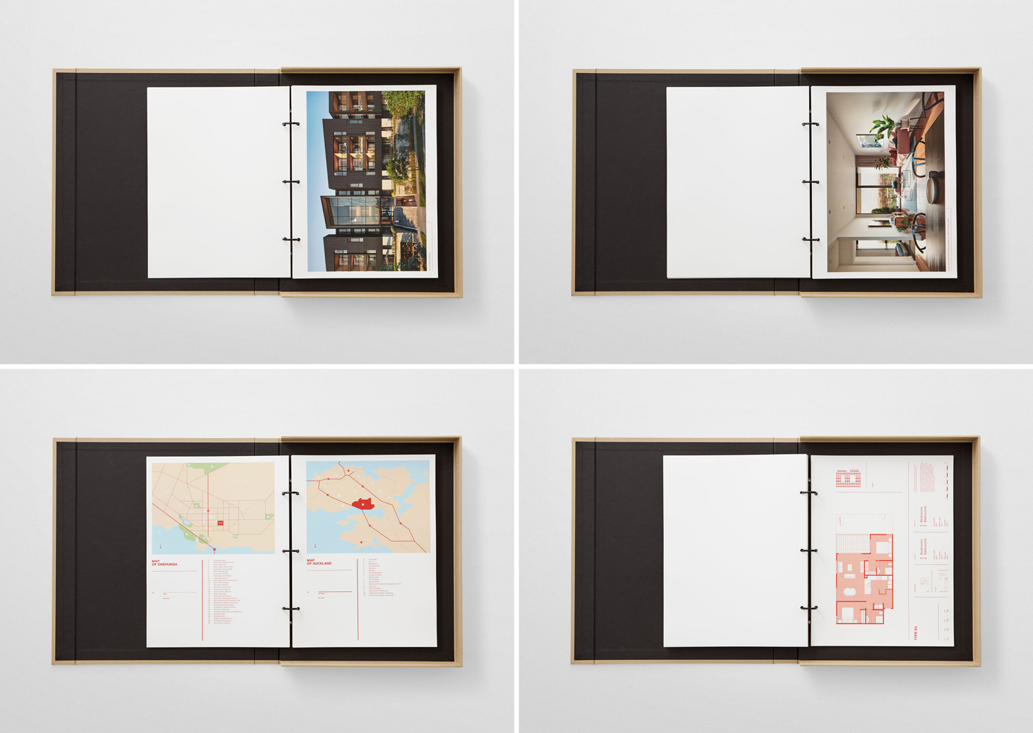
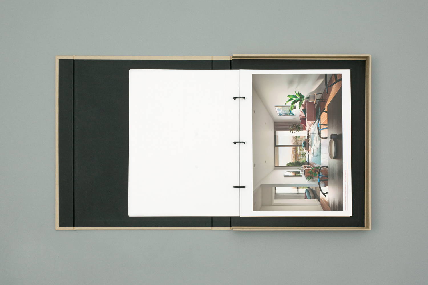
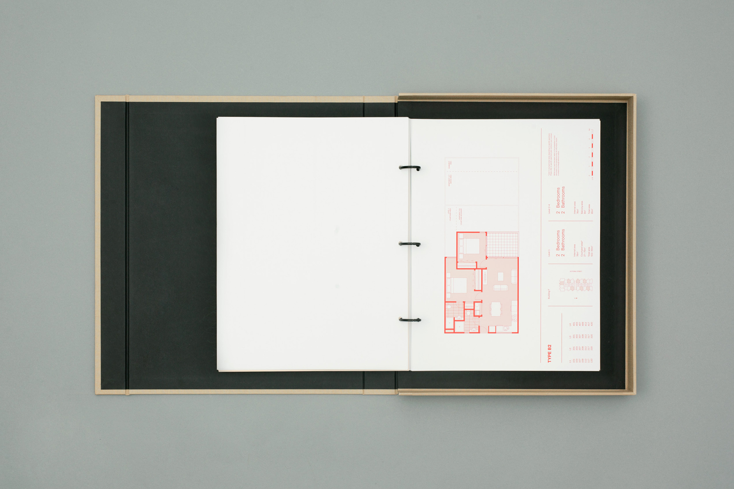
This connection with the area’s history and modern development also comes through in the showroom, a particular and unexpected highlight, in the choice of furniture (not too dissimilar from cutting tables and stools), steel frames, spot lighting, concrete ceiling and the hanging of large format images and floorplans (like drying fabric). There is a strong sense of the modular and structural here, which weaves a smart continuity throughout the showroom, brochure and website.
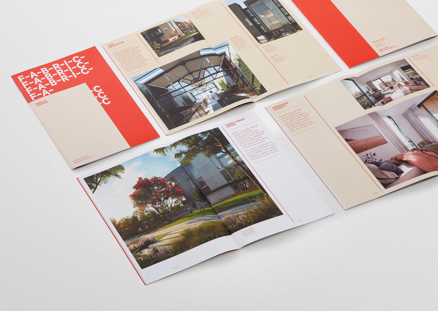
Although colour palette is restrained, it also plays with a sense of past and present. Often you see a favour for the architectural, be that warm and cool concrete greys or a preference for black and white, here there is the impact warmth and modern distinction of a bright red, which draws the eye, and the more retrospective quality of a linen white, which frame development images.
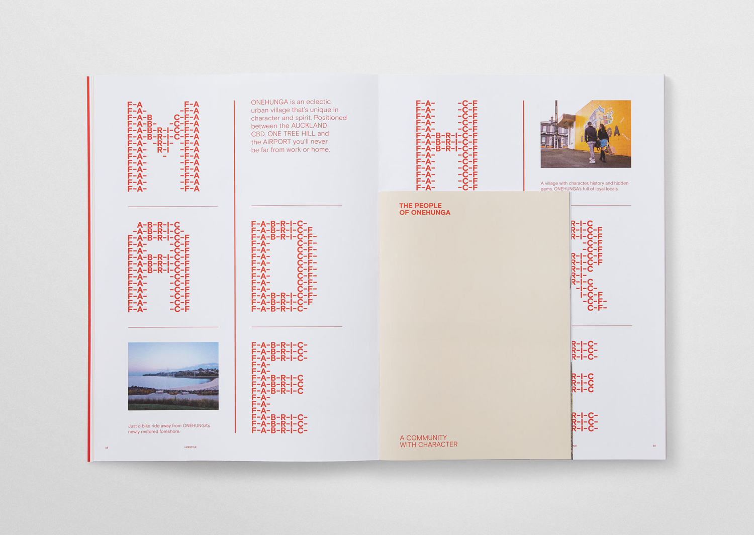
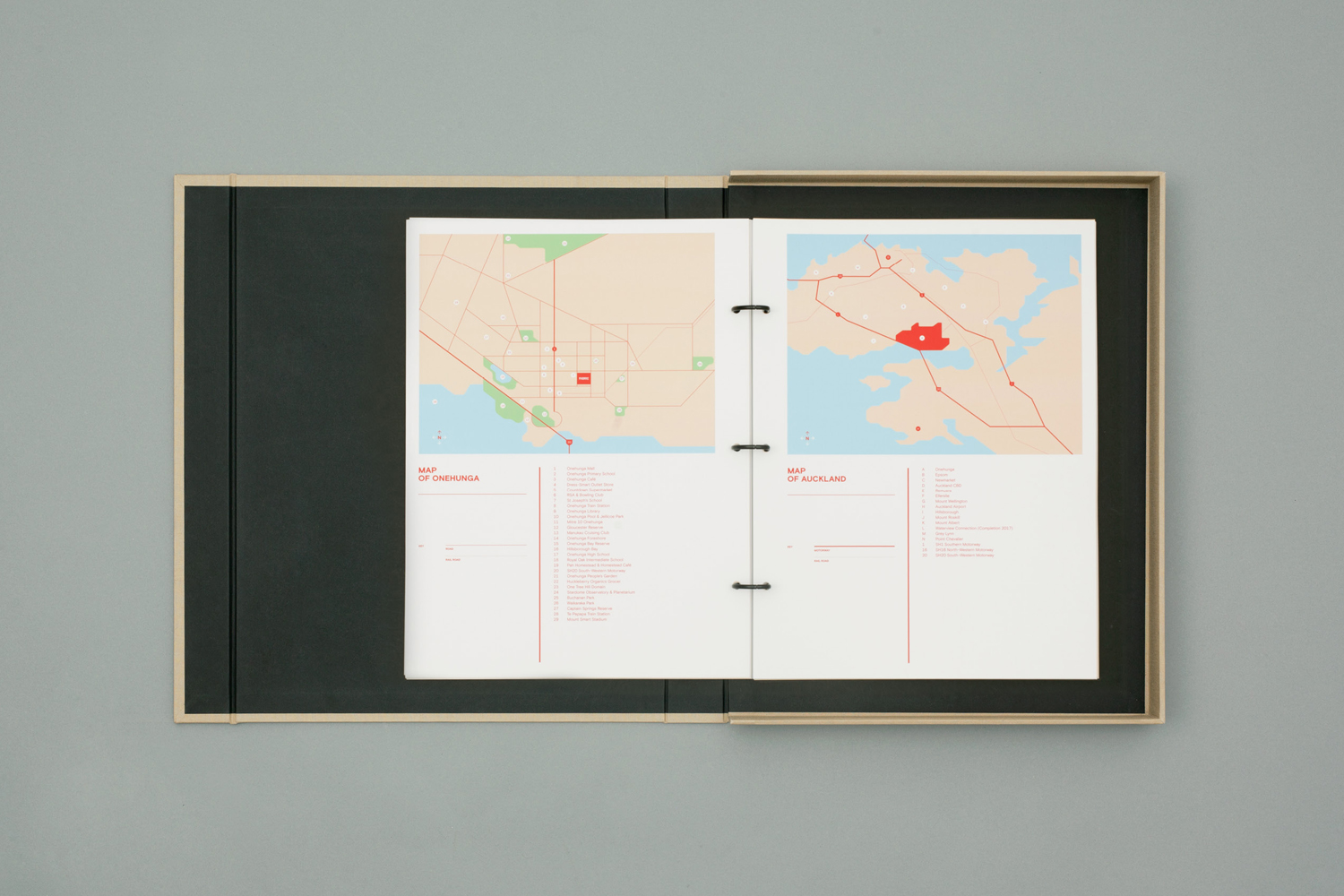
Brochure effectively plays with contrast; in the proportionality of titles and body copy, paper size and colour, image and space, and the mixing of solid colour and white. These choices, in conjunction with Fabric Display, work well to break up sections, have a modularity and structure like modern property and industrial process, and establish a distinctive and interesting visual character.
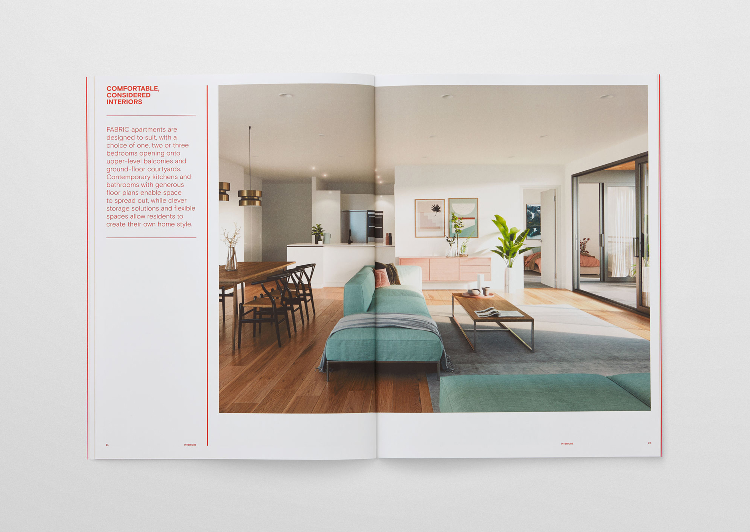
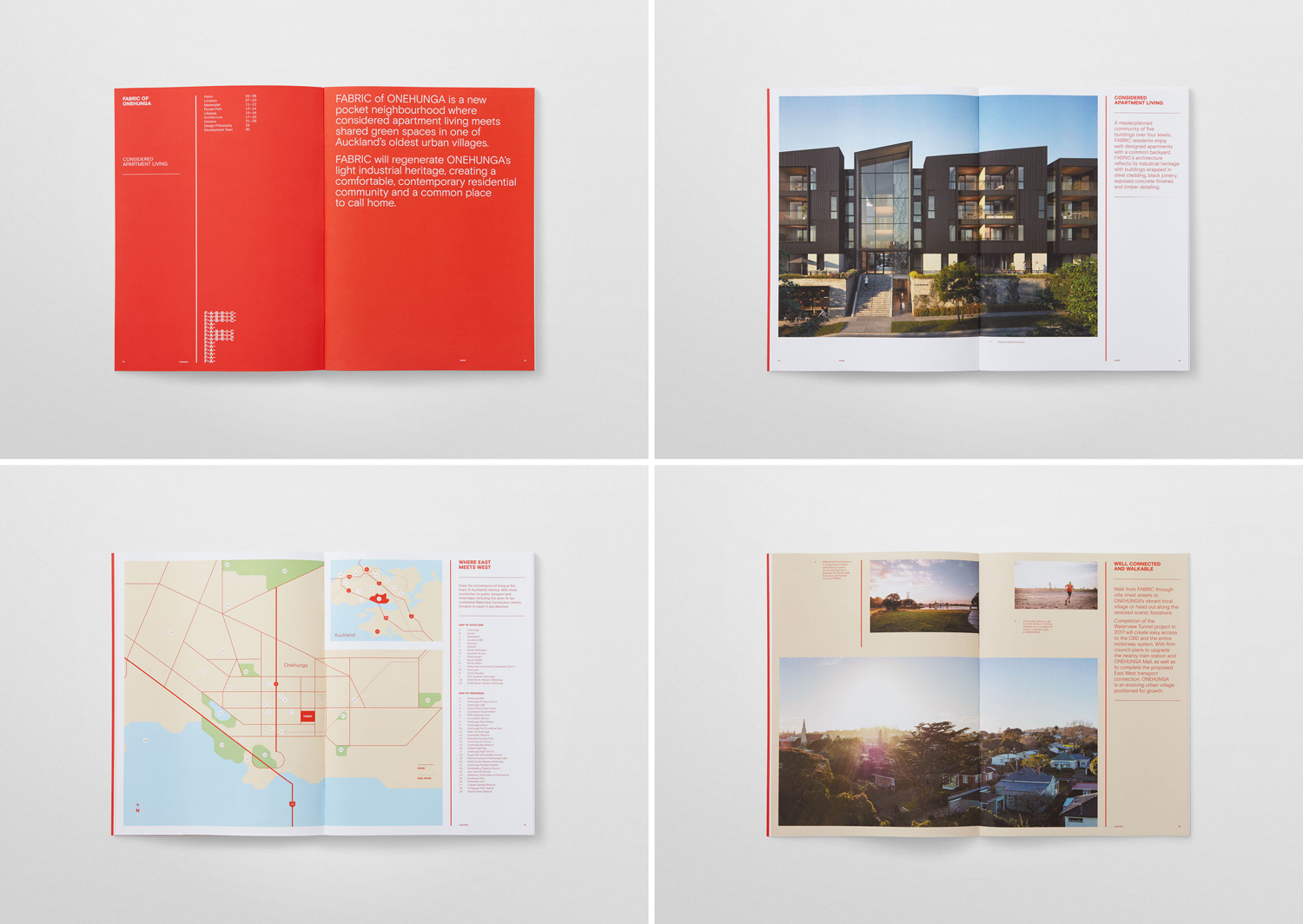
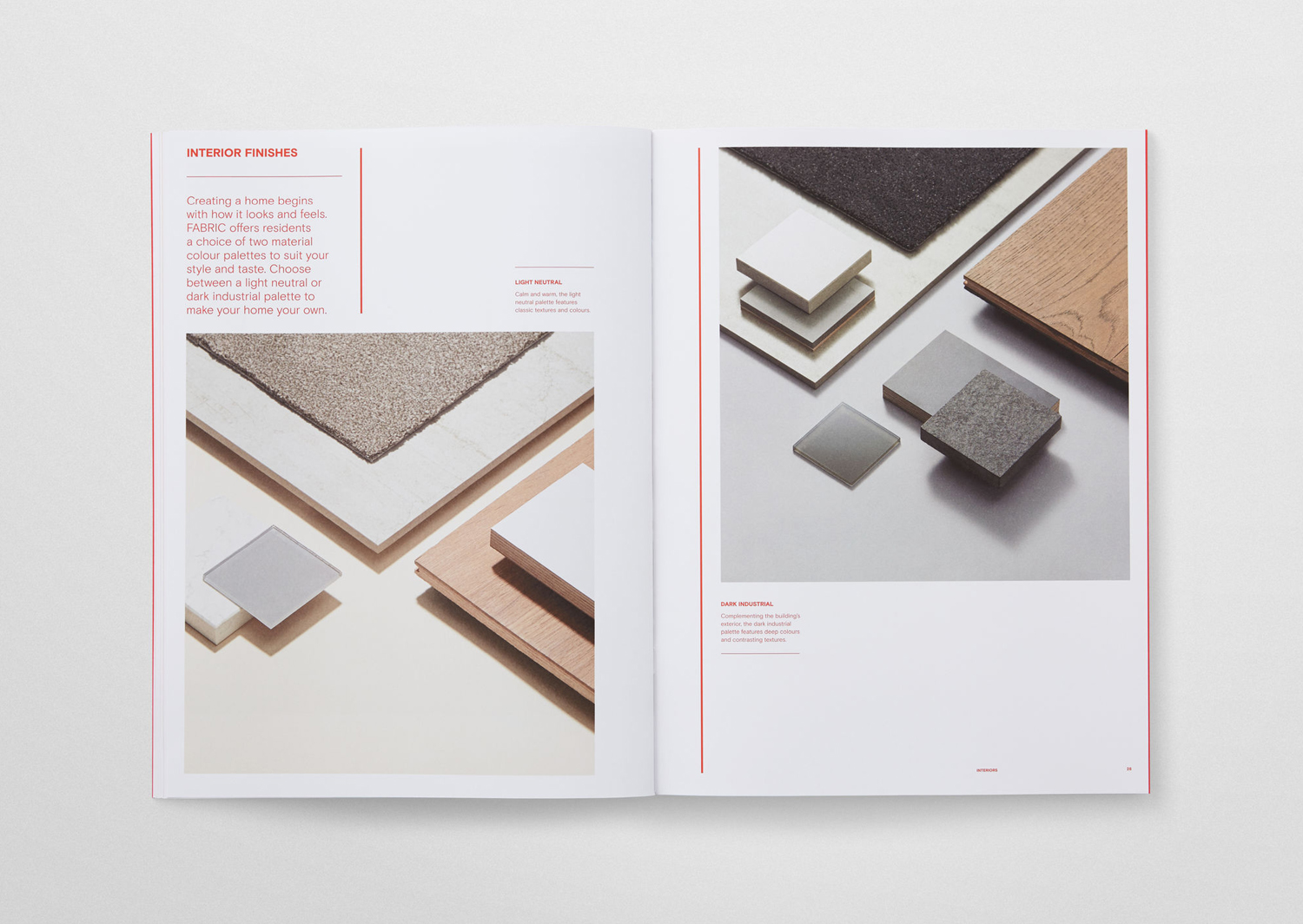
Where type and colour establishes a striking graphic expression, inspired by the threads of textiles, grounded in the history of area, and built from the modern qualities of Basis Grotesque, the choice of dyed paper, fabric cover of a robust folder and its blind debossing, introduce a more literal materiality to identity. This lends the work a tactile high-quality and a little more in the way of a sophistication and communicative breadth, yet is still rooted in concept. More work by Richards Partners on BP&O.
Design: Richards Partners. Opinion: Richard Baird. Fonts Used: Basis Grotesque & Fabric Display.
