Designed in Auckland

The Gospel by DDMMYY
Not a new project, but one certainly worth revisiting; this work for whisky brand The Gospel scooped a fair few awards back in 2020, and it’s not hard to see why. The design agency behind everything from strategy and naming to brand story, creative direction, packaging design, and more is DDMMYY, based in Auckland, New Zealand. The team was initially...

TWYG by Seachange
At some point over the past half decade or so, someone somewhere decided that vowels were profoundly uncool: see Anthropologie’s wedding line BHLDN; “virtual sneaker” brand [what?!] and Nike acquisition RTFK; Blndr (yes, it’s a blender) and the likes of Tumblr, Pixlr, and Flickr, which dared to sneak in just the one. Reading such words feels a bit like learning...

Think Packaging by Seachange
Cutting and creasing since 2010, Think is a design-driven structural packaging agency with an over-arching emphasis on form: ‘the neat bevels, the tight creases, the perfect fit’. The team of cardboard engineers has an international reputation thanks to its portfolio of award-winning work for global studios and brands, from startups to industry leaders, including Marx and Supply (New Zealand), OMSE...
Oji by Seachange
Oji is a sushi brand of firsts. It is the first in New Zealand to use fully recyclable and biodegradable packaging and the first to use all free-range products. This is a significant move forward and marks the brand out from well-established competitors. Oji opened in New Zealand with two locations in Auckland’s Commercial Bay, a place where they source...
We Compost by Seachange
When organic waste breaks down in landfill, methane, a potent greenhouse gas, is released. This has been identified as a significant contributor to climate change. Through composting, this organic waste can be repurposed as a soil nutrient which can then play a role in developing local and sustainable methods of regional food production. The challenge of turning this into a...
Supertrash by Seachange
Supertrash is a family-run New Zealand-based refuse collection service that helps to divert waste from landfill by employing circular solutions; these are typically recycling, reusing or repurposing. Although small they have big ambitions and are innovative and disruptive in their approach and ideology. Since 2012 Supertrash has diverted almost 6m kg of waste away from landfill. It is a challenge posed...

Outline by Studio South
Outline is a six lot freehold property development opportunity from Fearon Hay Architects located on Kings Road on the border of Mount Eden and Mount Roskill in a culturally and historically rich neighbourhood in Auckland. Each lot is 95m2 with the capacity to build four levels and include a roof living space totalling 300m2 of floor area. Studio South worked with Fearon Hay...
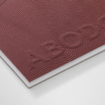
Abodo by Richards Partners
Abodo is a New Zealand-based timber specialist producing high performance and carefully crafted materials for architectural and structural contexts, and has a catalogue of cladding, decking, screening and timber panelling. Abodo worked with Richards Partners to better articulate its brand story, bring clarity to and emphasise the company’s respect for timber; where it comes from, where it is used and by...

Edition by South
Edition is a new property development by LEP Construction. It will be located in Parnell, a suburb of Auckland, New Zealand, and made up of 18 luxury apartments designed by architects Monk Mackenzie with a eye for flexible space and changing natural light. Edition will make the most of a sloping site, feature three levels cantilevered above ground and create what are described as...
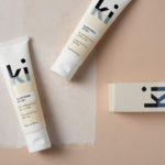
Ki Sunscreen by Akin
Ki Sunscreen was developed by national skincare clinic Caci to protect against the harsh New Zealand sun, and the skin damage and premature ageing that UVA and UVB rays can cause. It is made from the latest generation of ingredients proven to protect, and those that help to control oils and maintain a matt finish. This balance between clinically proven effectiveness and cosmetic...
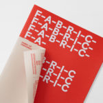
Fabric of Onehunga by Richards Partners
Fabric is a residential property development project and new pocket neighbourhood within the area of Onehunga, one of Auckland’s oldest suburbs and a brownfield site of warehouses with a light industrial heritage. Developers Lamont and Co., alongside Colliers International, commissioned graphic design studio Richards Partners to create a brand identity for the development that would link brochures, specifications pack, website and a variety of print communications for the...
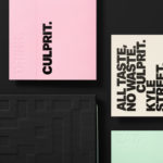
Culprit by Studio South
Culprit is a bar and restaurant located on Auckland’s Wyndham Street. It has a menu made from ingredients supplied by local New Zealand producers, growers and farmers, and is inspired founder’s Kyle Street & Jordan MacDonald’s travels across the United States and Europe. Culprit has a modern interior design in a converted loft space created by Kirsty Mitchell. This is characterised by large exposed beams and brick...