Blå Bär by BVD
Opinion by Richard Baird Posted 16 March 2017

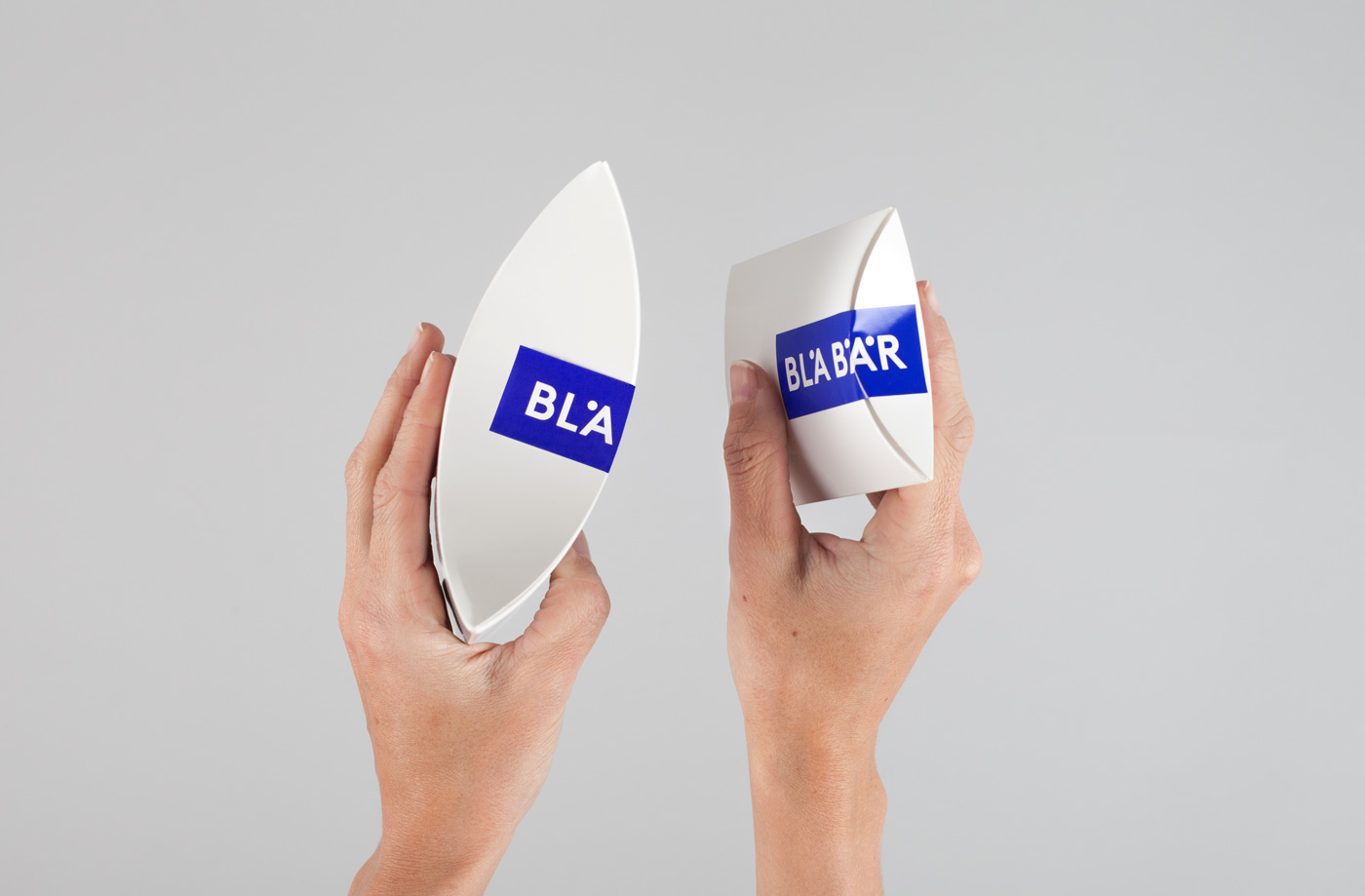
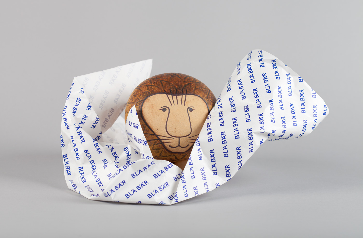
Blå Bär (Swedish for blueberries) sells a variety miscellaneous goods from Scandinavia from its store in Osaka, Japan. These include, but are not limited to, glass and kitchenware, soft furnishings, ornaments and jewellery. Many of these could be described as having something of a shared Scandinavian simplicity of form, lightness of colour, natural material quality and cheerful character in pattern and imagery. These are displayed within a well-lit space that blends white walls and shelves, a light wood floor and storage, with the blue of its brand identity, created by Stockholm-based graphic design studio BVD. This appears as a solid matte colour wall, glossy counter, pattern detail and display case, and runs across the store’s packaging.
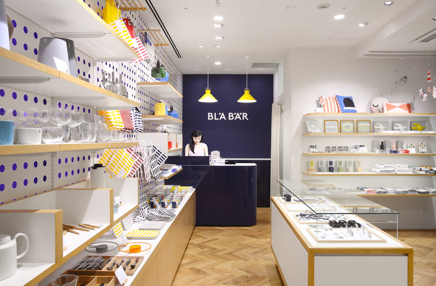
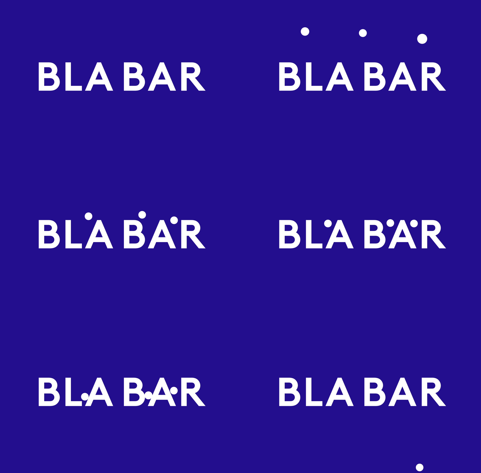
BVD describe their brand identity design work for Blå Bär as simple and kawaii (cool and charming in Japanese culture), scalable and dynamic. And it is a fair description. For those familiar with the Swedish language the work channells something of the Smile In The Mind in its use of the circles of the Å and Ä and colour choice to make a connection with blueberries. For those who are not, it is a minimal but visually interesting system that expresses a little of the province of products and personality of brand through typographical form, typesetting and characters, and in the playful nature of animated logo.
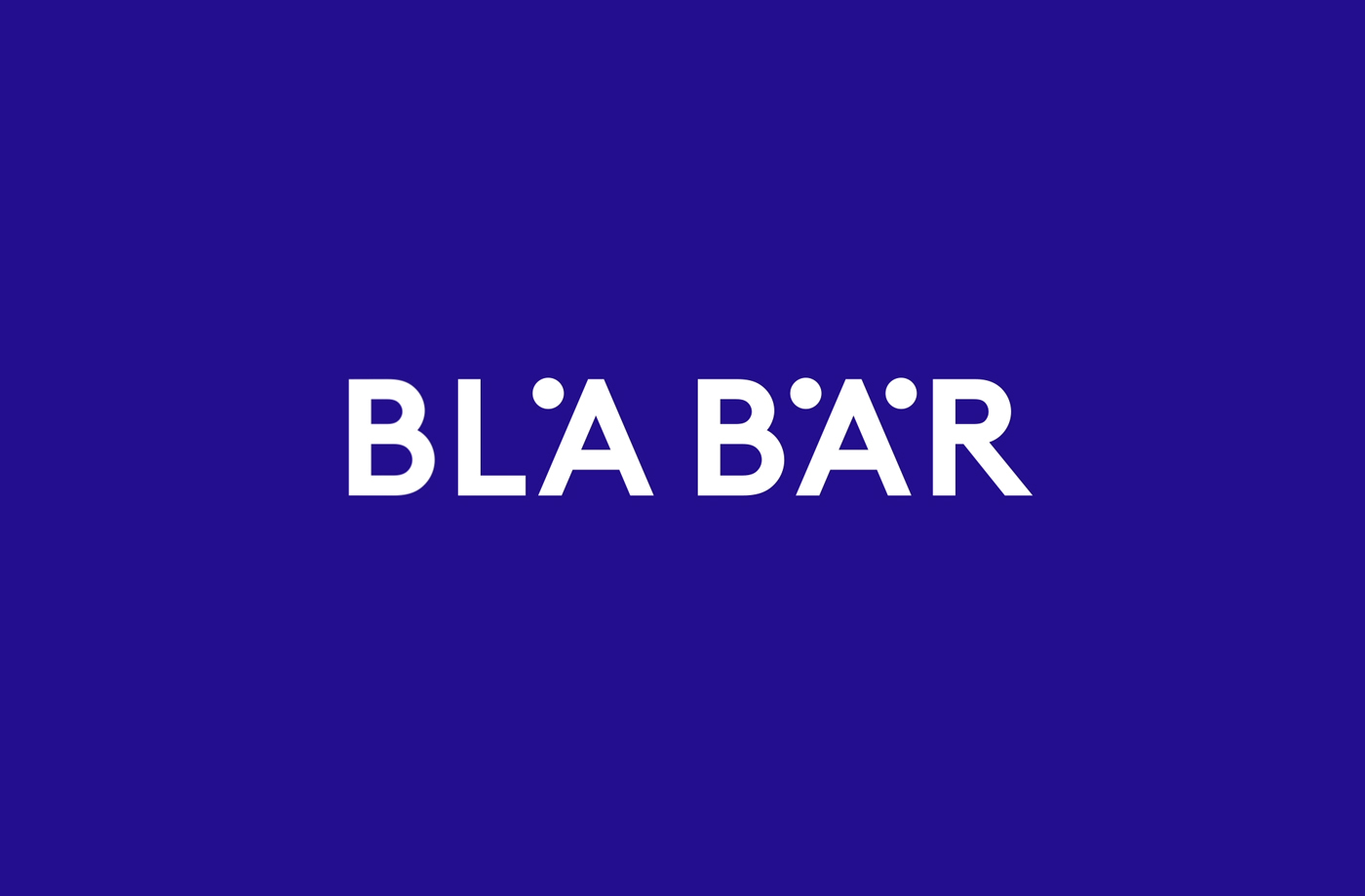
Communicatively logotype does not need to work particularly hard, especially within the Japanese context, with a Scandinavian association in the characters and a broader European quality in its modern geometric and monolinear lettershapes. Moving the diacritics down establish an unconventional moment alongside typographical restraint and add a flexibility for different arrangements. These then become a playful component when unlocked from logotype.
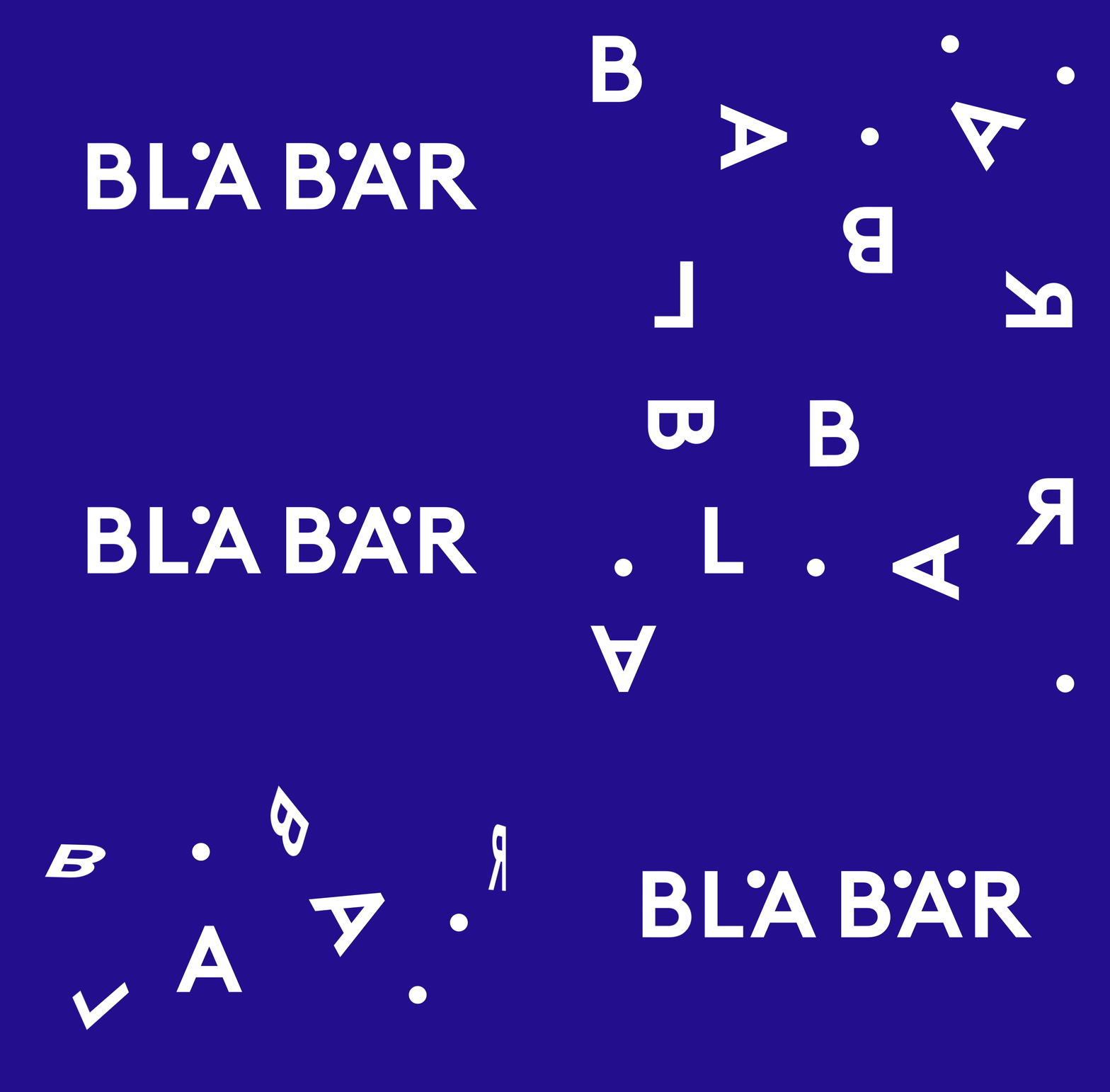
There some nice details in animation. The flipping and rotating letters, bouncing diacritic, the interplay of elements and use of space and framing in motion is neat, drawing personality from typographical restraint with plenty of room for variation. As static panels these arrangements do share some of this dynamic personality, however, how these animations are used is yet to be seen. Perhaps these will play out online as social media posts between products.
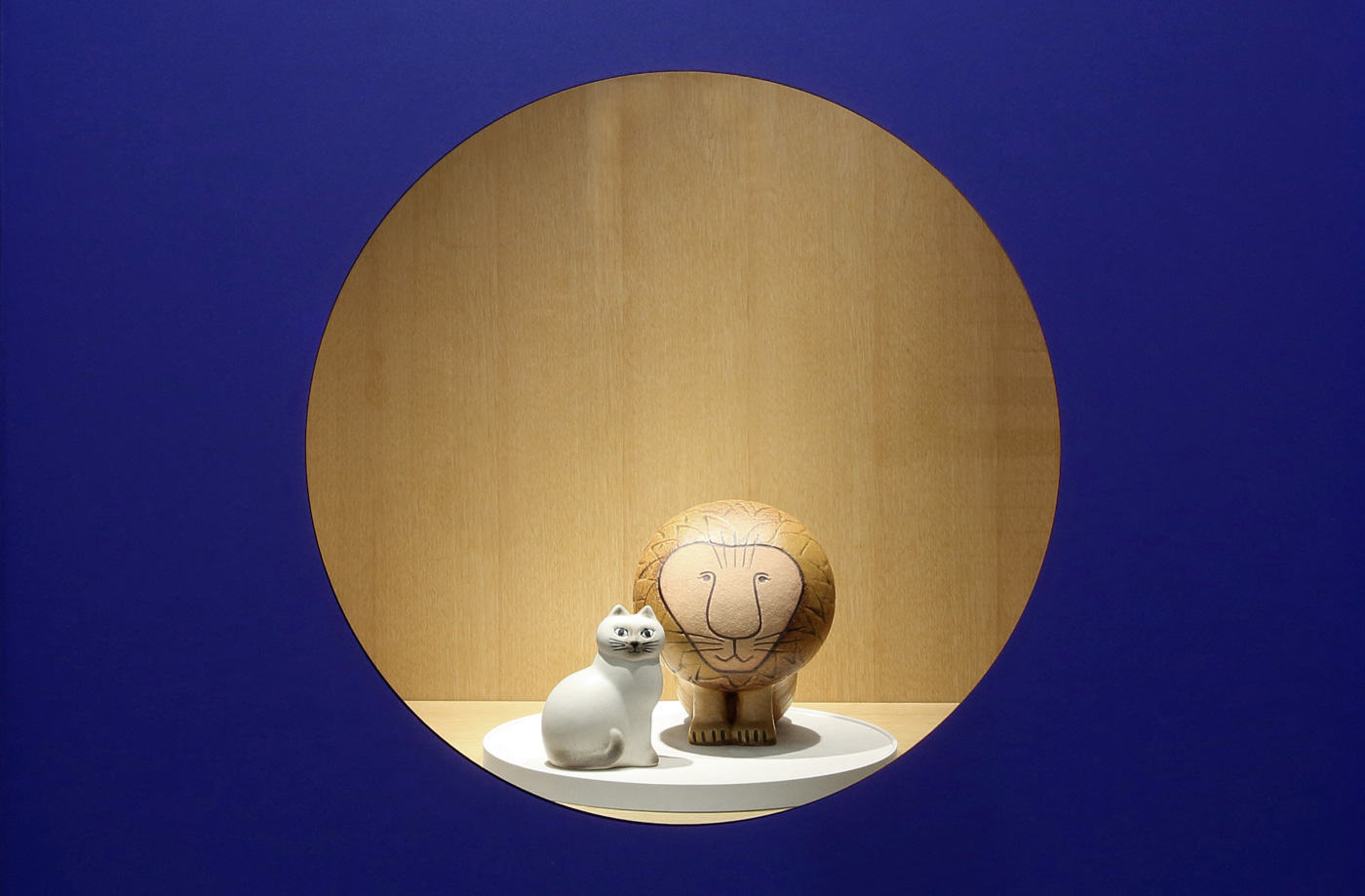
The circles of the Å and Ä work their way into interior, as wallpaper pattern and as a frame for the display of products. It is a pleasant way to link interior with visual identity, alongside colour, that avoids the logo-centric, and manages to draw a bit more visual equity from the qualities inherent to name and emphasised through design.
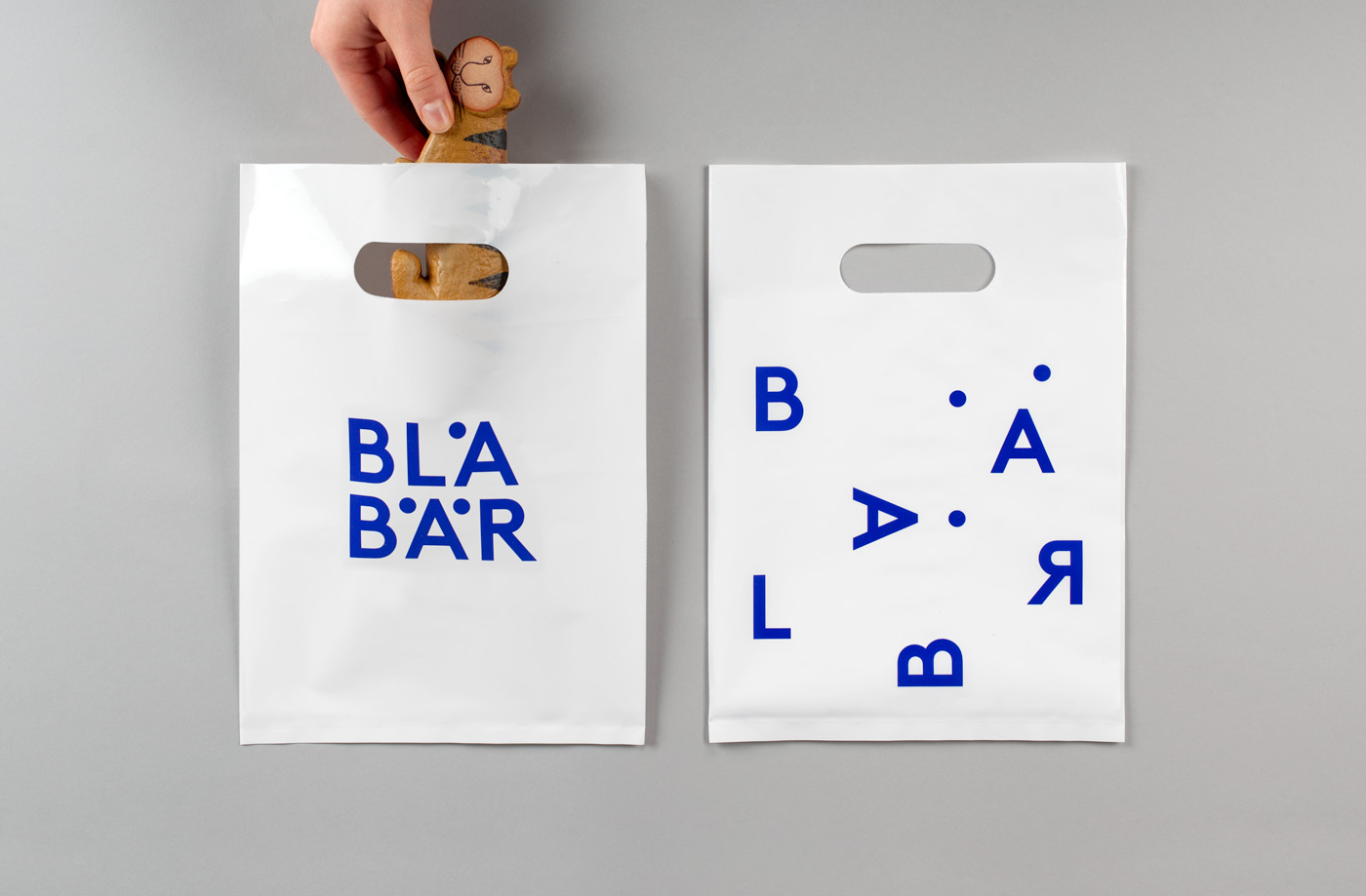
The reductive approach, aside from leveraging what might broadly if a little stereotypically be described as a Scandinavian simplicity, works because products and interior design provide much of the visual interest, because it draws on and distills down the common character of these products, and functions appropriately as a supportive component across interior without leaning on logotype.
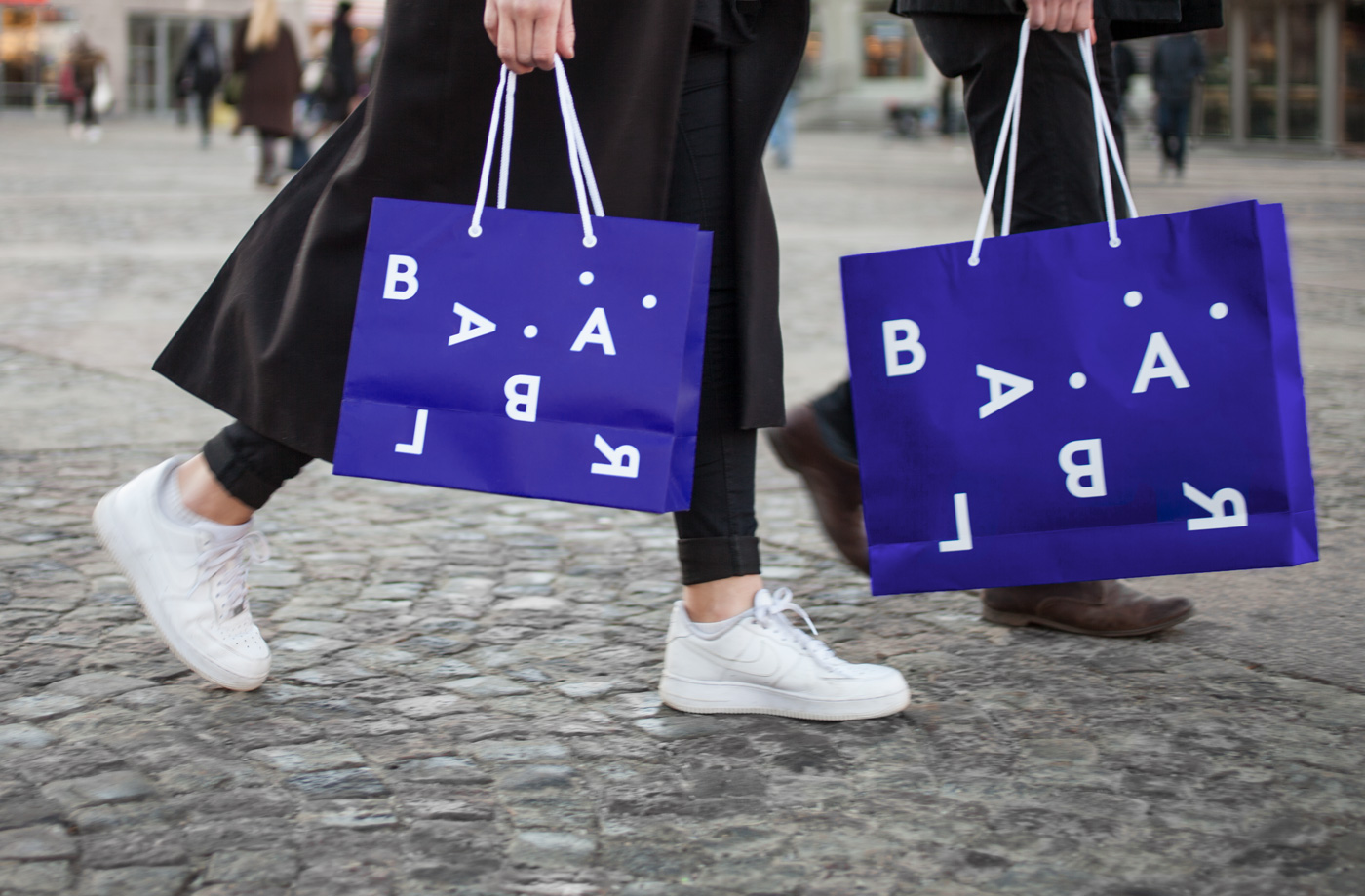
Outside of store, where the material detail of products and interior are absent, identity across bags offer impact and visual interest, functioning as a simple expression of store, balancing modern, reductive form with an element of play in arrangement, and impact in the use of a vivid blue. The more literal Scandinavian quality is lost and readability is problematic in this rearrangement across bags but visually it is distinctive and memorable.
Design: BVD. Opinion: Richard Baird. Fonts Used: Brown.
