Designed in Stockholm
Omaka by Stockholm Design Lab
According to Sweden’s travel and tourism website, craft beer enthusiasts will discover a ‘smorgasbord’ of artisanal, eco-friendly and organic things to drink there, with more microbreweries per capita than any other country (apart from the UK). Omaka joined the scene in September 2020, at the height of the pandemic, and with a slogan to match its fearless attitude: ‘taste before...
Tangent GC Organic Soap by Carl Nas Associates
Tangent GC began as a Scandinavian organic garment and shoe care company developing products that intended to increase the life of clothing and footwear, and entered the organic skincare market in 2016. The concern given to the longevity of skin becomes an understandable extension of that original intention. Carl Nas Associates, who have been working with Tangent GC on their packaging treatments for...

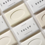
Tangent GC Organic Detergents by Carl Nas Associates
Tangent GC began as a Scandinavian organic garment and shoe care company developing products that intended to increase the life of clothing and footwear, and entered the organic skincare market in 2016. The longevity of skin being an understandable extension of that original intention. The company’s graphic identity, a typographical system designed by Essen International under the creative direction of Carl Nas, established...

Daniel Jensen: Current Events by Bedow
Daniel Jensen is a Swedish artist whose work moves between paintings, sculptures and drawings and explores themes such as society and pop-culture, film, literature and nature. His latest book, designed by Bedow, features artworks that are figurative and abstract, unrelated and absent a narrative. With such compelling and intense imagery of colour and dynamic shape, Bedow developed a format that...
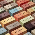
TGC x Stenerhag by Carl Nas Associates
Tangent GC began as an organic garment and shoe care company developing products that intended to ensure longevity and entered the organic skincare market in 2016. Designed by Essen International TGC’s graphic identity, by way of a simple typographical expression, established a visual system of informational immediacy through the absence of superfluous stylistic detail and colour. This divided content and drew a...
Näsby Slottspark by Bedow
Näsby Slottspark is a residential property development located in Täby, a municipality situated north of Stockholm. The development is built around a 17th-century castle and its gardens, and is made up of three distinct structural groupings, Södra Parken, Norra Parken and Strandängarna. Each of these is characterised by a Scandinavian simplicity, lightness and truth to materials inside and out and...

Tangent GC Hand Cream by Carl Nas Associates
Tangent GC began as a Scandinavian organic garment and shoe care company developing products that intended to ensure longevity, and entered the organic skincare market in 2016. The company’s graphic identity, a simple typographical expression, designed by Essen International, delivered a sense of informational immediacy through the absence of superfluous stylistic detail and colour, yet divide content and drew out a distinction in...
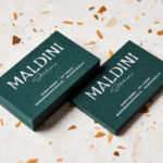
Maldini Studios by Jens Nilsson
Maldini Studios is a Stockholm-based interior design and carpentry studio made up of project manager and carpenter Rasmus Moberg, interior designer Elina Johansson and carpenter Theo Klyvar. The studio’s work often uses precise lines and geometric forms to elevate the irregular detail and texture of natural materials. There are moments of utilitarian and ornamental juxtaposition, times at which this feels subtle and transitional,...

14 Islands by Bedow
14 Islands is a Swedish digital development studio that focuses on the design and build of distinctive and creative user experiences for companies such as Google, Adidas and Plume. Although its products are diverse, and include websites, apps and web-based games, these are linked by the studio’s commitment to balancing good design principles and technical performance with natural and playful...
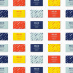
Helio by Bedow
Helio is a flexible co-working space and meeting venue with 8 different locations in and around the Swedish capital of Stockholm. It is made up of spaces with large desks for groups, small quiet areas for individuals, private meeting rooms and places to mix. These share an interior design language of modern utility and high quality handcrafted surfaces, upholstery and finishes. Helio...

REF by Kurppa Hosk
REF is an environmentally conscientious Swedish hair care brand with a range of products that are made from high quality organic ingredients. With a desire to enter the international market of the US and further into the Nordic regions, both dominated by well-established FMCG, Scandinavian design studio Kurppa Hosk were commissioned to rejuvenate REF’s visual identity. This included packaging design, art...

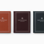
Anna Bjerger Book by Bedow
Anna Bjerger is a Swedish artist, born 1973 in Skallsjö, now living and working in Älmhult. Through a process of reconfiguring found imagery, bought from secondhand stores and garage sales, by transforming their context and reordering hierarchy with paint and a focus on dimension, Anna intends to intensify experience and create new narratives. Swedish design studio Bedow were commissioned to design...