Collect by Spin
Opinion by Richard Baird Posted 24 March 2017

Collect is an international art fair that this year took place between the 2–6 of February at London’s Saatchi Gallery. Presented by the Crafts Council, Collect gave visitors the chance to see and buy museum-quality and contemporary ceramics, glass, jewellery, wood, metal and textiles created by established and emerging artists and makers represented by over thirty of the world’s best galleries.
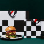
Collect’s brand identity, designed by Spin, draws character, play and visual interest from an economical use of a single and fairly austere font, and a black and white colour palette, and went on to include a variety of print communications including leaflets and catalogue, art direction, animation, advertising, signage and environmental graphics.

Spin’s work for Collect appears as a restrained but distinctive expression of modernity, and a neat play on the name Collect. The logotype’s double l does a good job expressing, in their italicised form (differentiating the pairing from the characters either side) the theme of collections in a simple visual gesture.
Repetition furthers this idea, also becoming an eye-catching visual element in print, across signage and as supergraphics. This is expanded upon in a number of different ways, both static and in motion. This call to mind something of the modernist aesthetic of non-fiction book covers from the 50s and 60s.

There is a visual economy to the work in its limited colour palette and number of fonts and the creation of image and iconography from type. This offers something in the way of contrast to a diverse and ornate exhibition of colour and texture, yet also shares something in common with the underlying and unifying intentions of the show. This plays out across catalogue and flyers where image, type and space are well-balanced. Other highlights include the use of proportionality, with large pattern and finer organic compositions of the double l appearing across flyers and super graphics that effectively brand venue. More work by Spin on BP&O.
Design: Spin. Opinion: Richard Baird. Fonts: Brauer Neue.