Summerhill Market by Blok
Opinion by Richard Baird Posted 13 April 2017
Summerhill Market is a family-run business, managed by the third generation, with premises on Toronto’s Summerhill Avenue and a smaller location—a floral boutique—on Mt. Pleasant Rd. The store has 200 employees, a butchers, bakery and deli, a BBQ in the summer and offers a variety of catering services.
Summerhill Market is admired for its high quality products, and its ability—since 1954—to consistently redefine what it means to be a boutique grocery store. Its commitment to quality is reflected in its extensive range of own-brand products, developed by an in-house executive chef and a team of 80.
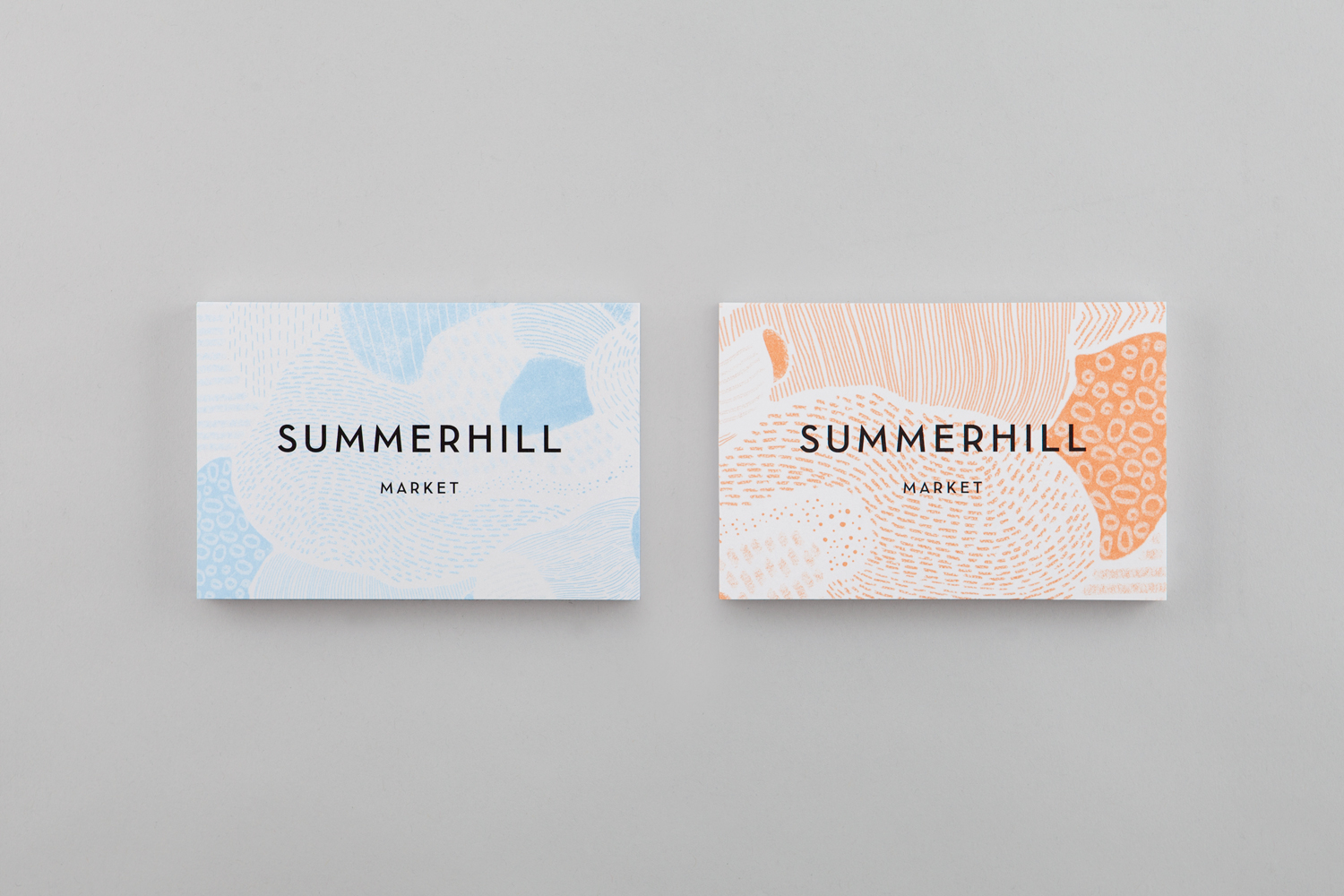
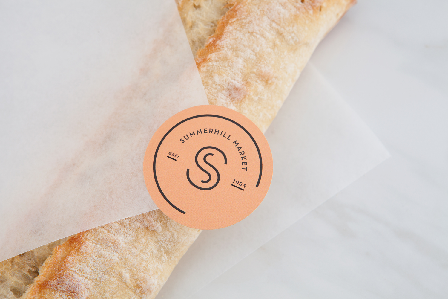
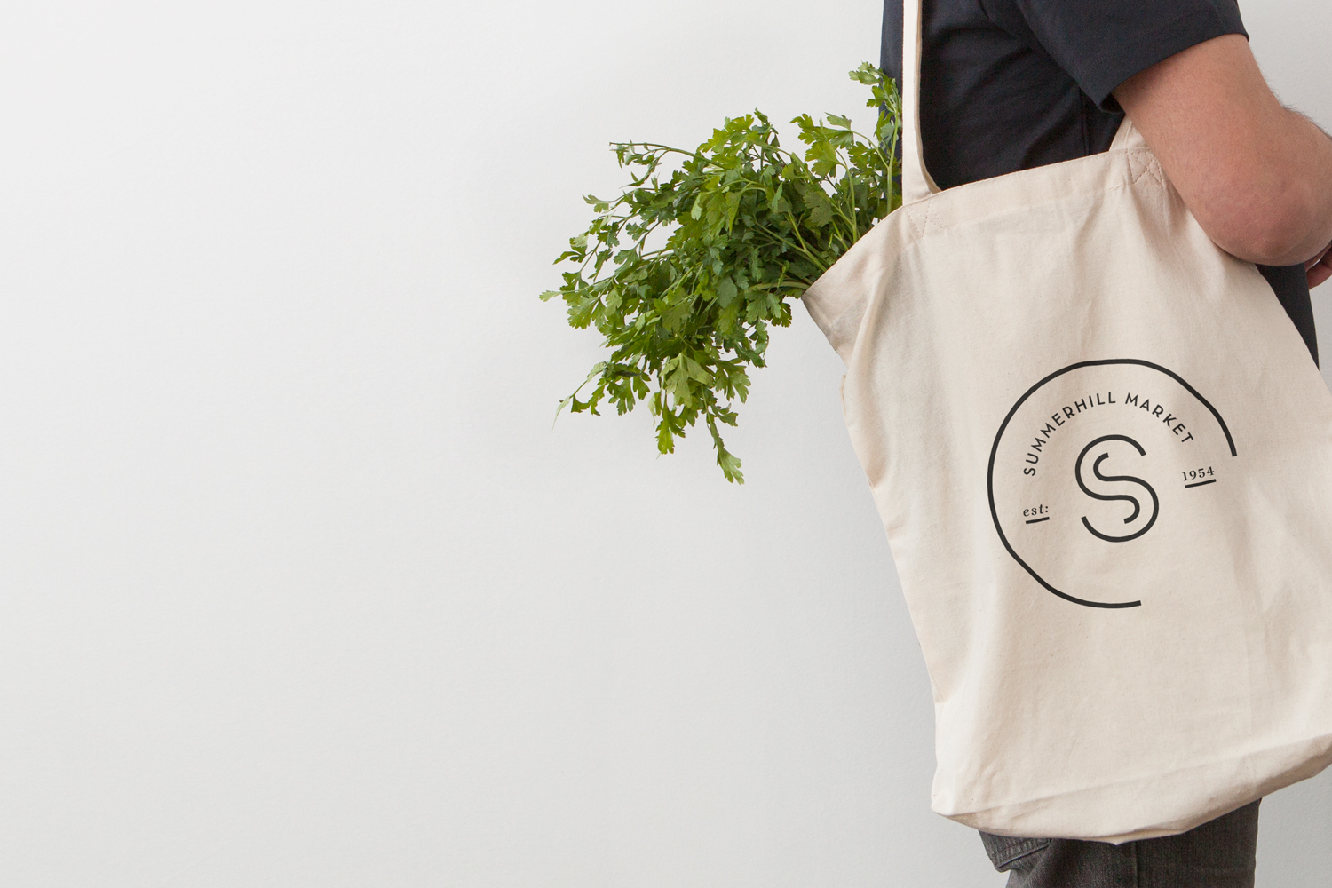
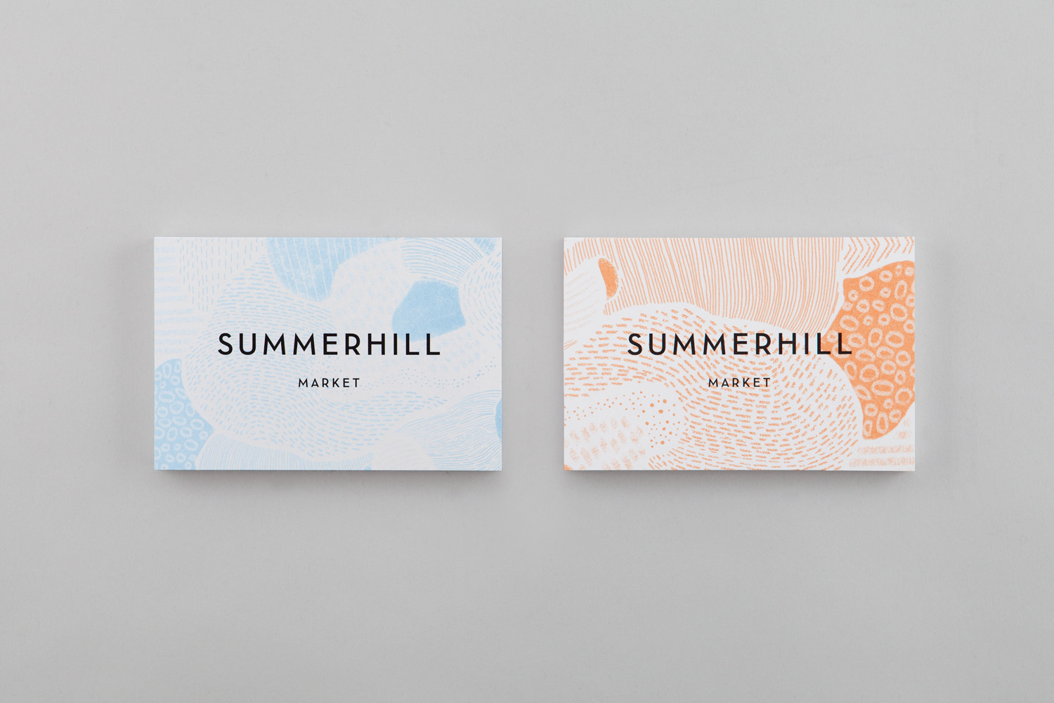
With the intention of giving the store a more contemporary voice whilst maintaining its warmth, Canadian studio Blok developed a new brand identity of pastel colour, sans-serif type, moments of illustrative texture and a labelling system that links an extensive line of own brand products. As well as this, Blok also delivered assets that included business cards and stickers, packaging design, branded tote bag and notecards.
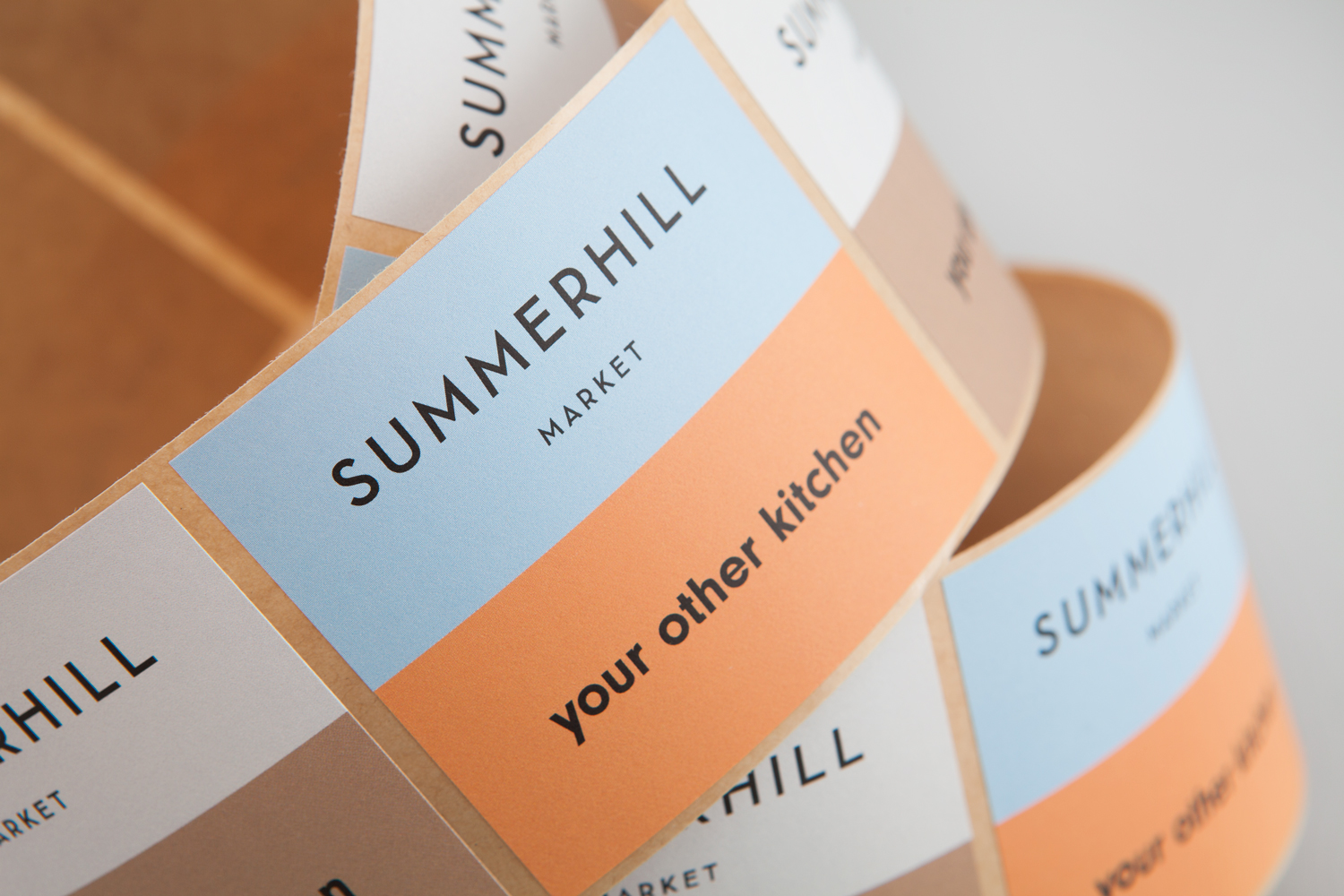
There is plenty to draw on yet Blok favours a restraint that acknowledges the store’s prominence and well-regarded place in the community, and emphasises this with a new tagline “Your Other Kitchen”. So, with a large and returning customer base, rather than a repositioning, Blok brings to Summerhill Market’s communications and labelling system, a modernity, simplicity and personable warmth.
Blok’s work is characterised by an absence of image and a communicative economy, with Summerhill’s brand identity being a confluence of colour, type and grid, rather than built around a dominant single asset or utilising vibrant ink, high contrast of photography. It differentiates itself, like many own brand products, through aesthetic simplicity and communicative clarity within a visually competitive context, but not at the expense of perceived quality.
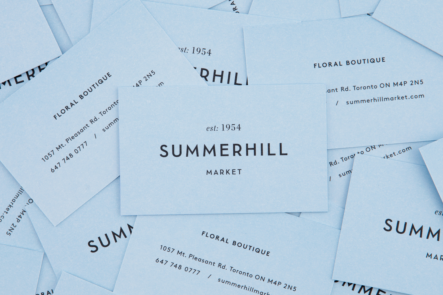
Legacy and modernity are discernible and effectively interwoven and expressed through the pairing of light serif and monolinear sans-serif, and alongside the use of space, choice of colour, and typesetting that favours the centre-aligned. Although logotype is straightforward in its communicative intentions, particularly in the use of est. there are some pleasant lettershapes that lend it character.
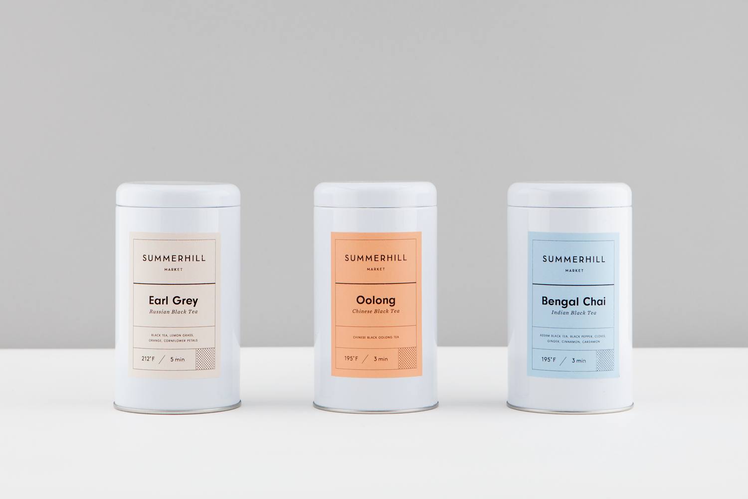
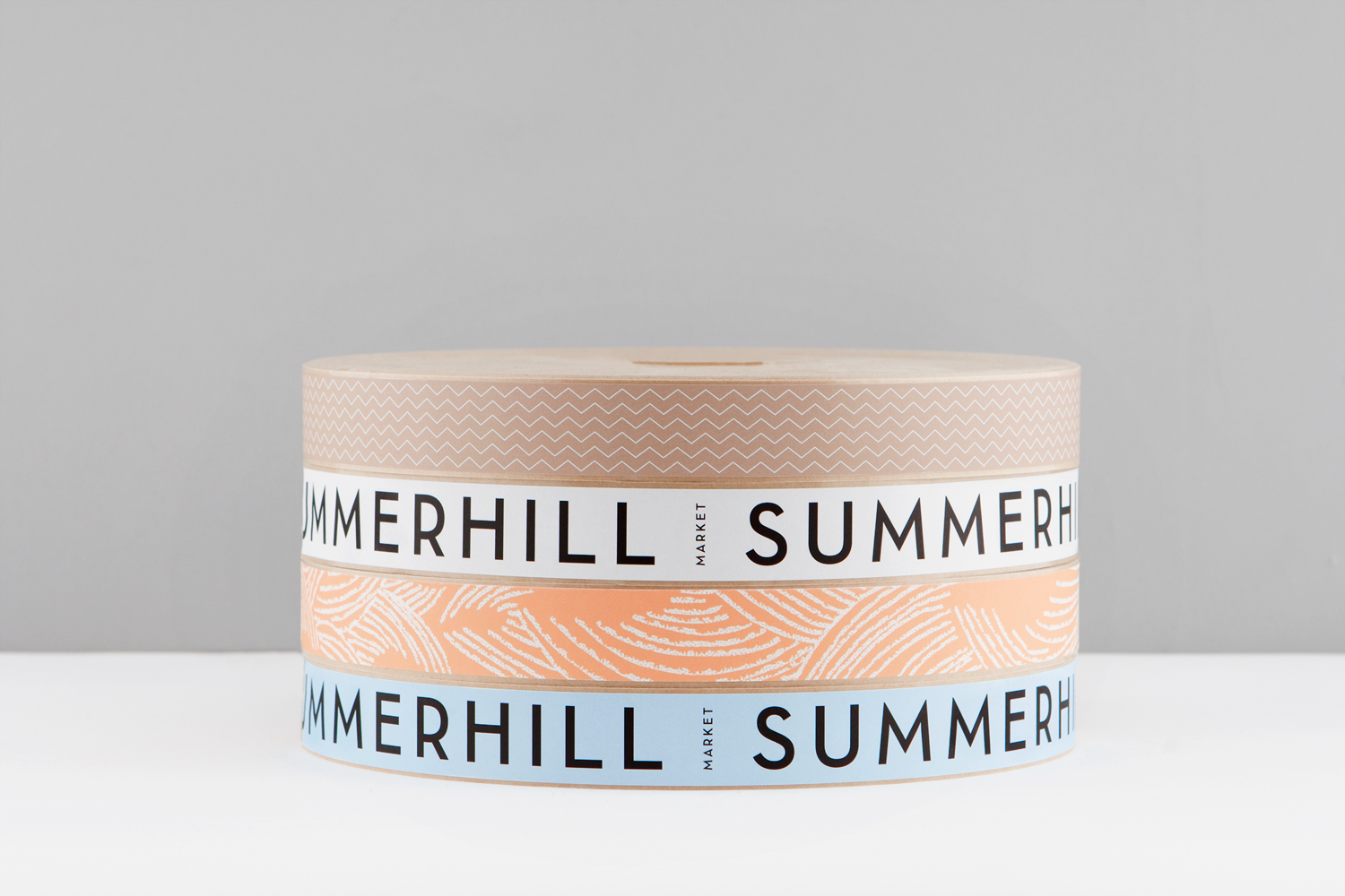
Although there are some pleasant pattern details (see further down), colour palette is the real highlight. The choices feel like a neat intersection of ideas. These appear cheerful and modern, light and summery, earthy and floral, touching on the brief to bring the store a modern voice, has something of the store’s seasonal name in it and is well-suited to the second location, a floral boutique. Strategically this is well-intentioned, avoiding the corporate and leaning into what is associated with smaller craft brands. Although there is not a particular graphic impact from a distance, the use of single colour and simple pairings function to help products stand out and establish an understandable and identifiable continuity when distributed throughout the store.
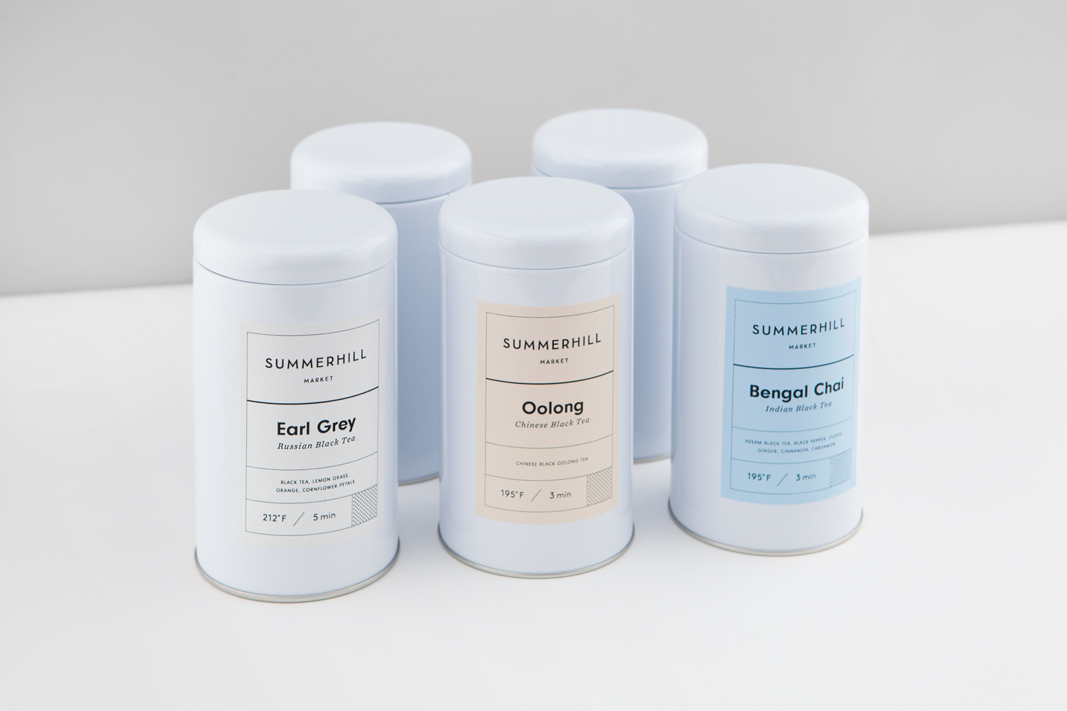
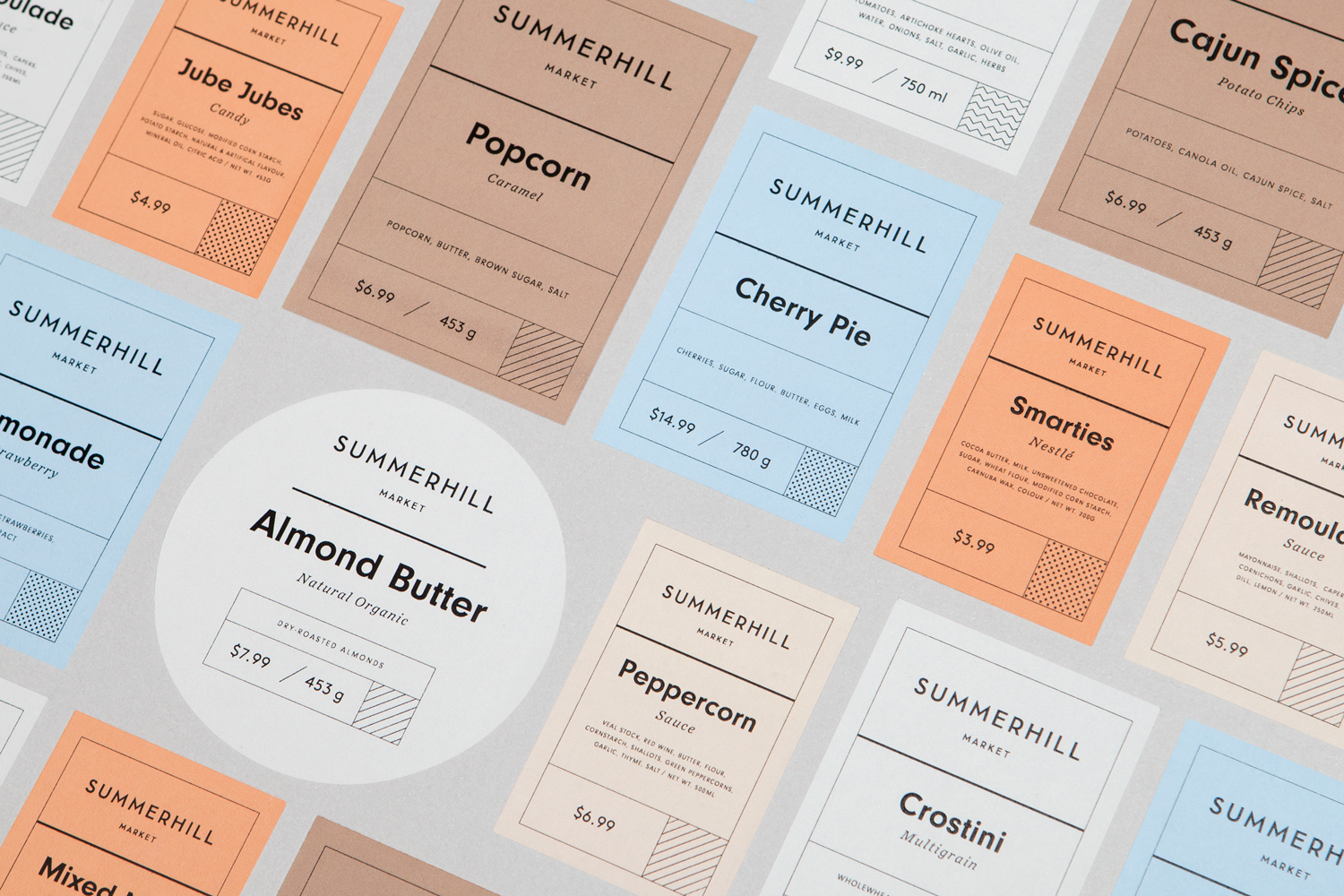
The systematic nature of brand identity is pushed to the forefront. Labelling has something of the utility of tax forms in its use of typographical weight and size, grid and colour to differentiate, identify and lead the eye. In conjunction with colour, layout blurs the line between the stylistic and practical, the dividing and ordering of information and the need to be visually distinctive and memorable. There is an unwavering typographical uniformity here that breaks from the immediacy of image, but is helped by familiar structural choice, context within the store, and a simple and intuitive approach to hierarchy.
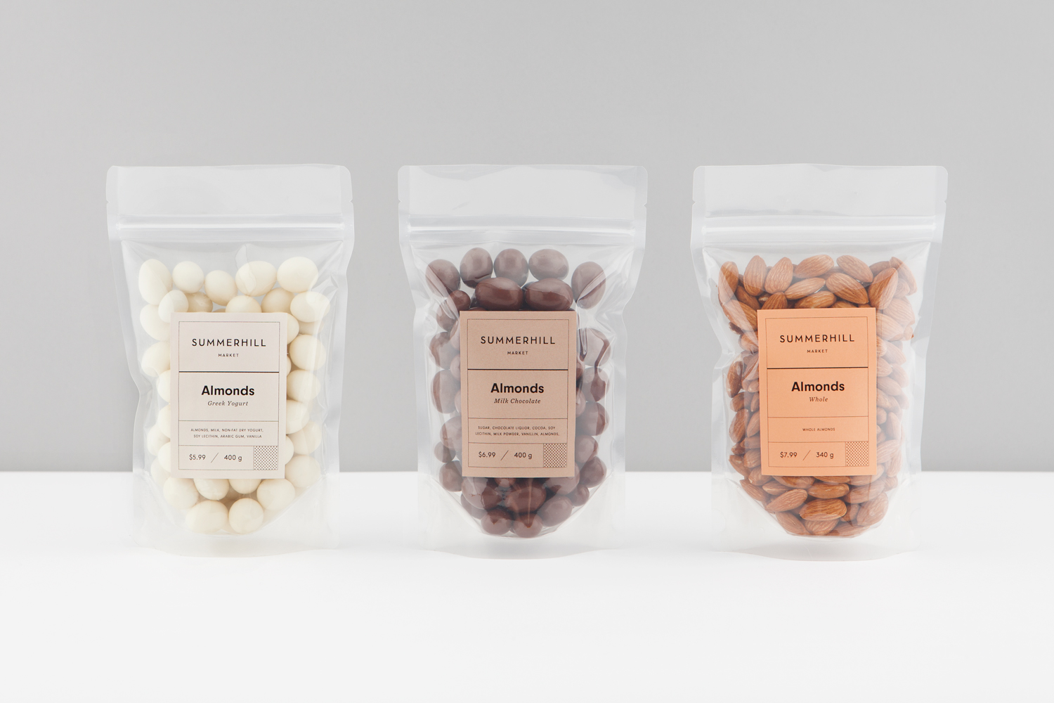
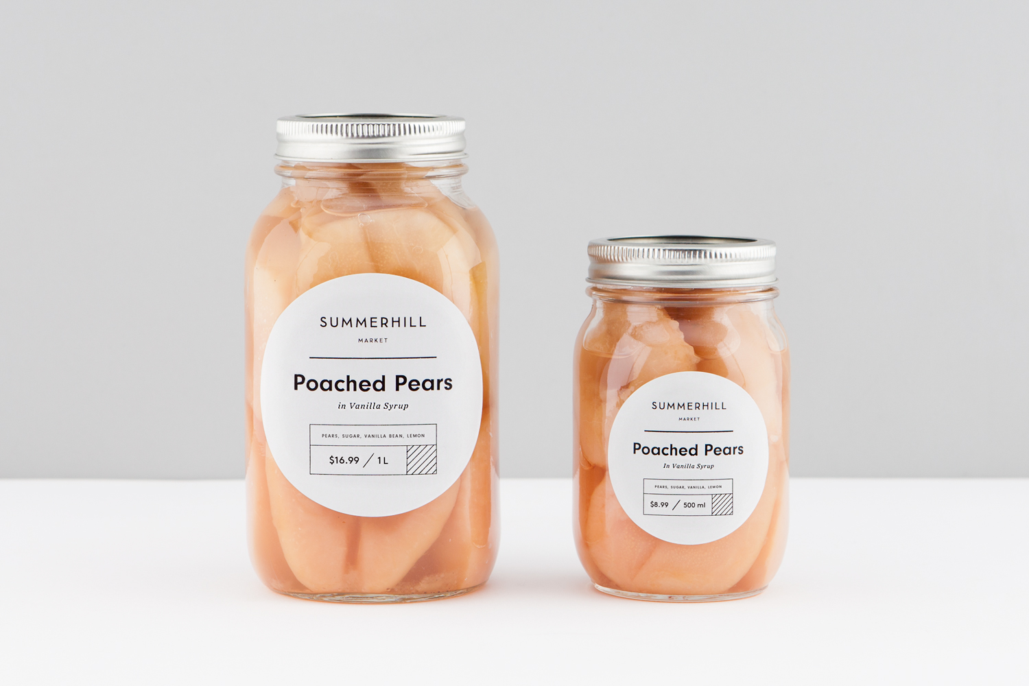
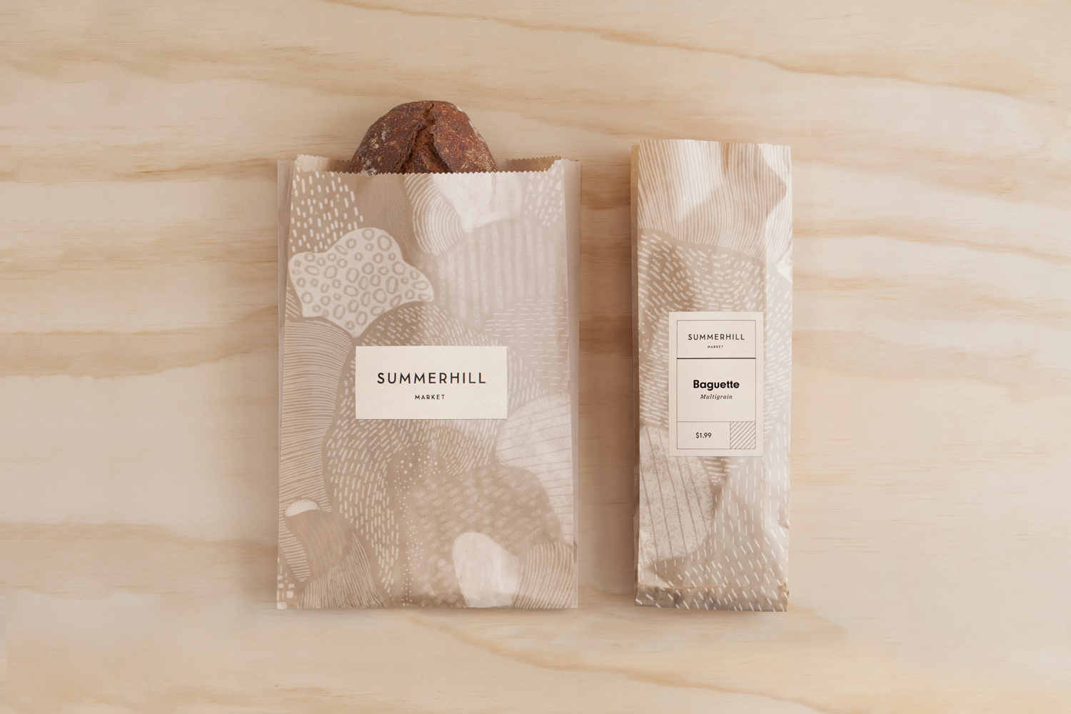
Label shape and proportion, in conjunction with familiar structural choices aid communication. There is a preference for large areas of transparency that establish a contrast between the natural colour and texture of product and the solid colour and geometric forms of type and label. Product and the open expression of its quality is worked into and forms part of identity, existing somewhere between the familiar own brand lexicon, the homemade, and a more recent association between quality and a visual restraint.
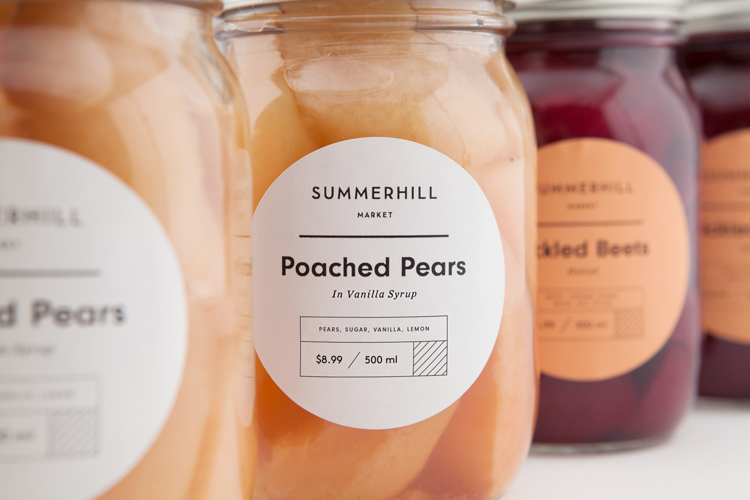
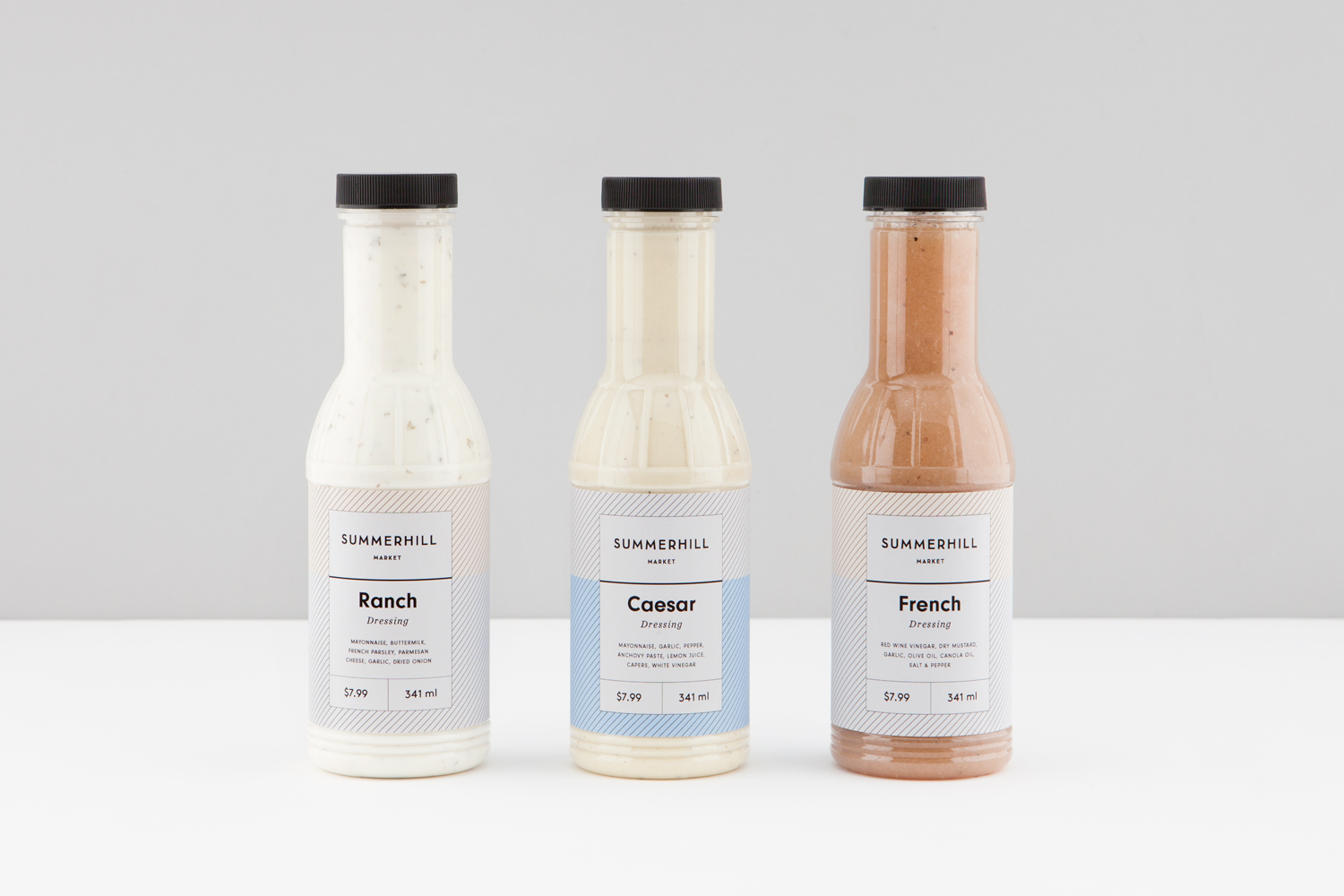
There are some pleasant variations that keep it interesting but with a clear continuity in line weight, colour, layout and type. These included hatched backgrounds, colour pairings, oversized type, and the addition of some organic pattern work, in contrast to the uniformity and geometric qualities of type and layout, that emphasises craft. These really work well to elevate the humble brown paper bread bag.
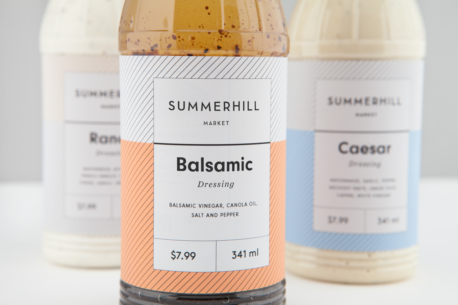
The new Summerhill Market brand identity effectively balances a sense of the small-scale and personable with the practical and systematic, and delivers a modern expression of quality. It acknowledges an established and loyal customer base and the ever-changing nature of its own brand products. The approach feels useful, flexible but cheerful and distinctive. It does leverage something of what might be described as the current in colour and type to set a contemporary tone, yet this aesthetic feels more like a paradigm shift, rather than anything that will be short-lived. More work by Blok on BP&O.
Design: Blok. Opinion: Richard Baird.
