Endgame: Duchamp, Chess, and the Avant-Garde by Hey
Opinion by Richard Baird Posted 8 June 2017

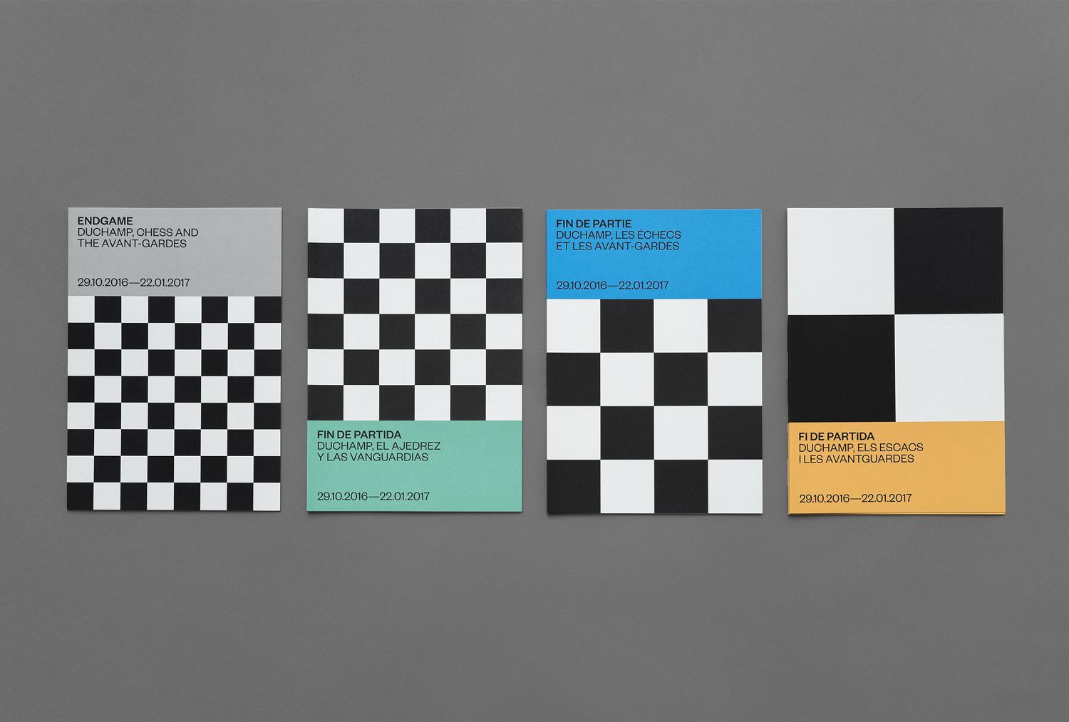
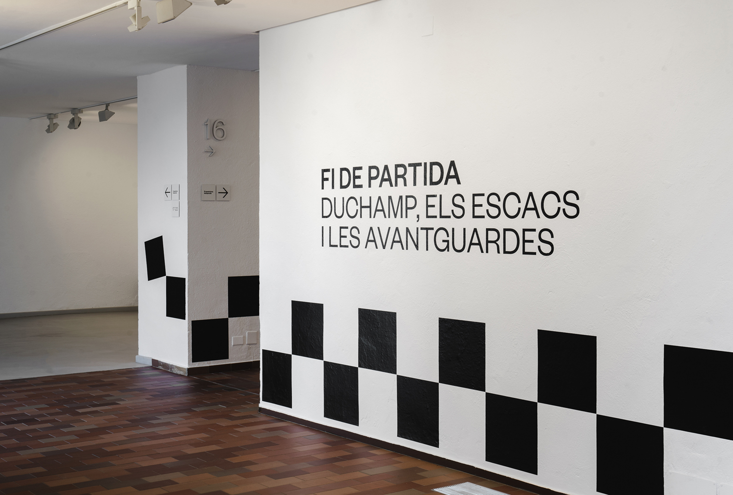
Endgame: Duchamp, Chess, and the Avant-Garde was a temporary exhibition that took place at Barcelona’s Fundació Joan Miró between October 2016 and January 2017. It was curated by Manuel Segade, explored the history of modern art through the lens of its relationship to chess, and featured a variety of works by 20th century artist. These included Marcel Duchamp’s La Partie d’échecs, Max Ernst’s Chess Set, and Mercè Rodoreda’s Untitled (Composition IX), amongst many others. Fundació Joan Miró commissioned Spanish graphic design studio Hey to develop a visual identity for the exhibition. This linked a variety of printed materials, from large format posters, banners and indoor signage to opening night invitations and a programme set in four languages.
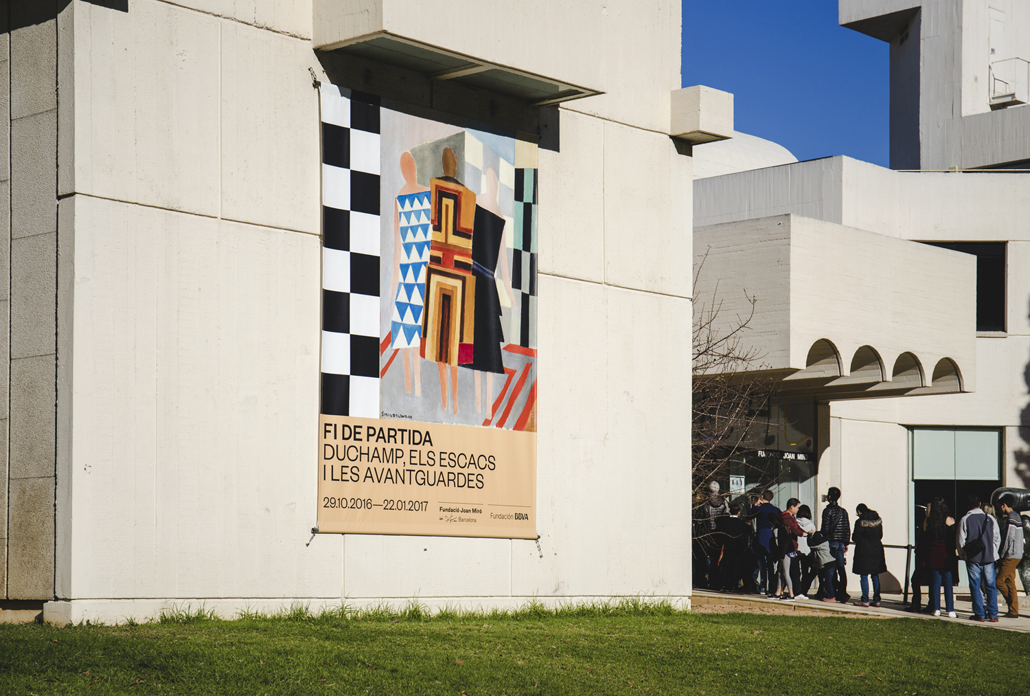
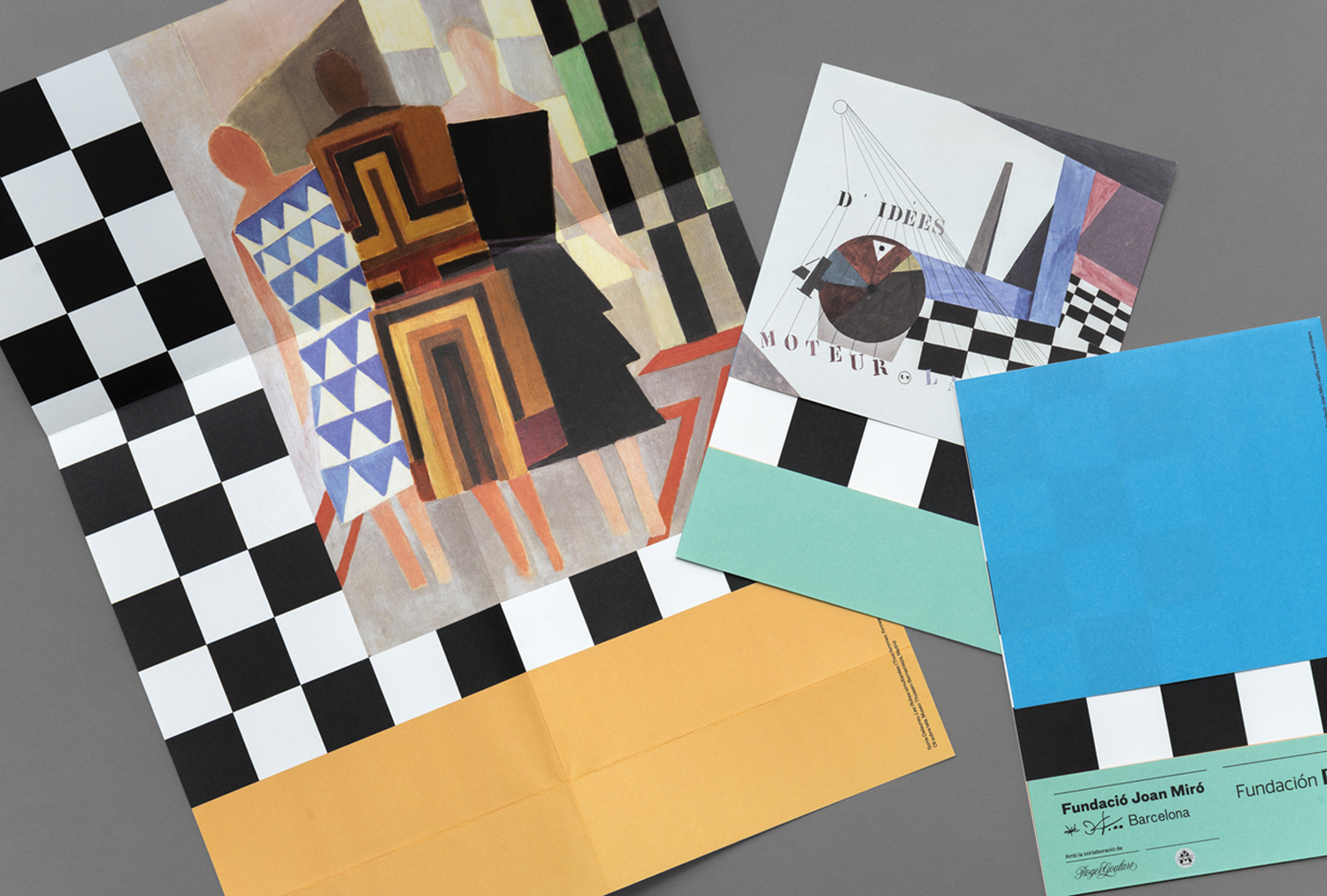
Rather than following convention; framing artwork with plenty of white space or leading with single images and superimposed text, Hey establish an interesting, direct and discernible relationship between artwork and exhibition identity. This is done in the same way chess was often interposed, either literally or more figuratively, within cubist artwork, and the fragmentation and superposition that often characterised cubist artwork at the beginning of twentieth century.
Hey intended to sow an intentional confusion between the consistent and strong visual character of exhibition identity and the individual pieces on display. And this really lends the work much of its conceptual weight, and visual impact, yet manages to balance this with moments of clear communication using a good balance of type and space.
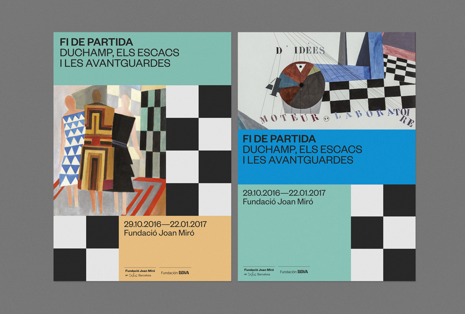
The chess board motif becomes a bold and memorable graphic expression. It effectively emphasises the recurring image, and its associated themes, within the artworks and the through line of exhibition. Colour functions in a similar way, sampling, emphasising and drawing out detail within the artwork through panels of solid colour.
While colour and chessboard play with commonality between exhibition and its visual identity, a modular structure, alongside a single font choice, offers a more precise, reductive and systematic contrast to the irregular shapes and nuanced qualities of featured artwork.
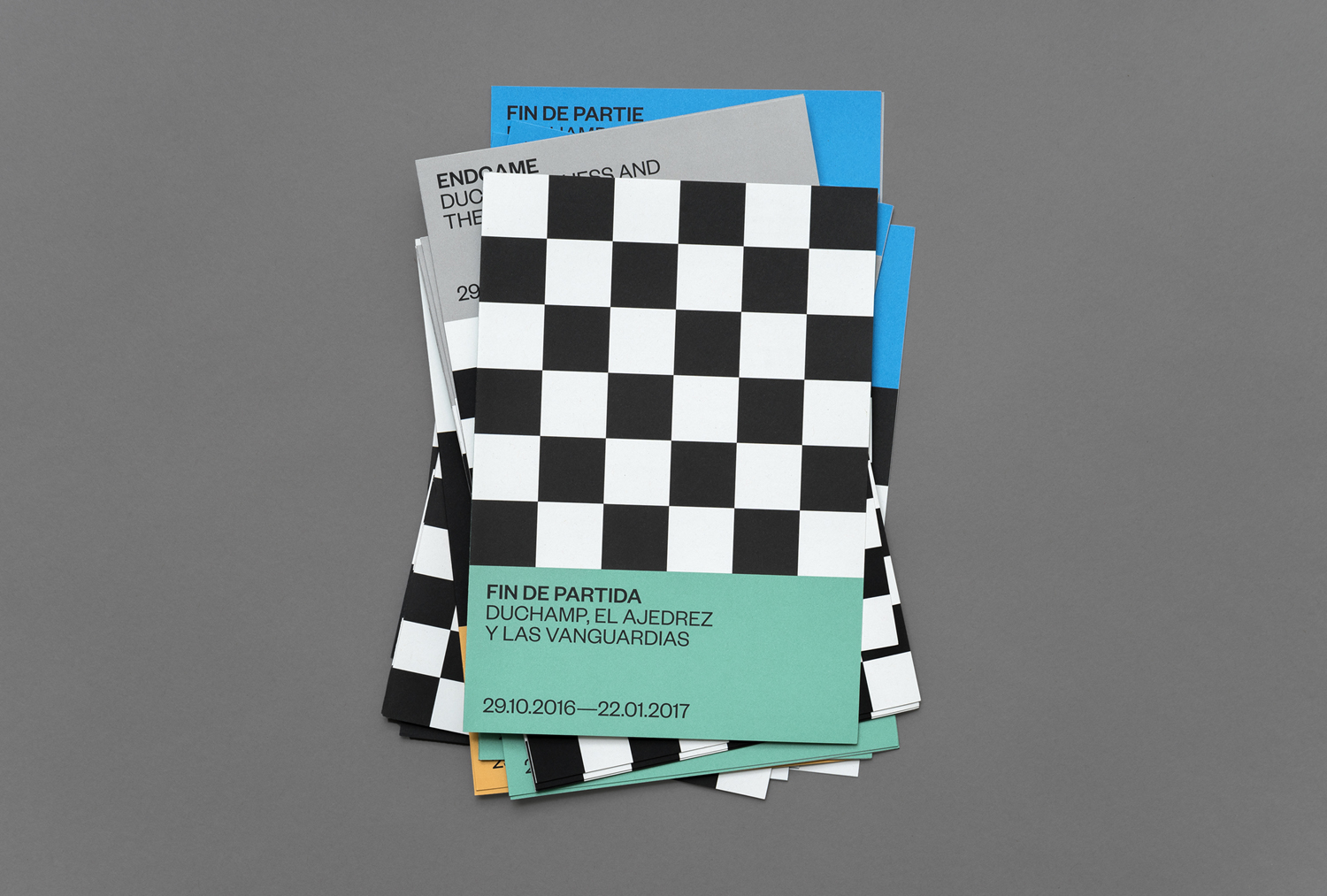
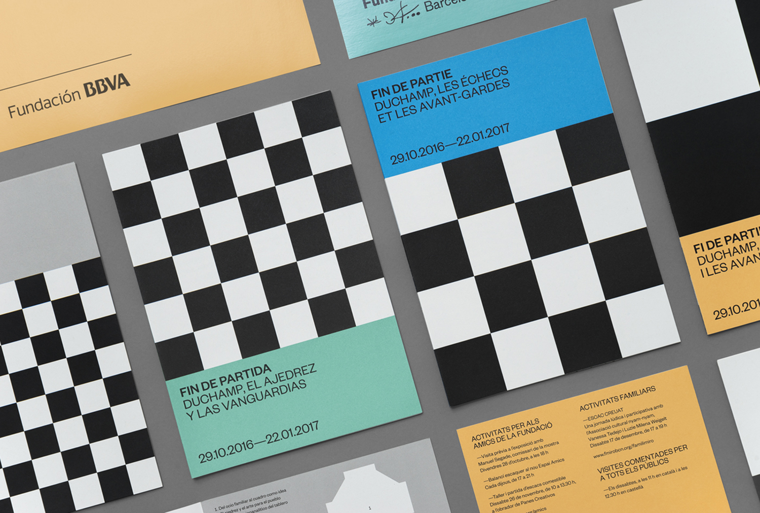
Exhibition identity also works well absent the artworks. The chessboard, its black and white squares, and panels of brighter colour establish a bold modern graphic expression, rooted in the through line of exhibition, and brings a striking, accessible and universal quality to a challenging exhibition that explores the more nuanced ideas within the artist’s work. Although the chessboard is a simple image, different grids sizes and layouts provide a useful differentiation between printed pieces and delivers both visual variation yet continuity where it could have become repetitive. More work by Hey on BP&O.
Design: Hey. Opinion: Richard Baird. Fonts Used: Founders Grotesk.
