Designed by Hey
Dissabtes MACBA by Hey
Dissabtes MACBA (“MACBA’s Saturdays”) is a partnership between The Museum of Contemporary Art of Barcelona (MACBA); an iconic architectural symbol and one of the city’s leading cultural institutions, and the Japanese fashion retailer UNIQLO who recently arrived in Barcelona, and due to open its second store this year. The Dissabtes MACBA initiative offers free entry to the museum every Saturday evening, 4–8pm, and invites...
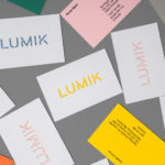
Lumik by Hey
Lumik is a Spanish lighting design and manufacture company, and partnership between the traditional metalworking company of Francesc and Ferran Martí, and interior designer and art director Frank Domínguez. Together they have 65 years of experience, and have built a catalogue of products with simple forms, moments of colour, elements of play and the industrial. These move between those that are...
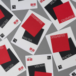
Kosmopolis by Hey
Kosmopolis is a five day literature festival that takes place in Barcelona every two years, but also has a programme of ongoing events in between. The festival, since 2002, has been organized by the exhibition and arts centre Centre de Cultura Contemporània de Barcelona, and intends to promote literature in its many different forms. It does this through a series of talks and...
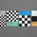
Endgame: Duchamp, Chess, and the Avant-Garde by Hey
Endgame: Duchamp, Chess, and the Avant-Garde was a temporary exhibition that took place at Barcelona’s Fundació Joan Miró between October 2016 and January 2017. It was curated by Manuel Segade, explored the history of modern art through the lens of its relationship to chess, and featured a variety of works by 20th century artist. These included Marcel Duchamp’s La Partie d’échecs, Max Ernst’s...
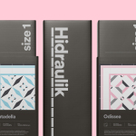
Hidraulik by Hey
Hidraulik is a Barcelona-based business producing floor mats, table mats and runners for contemporary spaces. These are inspired by cement panels hydraulically pressed, rather than fired, with a layer of coloured pigment. Hydraulic panels originated in the 1850’s and experienced a resurgence in the mid 20th century. At that time they would often feature brightly coloured and detailed patterns, and were popular during an era of...
Have A Great Day Films by Hey
Have A Great Day Films is the production company of French filmmaker Jérôme de Gerlache. Jérôme is said to have a taste for professional risk-taking and a distinct way of making short films, advertisements and TV comedies. Barcelona based graphic design studio Hey recently worked with Have A Great Day Films to develop a brand identity that would reflect Jérôme’s personality, convey a...
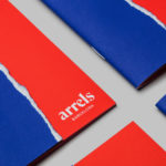
Arrels by Hey
Arrels (roots in English) is a Spanish shoe brand, established by cousins, friends and partners Javier & Pepe Llaudet, and inspired by the Mediterranean, its traditions, rhythm, colour and creative atmosphere. Javier & Pepe also draw on the city of Barcelona (the place they want to be), the countryside (where they are from), and their passion for music. These inspirations make their way into Arrels’ new brand identity,...
Estampaciones Fuerte by Hey, Spain
Estampaciones Fuerte is a Spanish cold metal stamping and pressing business with over forty years experience producing a variety of components for the automotive, domestic appliance and construction industries, as well as providing welding, finishing, threading and set assembling services. This year Hey worked with Estampaciones Fuerte to develop a new contemporary brand identity that would better reflect their industrial experience and professionalism....
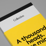
Collective by Hey
Collective is a new Istanbul based agency that is described loosely by Hey, the design studio behind its brand identity, as producing content, communication and design work. Its has an ideology, like the name suggests, based around a collaborative approach, developing projects with an extended network of people with a variety of skills. Hey recently created an visual identity treatment for...
Jeremy Maxwell Wintrebert by Hey
Jeremy Maxwell Wintrebert is a glassware designer and manufacturer currently working in France with a free hand glass blowing philosophy mastered while traveling internationally across the US and Europe. Spanish design agency Hey recently developed a new visual identity solution for Jeremy that captures the heat, craft and art of glass blowing through a smart combination of colour and laser...