Bundlelist by Bunch
Opinion by Richard Baird Posted 26 July 2017
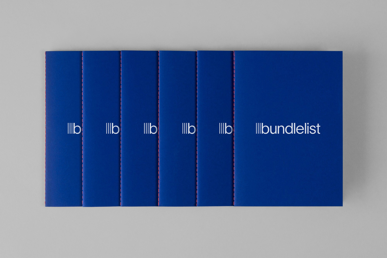
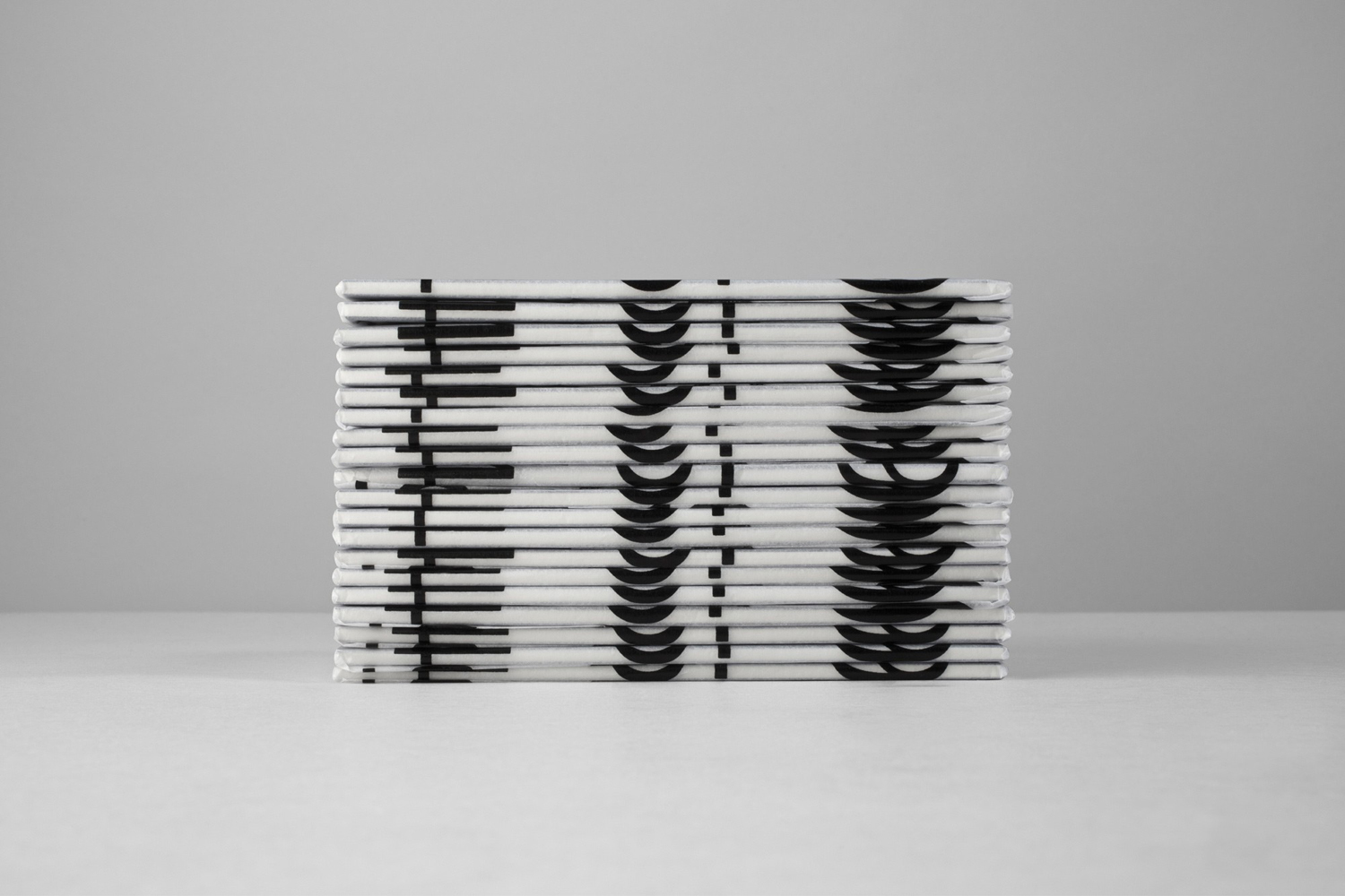
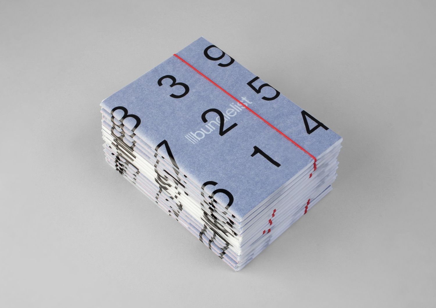
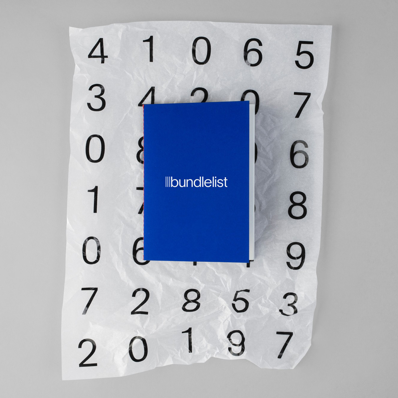
Bundlelist is an online platform that simplifies and draws together international mobile bundle costs, with a specific focus on mobile retail data, and facilitates comparisons between countries and mobile operators. Design studio Bunch worked to develop UX, UI and visual identity for the platform, which included logotype and a bundle of promotional notebooks.
Bundlelist’s value is in the clear and modern presentation of its data and its responsive build. However, there is character and a pleasure in the approach to transitions and use of colour, which are rooted in functionality. BP&O is largely a print-focused blog, with limited online technical insight, but in our preview, could appreciate the ease of use, usefulness and element of play that has gone into the platform’s interface.
There is an effective balance between space and colour, with a clear hierarchy in font size, weight, structure and transitions. These considerations are then expressed by the elements that make up visual identity and the platform’s offline promotion.

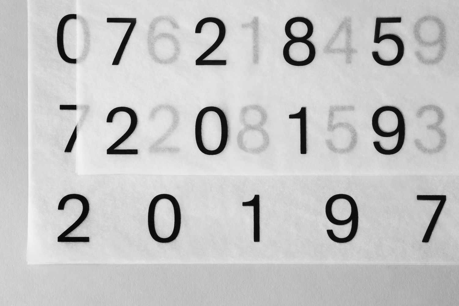
Visual identity is a straightforward expression of the utility of the service (numerical insight and comparison) through simple grid-based layout of numbers, in font choice, use of proportion, and the stacking element (or bundles) of the logotype, its simple shapes, tight kerning and low contrast. Promotional pieces bring a pleasant material quality (making a connection between physical and digital value) to what is a digital experience in the use of colour, stitching, tissue paper and red band. More work by Bunch on BP&O.
Design: Bunch. Opinion: Richard Baird.
