Vestre Anniversary Book by Snøhetta
Opinion by Richard Baird Posted 25 August 2017
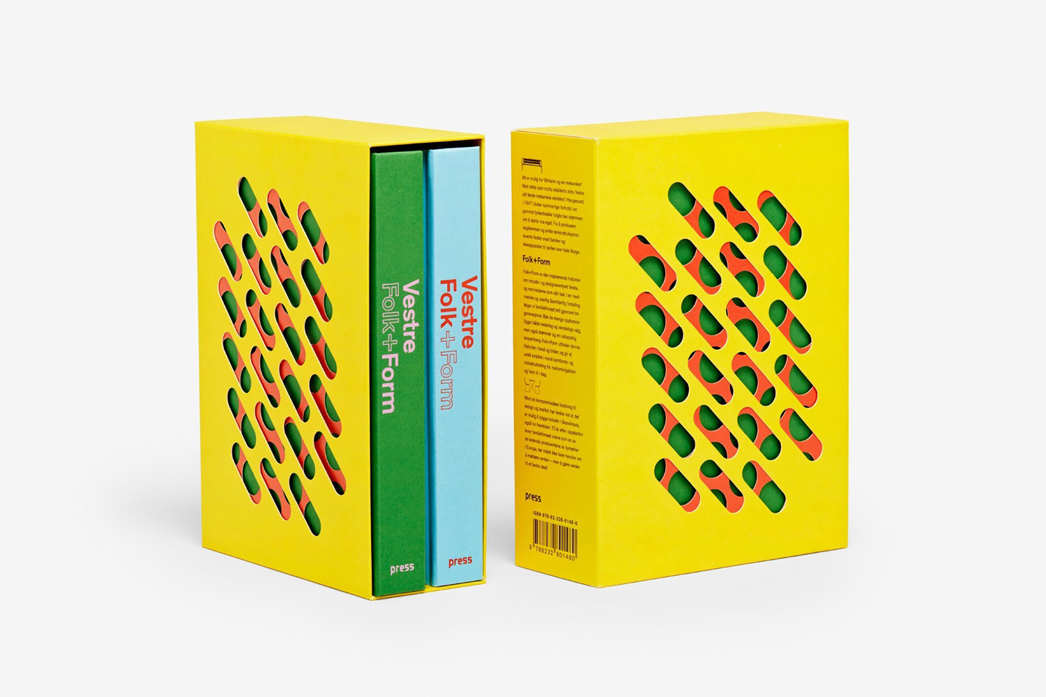
Vestre is a Norwegian, family-owned and run, furniture design and manufacturing business celebrating its 70th anniversary this year. Vestre’s extensive catalogue is characterised by an intersection between convivial colour detail, modern forms and long-lasting build. Snøhetta, who previously worked with Vestre on the development of a production facility in 2013, and the refurbishment of the company’s headquarters and showroom in 2017, continue to work with the business, this time on Folk+Form, an exhibition and two-volume book that intends to bring to life the Vestre family legacy.
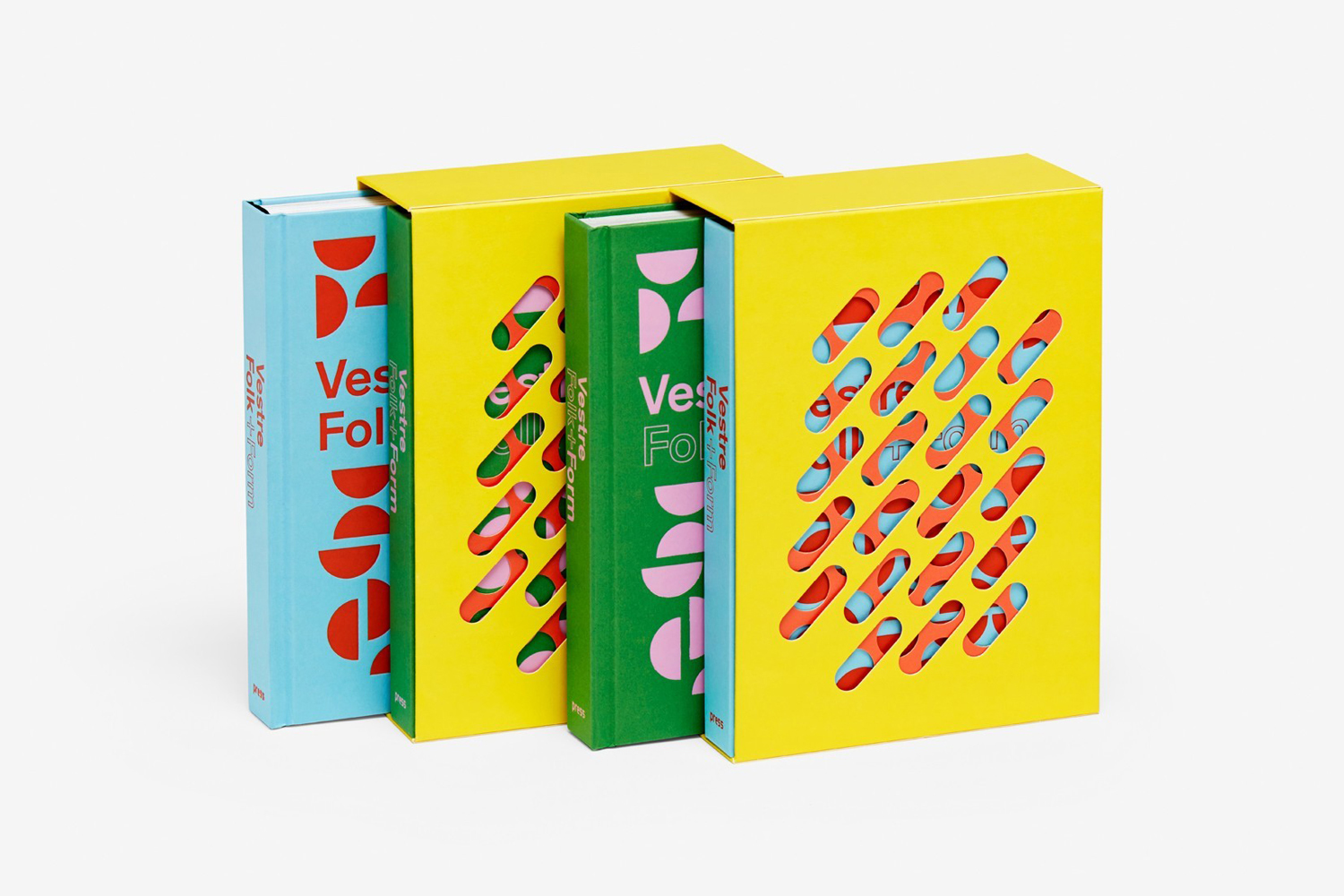
Through exhibited work, art pieces, film, text and photography, installation and book, Folk+Form pays tribute to the art of design and manufacturing of Vestre, and its continued commitment to making high quality, sustainability and accessible furniture for both the national and international markets.
The Vestre book, as published here, consists of a comprehensive and exclusive two-volume manifesto. One is described as being purely textual and the other pictorial. Both are contained in a perforated, bright yellow slipcase.
Material Specifications:
Cover: Geltex 111 LS.
Insert: Amber Graphic 130gsm.
Slipcase: Korsnäs Artisan 380gsm.
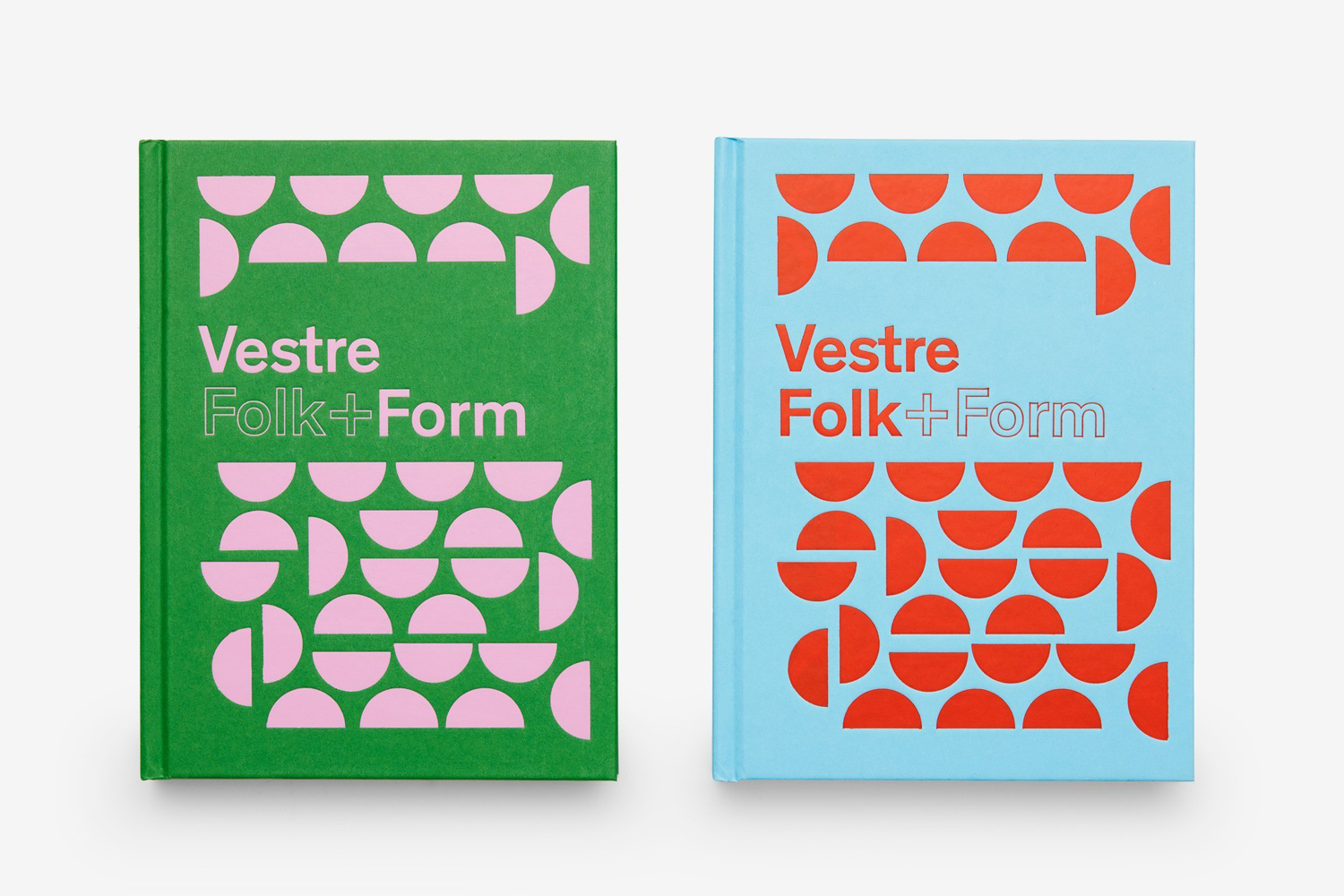
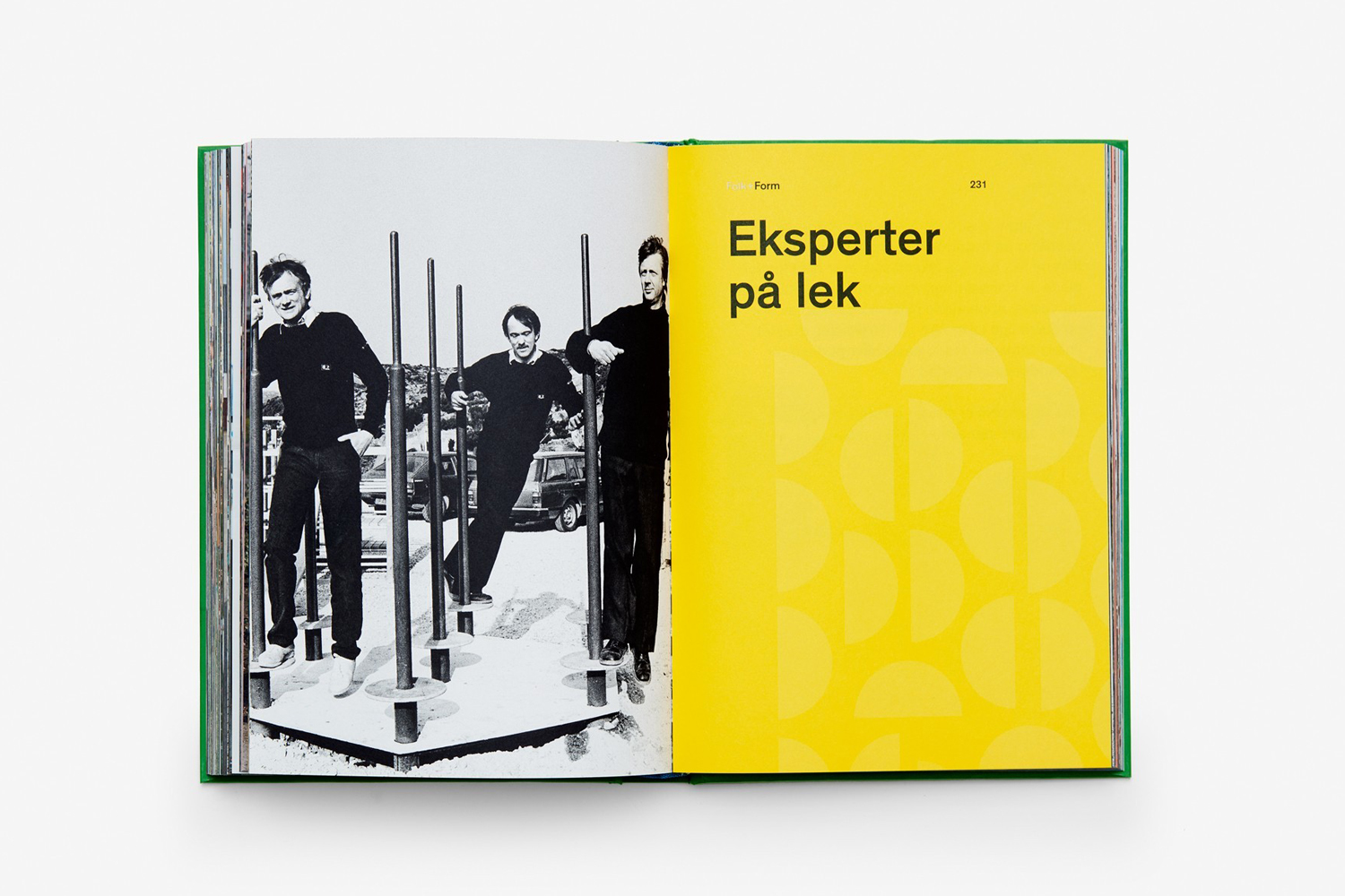
Using modern and contrasting colour, pattern and block foil, and in the layering of materials by way of die cuts, Snøhetta’s book channels many of the material qualities and design language of Vestre’s catalogue. The die cuts are a particular highlight. These take the practical need for traction and drainage in outdoor seating and elevates this to something playful, stylistic and immediate. Colour does something similar. In furniture it is just a small highlight running along edges, but in print, this is emphasised to give the work character and impact.
The pattern, which is informed by the design and shape of steel plates that adorn Vestre’s production facility in Torsby, and the interior of the company’s headquarters and showroom in Oslo, touch upon the company’s sustainable approach to design and manufacturing, drawing a stylistic and compelling image from a process of repurposing and making the most of a manufacturing bi-product.
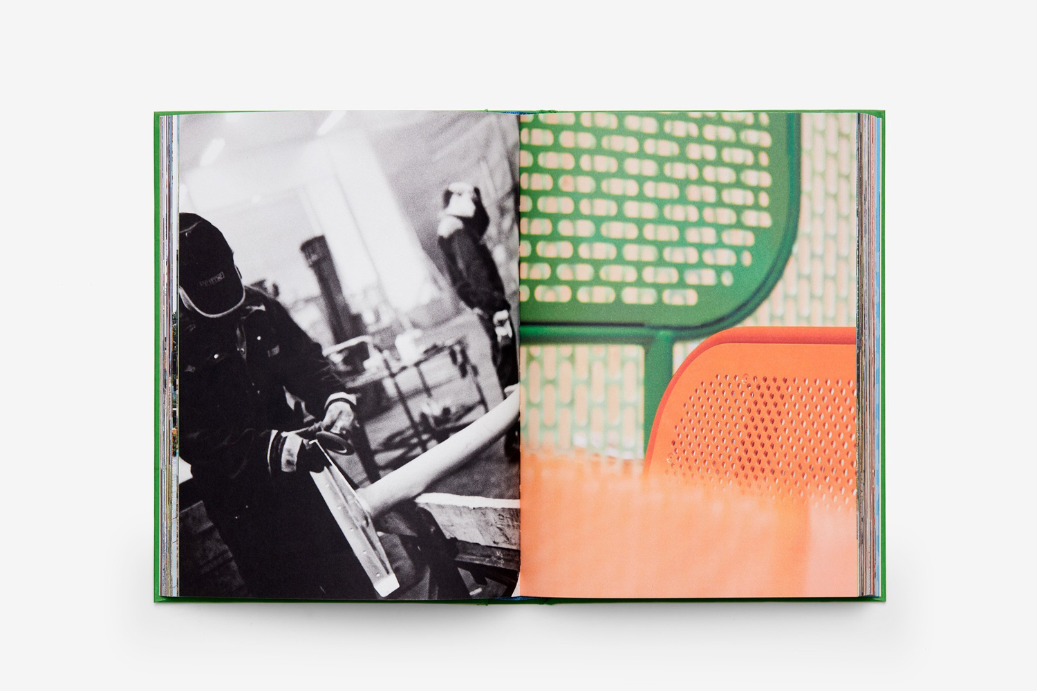
An interesting but underrepresented detail in documentation lies in the two volume nature of the book, and the division of text and image. Although it is difficult to really get a sense of the overall impression, and the individual qualities of each, be it the more visceral qualities of image and the insight of text, conceptually it makes for an interesting distinction between the value of the two. Where often these are interwoven, image often delivers an immediate impression that can unintentionally subvert the textual. Defining the two in separate volumes is an interesting way to guide the reader, to better control the story.
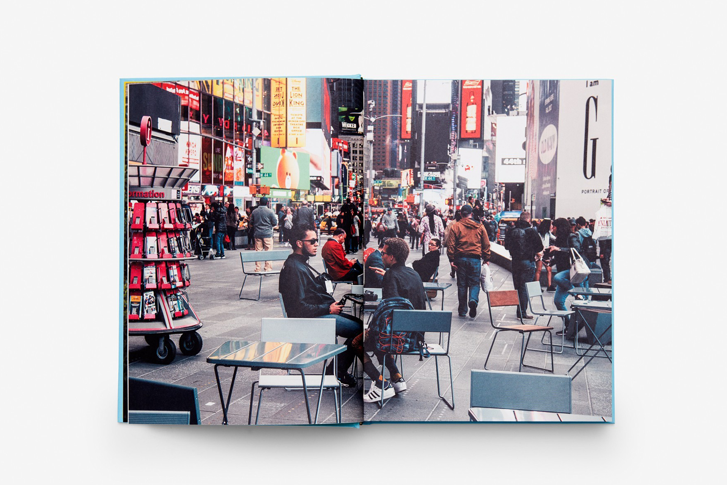
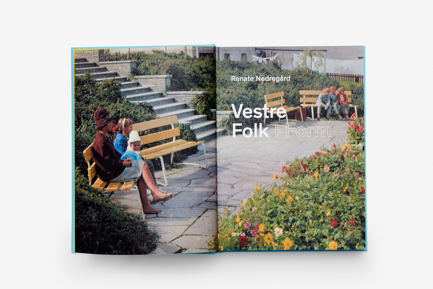
Inside the photo book, full bleed images, the communicative and visual impact of juxtaposing different approaches to framing, colour and composition, and those that are personal and craft-orientated and others that are more industrial, effectively play with people and products, and both literal and manufacturing family. It also does a simple and effective job, using double page spreads, to emphasis the international reach of the company, the contextual diversity of its products, and its heritage. More work by Snøhetta on BP&O.
Design: Snøhetta. Opinion: Richard Baird.
