Jackalope Hotels by Fabio Ongarato Design
Opinion by Richard Baird Posted 12 October 2017
Jackalope Hotels is a luxury hospitality experience developed by Melbourne-based Louis Li, a hotelier described as having a penchant for the avant-garde. The first Jackalope Hotel is situated in the heart of the Mornington Peninsula, Victoria, Australia. It is unique in its location, surrounded by the hotel’s vineyard, in its architecture and interior by Carr Design, and in its visual identity, created by Fabio Ongarato Design.
Interior design and visual identity are linked by the theme of alchemy – a metaphor for winemaking, a core part of the business, and expressed in the juxtaposition of visual and material elements to create a new whole. These include the hybrid qualities of the Jackalope sculpture by Emily Floyd, the mixed techniques employed by artist Kate Robertson, and the polished layers of stone and carved busts of Rolf Sachs. This also extends to the visual identity for hotel, its restaurant and bar, in the combination of paper and finish, organic image and precise typographical and geometric forms.
It is an extensive project with a sensory abundance, offering guests an immersive journey through dramatic moments and intimate shared experiences. The theme of alchemy, a relationship with wine making, and hotel naming, based on the mythical hybridisation of a rabbit and antelope, form the foundation for a variety of visual and material contrasts, and a framework from which the brand can expand globally.
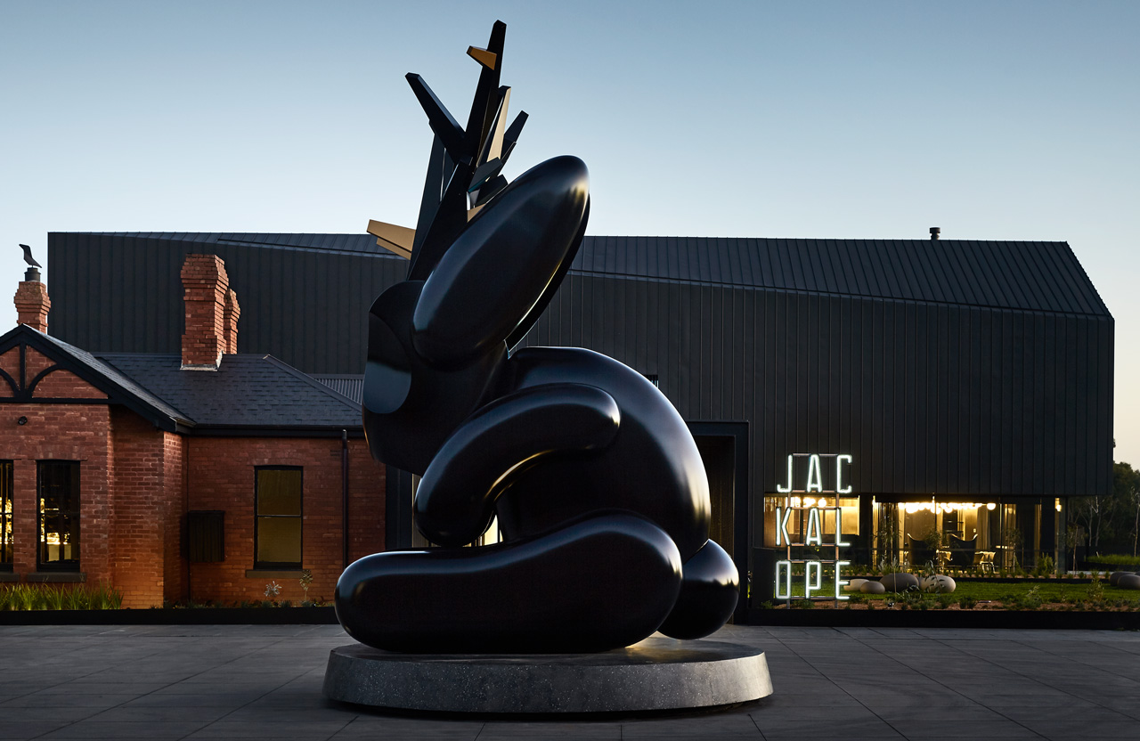
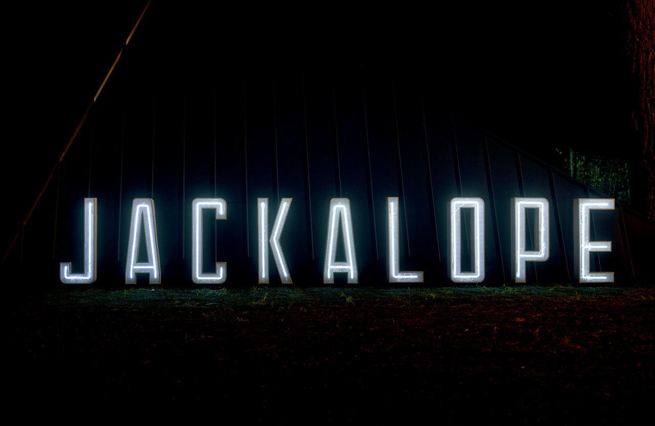
Geometric lines and dark metal glad structure, looming over a traditional brick building, surrounded by vineyard and featuring a large modern sculpture by Emily Floyd, appear as an effective, visually concise preamble to a rich interior experience. The hybridisation or alchemy at play is at its most precise in the shot above, and built on throughout interior. Not only in the juxtaposition of simplicity and detail in form and finish, different types of art that share themes, but also in the meeting of the modern and traditional, illumination and shadow.
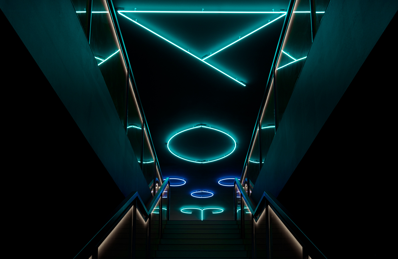
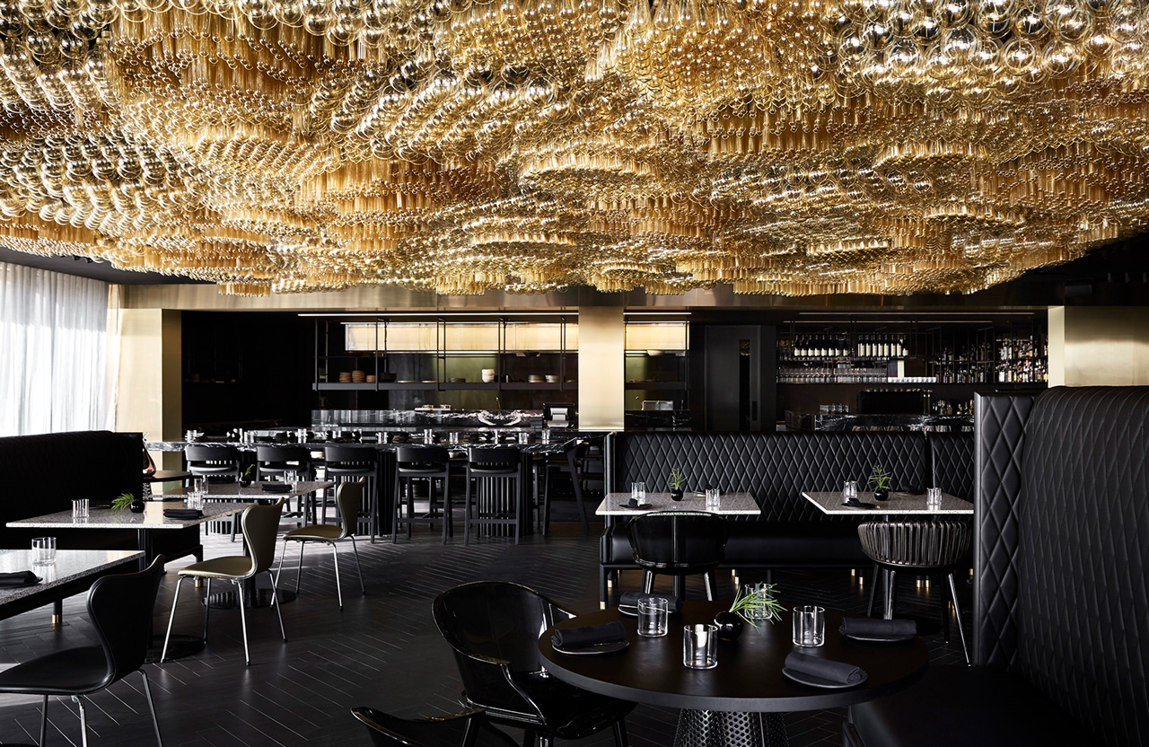
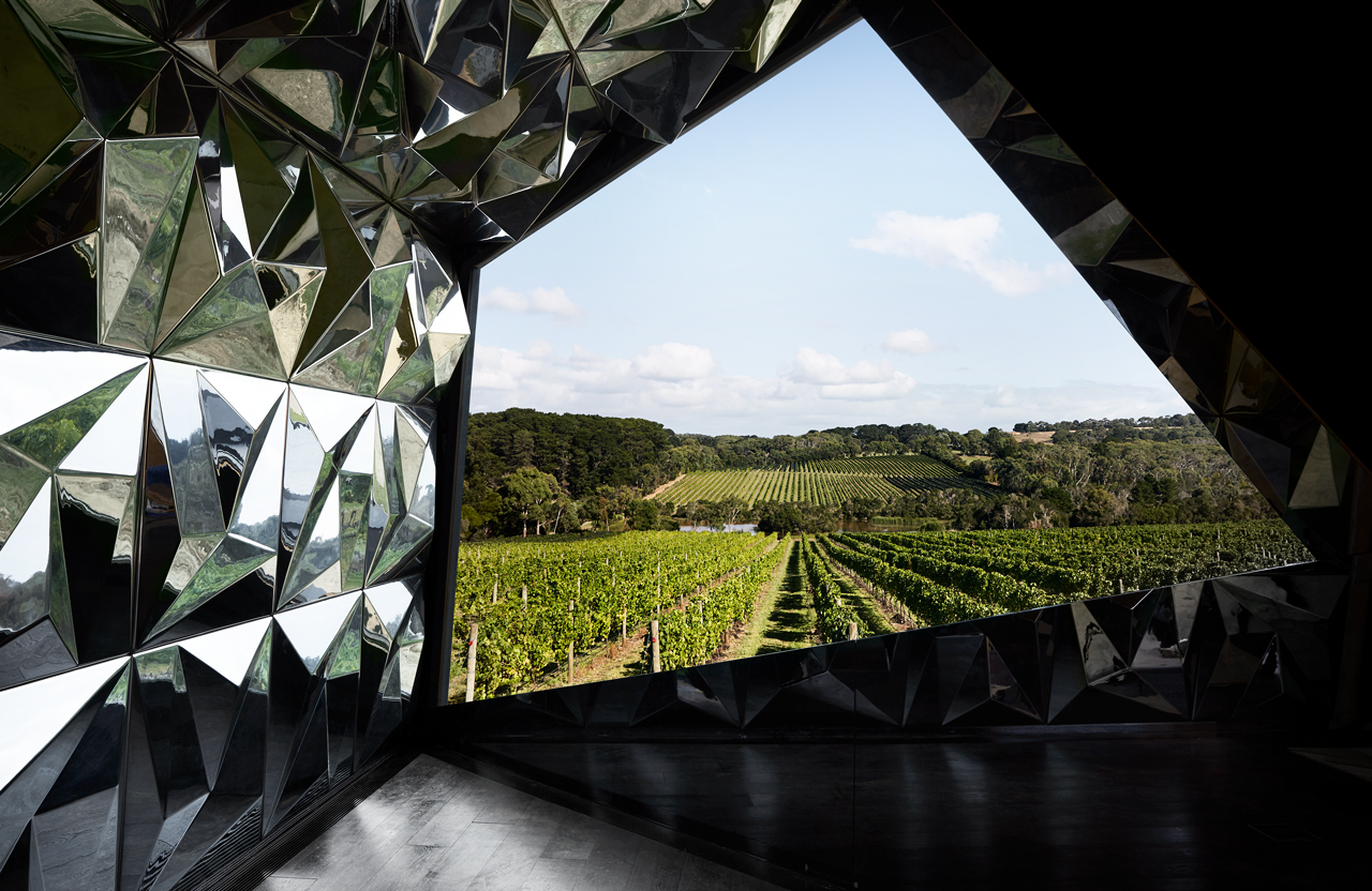
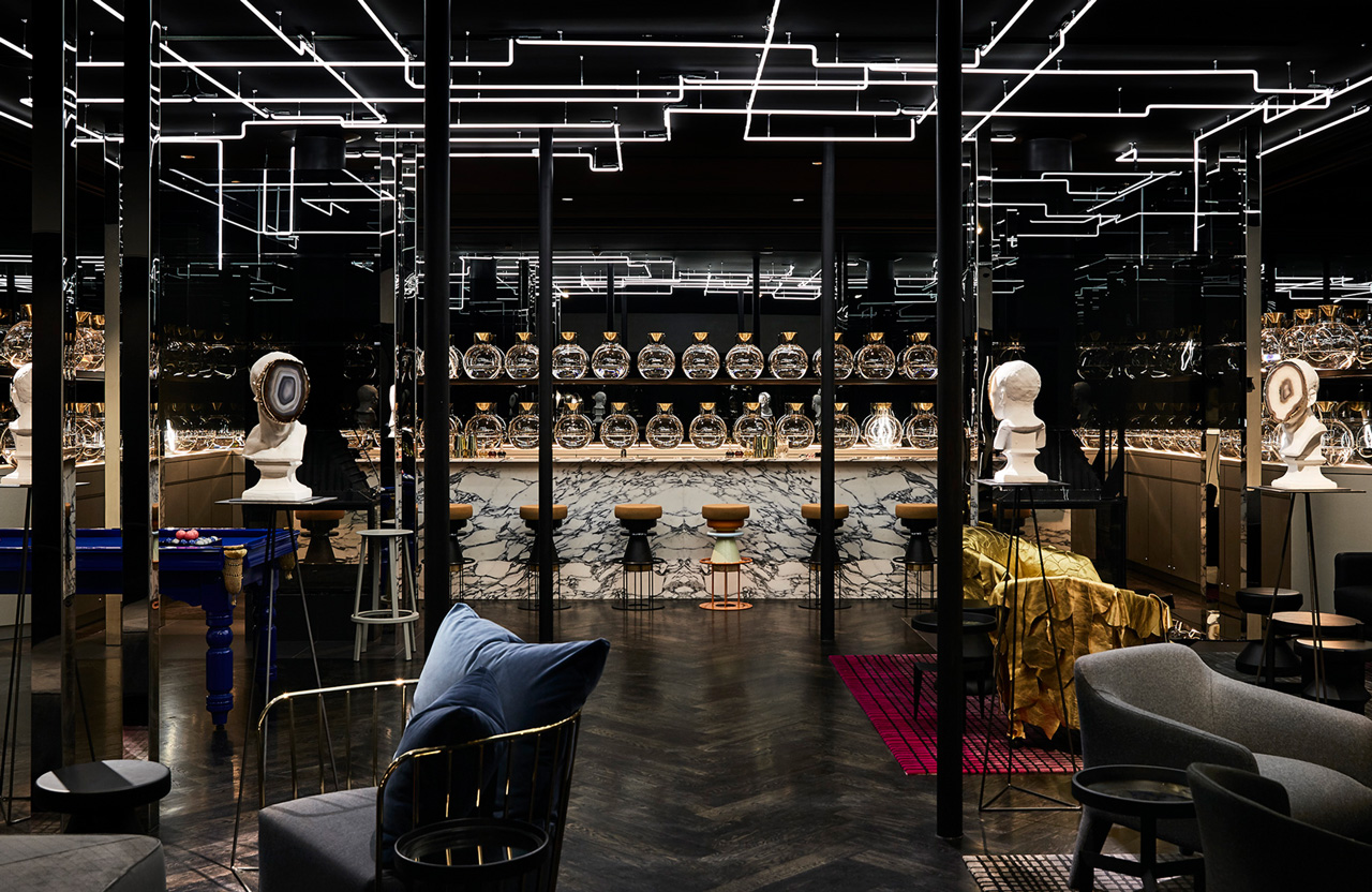
Highlights include shaped neon tubes and the lighting of railings, a ceiling and installation of light bulbs above an interior of black furniture and floor (broken up by different shapes and materials), and the geometric framing of a view across the natural vista of vineyard, broken and distorted by panels of shaped and reflective material either side.
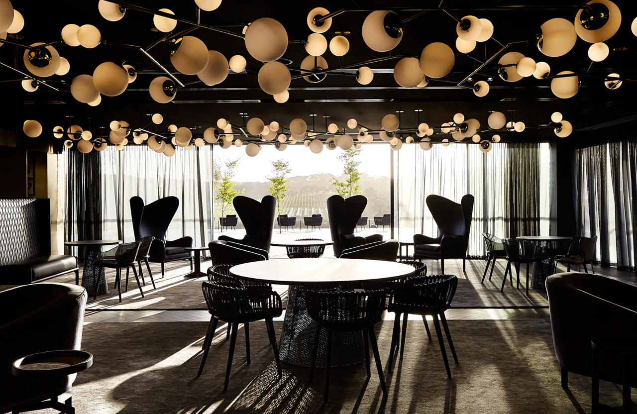
There is a sophistication to interior design, a constant thematic language, but a huge variety to its visual expression and material implementation. There are some lovely creative moments that individually are unusual and interesting, such as the sculpted neon tubes that run around the ceiling of the bar (below), yet gain a satisfying conceptual level in their relationship to the pipes of distillation. These are spaces of comfort and uniqueness but also of ingenuity and quality.
Although alchemy is predominately expressed using juxtaposition, the creation of new experiences from traditional materials and objects, and moments of the more literal placement of science paraphernalia, this also extends to process. Particularity, in the case of artist Kate Robertson, in her layering of analogue printing, photograms, chemigrams and scanograms, and the use of modern digital manipulation and large format camera re-photographing techniques to create a series of eight artworks.
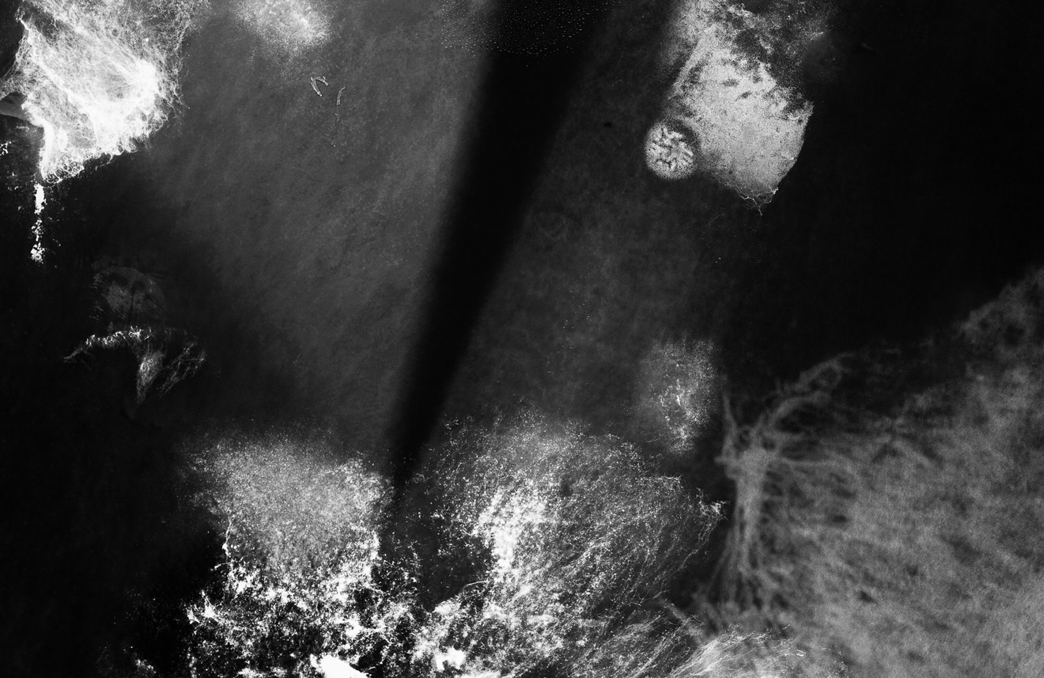
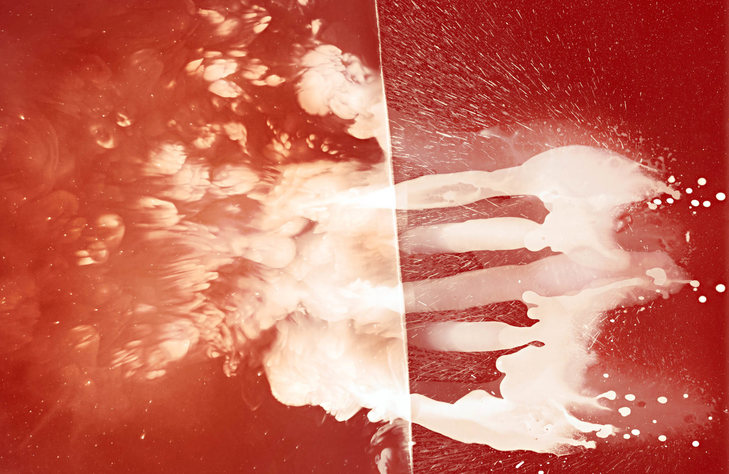
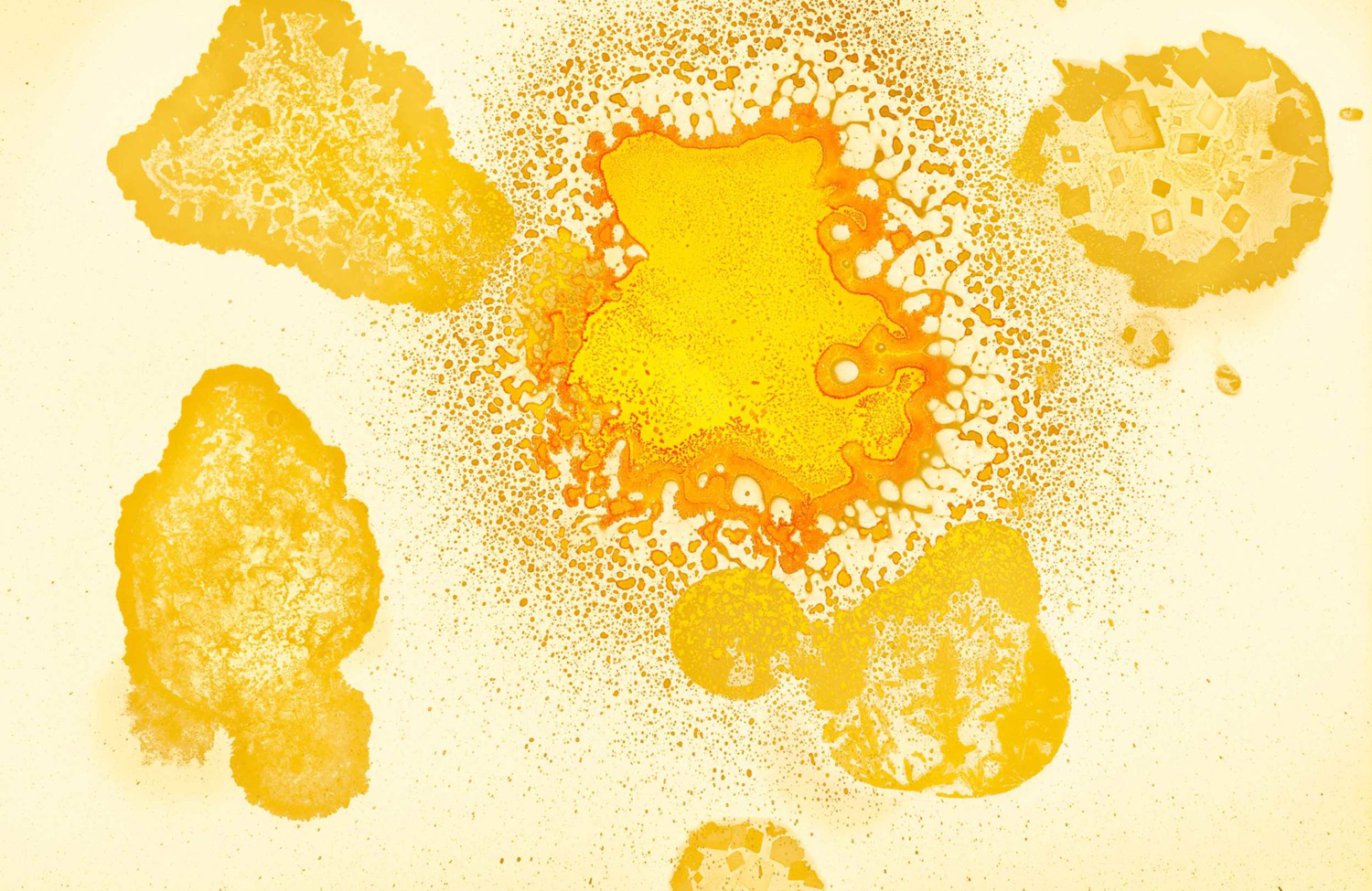
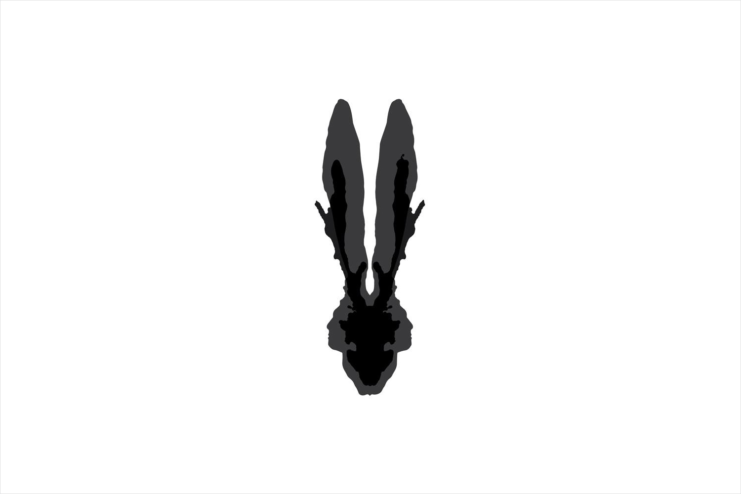
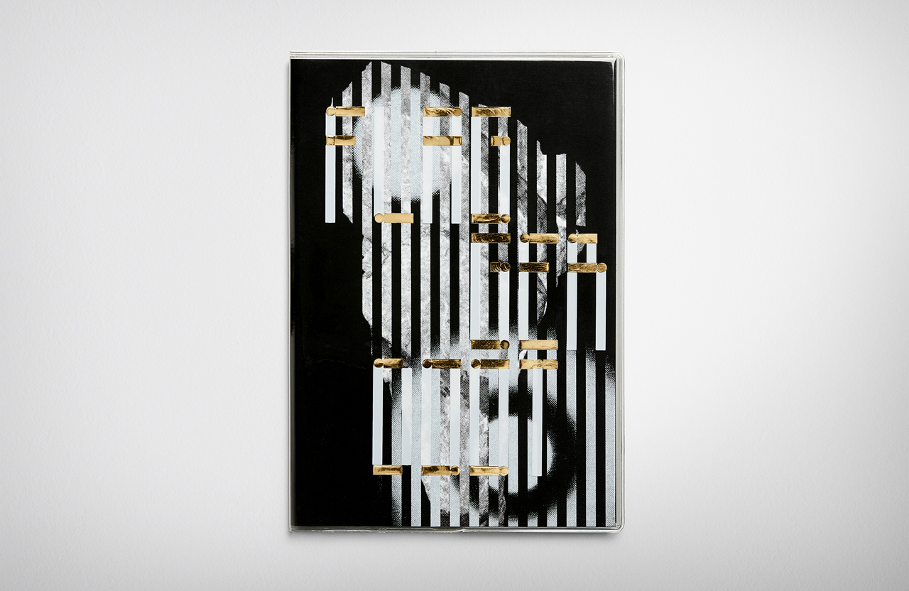
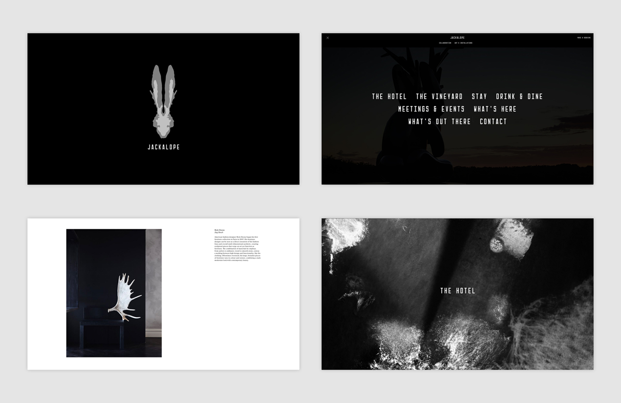
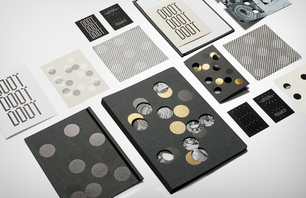
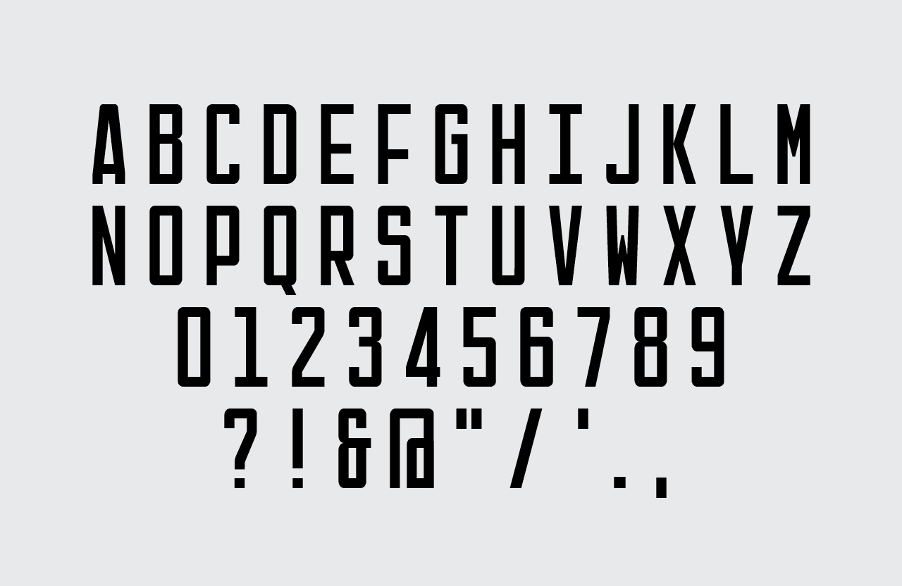
Visual identity channels much of what is happening in both interior space and exterior structure. Quite literally in the repurposing of Kate Robertson’s work across the back of room cards, in the debossed leather covers, and the contrast of modern and precise lines of typeface and the organic image of rabbit and blown ink illustration. Where interior is rich, visual identity offers a quieter break, distilling down the themes, motifs, materials and finishes of interior into useful singular expressions that can be used online and printed whilst retaining continuity. The multiplicity at play has also been effectively distilled down into logo, not just in the layering of the jackrabbit and antelope skull with ink, but in the the profile of two figures either side and the rorschach quality it has.
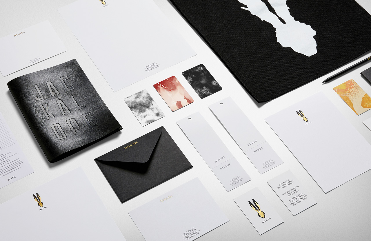

Specifications.
Mohawk Superfine Eggshell
Keaykolour Original Sombre Grey
Notturno Black
G.F Smith Colorplan Mist
Foiled, Embossed & Die Cut.
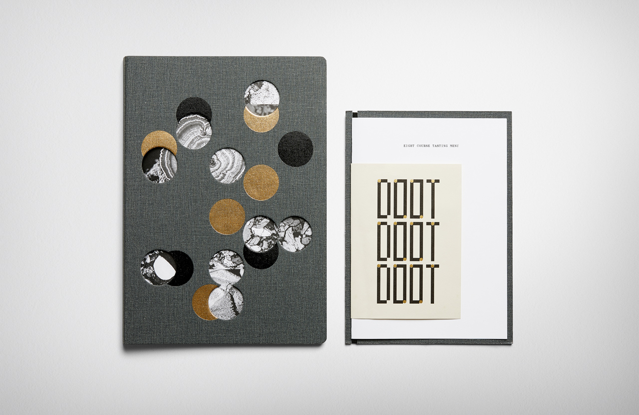
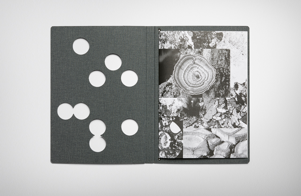
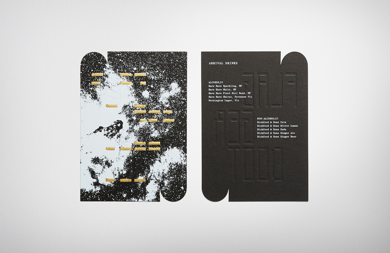
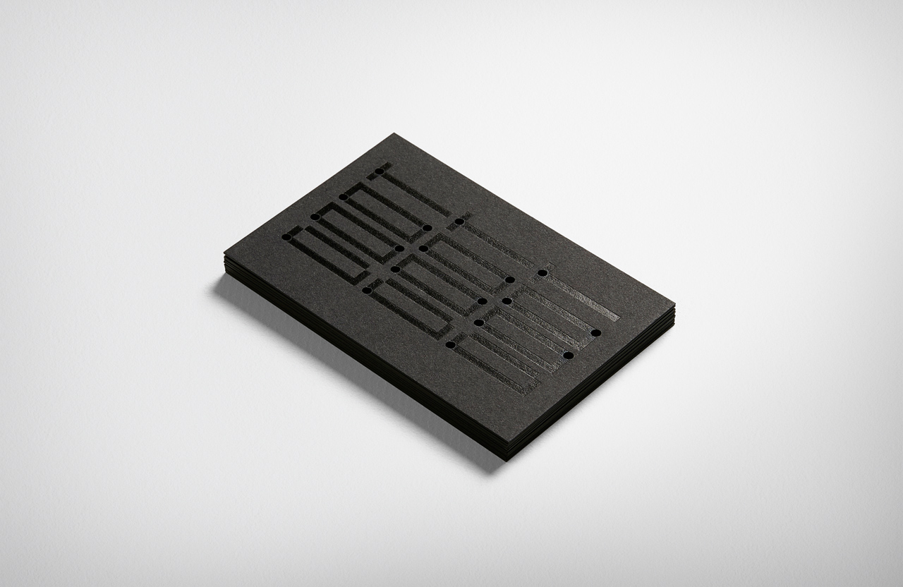
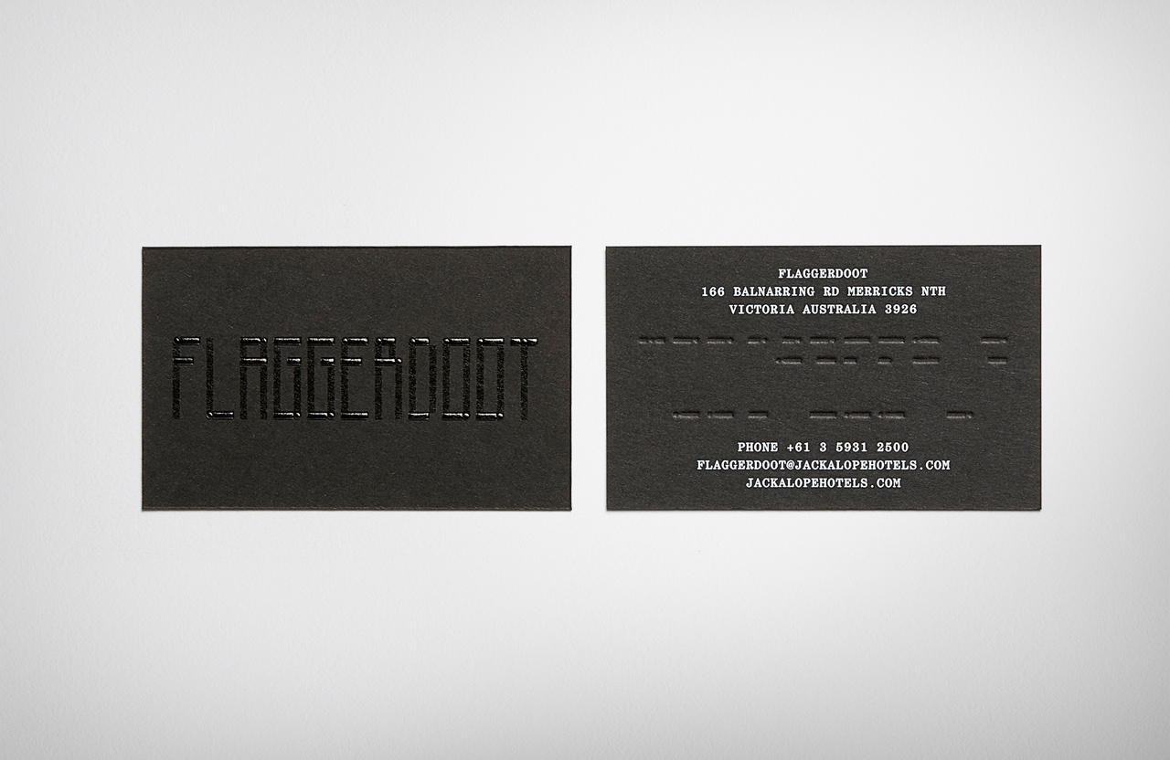
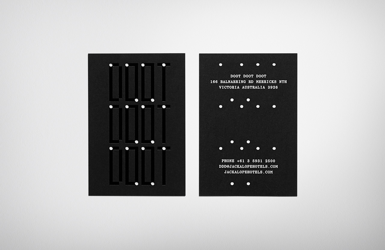
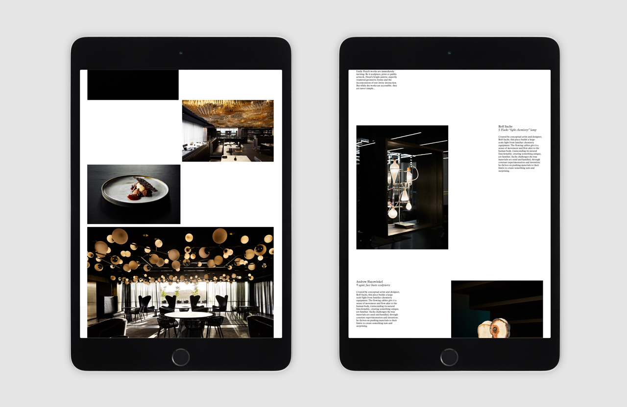
Each step through the hotel is described as a step in the alchemy process. From the distillation theme in Flaggerdoot bar, to the 10,000-suspended glowing amber lightbulb installation that depicts fermentation in the restaurant Doot Doot Doot. These themes are also visually articulated in the design of menus for each of these individual experiences, and also tie into the broader visual language of the hotel. This includes the geometric framing of nature photography across the menu of covers, typographical contrast that touches on the modern, the utilitarian and the traditional, gold foil and dark fabrics, and the use of colour, texture and form contrast throughout. Much like interior, these balance an immediate aesthetic and material pleasure and distinction with interesting ideas (literal and abstract, evident and hidden) that leave a lasting impression.
Design: Fabio Ongarato Design.
Architects & Interior Design: Carr Design
Landscape Design: Taylor Cullity Lethlean
Artists: Emily Floyd, Andrew Hazewinkel, Rolf Sachs & Kate Robertson
Print: Press Print Digital.
