Lumik by Hey
Opinion by Richard Baird Posted 1 November 2017
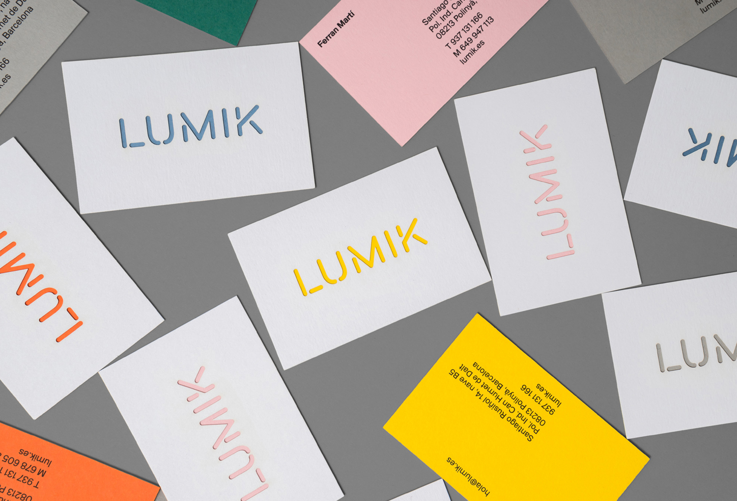
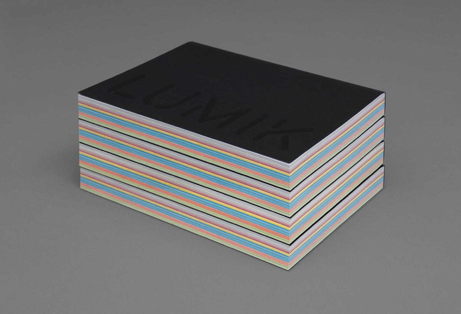
Lumik is a Spanish lighting design and manufacture company, and partnership between the traditional metalworking company of Francesc and Ferran Martí, and interior designer and art director Frank Domínguez. Together they have 65 years of experience, and have built a catalogue of products with simple forms, moments of colour, elements of play and the industrial. These move between those that are hidden and utilitarian and those designed to be a feature and focal point. Lumik is described as being a trendsetter with a customisable and made-on-demand approach that offers customers a multitude of possibilities. This is expressed by the company’s graphic identity, designed by Barcelona based Hey, through a variety of cheerful and modern colours, a custom typeface, and the strong material qualities of brochure and business cards.
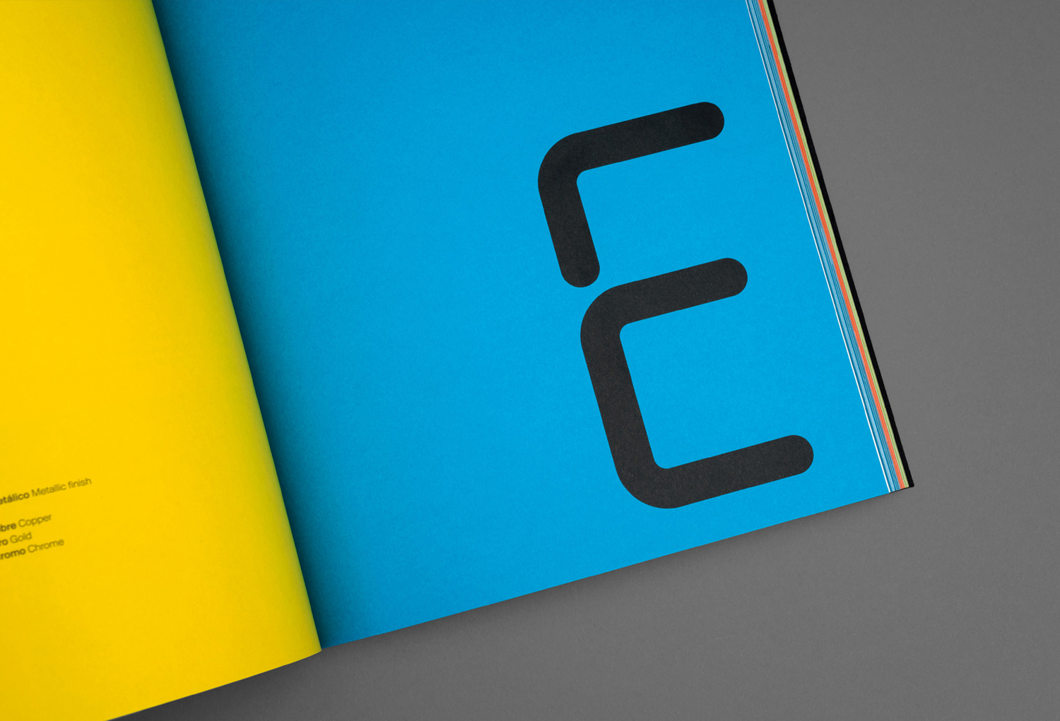
There are three distinct components to identity. Type, colour and materiality. Each is rooted in the basic principles of business. The functional, the customisable, the made-on-demand and the trendsetting. And worked together to form a distinctive identity of contrast, clear communicative intention and visual interest.
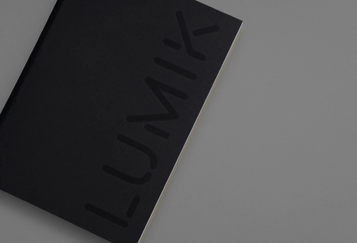
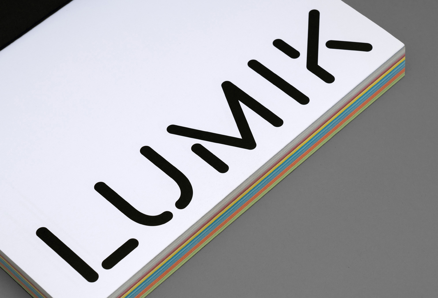
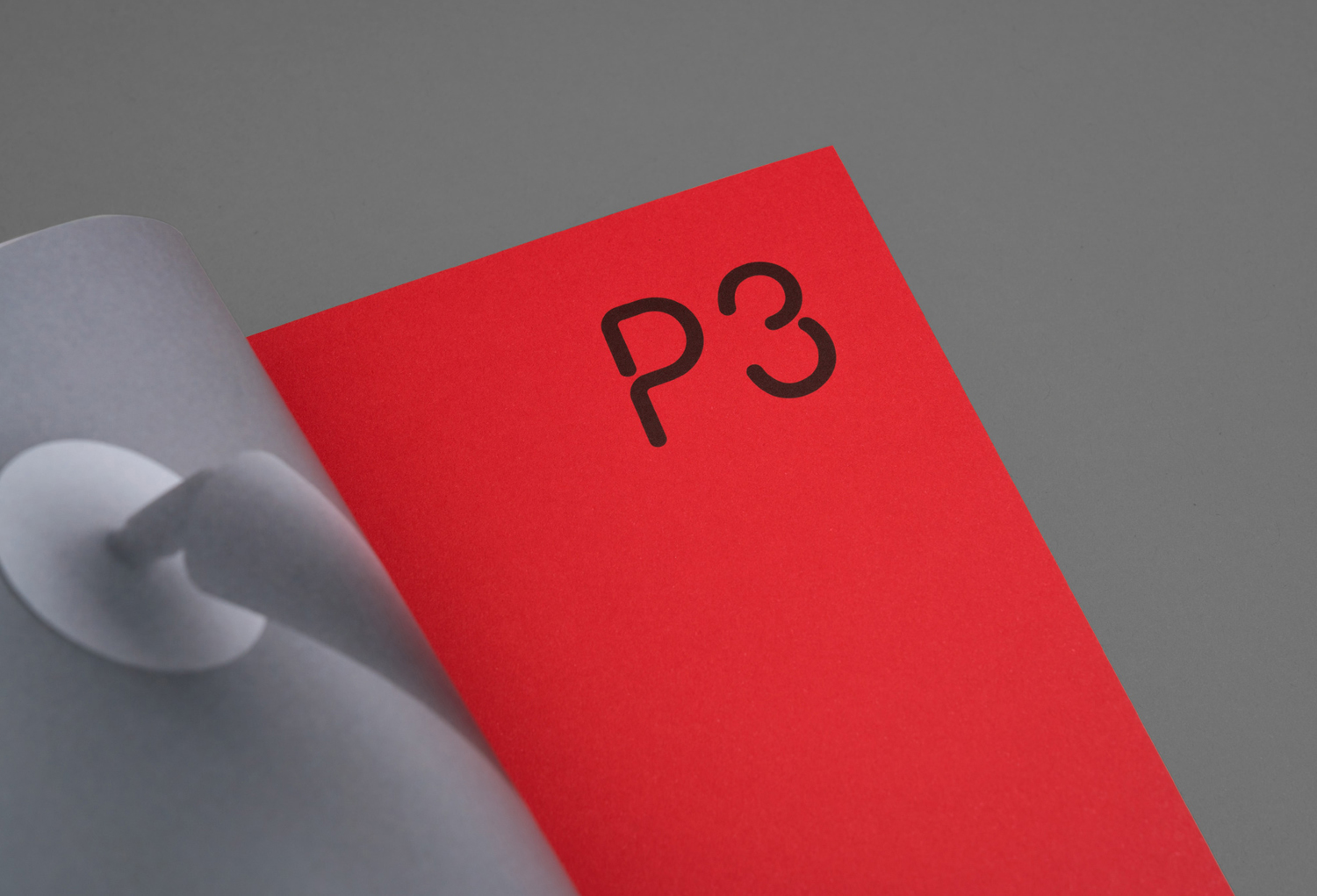
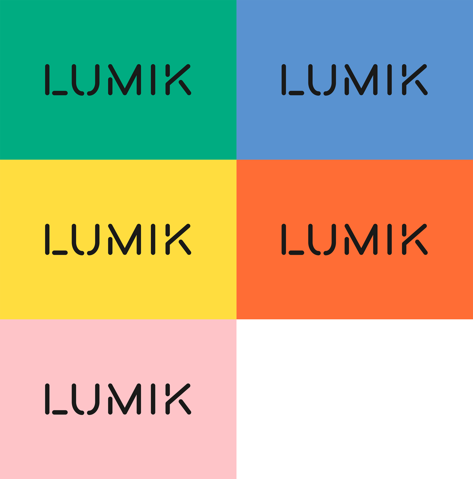
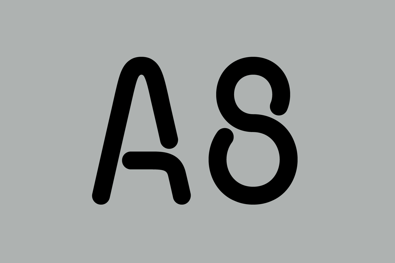
Custom typeface, a collection of condensed monolinear sans-serif forms exists somewhere between the industrial associations of a stencil cut typeface, the breaks of neon tubes and the rounded terminals of LED light sticks. It finds a balance between a long-serving and familiar utility, modern technology and individual character.
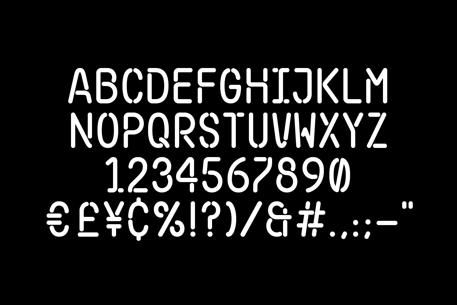
There is a notable contrast between the wide letterforms of logotype and condensed characters of custom typeface, a useful distinction, with some unique touches in the moments where lines break or intersect. Strategically, the time and prominence given to a custom typeface makes sense within the context of a product naming convention that is utilitarian in its typographical economy, not straying from a single letter and number.

Where type plays with the industrial, colour introduces a sense of cheerful character, a sense of warmth, the current and variety rooted in the customisation of Lumik’s products and its trendsetting intentions.
The use of dyed uncoated boards, rather than ink, and the die cutting and duplexing of boards to create layered business cards lends the work a simple but evident material quality grounded in the made-on-demand approach of Lumik. This colour is subtly worked into website as a simple rollover detail and effectively punctuates brochure. It brings a communicative breadth to a singular graphic expression and visual impact in colour combination and its opposition to the associations of type.
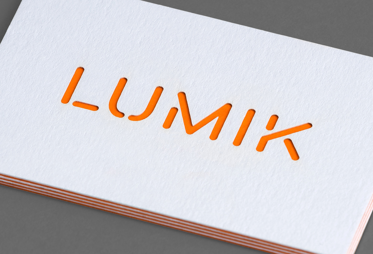
It is small project but with enough character in letters, colour and materiality, rooted in the character of brand, and the qualities of its products to appear distinctive. It is not abstract, but literal and intelligible in its communicative intentions, balancing a warmth and variety with the functional and industrial. More work by Hey on BP&O.
Design: Hey. Photography: Enric Badrinas. Opinion: Richard Baird.
