Nicollet by Pentagram
Opinion by Richard Baird Posted 6 February 2018
Nicollet Avenue runs between Loring Park and the Mississippi River and is described as the “Main Street” of downtown Minneapolis. It is a cultural and commercial centre, shopping and dining district, and home to flagship stores, major corporations, public transport hubs and landmarks. Nicollet Avenue also includes the Nicollet Mall, the first transit mall in the US, originally opened across eight blocks in 1967 and now covering twelve.
Following a major renovation to make the avenue more pedestrian friendly, and to coincide with its reopening and 50th anniversary, Pentagram’s Paula Scher and team developed a new graphic identity for Nicollet. This included a comprehensive system of signage, way-finding and environmental graphics which intend to capture the spirit of the street and its place within the city through typographic form, iconography, shape and colour.
“Coinciding with the 50th anniversary of Nicollet Mall, the new renovation improves the walking experience along Nicollet with clearly marked walkways, curb-free intersections, 1,500 LED lights illuminating the new sidewalks and streets, native plantings with locally grown trees, comfortable seating, a curated outdoor gallery of public art and new two-block “Light Walk,” and flexible spaces to support and enhance the outdoor cafés, markets, festivals and other street activities, as well as infrastructure upgrades below ground.”
Pentagram’s strategy seeks to move away from the idea of a mall, a term generally associated with shopping, to create an inclusive integrated area and destination under the name Nicollet, and the tagline “On Nicolett”, a place that attracts people to work, shop and eat all year round, and provides new visitors with a positive first impressions of city.
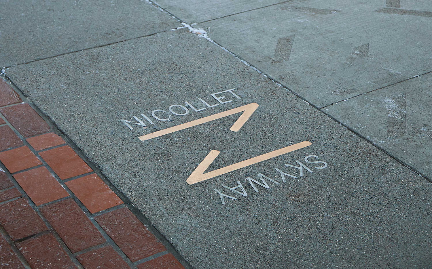
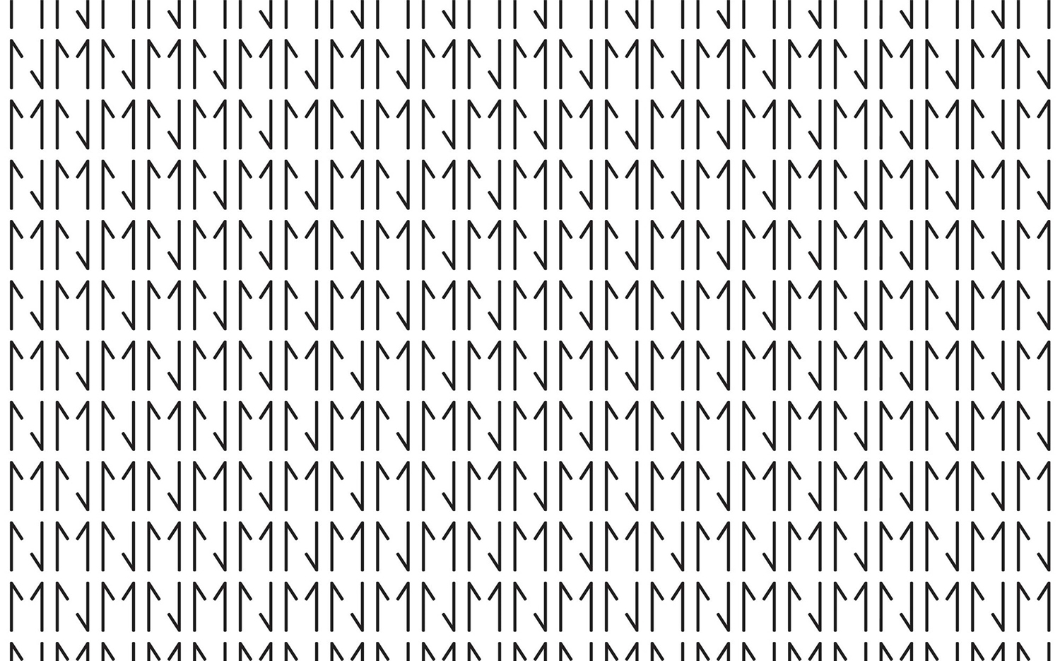
This unified strategic vision is aided by a new graphic identity based around the letter “N”, the pairings of “MN” (the state abbreviation) and “NM” for Nicollet Mall. These are created by cropping arrows, an articulation of the long bi-dierectional nature of the street, the flow of traffic and people, and the connective tissue and arterial role of Nicollet within the city. These are worked together alongside the sans serif Fakt and a colour palette of white, black and yellow.
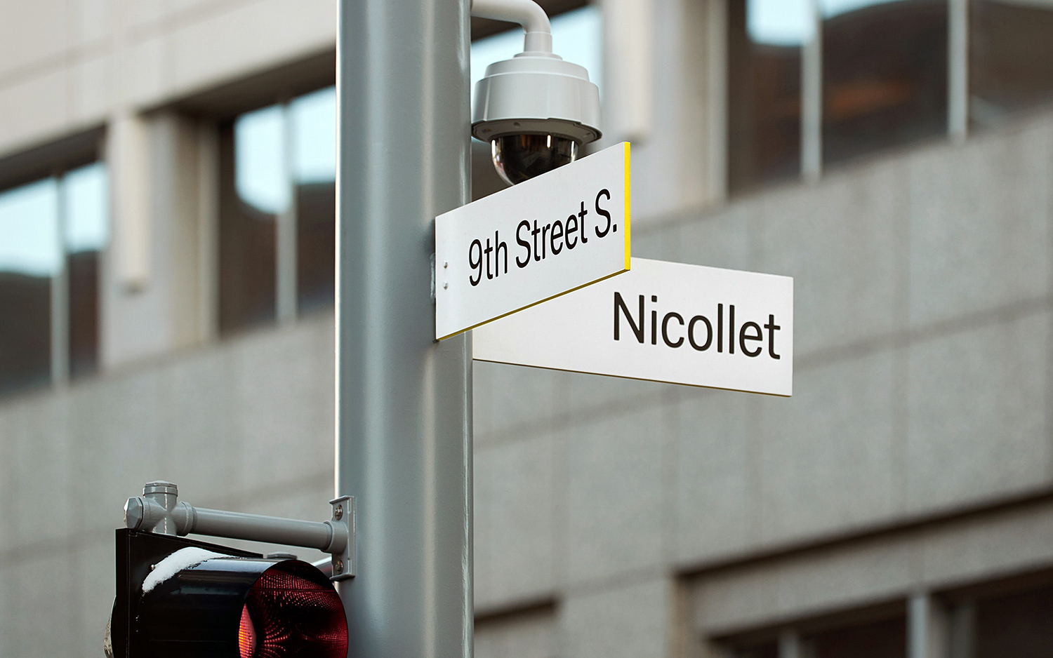
Pentagram’s work for Nicollet is an interesting take on area identity and the practical necessities of urban way-finding. It finds its distinction largely in the intersection of a bright white and use of space, framed and drawn out by an eye-catching yellow within a busy and grey urban environment.
The practical considerations, such as being clearly identifiable and quiet within a bustling space and legible from a distance, are served by those qualities that also give it its unique and unifying character, the combination of the “highly-legible” typeface Fakt, black on white, and yellow detailing.
There is an unmistakable industriousness to the system, in the cropping and cutting of arrows and the construction of the N and M, in the laser cutting of materials, and the yellow and black combination. This feels fitting for an industrial city and port.
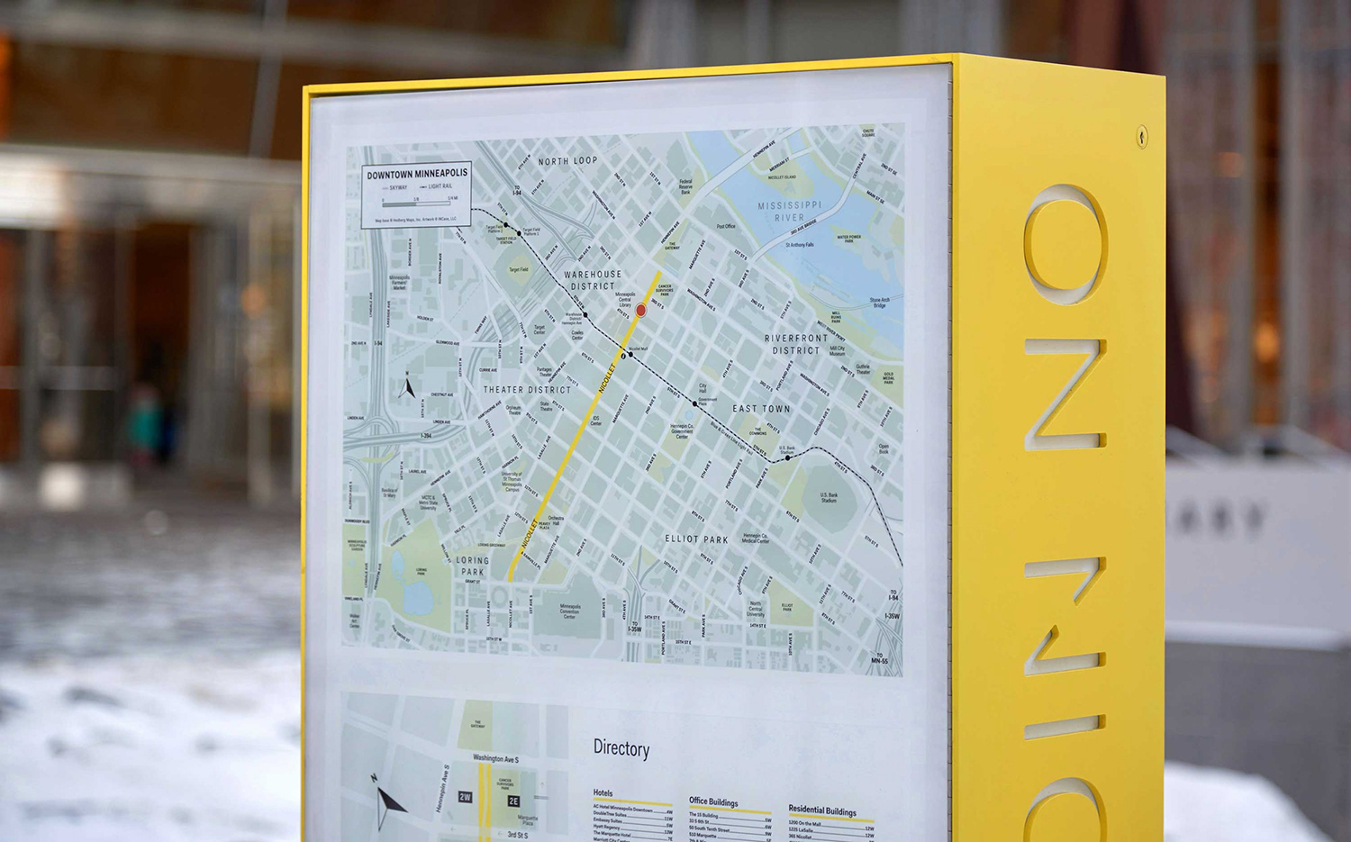
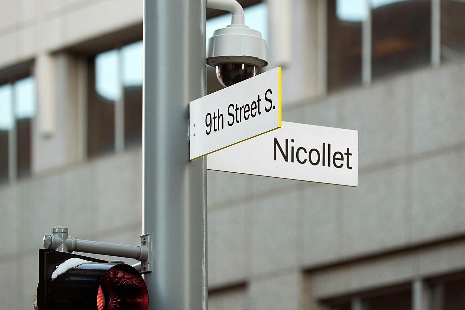
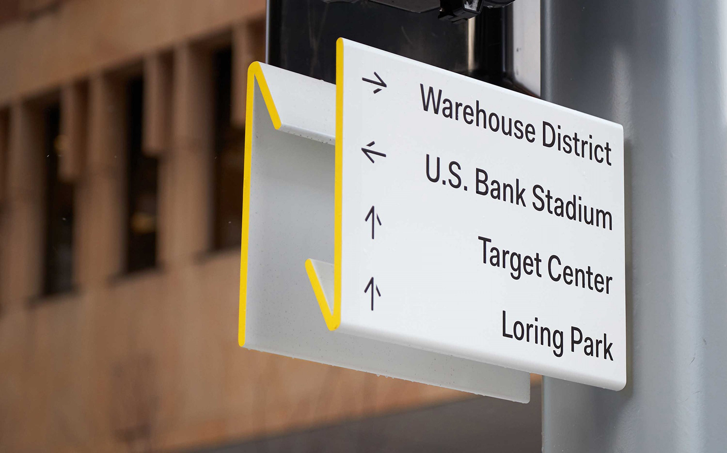
Structural form is also used to balance the distinctive with the practical and uniform. Street signs are slim and single panels, multi-directional signs have a cross-section that has the qualities of the N logo, the meeting-points, the places in which to orientate oneself, are monolithic, robust and with depth, and small overviews are folded to cover multiple angles of view. There is a structural language to these that help divide, while the white surface and yellow edging, the continuous use of Fakt, serve to link these with an immediacy. It is also worth noting mechanism, the simplicity of joins and hidden connection points that give further weight to the graphic.
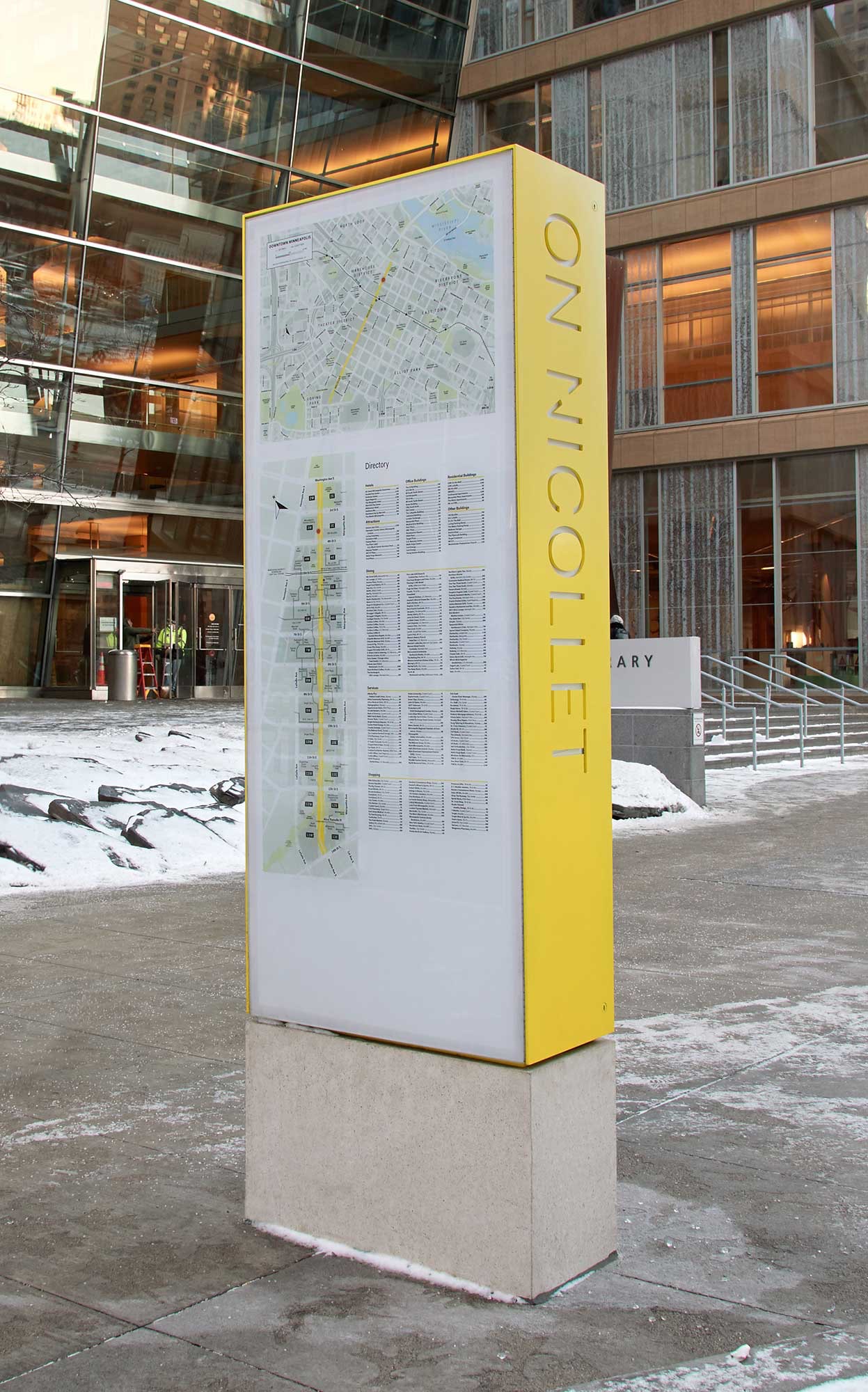
Nicollet Avenue is a long stretch, linking directly different areas of the city. The regularity of signage, and the punctuating of busy urban space with simple forms, solid blocks of colour and areas of white, reassure through an obvious continuum along the avenue.
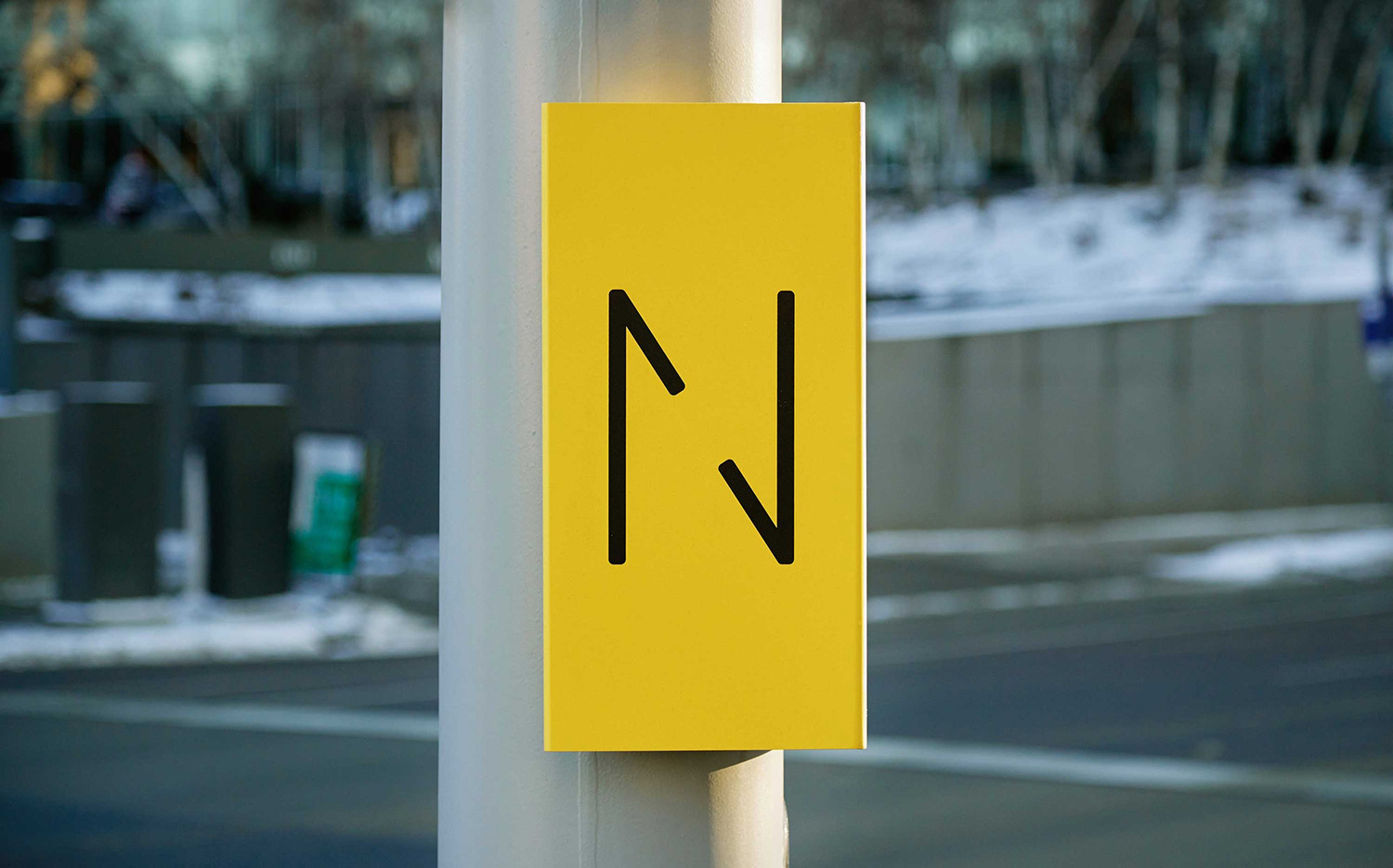
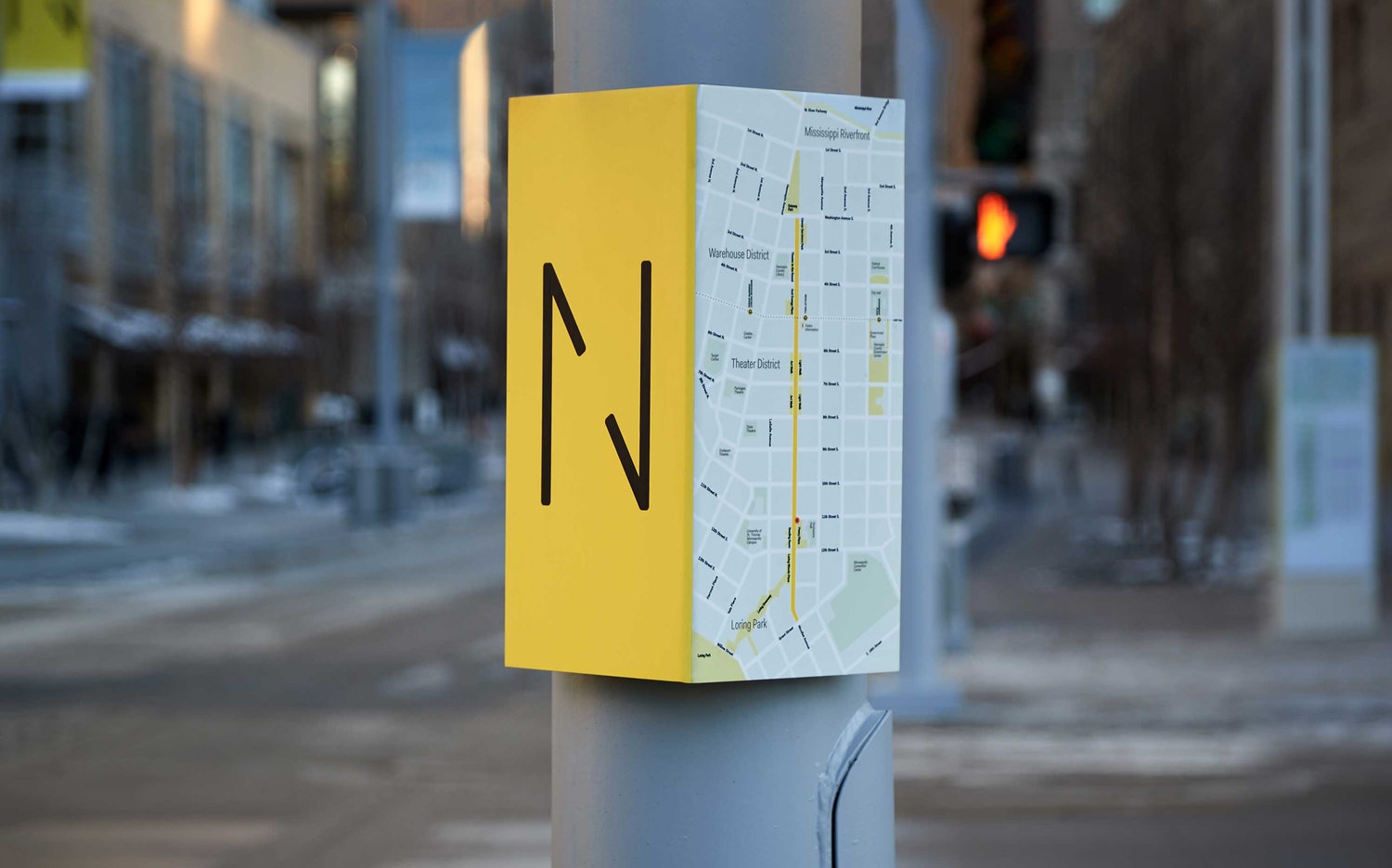
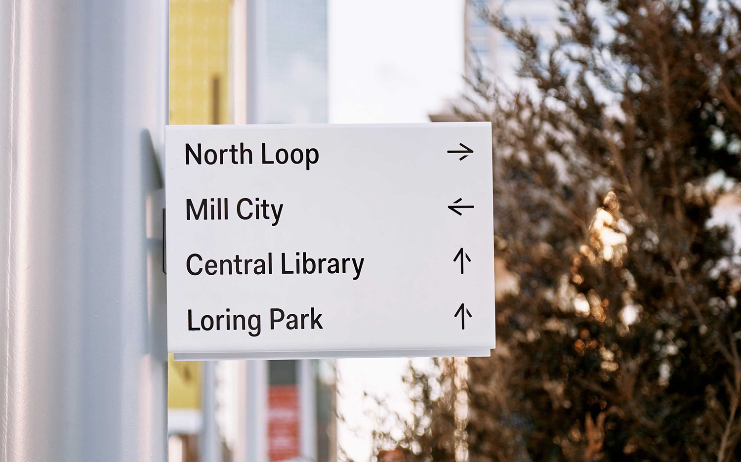
Fakt feels like a good choice. It serves its purpose through its intrinsic legibility and deployment, in conjunction with space and colour, but has enough of a difference to appear disparate from its surroundings, and in this way, it calls to mind the visual language of airports. Although there is continuity in the cuts through the arrows, these do reduce their impact and communicative immediacy slightly.
A couple of thoughts on longevity. Special coatings, a dedicated team of cleaners, and the occasional wet weather will all help to maintain quality, however, keeping light colours bright, and the ledges and troughs of folded signage and laser cut surfaces dirt-free is likely to incur an ongoing expense.

Other details include patterns which break up the arrows into an irregular composition of lines and space, and cut into street furniture that includes heat lamps. Although these have a more ornamental intention, rather than a functional foundation, the cuts and line weights maintain a continuity with signage and way-finding.
Signage and way-finding function as a useful tool to unify an specific area within a sprawling urban landscape, to find a meeting point between utility and uniqueness. As the point of initial engagement for new visitors it is notable and helpful, orientating first and following up with city character. Colour palette, while perhaps needing some form of ongoing and regular upkeep, serves a transit variety in its high visibility, feels grounded in an industriousness yet has an aesthetic and referential pleasure to it. More work by Pentagram on BP&O.
Design. Pentagram. Partner In Charge: Paula Scher. Project Team: Courtney Gooch & Sarah McKeen. Opinion: Richard Baird. Fonts: Fakt.

What do you think of Pentagram’s work for Nicollet? Get the conversation started on Twitter. Never want to miss a post? Sign up to BP&O’s once-weekly newsletter here.
