CCA Architecture by Manual
Opinion by Richard Baird Posted 21 February 2018

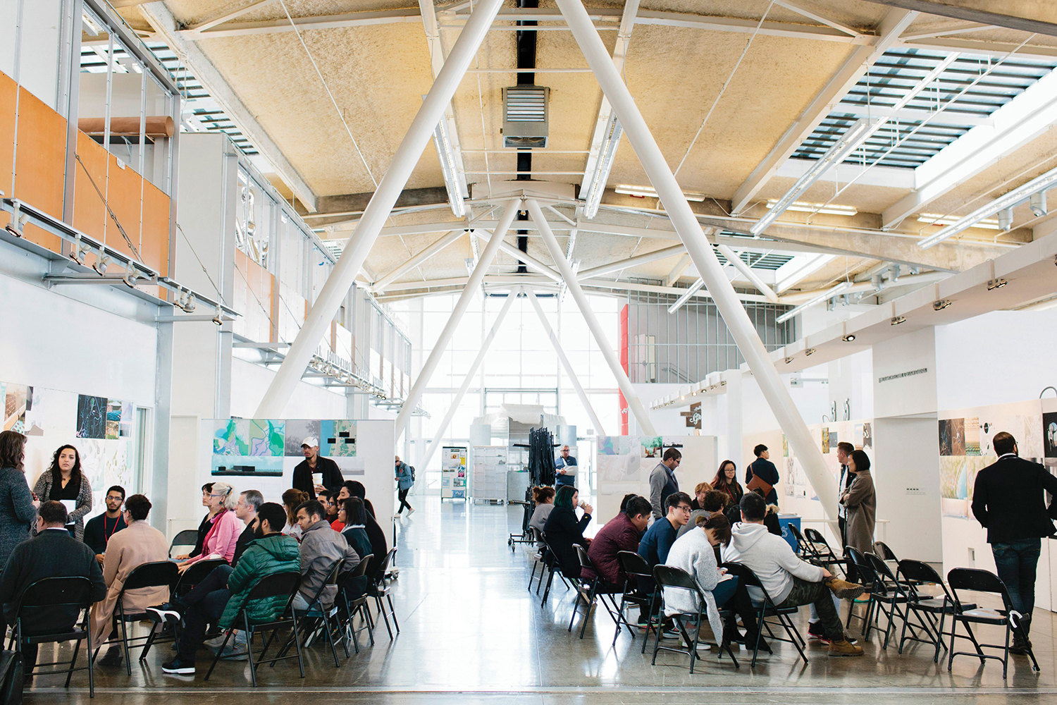
The Architecture Division of the California College of the Arts (CCA) is an internationally recognised leader in architecture and interior design education. Its programs, which focus on digital technologies and material systems, design research and urban agency, were developed to prepare students for creative practice where material innovation and formal experimentation meet social engagement and cultural collaboration. CCA Architecture strives to develop the next generation of architects and designers, those who will go on to shape the future of the built environment.
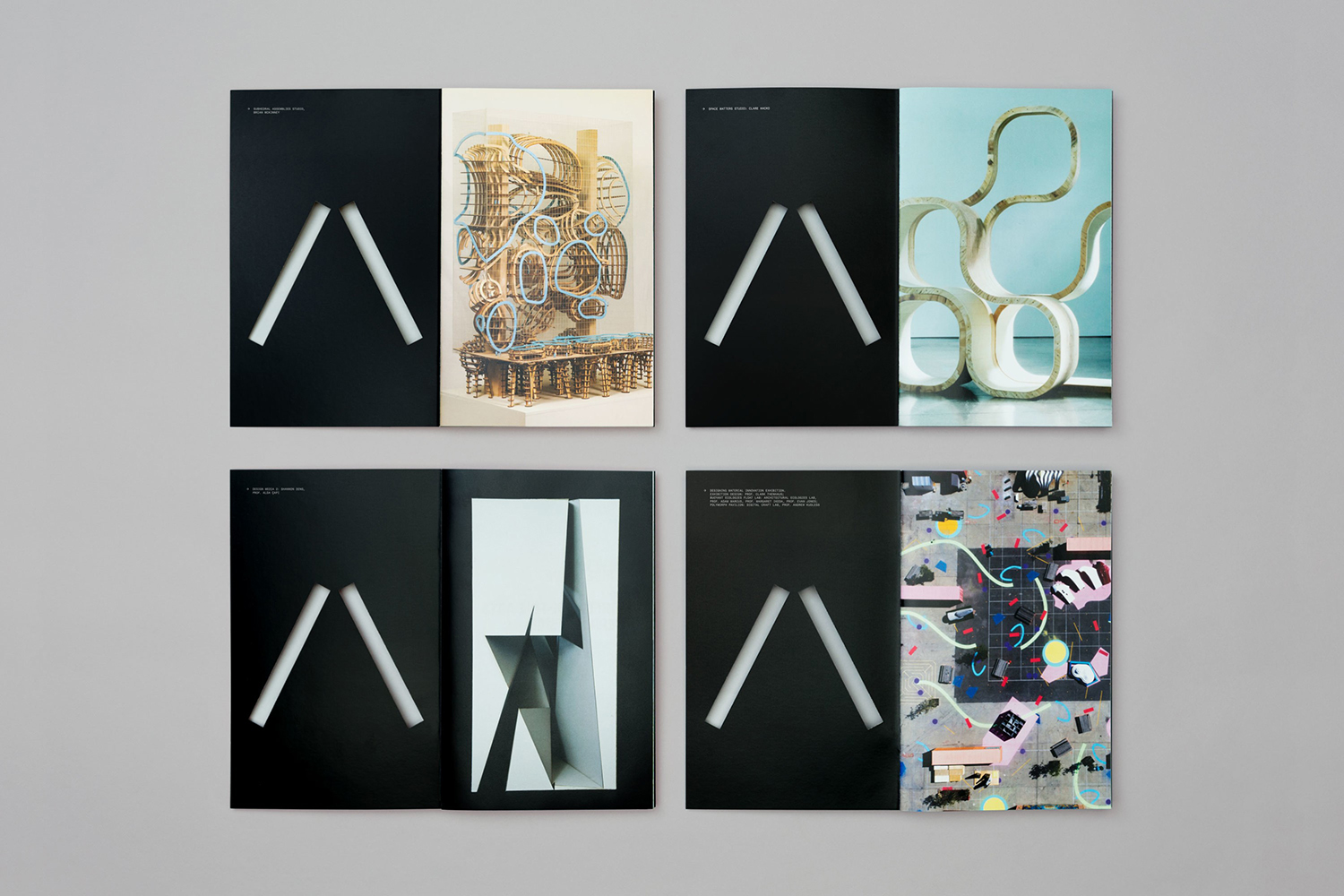
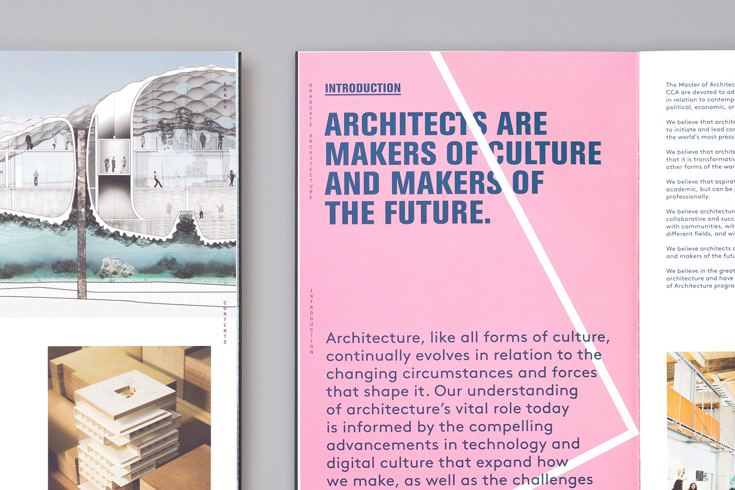
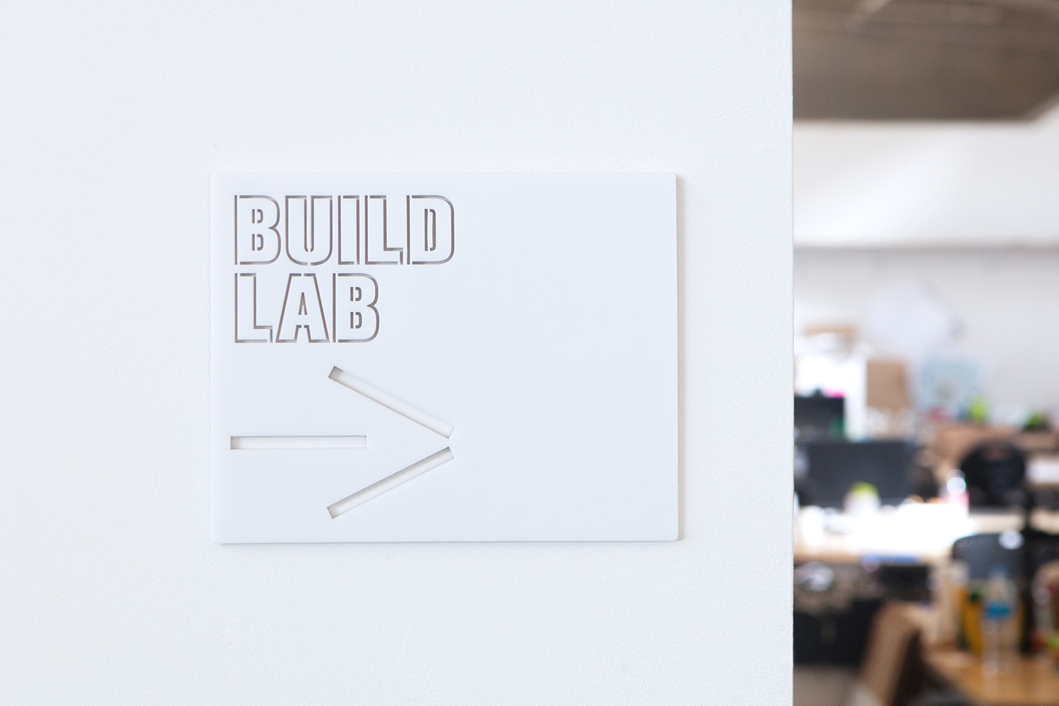
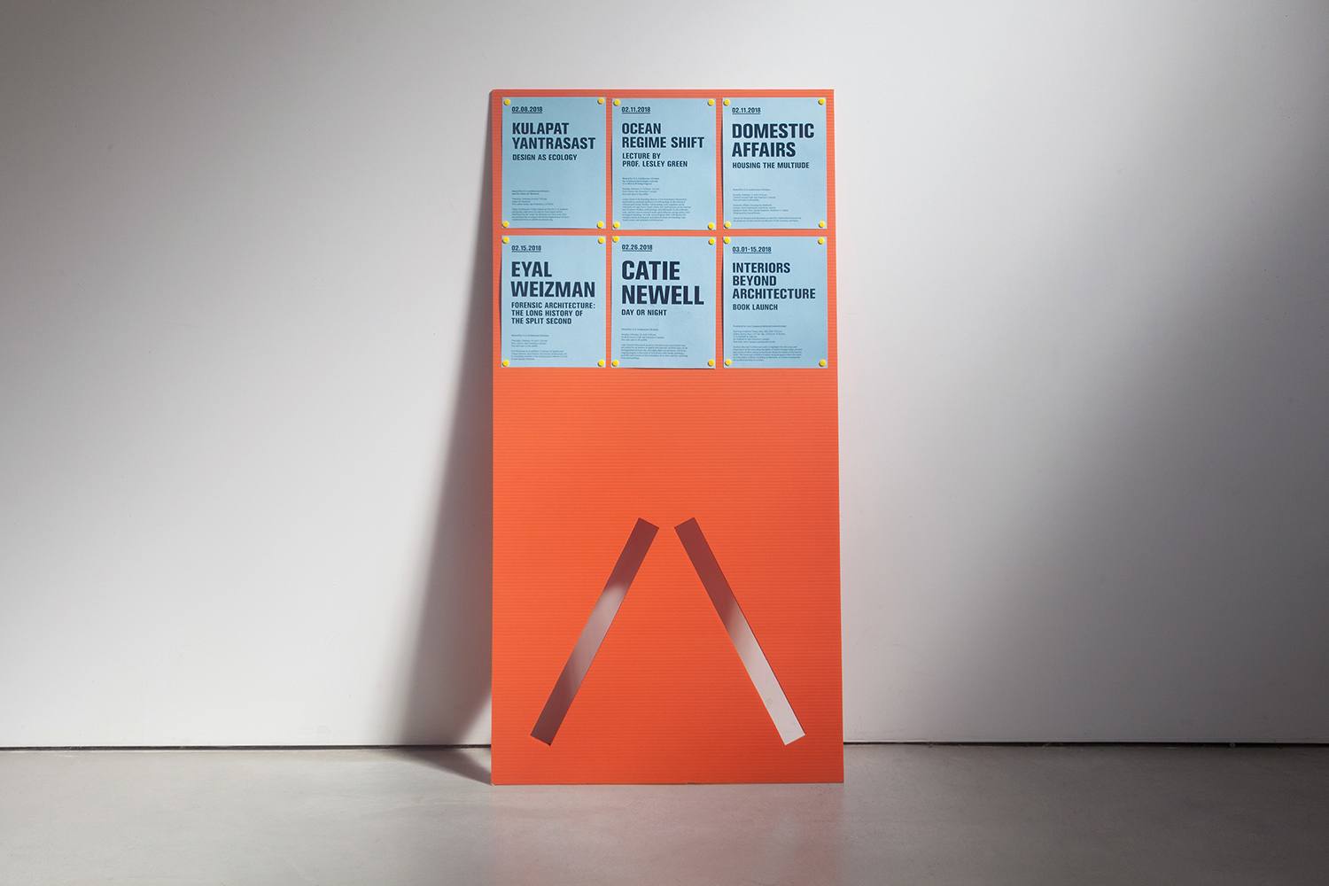
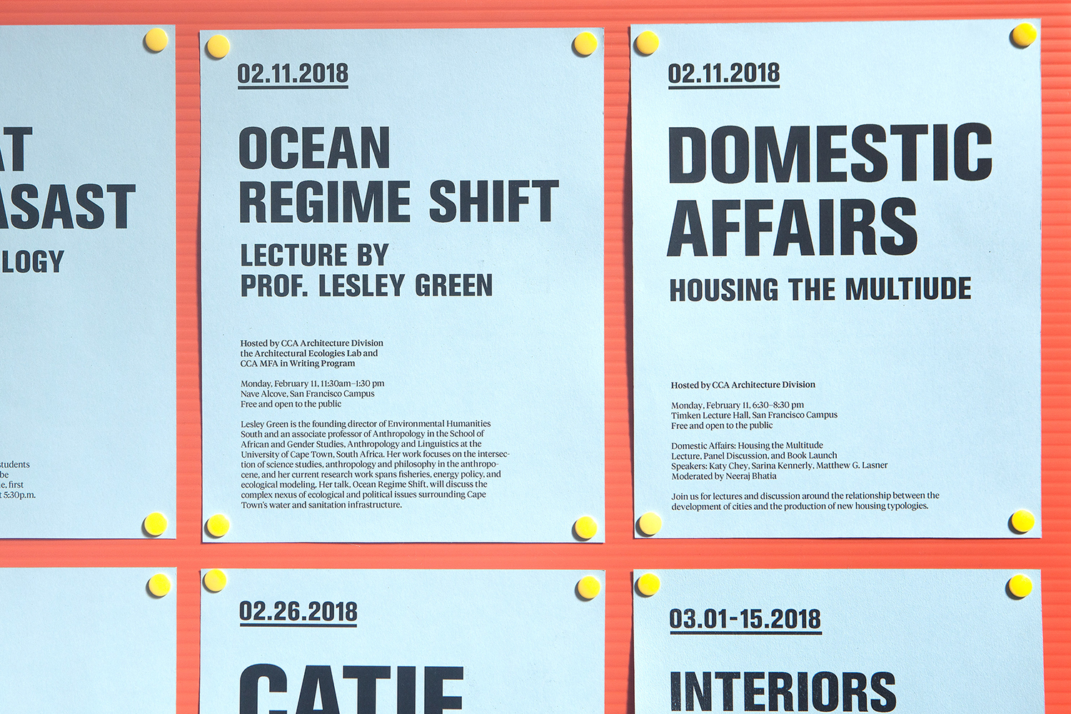
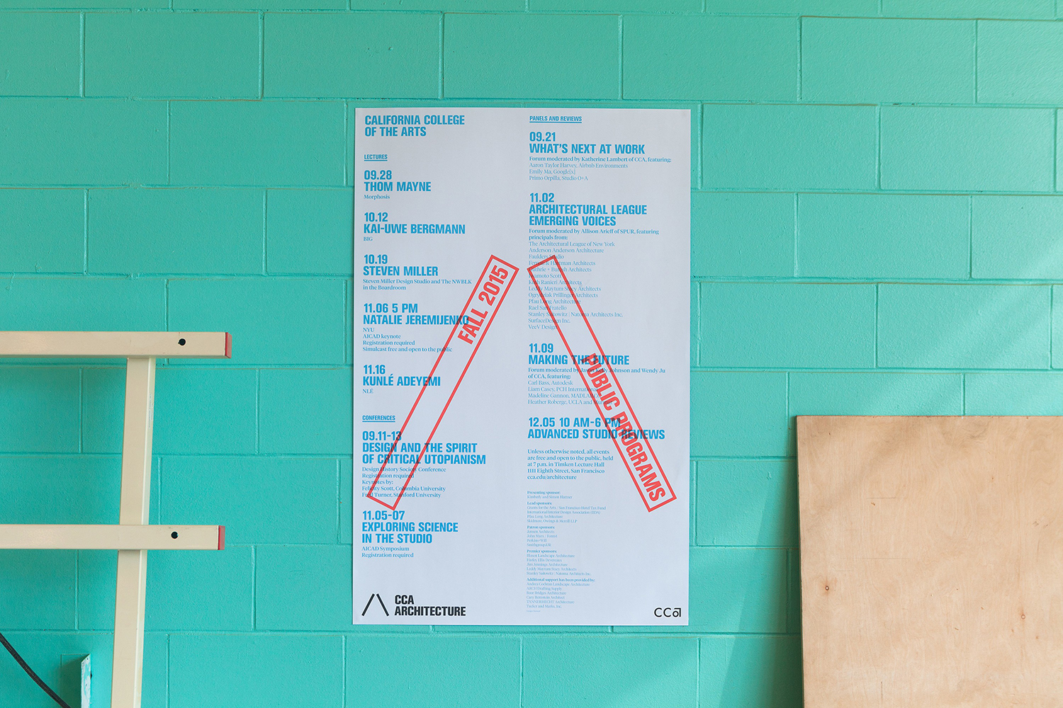
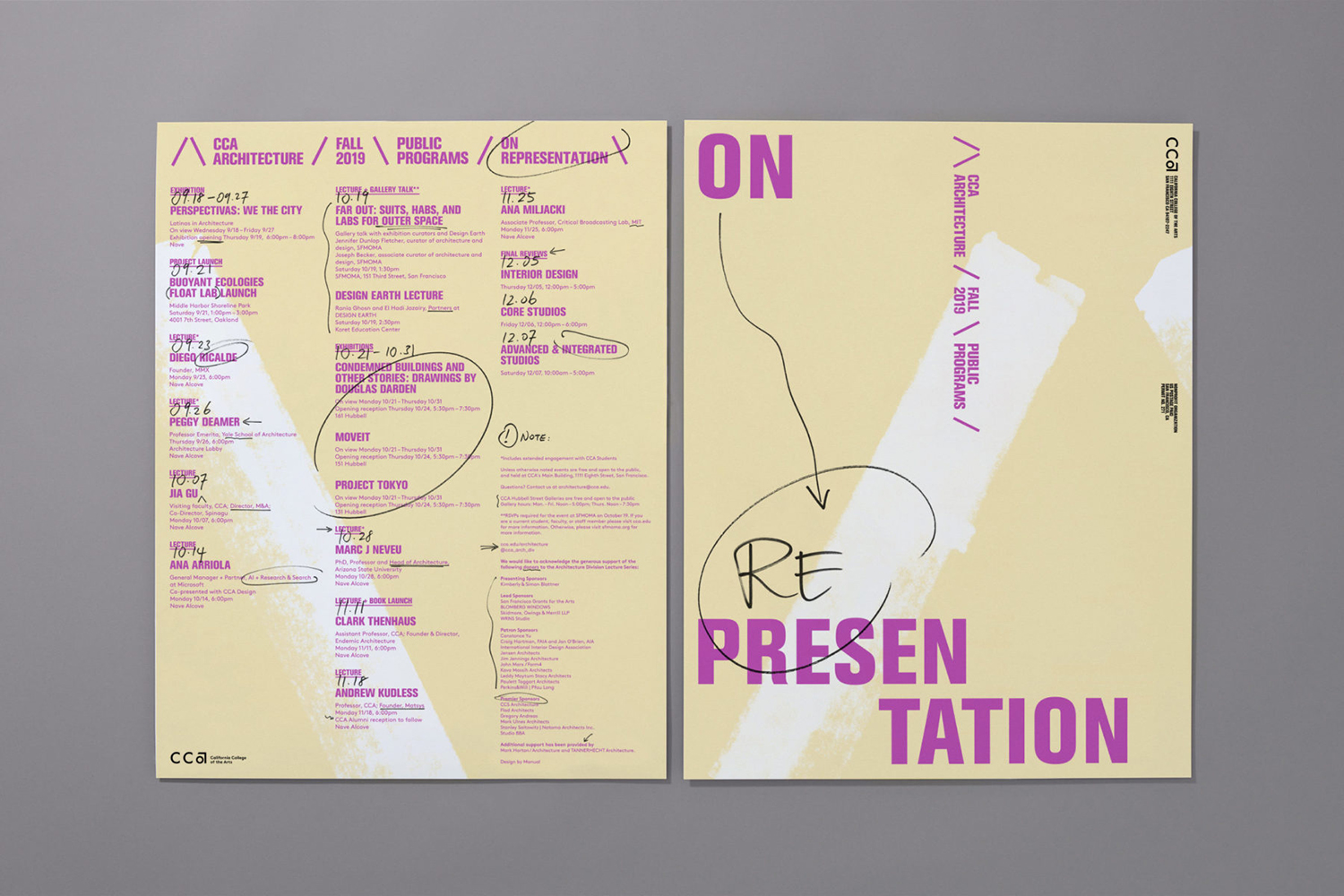
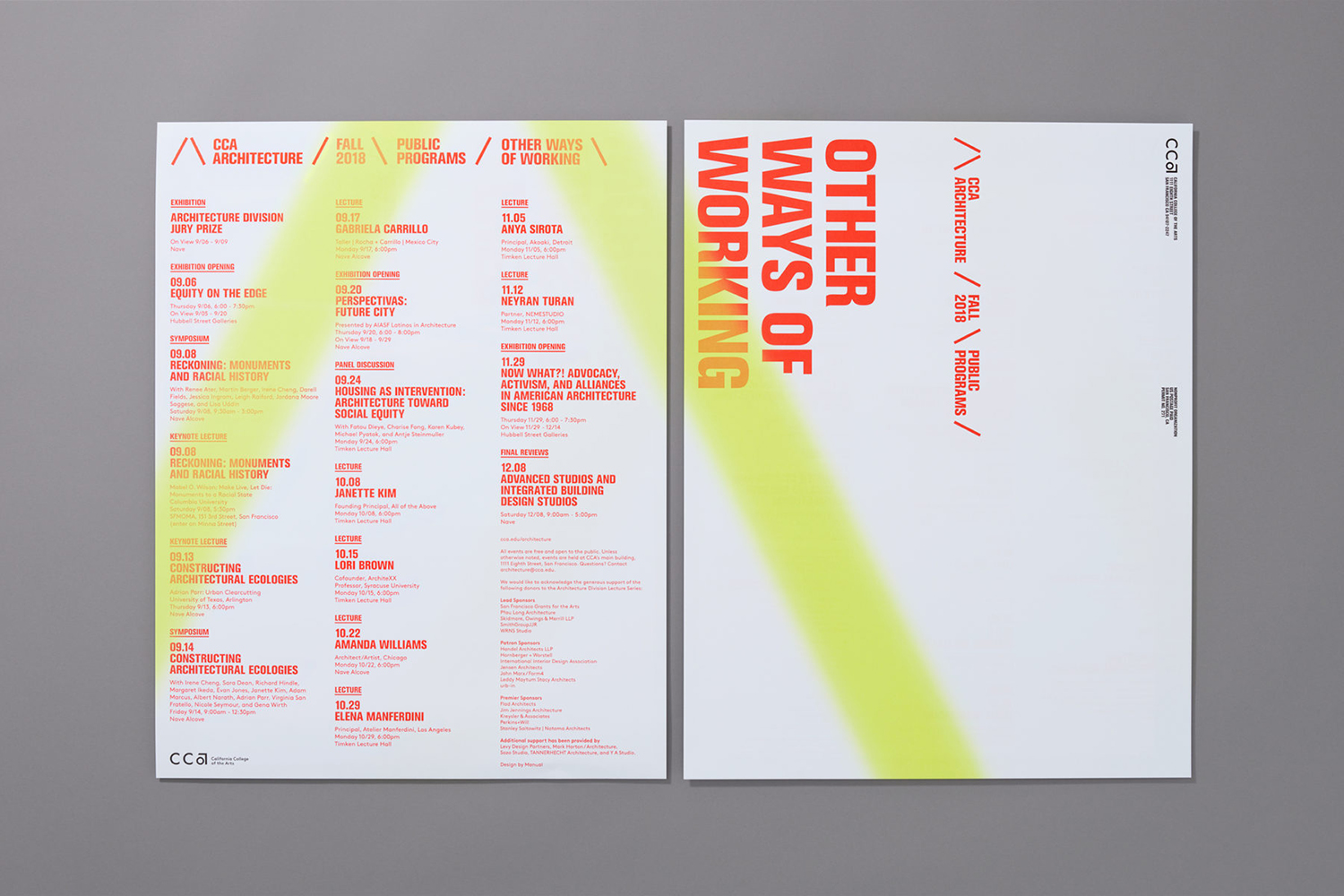
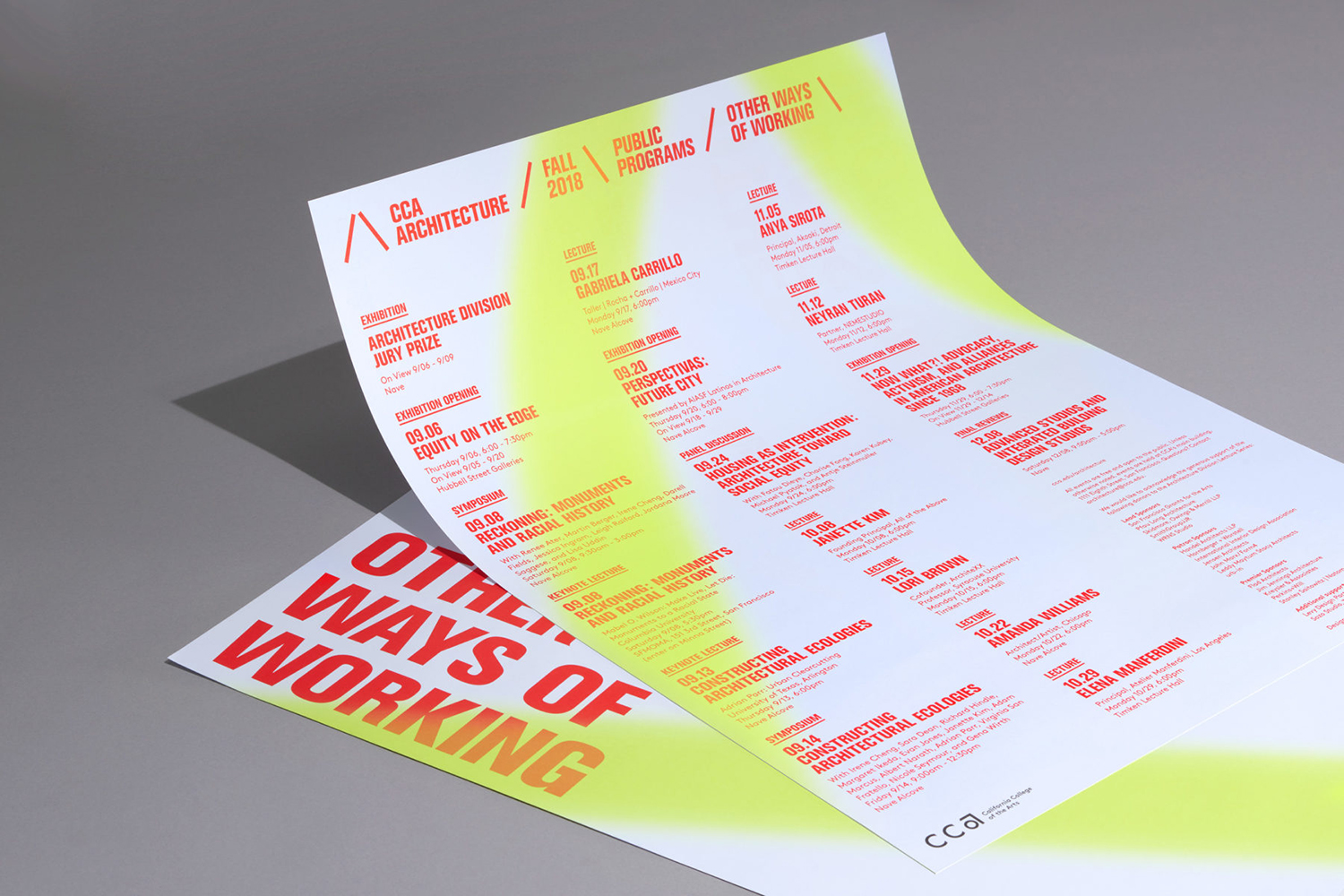
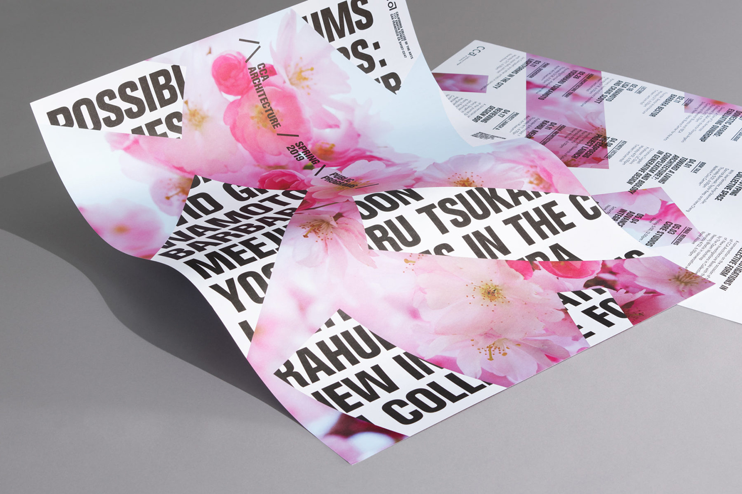
American studio Manual worked with the college to develop a unifying graphic identity for the division, to differentiate it within an art college with a diverse curriculum, and strengthen its wide-ranging communication materials, those that are aimed at prospective international students, faculty members and visiting lecturers. Using a simple /\ motif and employing a variety in its implementation Manual find an interesting balance between the structural, the material and the digital across brochures, posters and wayfinding.

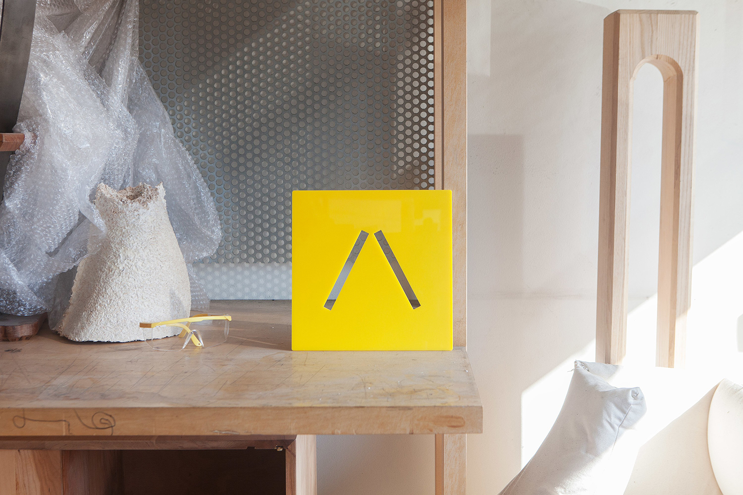
Running with such a simple marque requires some form of intelligible conceptual foundation and visual association. Something to infer, but also project onto. The references to the supportive structure of CCA’s distinct interior architecture, and architectural principles in general, the building of marque from a forward and backslash, easily replicable on-screen, and a stencil cut urbanism and industriousness, gives greater value to a very reductive and commonplace form, and serves to loosely connect both the digital and material components of architectural study. The expanding and rotation of marque, bookending different levels of education, work in a useful secondary component, with bold condensed sans-serif forms sharing something in common with the structural.

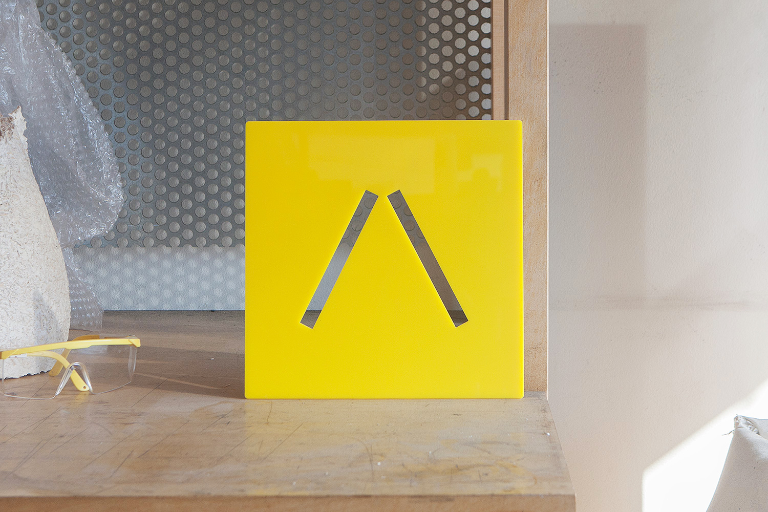
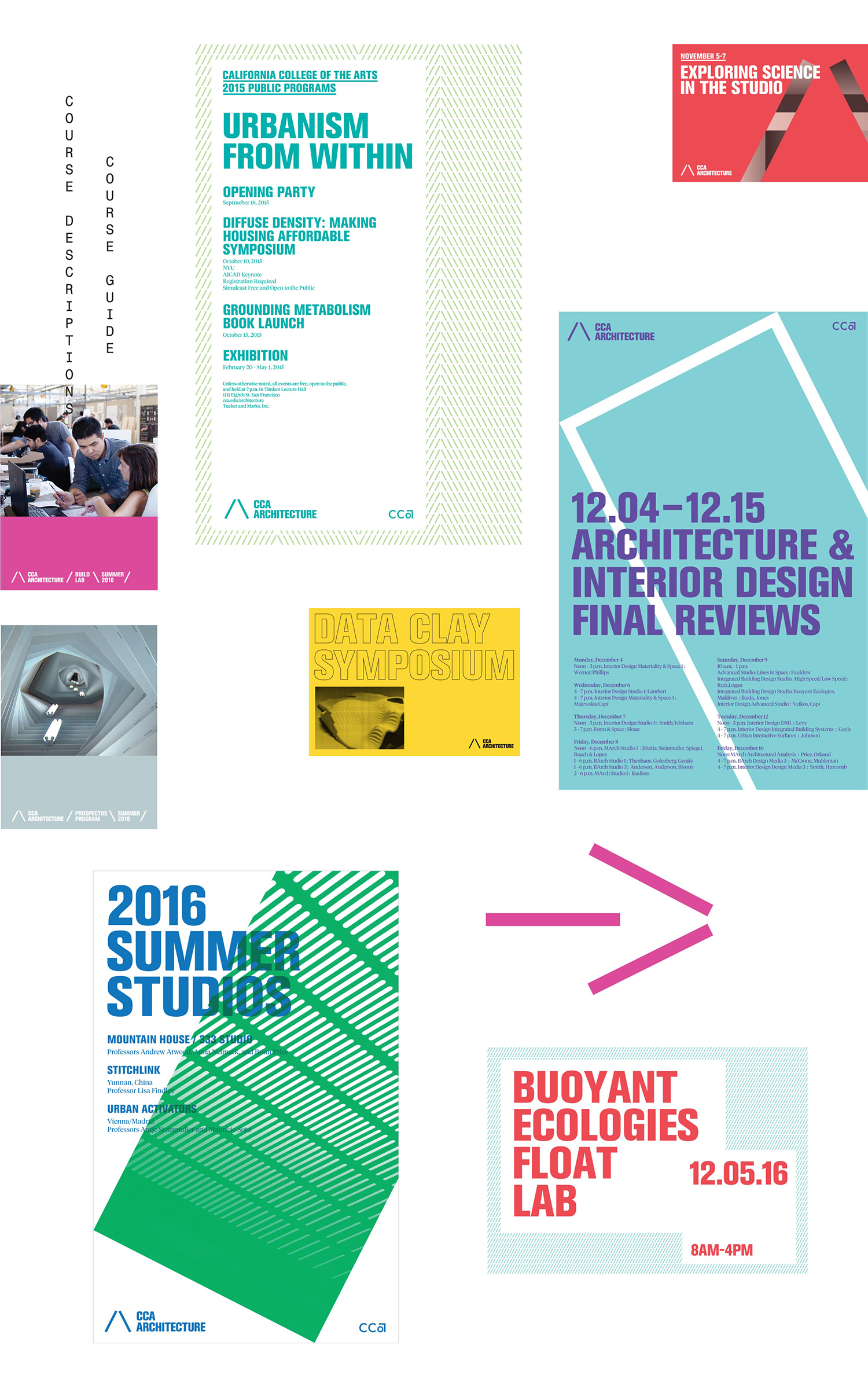
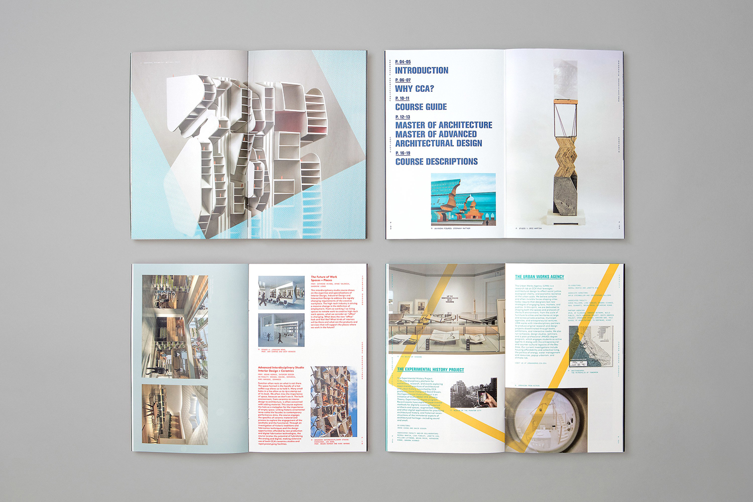
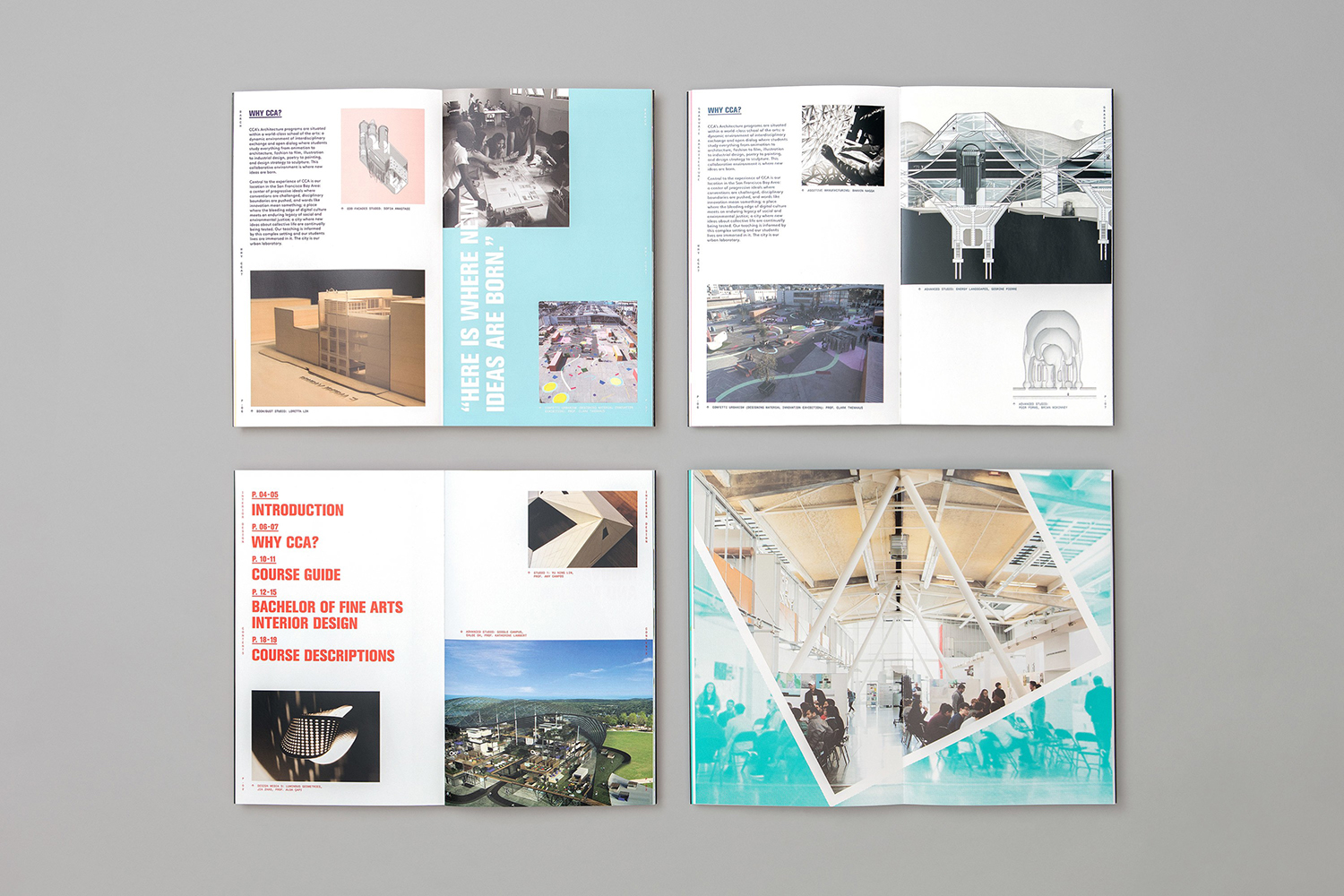
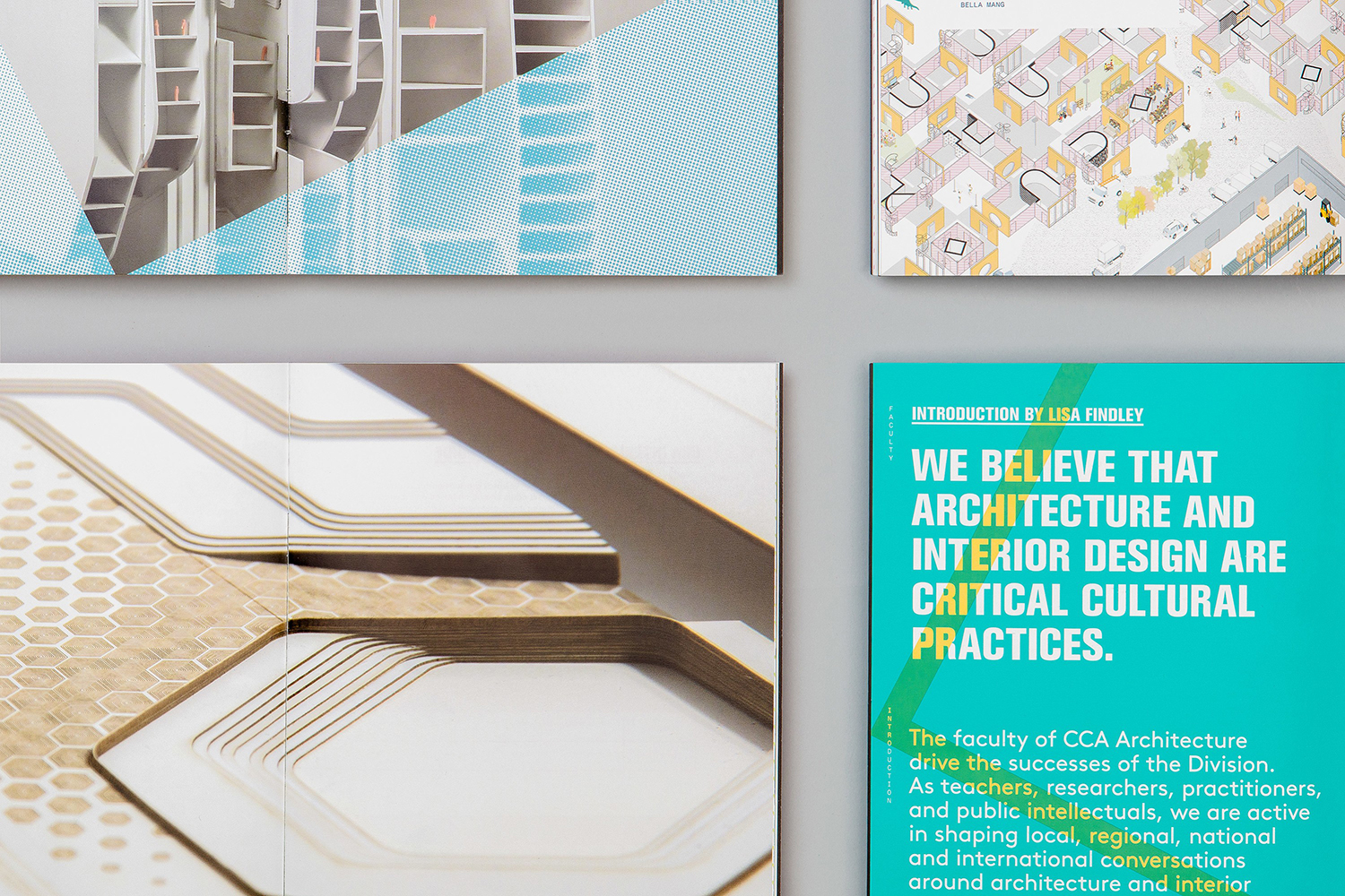
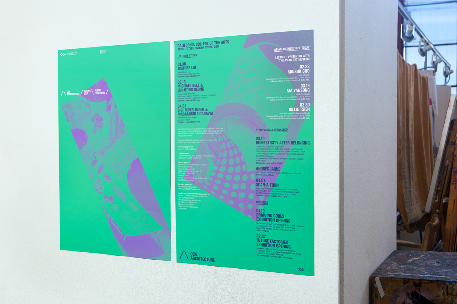
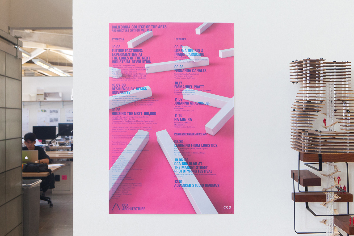
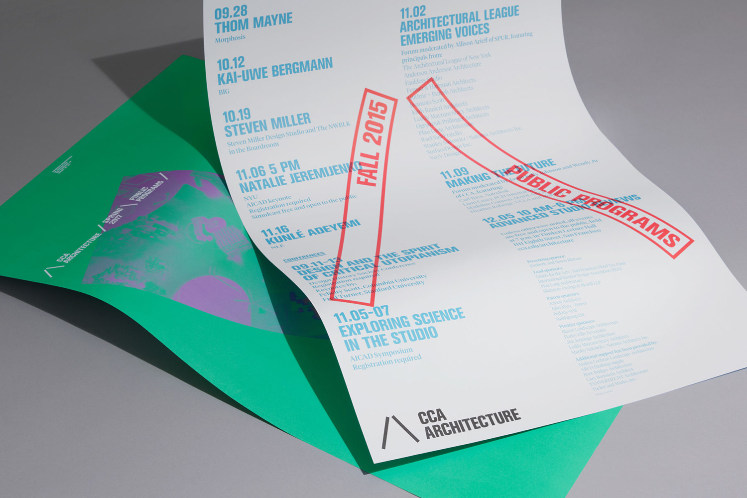
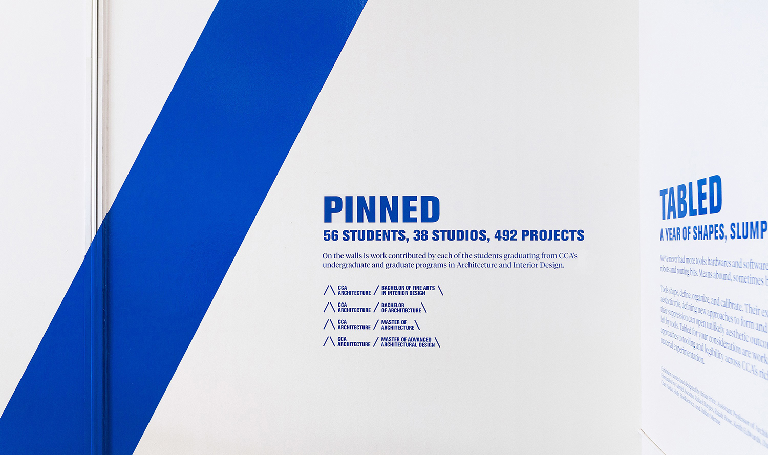
The monolinear lines and diagonal supportive qualities of marque go on to inform various other graphic communications. These are scaled up to frame and contain, used as solid blocks of colour, as overlays or rendered in three dimensions. This use of overlays, in conjunction with proportionality, angles, halftone, die cutting, outlined type, tinted image, space and pattern give identity something of a layered and material quality, a sense of the exploratory in arrangement and interaction between different elements that is fitting of a college, and touches on the material component of study.
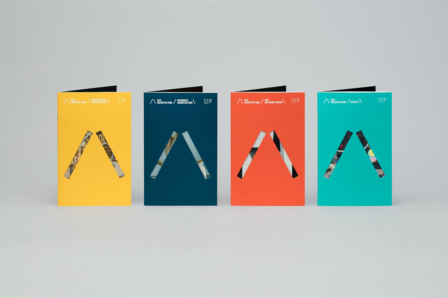
Colour and form establish a playful, flexible and dynamic quality with a variety yet continuity throughout. The work comfortably conveys learning through a hands-on approach and employs some useful graphic design principles to catch the eye and communicate through bold form, arrangement, proportionality, colour and type. There are times where it leans on the youthful and enthusiastic, particularly in colour, but has the capacity to dial this down and focus more on the formal. More from Manual on BP&O.
Design: Manual. Opinion: Richard Baird. Fonts Used: Fonts Used: Logotype & Headlines: Akzidenz Grotesk Condensed, Serif: Tiempos, Brochure Body Copy: LL Brown, Captions: Monospace 821.
