Here Design
Monica Rich Kosann by Here
There’s been a fair bit of chatter in recent times in the brand design world about the ‘new codes of luxury’ – how today’s hip young well-to-dos are eschewing the signifiers of yesteryear (ostentation, gold, bling, anything remotely showy) for a more understated aesthetic. Being fabulously rich today, then, is perhaps a little like the whole ‘no makeup’ thing: anyone...
Trulli Ulivi by Here Design
Most people have likely never played the game ‘Italian Food or Italian Celebrity’; but trust me, it’s a pretty fun game – great for car/tube/bus journeys, or whiling away a bit of time after Christmas between gorging on something and watching Eastenders Omnibus. The premise is simple: someone says a name, the others guess if it’s an Italian food, or...
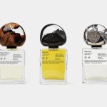
.Oddity Fragrance by .Oddity Studio
In July 2019 New York-based Stefan Sagmeister and Jessica Walsh announced that they would be splitting their shared practice after nearly a decade of innovative and boundary-pushing work together. In the amicable separation, &Walsh took over the commercial projects while Sagmeister announced he would exclusively be working on ‘self-generated design’ under Sagmeister Inc. Having made his millions, Sagmeister’s days are...
Seedsman by Here Design
Water masquerading as an edgelord-baiting energy drink (Blackletter fonts, skulls, and a name straight out of the heavy rock canon); running shoes aping a chesty cough remedy; olive oil bottles that owe more to the science lab than the Mediterranean. Packaging at the moment, it seems, is frequently playing fancy dress. That’s no bad thing, of course: brands borrowing aesthetics...
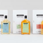
Kininvie by Here Design
The Kininvie distillery was established in 1990 as a third home for William Grant & Sons – it was initially built to relieve pressure on stock at neighbouring sites in Dufftown. Kininvie Works is a more recent development, created as an innovation arm to develop new recipes and processes. As such it is liberated from the rules and regulations that...
Teatulia by Here Design
Teatulia is a Bangladeshi single origin tea brand that recently moved into the UK market, opening a flagship store, tea shop and cocktail bar in London’s Covent Garden. It is a social enterprise creating jobs in a remote region of Bangladesh and has, so far, transformed 3,000 acres of barren land into an organic tea garden. Drawing on Teatulia’s single-source positioning—common...

Piccolo by Here Design
Piccolo is an Italian seed brand with a particular favour for those that are ideal for urban growers, people with small balcony gardens or working with limited space. It is a brand with character, with product naming that includes Slim Jim Aubergine and Spacemaster Cucumber expressing the space-smart dwarf varieties of the range. Piccolo worked with UK-based studio Here Design to develop a...
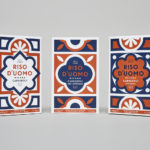
Riso D’uomo by Here Design
Riso D’uomo is a Milanese Carnaroli rice brand, cultivated from the same stock over hundreds of years, and grown within sight of the historic Duomo di Milano. Carnaroli is often referred to as ‘the king of rice’, and is known for its high-quality nutritional properties, cooking consistency and a ‘bite’ that makes it ideal for risotto. Taking inspiration from Riso D’uomo’s provenance, specifically the ornate...

Rocket by Here Design
Rocket began in 2000 as a small family-run catering company, implementing other people’s plans, and has grown to become a multifaceted enterprise with its own ideas, creating culinary worlds in partnership with some of the country’s most prestigious institutions and brands. Rocket worked with London-based Here Design to express this bold new position throughout its brand identity, in logo design, and across its stationery, business cards, print...

Sardine by Here Design
Sardine is a restaurant, located on London’s Micawber Street, with a simple menu of rustic, Southern French and Mediterranean-inspired dishes cooked over a wood fire. It features an interior design of bent wood chairs, open kitchen, steel and light wood table tops and a brand identity created by Here Design. This adds a touch of a mediterranean colour to interior through menus and tile detail, while also linking other assets such...
Little Italy by Here Design
Little Italy is a restaurant, gelateria and pizzeria located in the Jordanian capital of Amman. The restaurant features a distinctive, period and European-inspired interior of stained wood, glossy white tiles, concrete floor, vintage glass light shades, wood panelling and exposed I beams, brought together with a modern balance and lovely sense of form and contrast. This continues through to the restaurant’s brand identity, developed by London based Here Design, in...
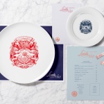
The Palomar Restaurant by Here
The Palomar Restaurant is located at the heart of London’s Soho district with a menu that is described as being reflective of the foods of modern-day Jerusalem and influenced by the cultures of Southern Spain, North Africa and the Levant. Its interior features a zinc kitchen bar, mosaic marble and reclaimed parquet floors, marble surfaces, oak panelled walls, a skylight providing natural light and royal blue...