Strömma Arkipelag by 25ah
Opinion by Richard Baird Posted 8 March 2018

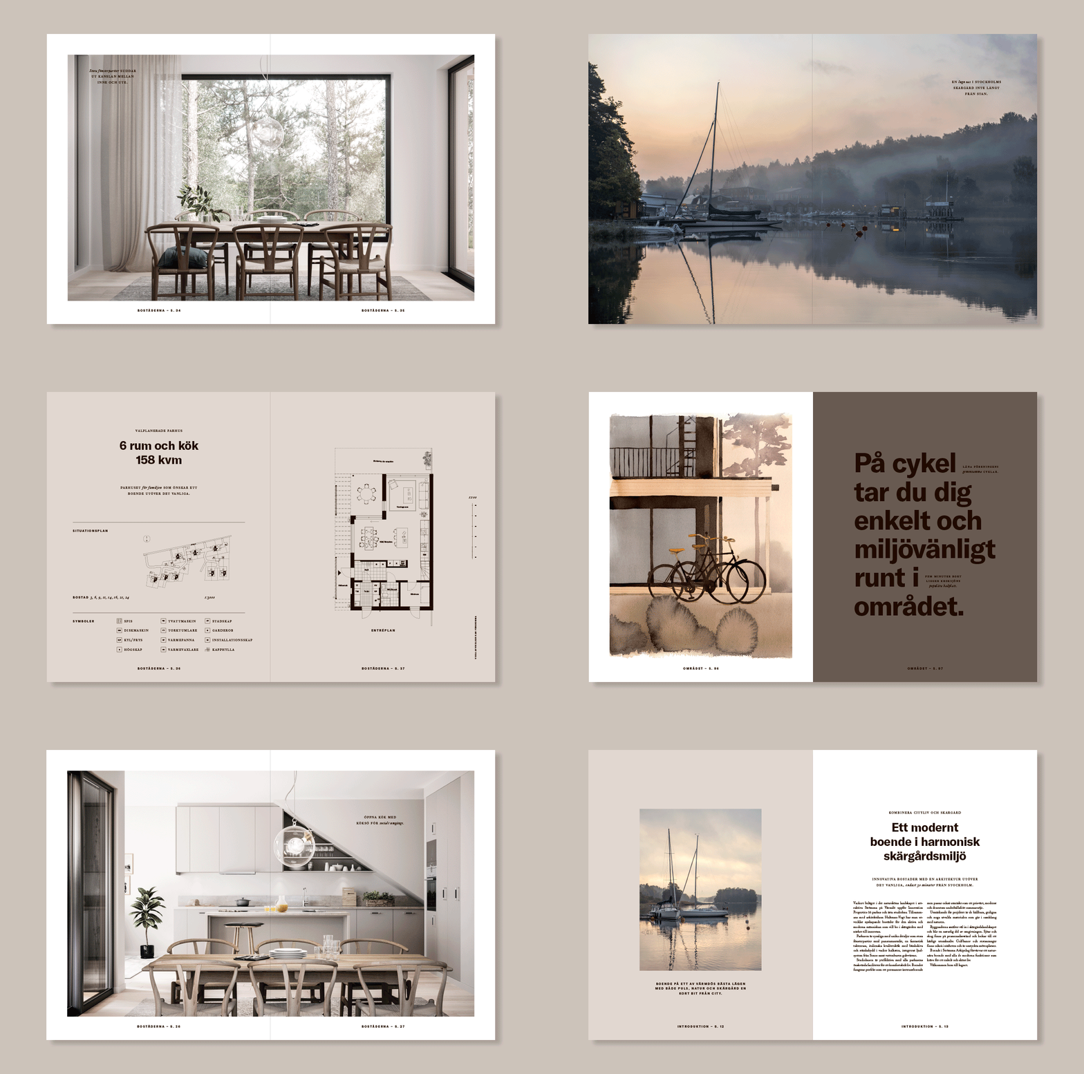
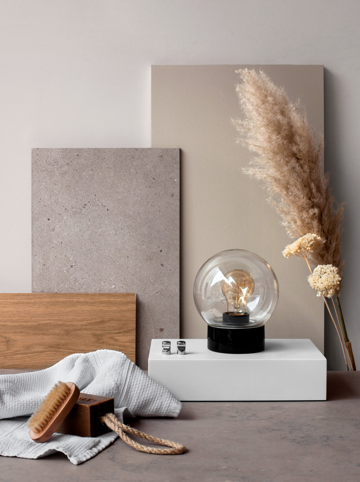
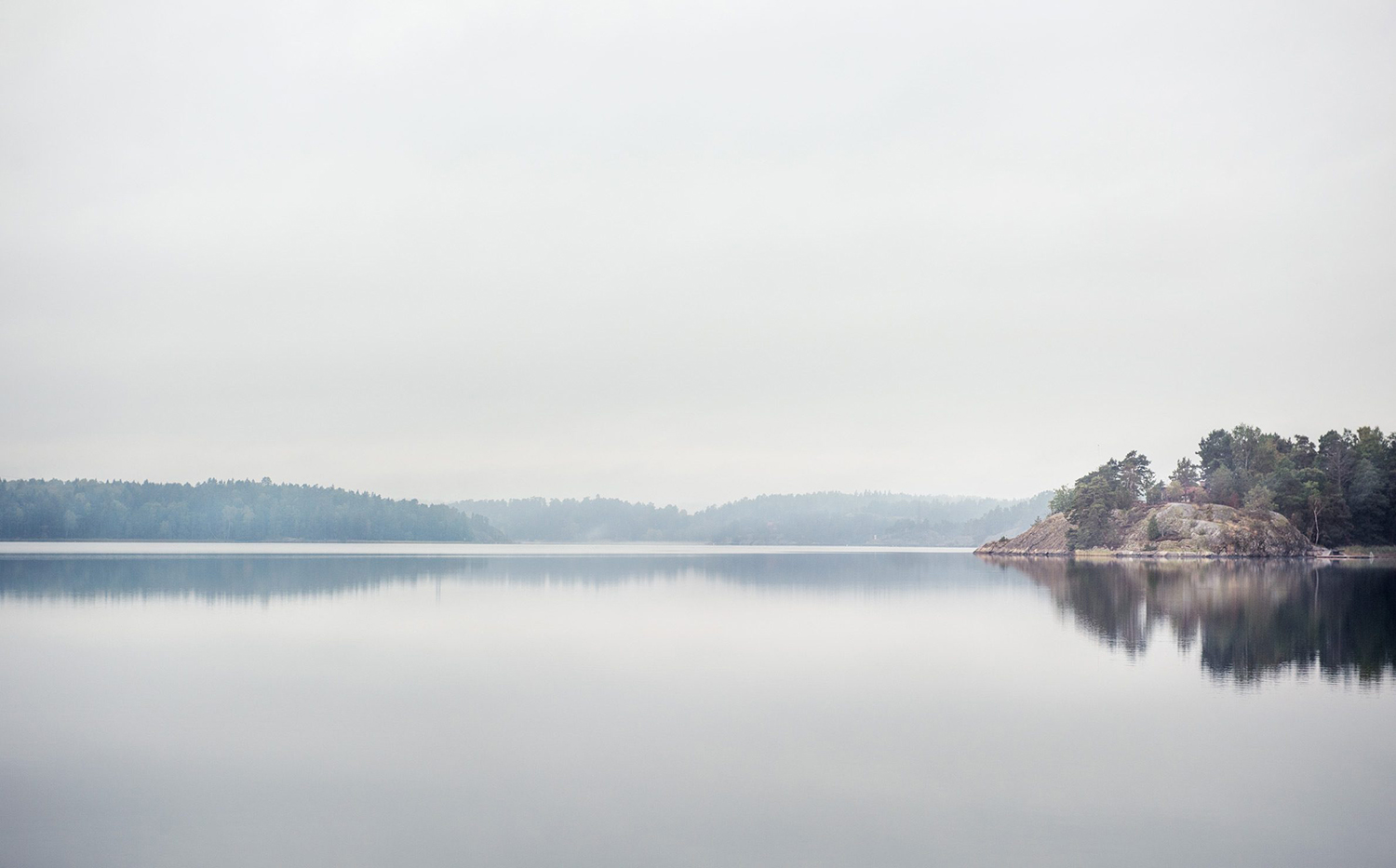
Strömma Arkipelag is a new residential property project from Swedish developer Innovation Properties, and located in between the inner city and outer archipelago of Stockholm. Strömma Arkipelag offers a unique intersection of modern living spaces and an unspoilt rural environment, with the two interlinked by large windows and a material commonality. This relationship is also expressed by the development’s graphic identity, designed by 25ah, through colour, print finish, illustration, photography and a bold typographical gesture.
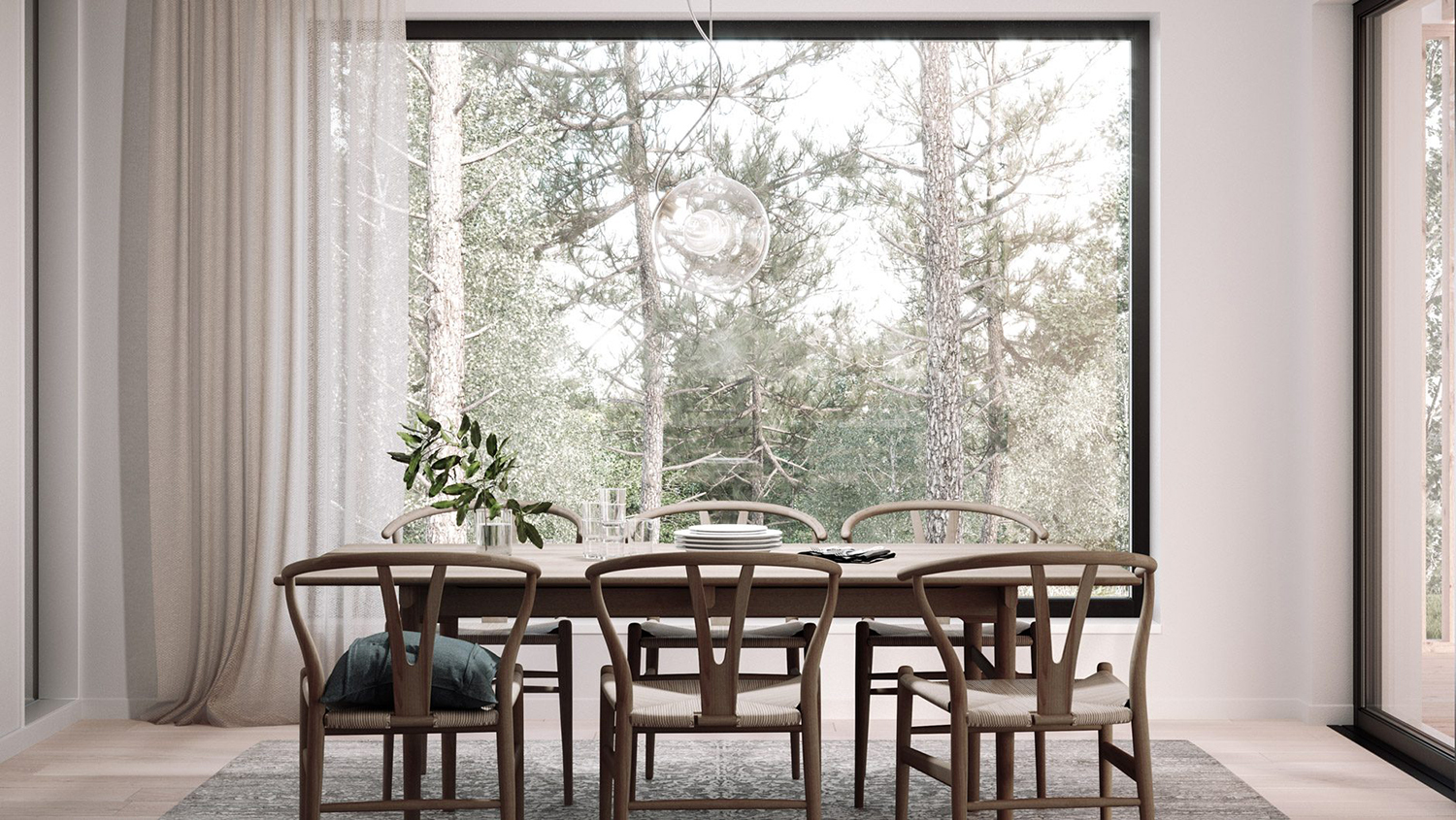
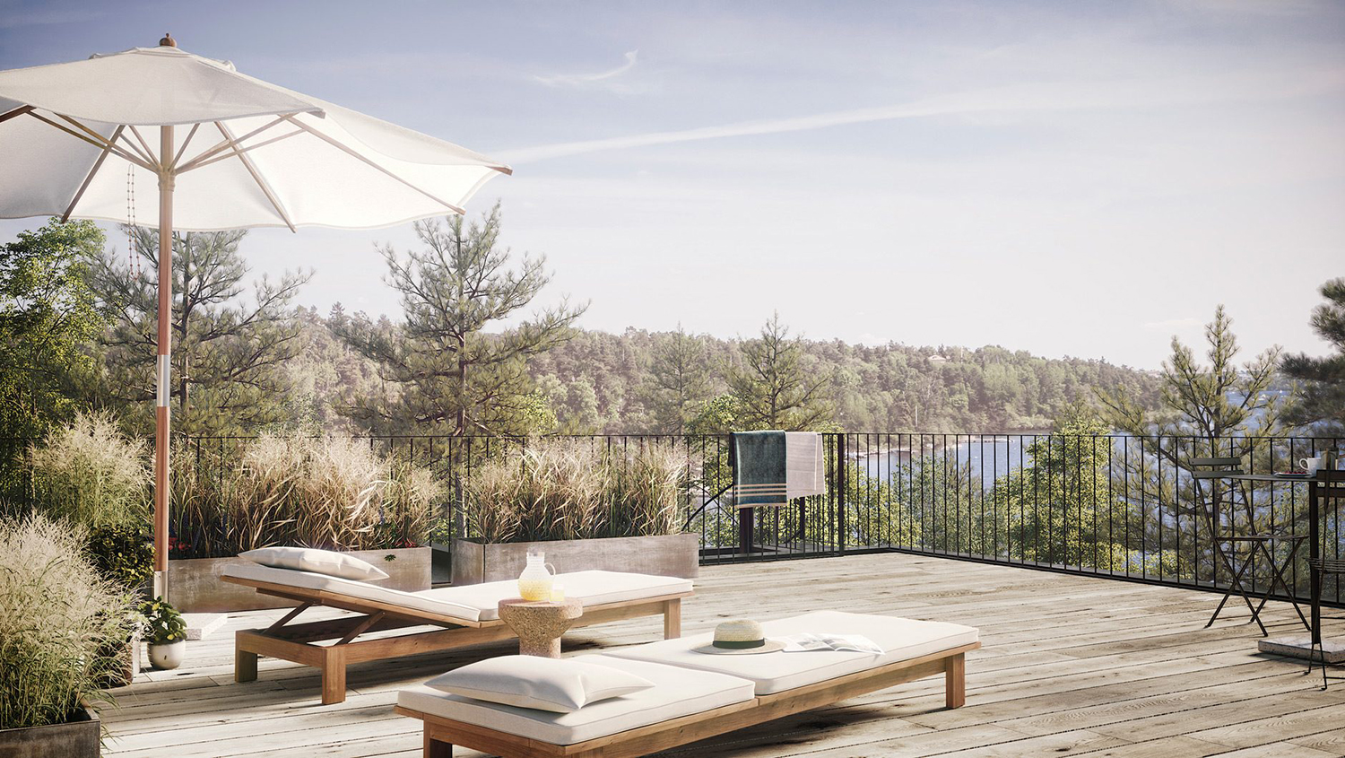
25ah’s direction for Strömma Arkipelag is deeply and appropriately rooted in the property’s unique location, and the intentional play with boundaries, those between built structure and the surrounding natural environment, rural peace and the comforts of contemporary city living.
Where the property and its location share many material similarities, choices that contribute to the diminishing of boundary, they also are disparate. Modern shape and precise lines frame or punctuate a rough and irregular local terrain and distant landscape.
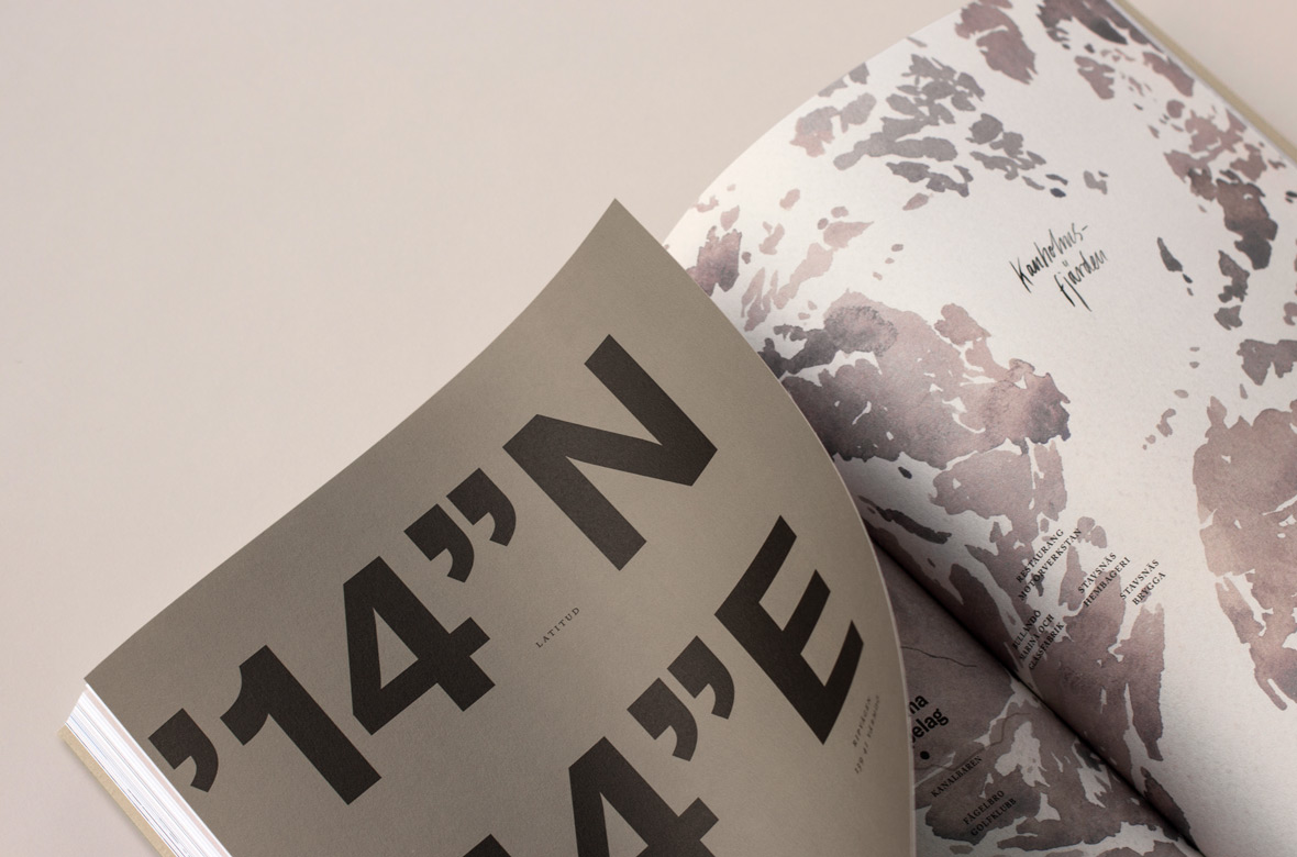
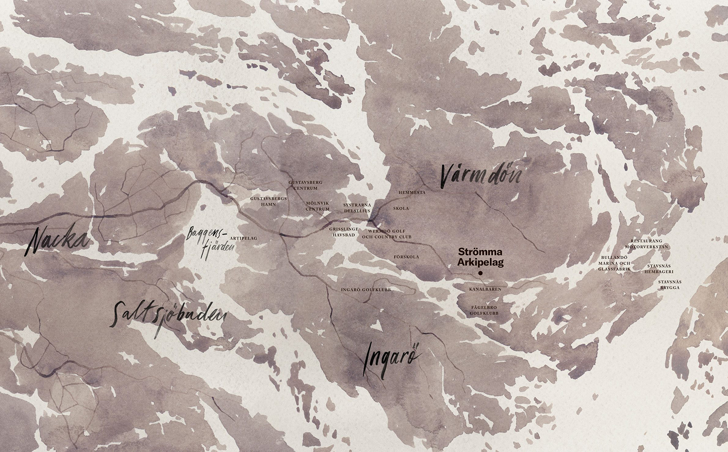
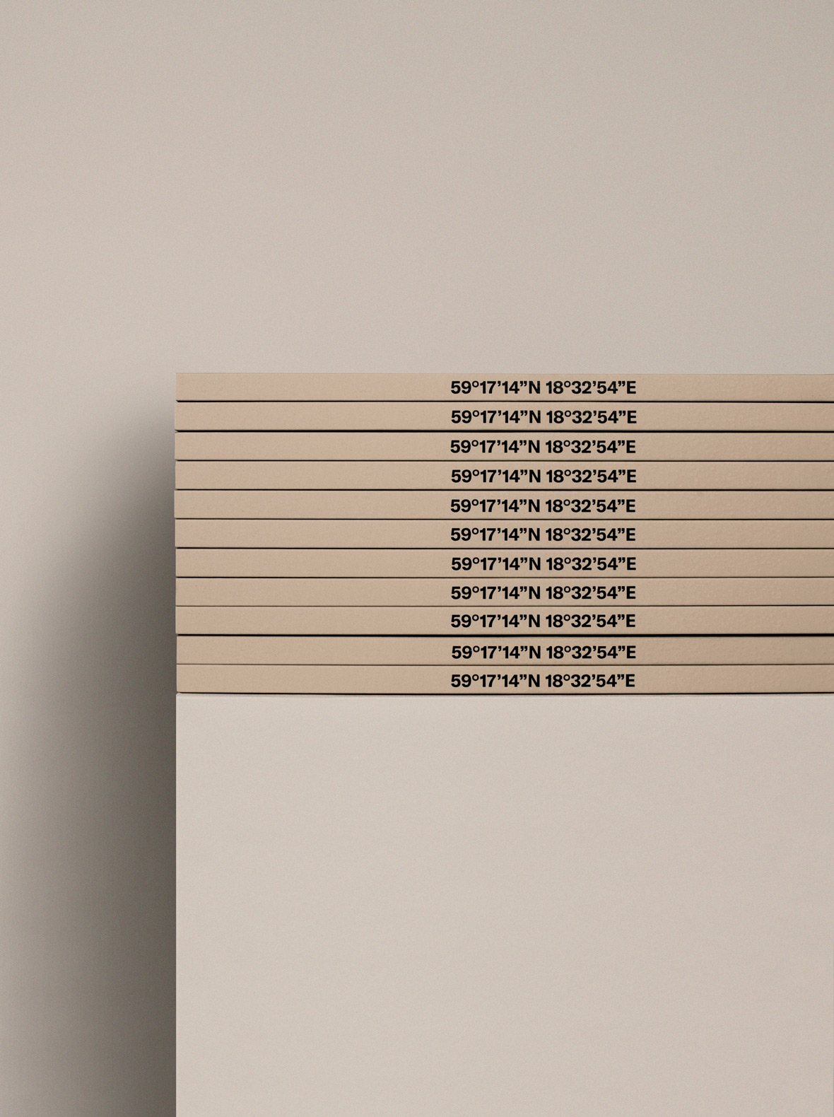
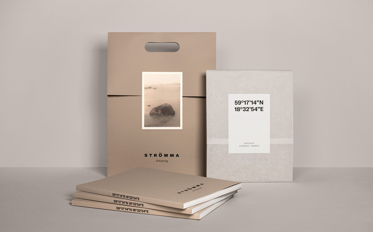
These themes are brought together and expressed in print using blind embossing and block foiling, the colour of dyed boards, watercolour illustration and photography, brush stroke lettering, a serif italic (Caslon & Big Caslon) and a prominent use of coordinates set in a bold sans-serif. There is plenty of detail here yet moderated and weaved together in a way that is conceptually concise, interesting and intelligible.
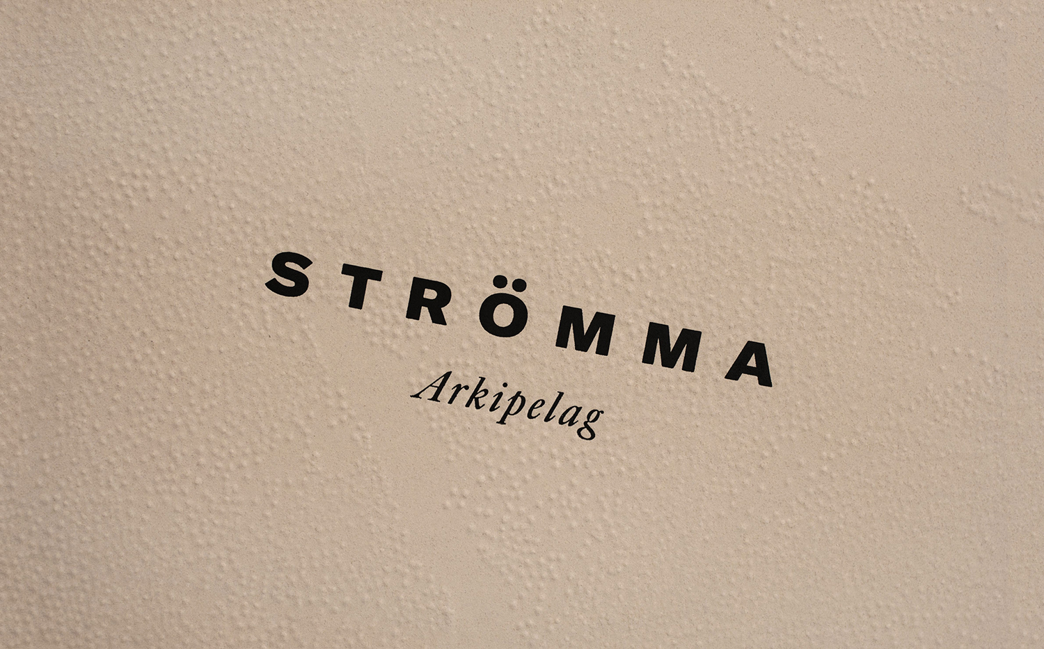
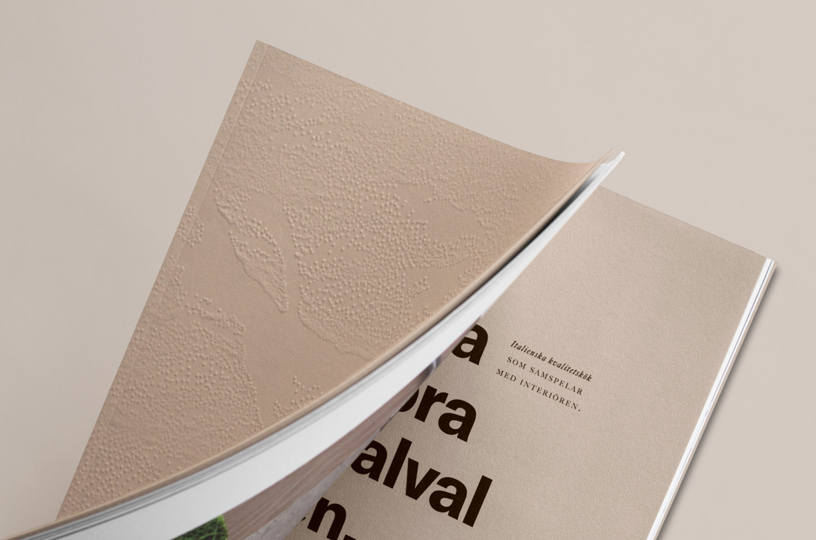
The juxtaposition employed by 25ah elevates the communicative intention and stylistic qualities of each element, and their value as a collective whole. Build quality and interior material craft emerge not only in photography, and presumably in words, but in the material composition and finish of brochure, in its wrapping and packaging. The graphic and the material literally intersect in the very physical manner of embossing and block foiling in the same way structure has a critical and intrinsic relationship with its surroundings.
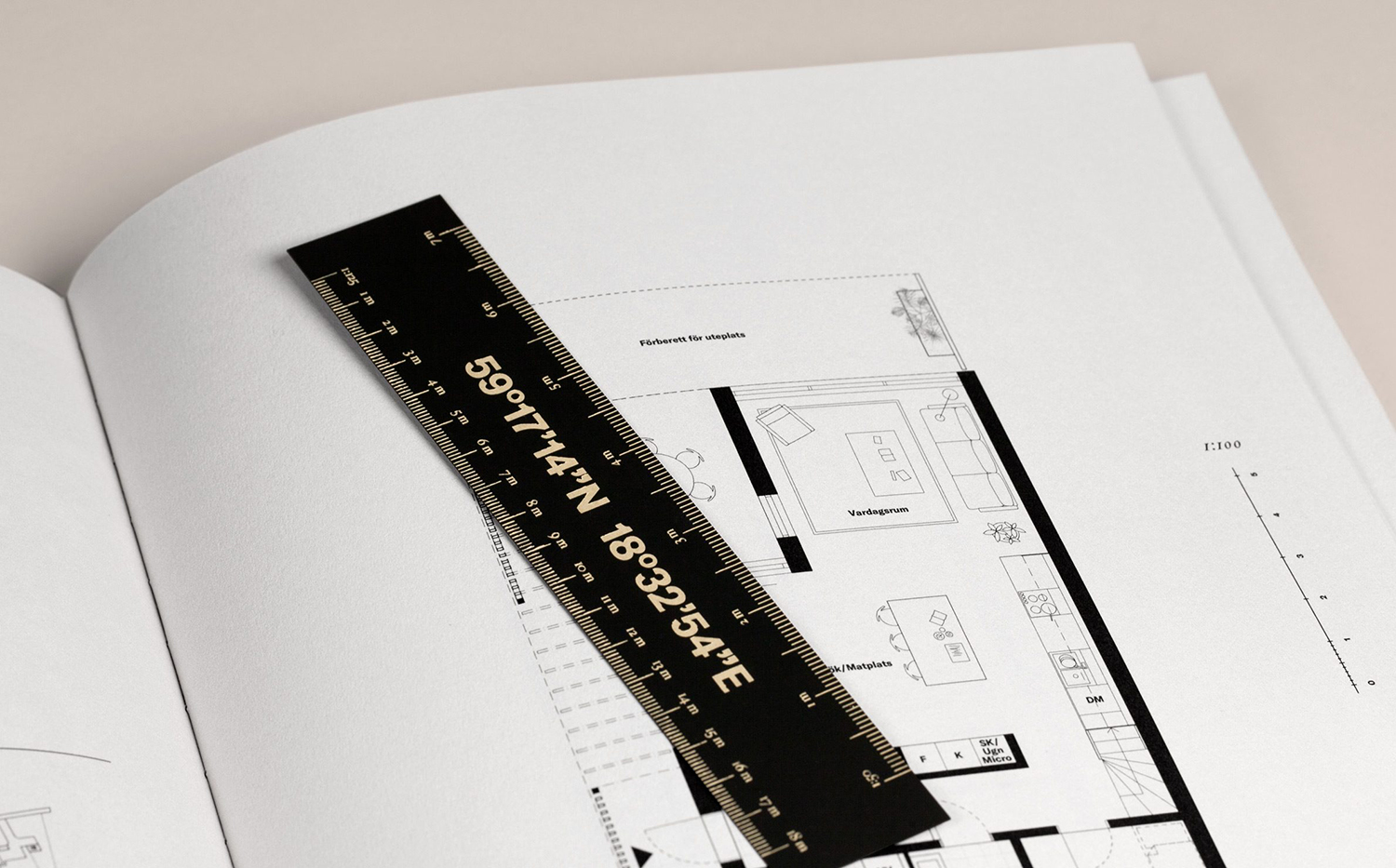
This use of coordinates in print is a neat detail. It serves to really emphasise the value of location in its size, recurrence and prominence. It makes a connection with the remote. And at the same time, pushes modernity in its visual language. More from 25ah on BP&O.
Design: 25ah. Opinion: Richard Baird. Fonts Used: GT America, Big Caslon & Caslon.
