Center for the Study of Political Graphics by Blok
Opinion by Richard Baird Posted 9 March 2018
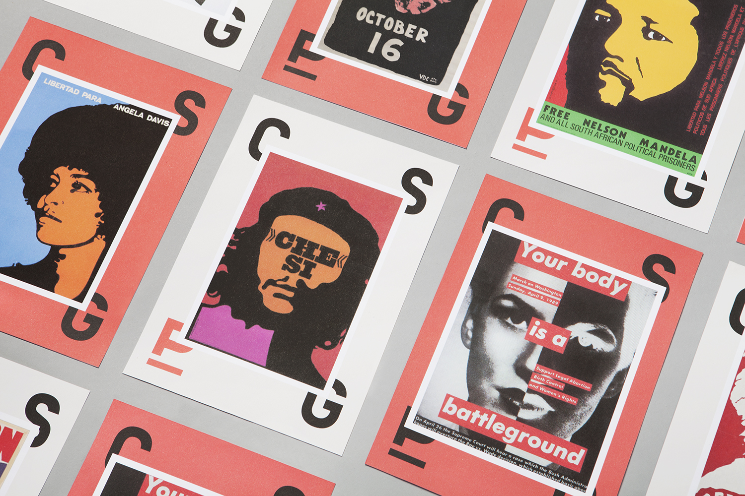
The Center for the Study of Political Graphics (CSPG) explores the enduring power and immediacy of the political poster in the fight against inequality, their capacity to acknowledge and bring to light the injustices and atrocities of the world, and through their archival, keep alive the stories, voices and controversies that they have come to represent.
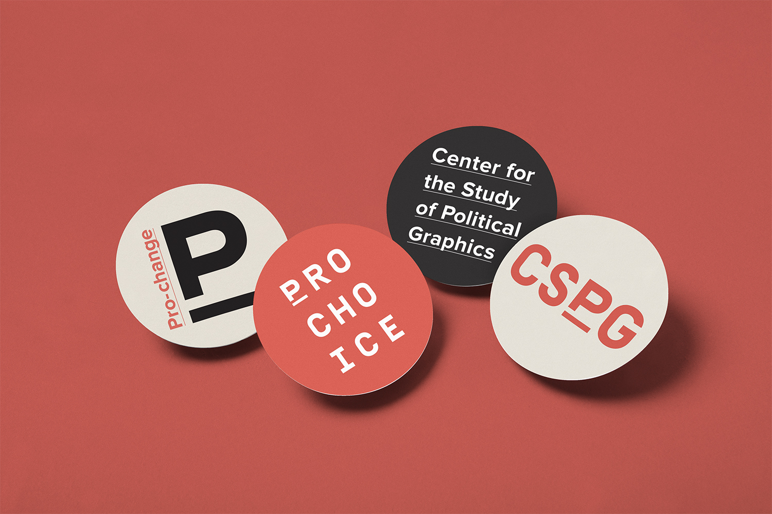
CSPG worked with Canadian studio Blok to develop a graphic identity that would honour the role the centre serves as a chronicler and catalyst, reflect its position as a participant in the fight for human rights, leave space to frame and connect the graphic and bring to light the diversity of their political poster archive.
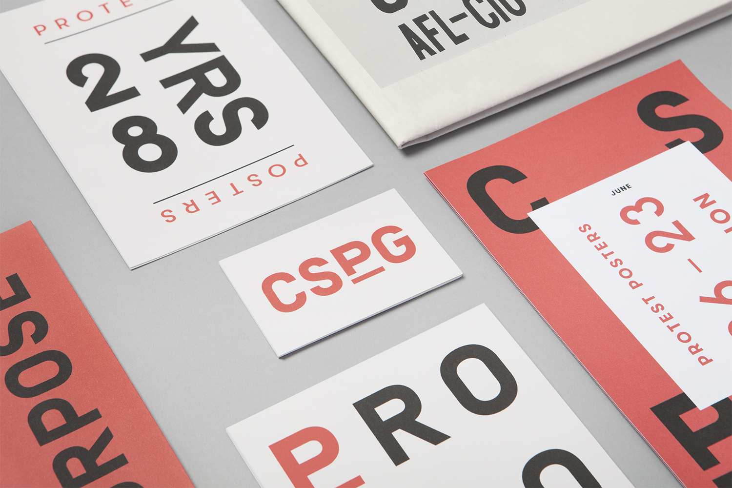
Blok effectively channels the necessary impact, immediacy and communicative clarity of political posters into CSPG’s visual identity. They do this through type size, proportionality and arrangement, in conjunction with eye-catching colour and use of contrast. In their type-centric approach, disregarding proprietary imagery—often a critical component of political posters—it essentially takes a step back and functions as a frame for a variety of images and messages. These include Jerry Palmer’s Resist October 16, 1967, Barbara Kruger’s Your Body Is A Battleground, 1989, and Alicia Nauta’s End Police Brutality, 2015.
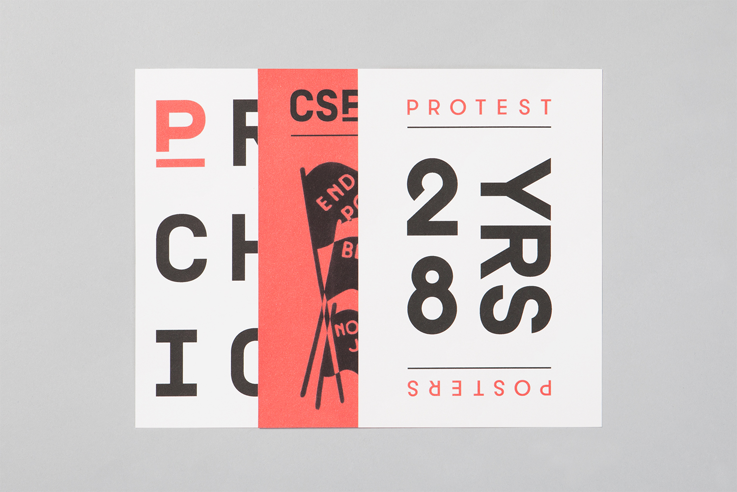
Type choice and typesetting balance moments of character and clear messaging with the utility of a historical archive or white paper. It has an identity of its own, rooted in some of the same visual language of its collection but with some pleasant typographical quirks. It does, however, really start to work in conjunction with the colour, detail and graphic gestures of CSPG’s archive.
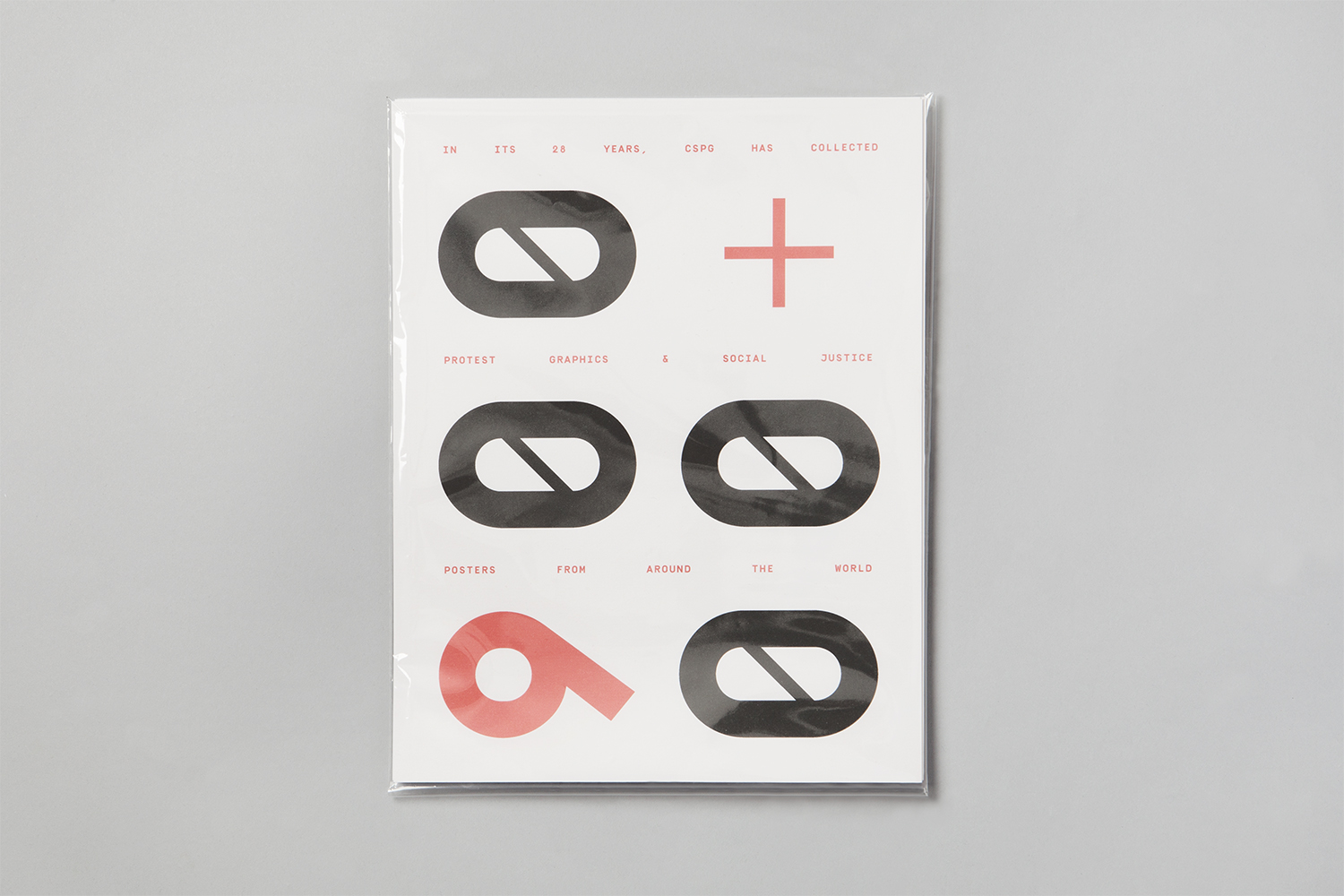
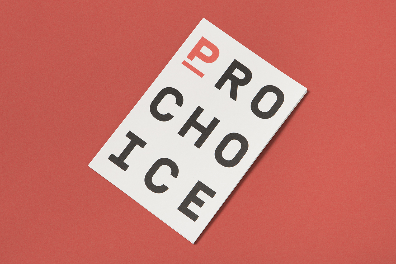
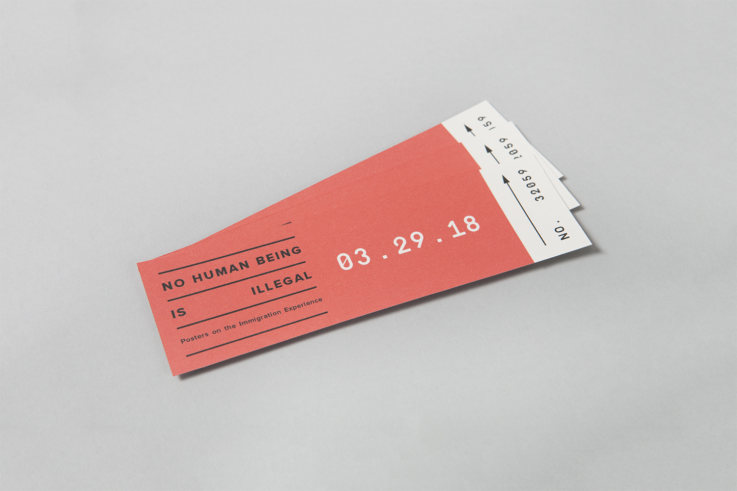
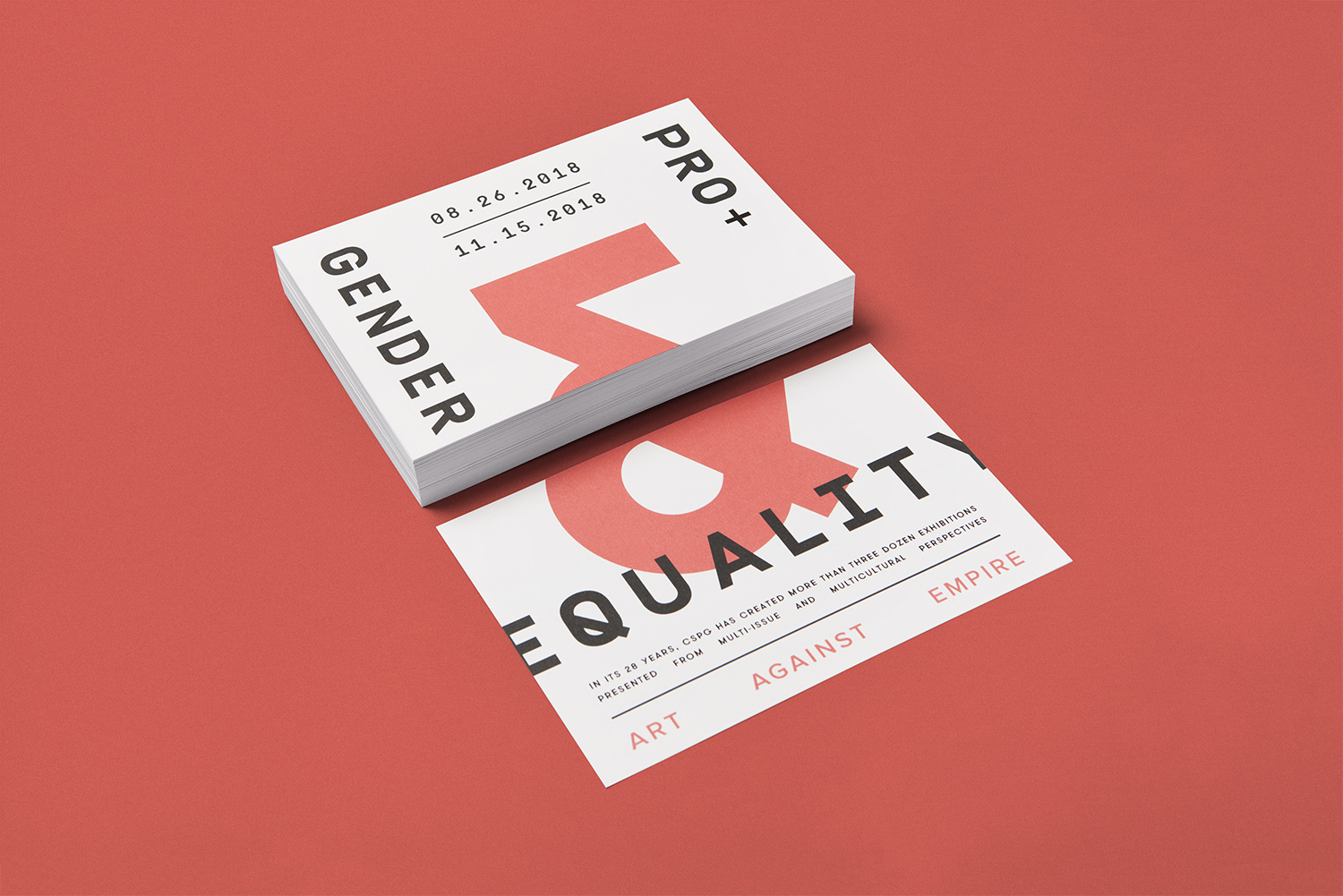
The approach plays with the material in the same way as posters. It is absent the expense of print finishes yet, in the cropping of type, the use of inserts and newsprint, invokes a material language. The cropping of type speaks of a grassroots necessity to reuse and repurpose, newsprint alludes to the role newspapers play in shaping the political landscape, for good or bad, layering calls to mind fly posters, and polythene bags have something of a magazine or mailshot quality.
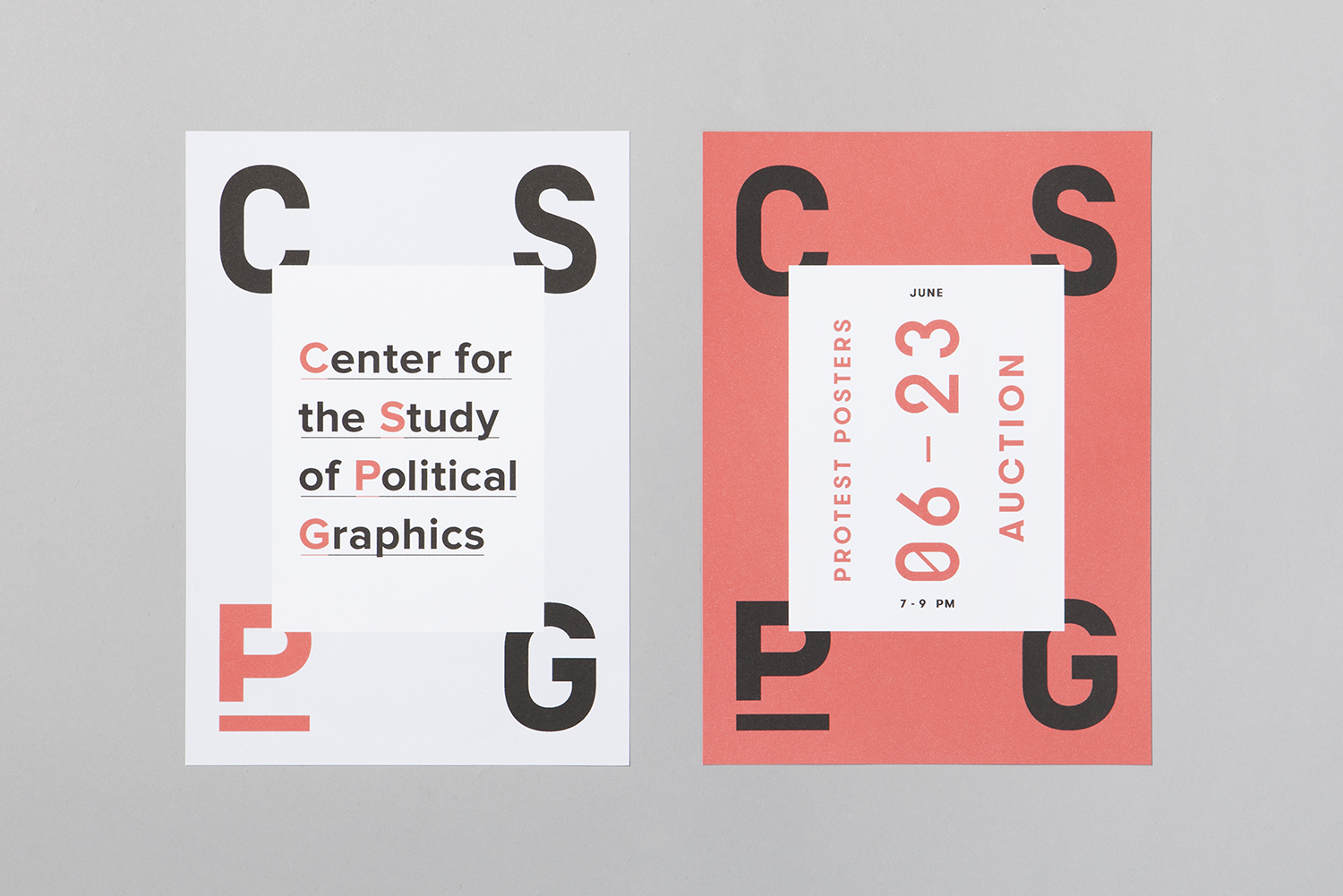
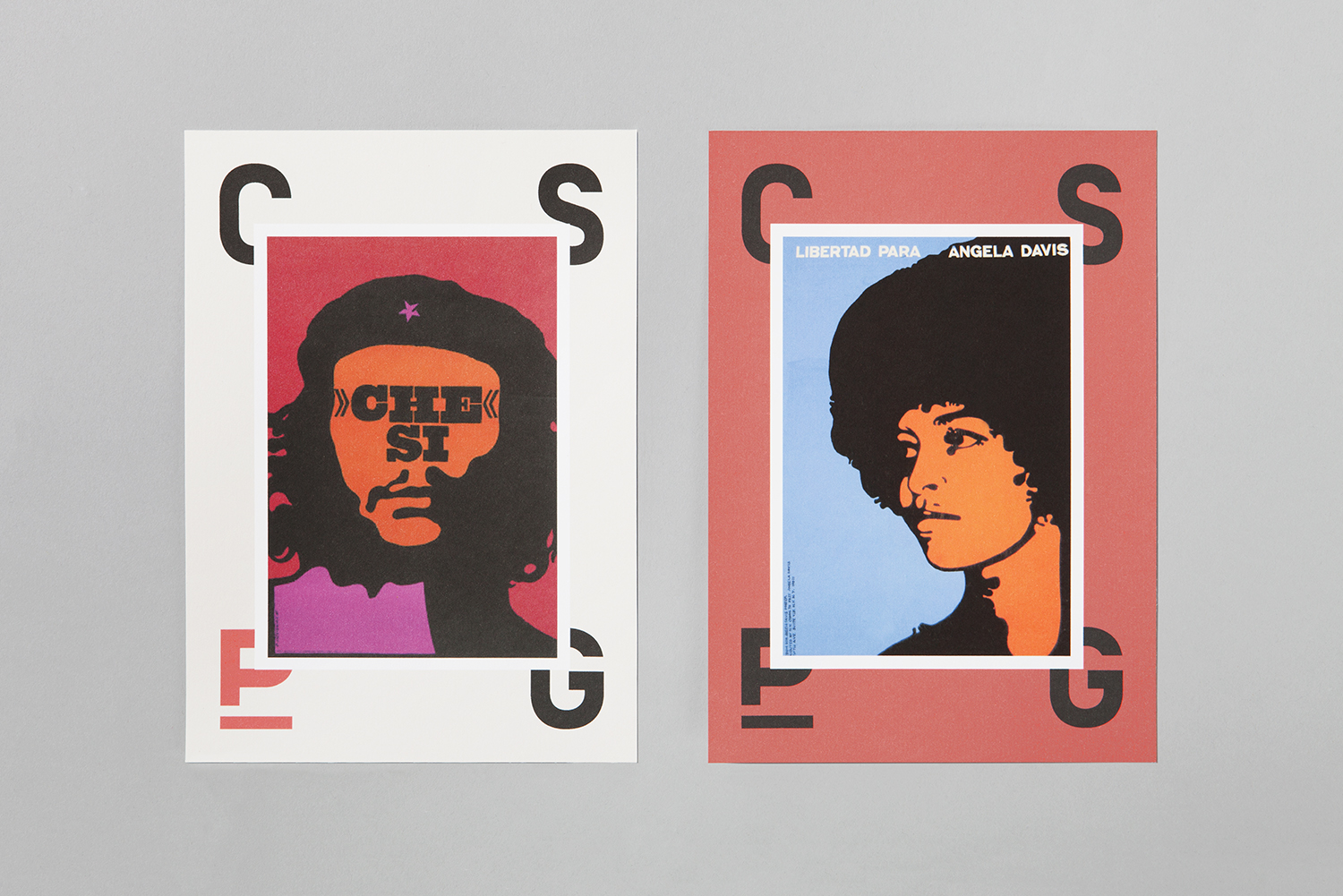
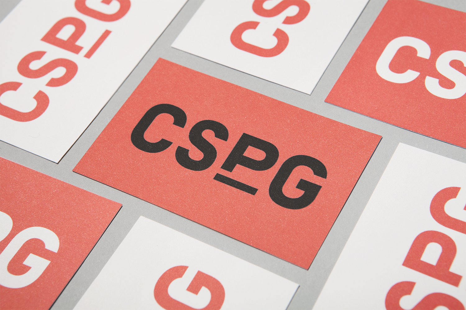
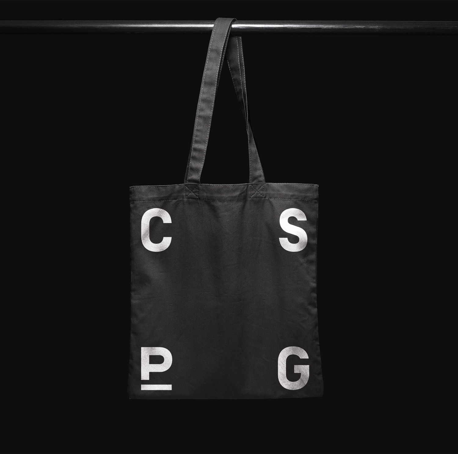
Other neat details include the expanding and contracting nature of the initials. This works as an obvious frame with four points, anchoring the common proportionality of large format posters. It functions well to link artwork from a variety of designers, from different times and for a multitude causes. The red and white background options afford CSPG a flexibility, the opportunity to avoid awkward colour clashes, draw out or compliment colour.
The play with both landscape and portrait within a single piece of communication is a nice way of touching on the portrait nature of posters and the typically landscape format of protest signs.
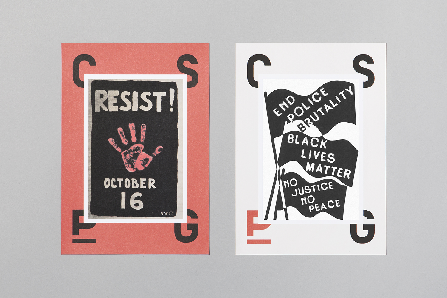
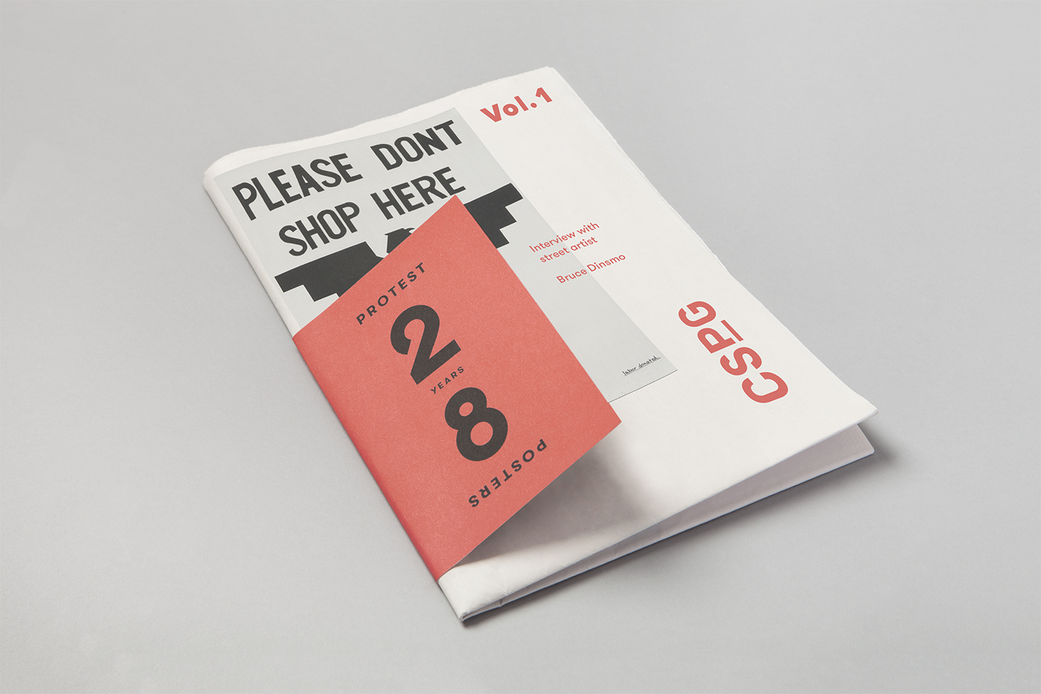
Initially, there appears to be a simplicity, and something of Blok’s own aesthetic preferences at play, a direct typographic expression of communicative immediacy and visual impact, yet there are a number of smaller details that give it a thoughtfulness, details that touch upon the many forms of political dialogue and expression, be that in cropping and layering, arrangement and proportionality, substrate or packaging. More work by Blok on BP&O.
Design: Blok. Opinion: Richard Baird. Fonts Used: Simplon & GT Walsheim.
