Piccolo by Here Design
Opinion by Richard Baird Posted 16 March 2018

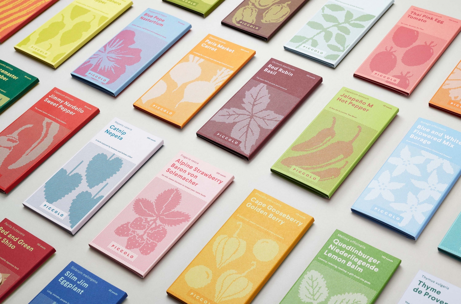
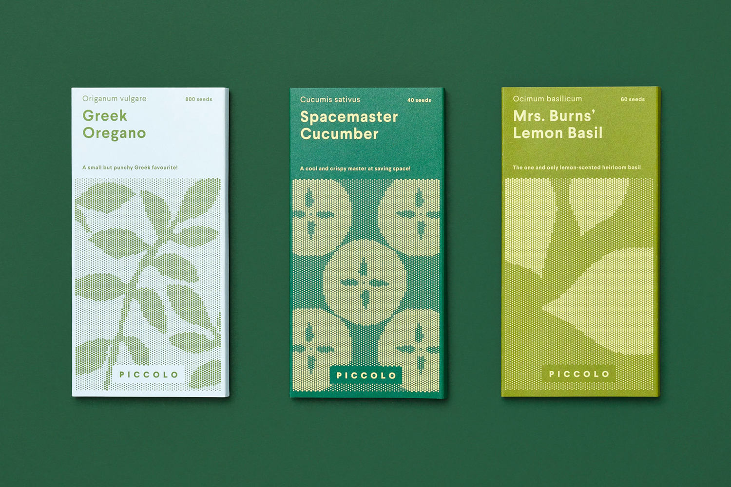
Piccolo is an Italian seed brand with a particular favour for those that are ideal for urban growers, people with small balcony gardens or working with limited space. It is a brand with character, with product naming that includes Slim Jim Aubergine and Spacemaster Cucumber expressing the space-smart dwarf varieties of the range.
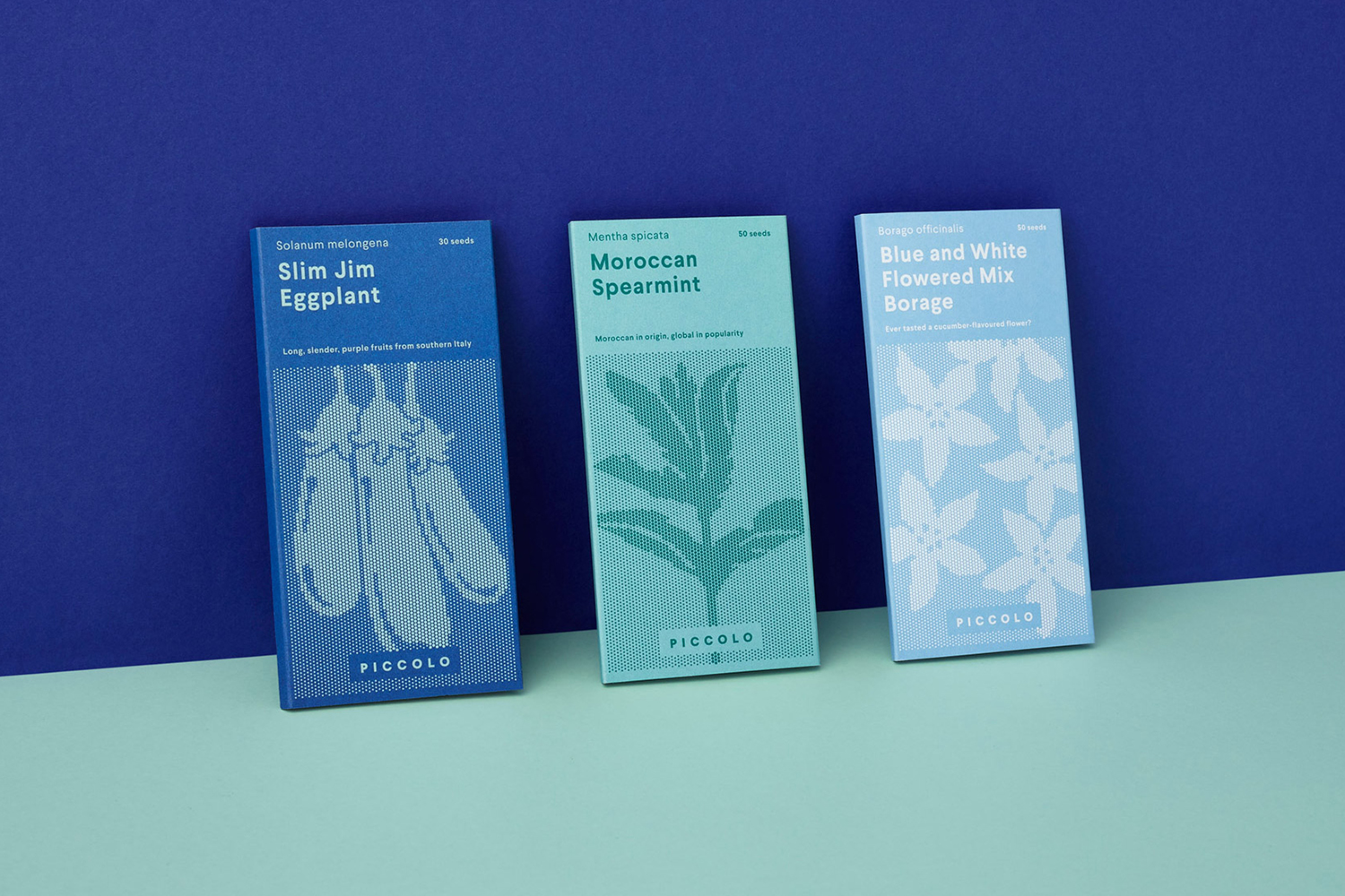
Piccolo worked with UK-based studio Here Design to develop a new graphic identity that would establish a distinct and cohesive visual language across their packaging. With a miniature storybook-like quality and an illustrative approach that plays with both the bold and the granular, these tell the story of Piccolo, bring to light the rewarding experience of growing, and intend to engage with the many urban gardeners of the world.
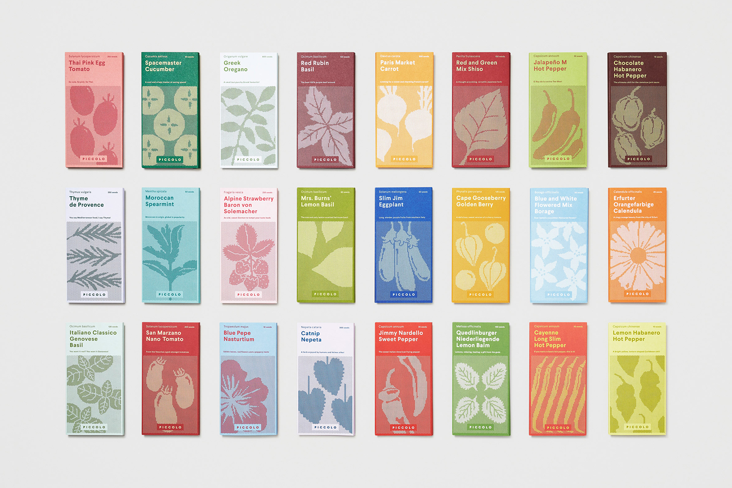
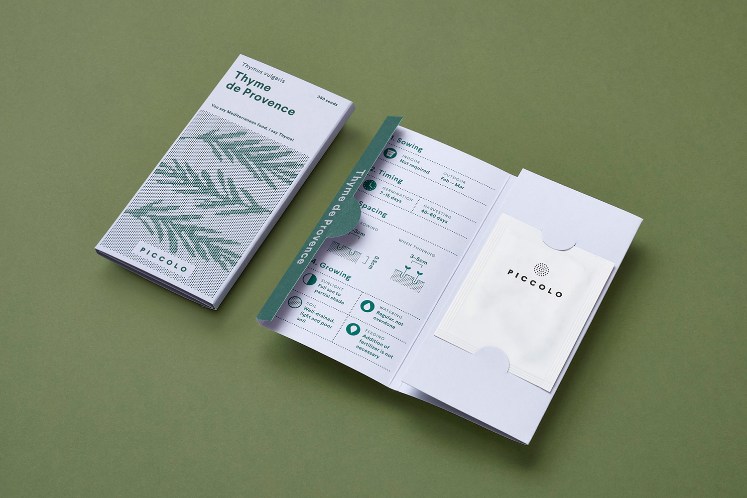
Here Design’s work for Piccolo is characterised by a concise and smart confluence of ideas. Structure, illustration and colour. The robustness of structure, rather than exclusively (and conventionally) employing a paper sachet, is quick to establish a point of difference, with a proportionality closer to, and calling to mind, the immediate reward of chocolate, which continues through to colour palette, and a structural language that implies value of contents through the rigidity of material and in its folding.
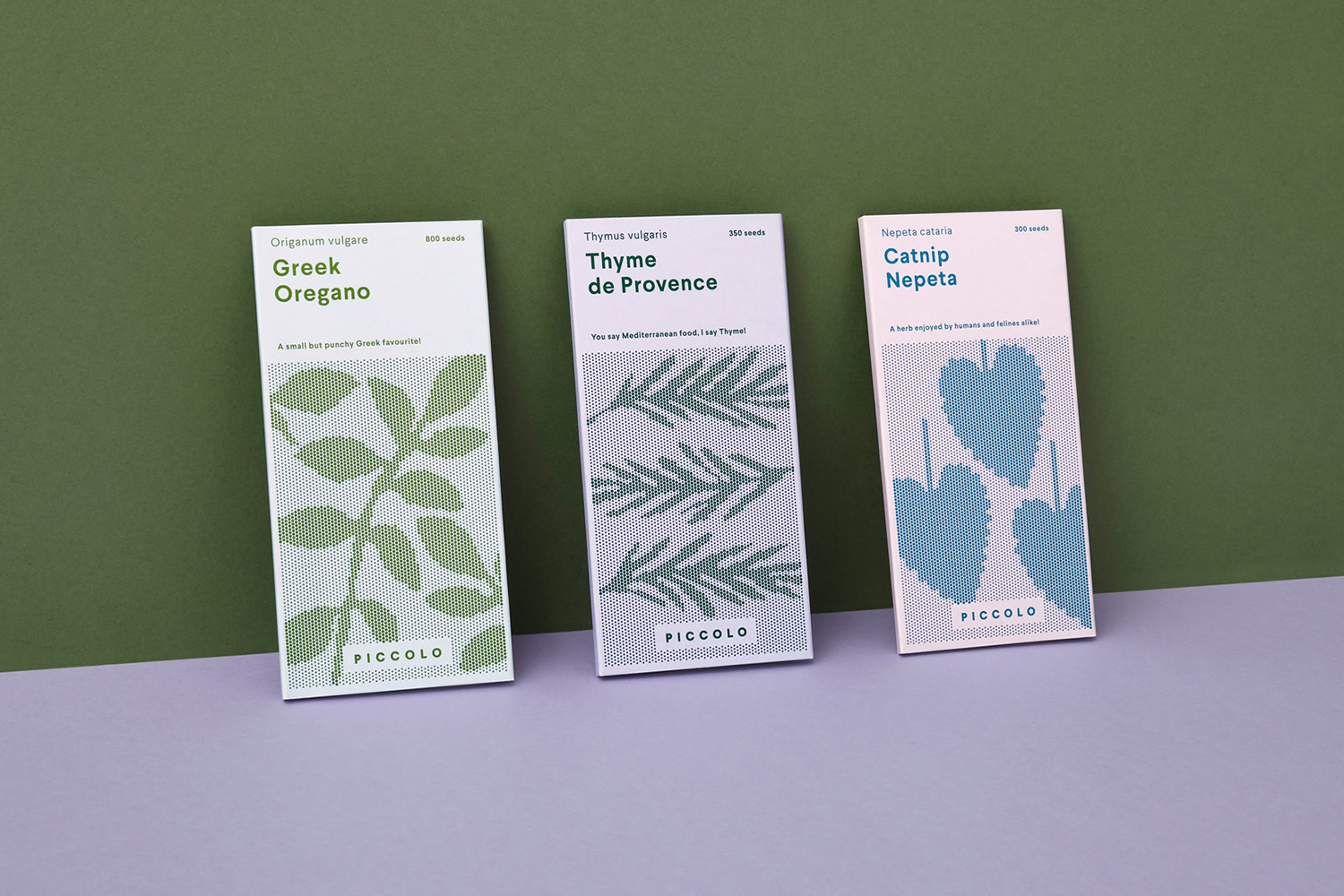
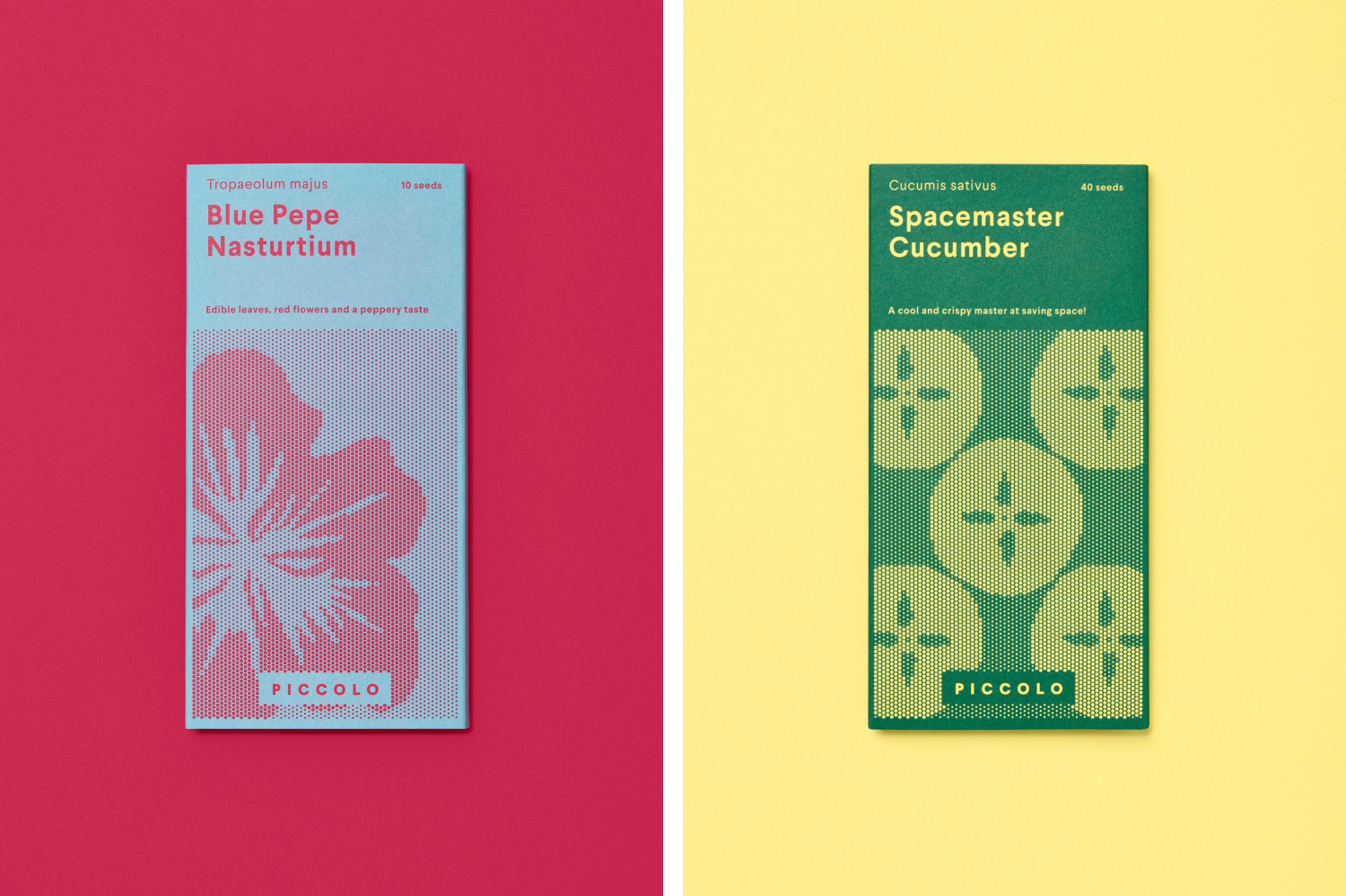
Words, colour and image serve to divide varieties clearly, with type (Larsseit), typesetting, colour combinations, hierarchy and structure establishing an unmistakable and cohesive visual and material language.
There is a lovely and thoughtful relationship formed between product—a granular potential—and the result—the bold immediacy of flower, fruit and vegetable shape throughout each illustration. This also plays with impact and a universal communicative intention from a distance and a detail and an intelligible smile in the mind moment up close.
The seed market can often favour the utilitarian, and default to a blunt visual language of photography and neutral or poorly-considered type. This is, of course, immediate, yet it treats gardening as something closer to household maintenance rather than a pastime that requires care, patience and a nurturing sensitivity. It is a very individual experience. Here Design’s response better reflects this, not just in illustration, but in the confluence of type, colour and structure. Together, these appear modern and personable.
There is a question of material excess. Whether Here Design has justified the additional expense (and waste) in a market that is traditionally materially economical. The effort required to generate results from seeds, the absence of a guaranteed quality outcome, an abundance and commodification make it difficult to justify this. To make it more than just a materially and graphically appealing design direction.
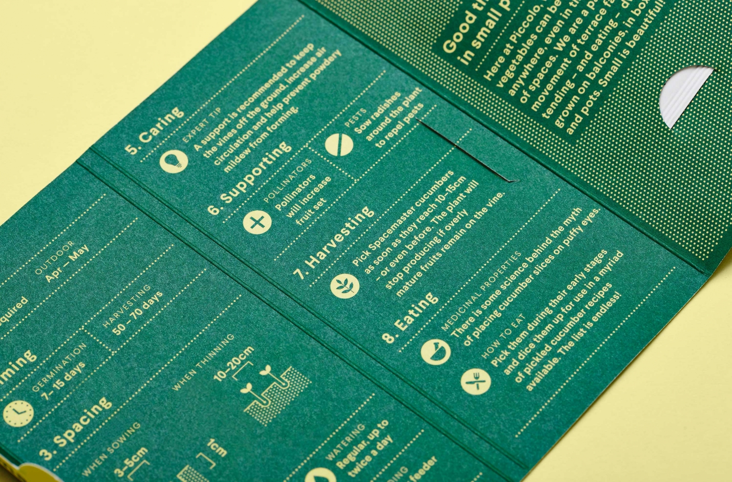
The fold-out structural design, layers of insight which is accessible but not basic and smart in its story of planting, nurturing, harvesting and eating, bring a richness and thoughtfulness to the market. It differentiates. It serves to express the challenges and rewards of growing and, by extension, draws out the experiential value of the product, its potential and the support the brand offers alongside this.
It is a shame that this has not been deployed as effectively online. The storybook content is perhaps better-served in the material interaction, in the opening of packaging, but could have been explored in an interesting way online and in conjunction with illustration, at least from a continuity standpoint. More work by Here Design on BP&O.
Design: Here. Opinion: Richard Baird. Fonts Used: Larsseit
